Hootsuite Logo History and Meaning in Brand Design
Explore the evolution of the Hootsuite logo, its owl symbolism, color choices, and branding lessons for creating a lasting visual identity.

Hootsuite Logo History and Meaning in Brand Design
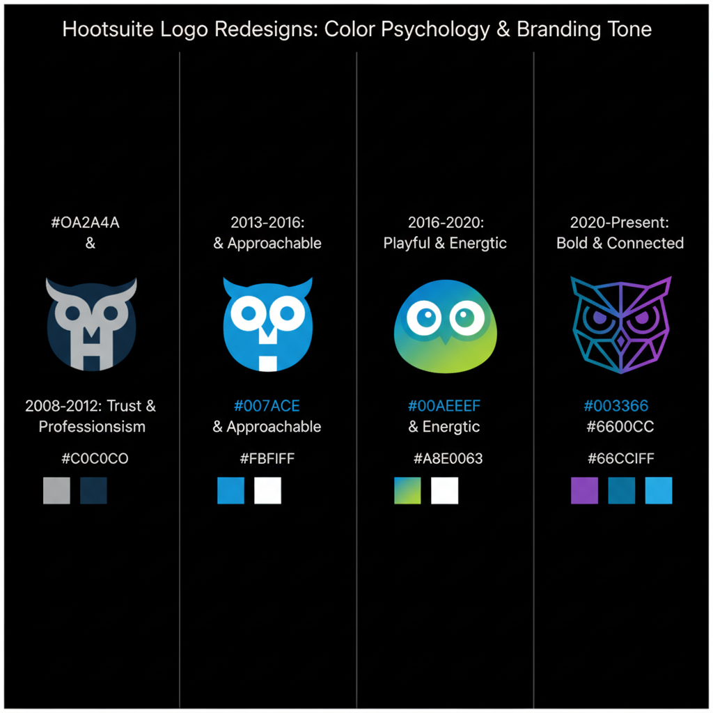
The Hootsuite logo is one of the most recognizable symbols in the social media management industry. Since the platform’s launch in 2008, Hootsuite has transformed from a simple Twitter dashboard into a global leader offering analytics, advertising, scheduling, and team collaboration tools. Parallel to these functional upgrades, the company’s branding — especially its iconic owl emblem — has evolved to reflect its growth, brand positioning, and contemporary design trends.
In this guide, we will explore the history of the Hootsuite logo, the meaning and symbolism behind its design, the timeline of its redesigns, and what lessons marketers can take away for building a lasting and trusted brand identity.
---
Brief History of Hootsuite
Founded in Vancouver, Canada, Hootsuite started life as “BrightKit,” an internal solution to manage multiple social media accounts more efficiently. By 2009, the name was changed to “Hootsuite,” marking the beginning of a distinctive brand journey.
Over the years, Hootsuite grew to serve millions of users — from freelancers and small businesses to large enterprises and government agencies. As the platform scaled, the importance of a clear and memorable visual identity became vital to stand out in a rapidly crowded social media tools market.
---
Origin and Meaning Behind the Hootsuite Name
The brand name Hootsuite is both playful and strategic:
- Hoot — recalls the sound of an owl, representing wisdom, insight, vigilance, and observation.
- Suite — suggests a comprehensive set of tools, positioning Hootsuite as an all-in-one social media command center.
This combination projects the image of a wise, attentive guide helping organizations navigate the noisy world of online conversations.
---
Timeline of Hootsuite Logo Changes and Redesigns
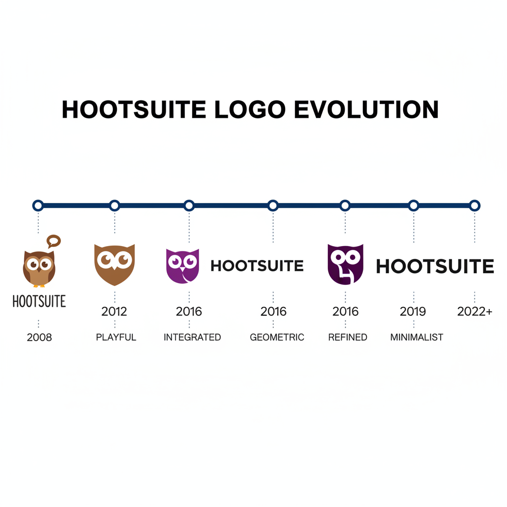
Since 2009, the Hootsuite logo has been refreshed to align with design trends and brand strategy while keeping the owl as its central symbol.
| Year | Logo Version | Notable Features |
|---|---|---|
| 2009 | First Owl Logo | Cartoon-like mascot with oversized eyes, playful colors, and a friendly persona. |
| 2014 | Refined Owl | Sleeker silhouette, reduced details, simplified features, and updated typography. |
| 2021 | Minimal Owl Icon | Flat design with abstract eyes, modern sans-serif lettering, optimized for screens. |
Each redesign reflects broader visual trends (e.g., the rise of flat design) and Hootsuite’s maturation from a startup to a software provider with enterprise credibility.
---
Symbolism in the Hootsuite Owl Logo
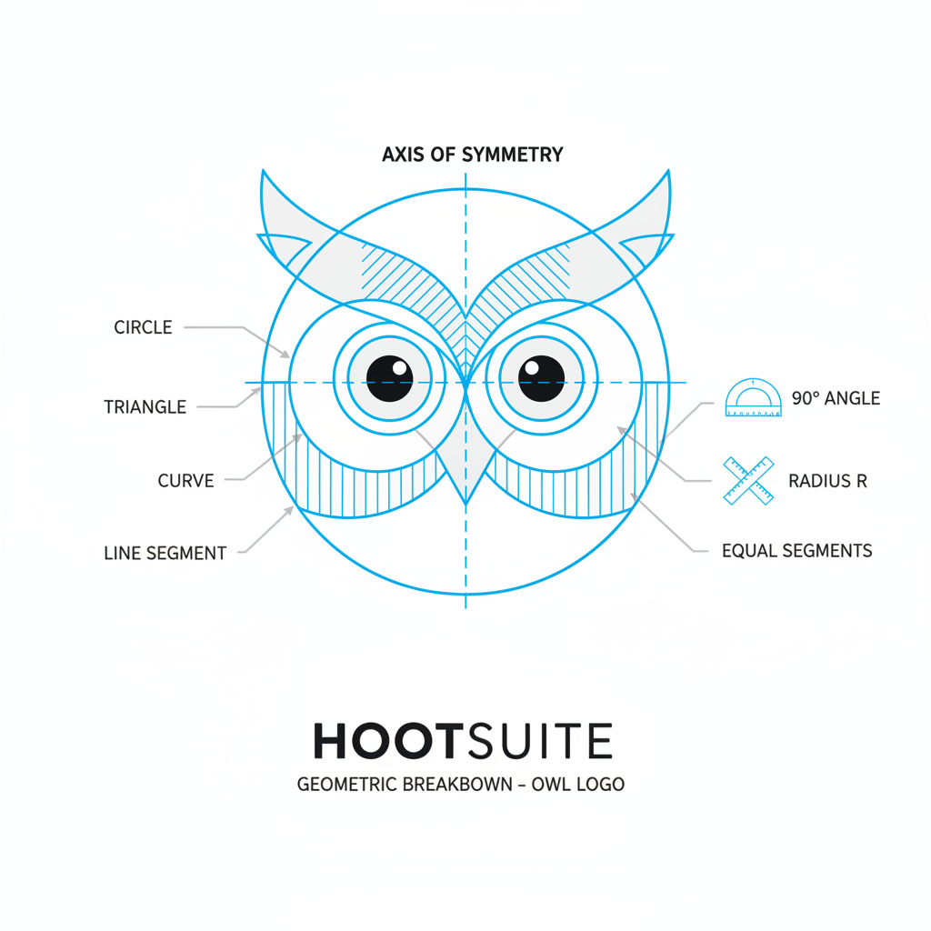
The owl is a timeless emblem of knowledge and keen perception — perfect for a platform centered on listening, analyzing, and engaging across social media networks.
Shapes and Lines
- Big Eyes: Symbolize alertness, data observation, and comprehensive monitoring.
- Smooth, Rounded Silhouette: Adds a friendly yet professional tone, bridging consumer and enterprise audiences.
- Minimal Detailing: Creates adaptability and clarity across web, mobile, and print mediums.
Typography
- Sans-Serif Typeface: Evokes modernity and readability at multiple scales.
- Bold Letterforms: Enhance presence while suggesting confidence and stability.
---
The Role of Color Psychology
Hootsuite’s core palette revolves around black, white, and gray, reinforcing professionalism and versatility, with occasional secondary accents.
- Black: Authority, elegance, expertise.
- White: Simplicity, transparency, and clarity.
- Gray: Neutrality and balance.
This restrained palette ensures timelessness and works seamlessly across both light and dark applications.
---
Communicating Brand Values Through Design
A well-crafted logo communicates a brand’s ethos without a single word. Hootsuite’s owl encapsulates:
- Trust: Balanced, symmetrical design promotes reliability.
- Wisdom: Leveraging the owl archetype’s global association with intelligence.
- Attentiveness: Wide, open eyes convey active listening — crucial in social engagement.
---
Comparing Old and New Logo Versions
The early cartoon-inspired Hootsuite logo spoke to the early, casual culture of social media. Today’s iteration reflects a corporate maturity aligned with serving global enterprise clients.
| Attribute | Old Logo | New Logo |
|---|---|---|
| Style | Playful, colorful | Minimal, flat, monochrome |
| Typography | Rounded, casual | Clean, geometric sans-serif |
| Owl Graphic | Detailed, illustrative | Abstract, simplified |
---
Multi-Platform Use of the Hootsuite Logo
Hootsuite adapts its branding for various digital and physical formats:
- Full Logo (Wordmark + Owl): Used in website headers, press releases, and promotional materials.
- Owl Icon Only: For app icons, favicons, and social avatars.
- Monochrome or Inverse Versions: For overlays, embossing, or minimalistic applications.
---
Official Guidelines for Logo Use
Consistent brand deployment is ensured through Hootsuite’s official asset guidelines:
- Maintain Clear Space: Adequate margins prevent crowding.
- Respect Proportions: No stretching or skewing.
- Honor Approved Colors: Only use sanctioned brand palettes.
- Use Correct Formats: SVG or EPS for print; PNG for online.
---
Brand Consistency Lessons for Marketers
Marketers can draw inspiration from Hootsuite’s branding approach:
- Evolve Authentically: Keep familiar elements while modernizing.
- Simplicity Wins: Minimal icons scale better and load faster.
- Leverage Symbolism: Align imagery with core brand messages.
- Stay Flexible Yet Recognizable: Prepare alternate logo lockups for varied contexts.
---
Other Tech Brands with Impactful Logos
Hootsuite’s branding success is echoed in other well-known tech companies:
| Brand | Logo Element | Key Message |
|---|---|---|
| Blue bird | Communication, agility | |
| Slack | Hashtag symbol with colors | Collaboration, connectivity |
| Dropbox | Open box | Organization, openness |
| Zoom | Camera icon | Video communication |
Each uses simplicity and symbolism to anchor its brand in consumers’ minds.
---
Conclusion: Why the Hootsuite Logo Matters
A logo is often the first impression of a company’s personality and values. Hootsuite’s owl has transitioned from a charming, cartoon-style mascot to a sophisticated, minimalist icon — mirroring the platform’s rise from startup to global authority in social media management.
The "logo Hootsuite" is a masterclass in blending symbolism, adaptability, and consistency. For marketers, the key takeaways are clear: choose a design grounded in your mission, evolve it thoughtfully, and uphold strict usage standards to retain recognition and trust.
---
Ready to strengthen your brand identity? Apply these lessons from Hootsuite’s logo evolution to ensure your brand resonates, scales, and endures over time.
