Horizontal LinkedIn Post Size and Image Dimensions Guide
Learn optimal horizontal LinkedIn post sizes, aspect ratios, and design tips to create crisp, professional images that display perfectly across devices.
Understanding Horizontal LinkedIn Post Size
If you're aiming to boost professional engagement on LinkedIn, mastering the horizontal LinkedIn post size is a must. This landscape orientation—where width exceeds height—is perfect for wide shots, team photography, charts, banners, and infographics that need breathing space across the feed. Knowing how to design and size these posts correctly ensures they render crisply on both desktop and mobile, while maintaining brand consistency.
Horizontal images can:
- Showcase panoramic views or wide diagrams effectively
- Give a professional, brochure-like feel to your post
- Perform better for content that needs text overlay without feeling cramped
- Appear consistent with banner-like branding for campaigns

Choosing the right orientation is key: on LinkedIn, images that are optimally sized in horizontal format look cleaner, display properly across devices, and aren't cut off by automatic cropping.
---
Current Horizontal LinkedIn Image Dimensions
LinkedIn currently supports several image aspect ratios, but for horizontal posts in the feed, the following dimensions are ideal:
| Placement | Recommended Pixel Size | Aspect Ratio | Max File Size |
|---|---|---|---|
| Single Image Post (Horizontal) | 1200 x 627 px | 1.91:1 | 5 MB |
| Event Cover Image | 1920 x 1080 px | 16:9 | 10 MB |
| Company Page Cover | 1128 x 191 px | ~6:1 | 2 MB |
Pro Tip: Always export in PNG for sharper text overlays and crisp lines. JPEG is fine for photography-heavy content, but keep compression settings high quality.
---
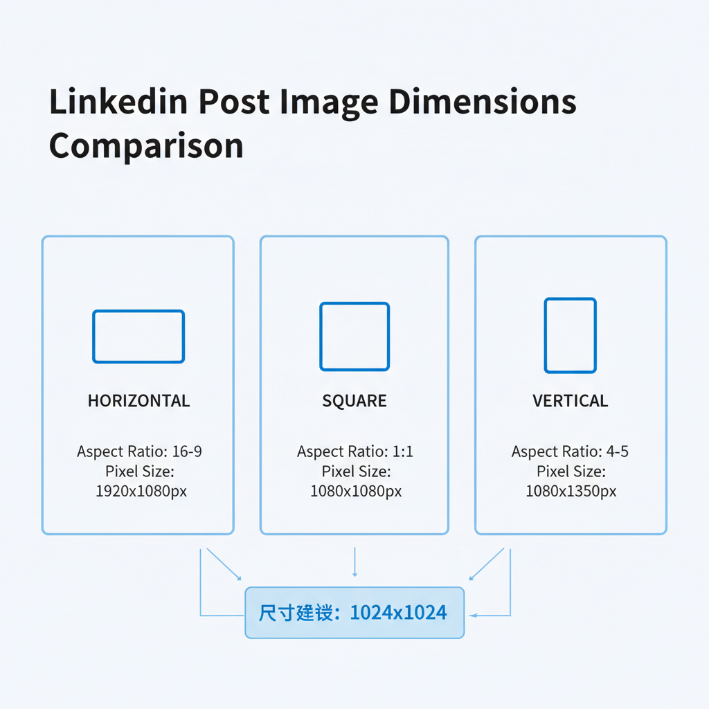
Horizontal vs Square vs Vertical Formats
Understanding how horizontal compares to other LinkedIn image formats can help you choose the optimal type for each campaign.
| Format | Pros | Cons | Best For |
|---|---|---|---|
| Horizontal | Professional look, fits well in most feeds, ideal for banners | Less vertical space on mobile feed | Campaign banners, charts, group shots |
| Square (1:1) | Balanced on desktop/mobile, grabbing equal feed space | Less cinematic visual style | Product shots, quotes, portraits |
| Vertical (4:5 or 9:16) | Takes more screen space on mobile, more immersive | May crop on desktop view | Event promotions, long infographics |
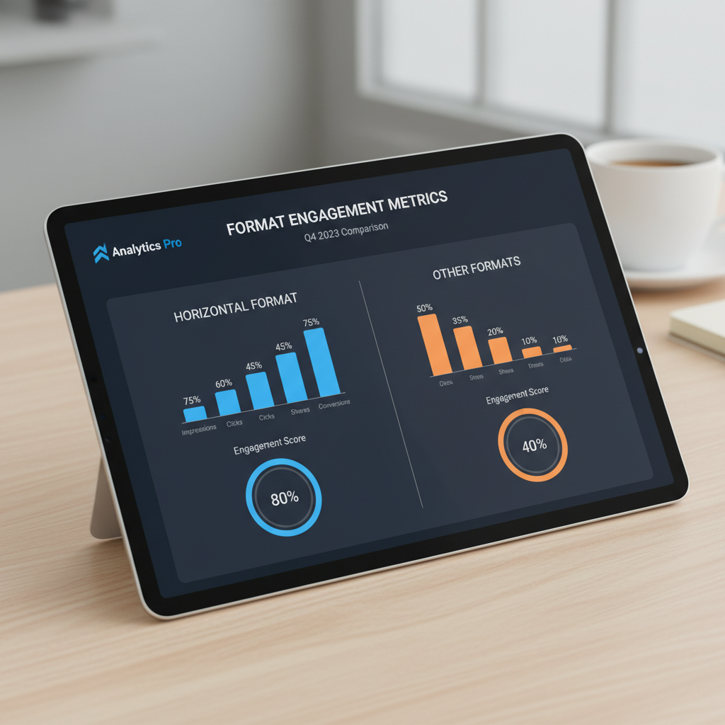
By weighing the pros and cons, it becomes clear: horizontals deliver clarity and sophistication, while verticals drive mobile attention.
---
Best Practices for Designing Horizontal LinkedIn Posts
Follow these guidelines when designing landscape-oriented LinkedIn posts:
- Safe Zone for Text – Keep critical text within the central 1000 px width to avoid cropping on smaller screens.
- Adequate Padding – Use at least 40–60 px margin from edges to prevent UI overlap.
- Consistent Font Size – Choose legible font sizes between 18–36 pt for overlay titles.
- Visual Hierarchy – Arrange elements from left to right with clear focus points.
- Color Contrast – Ensure text color contrasts well against the background image.
Sample CSS to simulate safe zones during design:
.canvas {
  position: relative;
  width: 1200px;
  height: 627px;
  background: #eef2f5;
}
.safe-zone {
  position: absolute;
  left: 80px;
  right: 80px;
  top: 60px;
  bottom: 60px;
  border: 2px dashed #ff9900;
}
---
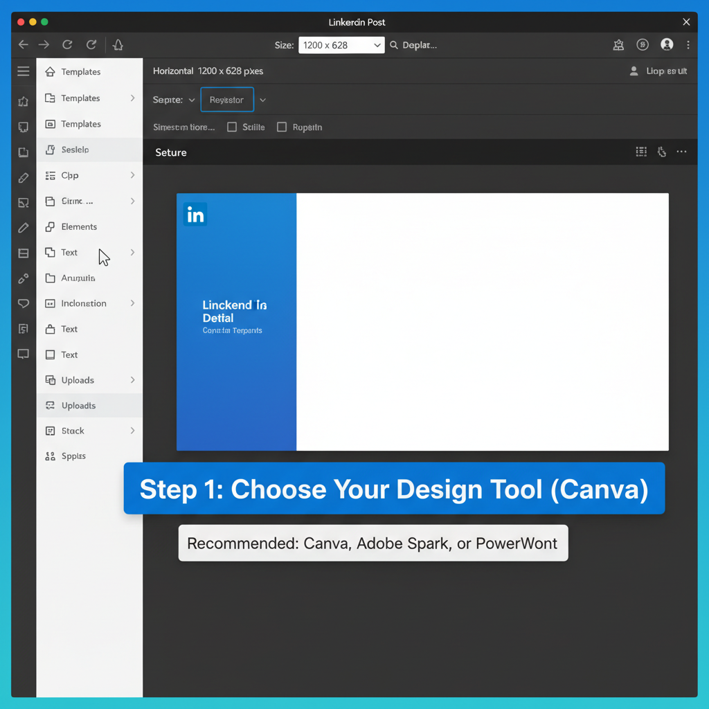
Recommended Tools for Creating LinkedIn-Ready Horizontal Graphics
You can use free or paid tools to ensure perfect sizing:
Free Options:
- Canva – Pre-made LinkedIn templates, drag-and-drop interface
- Figma – Collaborative design platform, precise pixel control
- Pixlr – Simple online photo editing and resizing
Paid Options:
- Adobe Photoshop – Professional editing, advanced export settings
- Affinity Designer – One-time purchase vector and raster design
- Visme – Presentation-style graphics with LinkedIn presets
Always verify the final resolution matches LinkedIn's recommendations and test the post on desktop and mobile before publishing.
---
Common Mistakes to Avoid
Steer clear of these pitfalls to maximize LinkedIn engagement:
- Wrong Aspect Ratio – Can result in cropping or stretching.
- Oversized File – LinkedIn may reject it outright.
- Over-compression – Causes pixelation and reduced clarity.
- Cluttered Backgrounds – Draw attention away from your message.
- Ignoring Mobile Display – Vital text might be unreadable on smaller screens.
A quick checklist before posting can protect your visual brand integrity.
---
Testing Horizontal Post Performance with LinkedIn Analytics
Leverage LinkedIn's analytics to assess how horizontal formats perform:
- Insights Tab – Check impressions, clicks, and CTR for each post.
- Compare Formats – Tag posts internally to monitor engagement differences between horizontal, vertical, and square.
- Audience Demographics – Identify industries or job roles that respond better to wide images.
- Posting Time Experiments – Test different times to find optimal visibility.
Monitoring performance over 4–6 weeks enables data-driven decisions.
---
Case Examples of Brands Using Horizontal Formats
Example 1: Tech Startup Launch
- Horizontal banner (1200x627 px) with product mockup left-aligned, CTA right-aligned.
- Achieved a 17% CTR increase compared to vertical designs.
Example 2: Consulting Firm Thought Leadership
- Horizontal infographic matching website banners.
- Strengthened visual brand identity.
Example 3: Event Promotion
- Wide event cover photo showcasing speaker lineup.
- Encouraged shares and cross-device appeal.
These real use cases show how horizontal formats can elevate professionalism and engagement metrics.
---
SEO Tips for Naming Images and Adding Alt Text
Search optimization boosts visibility outside LinkedIn:
- File Naming: Use descriptive keywords, e.g., `horizontal-linkedin-post-size-guide.png`.
- Alt Text: Write clear, accessible descriptions.
- Metadata: Embed keywords and copyright info via IPTC if supported.
- Compression: Keep load times low without sacrificing clarity.
---
Summary Checklist for Perfect Horizontal LinkedIn Post Sizing
Use this quick reference before hitting “Post”:
- Dimensions are correct (e.g., 1200x627 px)
- Text safe zone respected
- File size under maximum limit
- High-quality PNG/JPEG export
- Strong color contrast for readability
- SEO-friendly filename with “horizontal linkedin post size” keyword
- Relevant alt text for accessibility
- Previewed on desktop and mobile
Bottom line: By applying the right dimensions, design principles, and SEO tactics, you'll ensure your horizontal LinkedIn posts look professional, load quickly, and engage the right audience. Ready to optimize your visuals? Start designing your next post with these tips today.