How to Check Image Size on Any Device: Dimensions, File Size, and Best Practices
Learn how to check image dimensions, file size, and DPI on Windows, macOS, Linux, iOS, and web tools, plus best-practice targets for web, email, and print.
Getting image size right is more than a single number—it blends pixel dimensions, file size, and resolution, each affecting quality, speed, and usability in different ways. This guide shows you how to check those attributes on desktop, mobile, and web, and how to choose smart targets for blogs, social, email, and print. Keep it handy as a reference while working in file managers, browsers, and design tools.
How to Check Image Size on Any Device: Dimensions, File Size, and Best Practices
Image “size” is often used loosely, but it actually refers to different attributes that matter in different contexts. Whether you’re optimizing for a fast website, passing email attachment limits, or preparing a high-quality print, knowing how to check image size correctly—and what to do with that information—will save headaches and improve results.
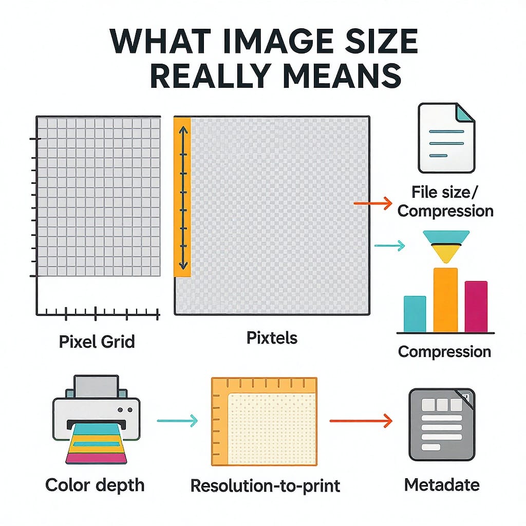
What “image size” really means
Image size has three core concepts:
Pixel dimensions: width × height in pixels (e.g., 1920×1080). Controls on-screen detail and layout.
File size: bytes on disk or over the network (e.g., 240 KB, 2.4 MB). Controls load time, bandwidth, and email deliverability.
Resolution: dots or pixels per inch (DPI/PPI). Important for print scale, mostly irrelevant for web rendering.
Why each matters:
Web performance: Large pixel dimensions and high file size increase LCP and total bytes. Use the smallest dimension that looks crisp on target screens and a modern format.
SEO: Faster pages tend to rank and convert better; correct dimension and responsive images help avoid CLS.
Email: Many providers throttle or block large images; keep inline images under ~200–400 KB each.
Print: Ensure enough PPI for the intended physical size (e.g., 300 PPI at final print dimensions).
Select file > Cmd‑I. Look for “More Info” with pixel dimensions and file size.
Preview Inspector:
Open image in Preview > Tools > Show Inspector (⌘I) > Info and General/Exif tabs for dimensions, color profile, and DPI.
Linux
File managers (Nautilus, Dolphin, Thunar):
Properties often show dimensions and size. Enable “Additional” info or column views where available.
ImageMagick identify:
identify -format "%f: %wx%h, %b, %m\n" photo.jpg
Outputs file name, width×height, file size, and format.
Mobile methods
iPhone/iPad (iOS/iPadOS)
Photos app:
Open image > tap the “i” (Info) or swipe up. Shows pixel dimensions, file size, and camera metadata.
Files app:
Long‑press file > Info to see size and sometimes dimensions.
Sharing tips:
Mail offers “Actual Size” vs reduced sizes. Choose “Actual Size” for full quality.
iMessage typically sends high quality; AirDrop preserves originals.
Android
Gallery/Photos:
Open image > three‑dot menu > Details. Shows resolution and size.
Files (by Google) or OEM file manager:
Long‑press > Properties or Details for file size and often dimensions.
Sharing tips:
Messaging apps may compress. To preserve quality in WhatsApp, share as “Document” instead of “Photo.” Google Photos allows sharing “Original quality” if enabled.
On the web: DevTools for real-world sizes
DevTools reveal how images behave in the browser:
Natural vs rendered dimensions:
Right‑click element > Inspect. In the Styles/Computed panel, note the rendered size (CSS pixels).
Check window.devicePixelRatio in Console (1 for standard, 2 for “retina”). Supply higher-density sources via srcset.
Network panel:
Columns: Size (resource) vs Transferred (after compression). Inspect Content-Encoding (gzip/br) and actual bytes over the wire.
Lazy loading:
Images with loading="lazy" won’t download until in/near viewport. Use the Performance panel or Network filters to see requests as they occur.
Layout stability:
Prevent CLS by setting width and height attributes to reserve space:
Design and editing apps
Photoshop
Check: Image > Image Size shows pixel dimensions and resolution. Toggle “Resample” off to change DPI without altering pixels (for print planning).
Export:
File > Export > Export As shows output dimensions, format, and size estimate.
Use JPEG (quality ~70–85), WebP, or AVIF when available. Consider “Bicubic Sharper” for downscaling.
Figma/Sketch
Frame/artboard size is your pixel dimension.
Export panel:
Add @1x/@2x (@3x if needed). Set formats (PNG for transparency, JPEG/WebP for photos).
Inspect panel shows node size. Use constraints/autolayout to keep intended dimensions.
Canva
Resize (Pro) to set target dimensions. Download dialog shows pixel size; choose PNG/JPG/WebP and quality. For print, export PDF or high‑res with appropriate DPI settings.
Online tools and batch checks
Drag‑and‑drop checkers:
Tools like Squoosh.app show pixel dimensions, preview compression, and output file size. Be mindful of privacy for sensitive images.
EXIF viewers:
Reveal orientation, DPI, color space, and capture metadata. Use to debug unexpected rotations or color shifts.
    shopt -s globstar nullglob
    for f in **/*.{jpg,jpeg,png,webp,avif,gif}; do
      identify -format "%P,%f,%w,%h,%b,%m\n" "$f"
    done | tee images.csv
macOS sips for quick conversions:
sips -s format jpeg input.heic --out output.jpg
CMS and site workflows
WordPress:
Media Library shows dimensions. WordPress auto‑generates multiple sizes and srcset. Use add_image_size for custom crops and Regenerate Thumbnails when changing theme sizes.
Shopify:
CDN can resize via URL params (e.g., ?width=800). Check theme docs for best practices and responsive attributes.
Naming conventions:
Include dimensions in filenames (banner-1600x900.jpg) to quickly identify size, especially when multiple variants exist.
Choosing target sizes by channel
Use these as starting points; always validate with your design and analytics.
Channel
Recommended pixel dimensions
Notes
Blog hero
1600–2400 px width (aspect 16:9 or 21:9)
Provide srcset down to 800 px; keep under ~300–500 KB if possible
Inline blog images
800–1200 px width
Use WebP/AVIF for photos; PNG/SVG for diagrams
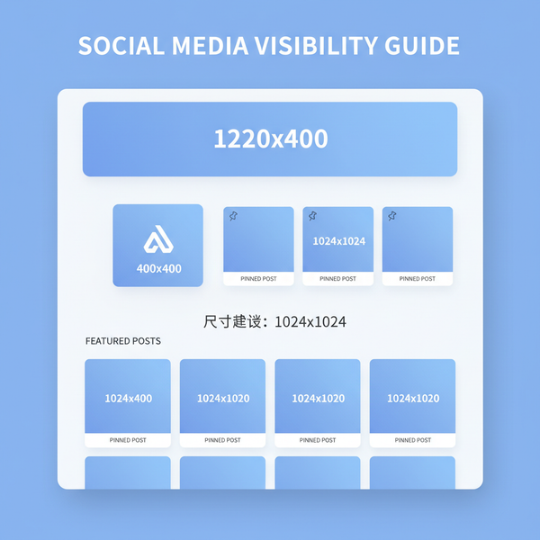
Social (Instagram square)
1080×1080 px
Export sRGB; avoid tiny text
Social (X/Twitter landscape)
1200×675 px
Often auto‑crops; keep key content centered
LinkedIn shared image
1200×627 px
Check preview before posting
Email newsletter
Max width 600–800 px
Each image ideally <200 KB; use progressive JPEG/WebP where supported
Print (8×10 in)
2400×3000 px (at 300 PPI)
Set DPI metadata to 300 for print shops; export TIFF/JPEG
Retina/HiDPI assets
Provide @2x via srcset
Use sizes to avoid over‑downloading on small viewports
For complex art direction (cropping differently per breakpoint):
If the image is too big or too small
Resizing without blur:
Downscale with high‑quality filters (Lanczos/Bicubic Sharper). Add mild output sharpening after big reductions.
Compression:
Lossy (JPEG/WebP/AVIF): best for photos. Start at quality 70–85 (WebP may look great at 60–75).
Lossless (PNG/WebP lossless): best for line art, UI, transparency.
Format selection:
JPEG: ubiquitous; no transparency; use progressive.
PNG: sharp edges, transparency; big for photos.
WebP: great balance, wide support.
AVIF: highest compression efficiency; slightly slower encode; excellent for HDR/10‑bit where supported.
Automated pipelines:
Squoosh CLI, cwebp, avifenc, or Node Sharp in CI/CD.
Convert HEIC to JPEG/WebP for cross‑browser compatibility.
  # macOS
  sips -s format jpeg input.heic --out output.jpg
  # WebP direct
  magick input.heic -quality 80 output.webp
Transparency and backgrounds:
Use PNG/WebP for transparency. Avoid JPEG if you need alpha. For emails and some social networks, add a solid background to avoid unexpected dark backgrounds.
Color profiles:
Convert to sRGB for web to avoid desaturation or shifts.
Web: DevTools (natural vs rendered, Network bytes).
Export smart:
Choose WebP/AVIF for photos when possible; PNG/SVG for graphics.
Provide responsive srcset and width/height attributes.
Automate:
Use CLI tools and CI to enforce target sizes and formats across folders and repositories.
Verify:
Spot‑check with DevTools and analytics (image bytes, LCP, CLS) to confirm improvements.
With these methods, you can accurately check image size on any device, choose the right targets for each channel, and ship sharp, fast, and reliable visuals every time.
Summary
Understanding the distinction between pixel dimensions, file size, and resolution—and knowing where to check each—lets you balance quality and performance across web, email, social, and print. Use the platform-specific steps above, export thoughtfully, and validate with DevTools and analytics to keep images crisp, lightweight, and predictable.