Create an Aesthetic Instagram 9 Grid Layout for Branding
Learn how to design an aesthetic Instagram 9 grid layout to boost branding, maintain visual consistency, and engage your audience effectively.
What Is an Instagram 9 Grid Layout and Why It Matters for Branding
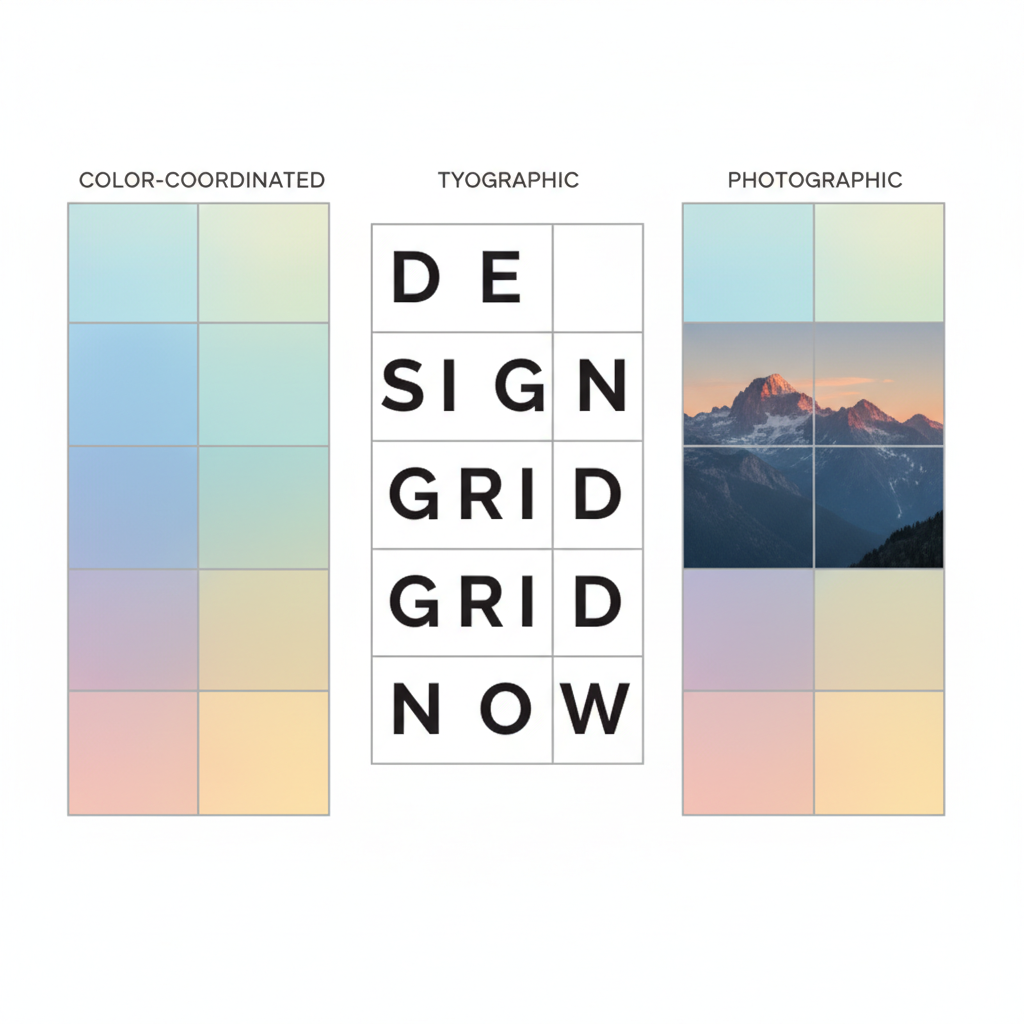
An Instagram 9 grid layout is a creative profile design where the first nine posts form a single, cohesive visual that doubles as a branding statement. By strategically coordinating images, colors, and design elements, each individual square works both alone and as part of a larger image or narrative.
This technique is widely used in Instagram branding strategies because it:
- Creates strong first impressions – Visitors recognize your style and message instantly.
- Builds brand consistency – A visually unified grid projects professionalism and reliability.
- Enhances storytelling – The arrangement allows a sequential or thematic story to unfold across posts.
- Differentiates your brand – A striking, distinctive feed layout can attract more profile clicks.

---
Choosing Your Visual Theme
Before posting, establish a visual theme to guide your design decisions. Your theme determines the overall mood, style, and personality of the grid.
Key Elements of a Visual Theme
- Color Palette
- Select 3–5 core brand colors and apply them consistently to improve brand recall.
- Mood
- Decide if your profile aesthetic is vibrant, bold, minimalist, dark, corporate, or playful.
- Typography
- Use consistent fonts on any text overlays. This maintains visual identity and readability.
- Imagery Style
- Define how photos are shot and edited — angles, filters, lighting, and composition should remain uniform.
---
Planning Your 9-Grid Concept
Treat your nine tiles as parts of one larger storytelling canvas. Planning prevents mismatched visuals and unclear messaging.
You might choose:
- Storytelling Sequence – Each tile acts as a chapter in a visual narrative.
- Product Showcase – Each square highlights a feature or benefit of your product.
- Campaign Reveal – A teaser image split into nine posts to build anticipation.
---
Preparing High-Resolution Images
Professional image quality ensures your grid has maximum impact.
- Resolution: Use minimum 1080 × 1080 px for each tile to keep images clear.
- Lighting: Rely on natural light or studio setups for sharp results.
- Editing: Apply the same filters, presets, or adjustments for a consistent tone.
---
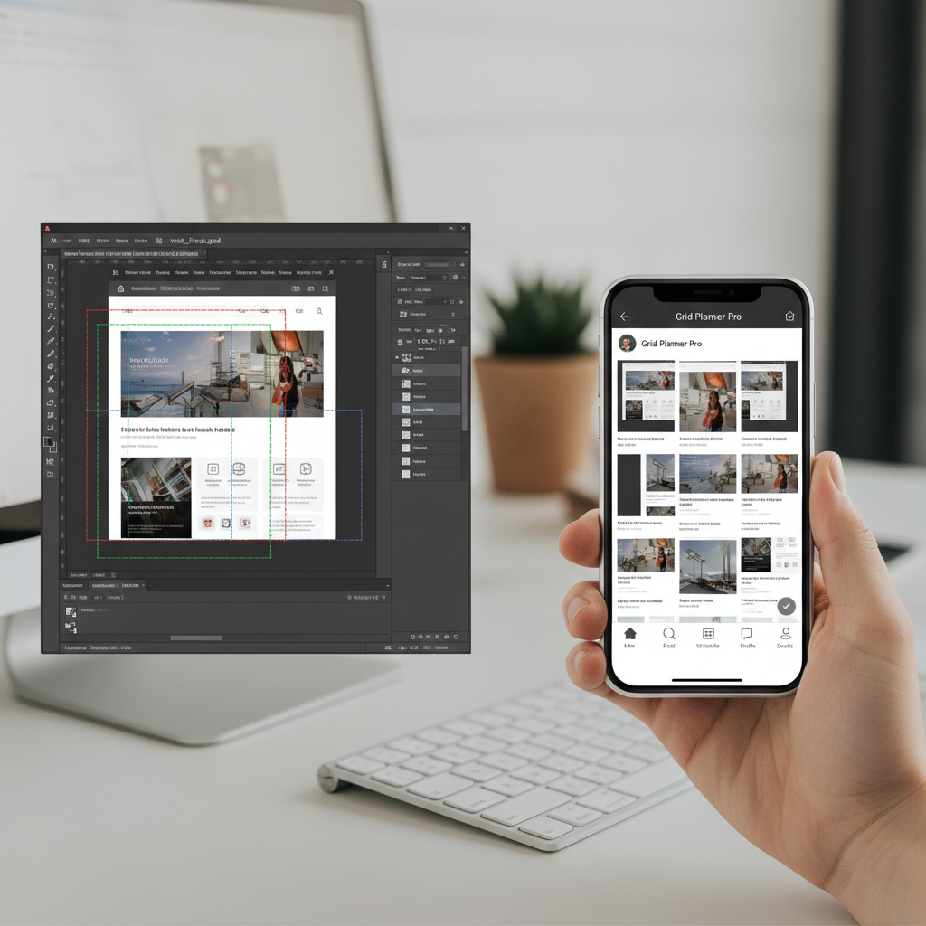
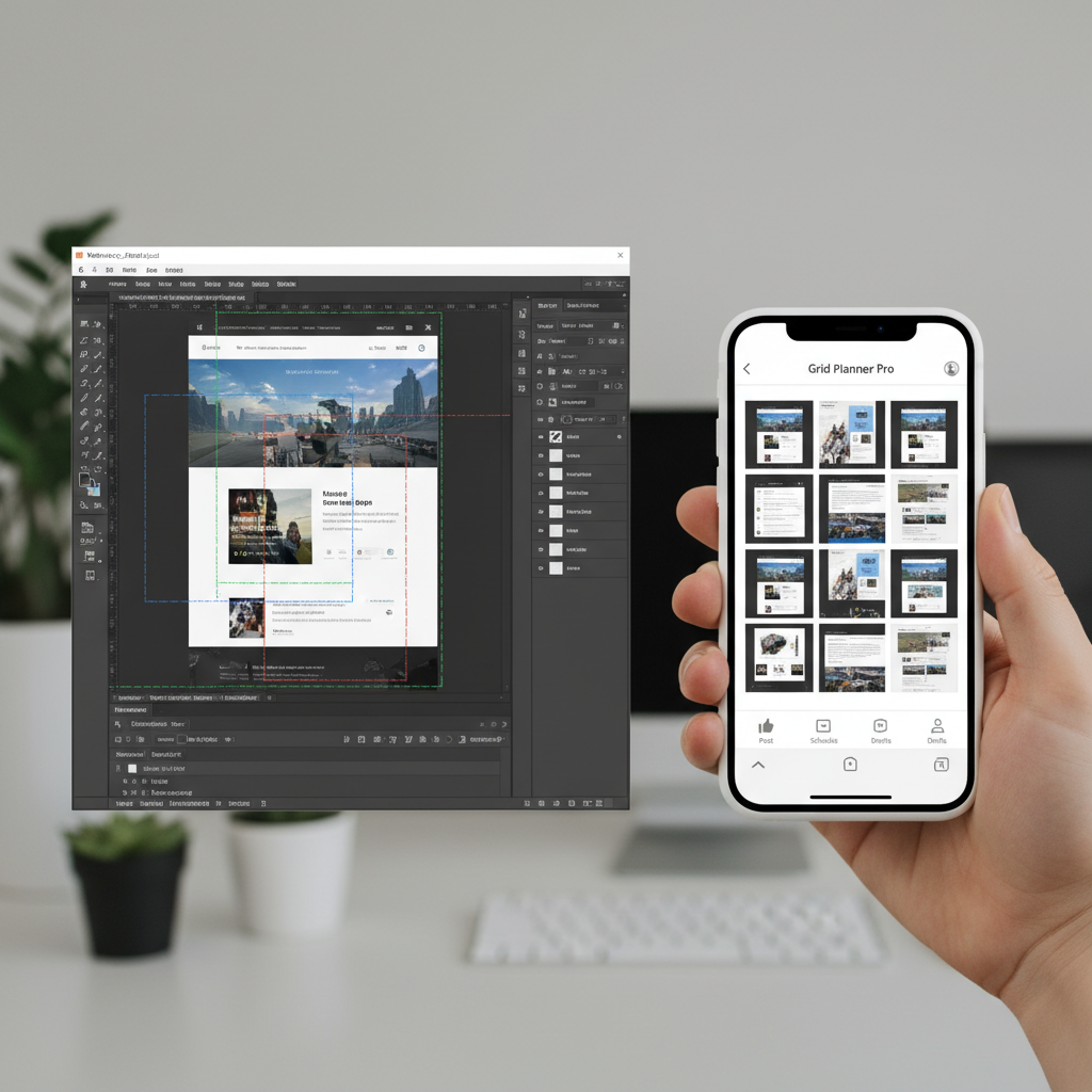
Tools for Splitting the Grid
To create the grid effect, you’ll need design tools to slice your layout into 9 equal parts:
- Canva – Beginner-friendly templates with slicing functionality.
- Photoshop – Perfect for precision and control with layers and guides.
- Figma – Great for collaborative projects and layout previewing.
Example Workflow in Photoshop
1. Open your composite image.
2. Set canvas size to 3240 x 3240 pixels for a 3 × 3 grid of 1080 px squares.
3. Use the Slice Tool to create 9 equal sections.
4. Export each slice in correct posting order.
---
Arrange a Preview in a Grid-Planning App
Before publishing, test your arrangement:
- UNUM, Planoly, and Later offer drag-and-drop grid previews.
- They maintain post order and allow you to schedule uploads.
- Many also include analytics to track performance over time.
---
Writing Cohesive Captions
Captions should connect each tile into a single overarching story, while still engaging independently.
Pro Tips:
- Use a mini-series name or grid project title in each caption.
- Add CTAs such as “Tap link in bio” or “Comment your thoughts.”
- Include niche-specific hashtags to reach targeted audiences.
---
Scheduling Posts for Grid Integrity
The visual effect depends entirely on sequential posting.
- Upload posts exactly in the planned order.
- Don’t insert unrelated content until the 9-post set is finished.
- Prepare and schedule all nine images together for consistency.
---
Balancing Aesthetics and Engagement
A perfect grid loses value if it doesn’t engage users.
Approaches to blend beauty and interaction:
- Feature standalone quotes, tips, or facts in certain tiles.
- Use interactive CTAs or polls in captions.
- Tag brands, people, and places to expand organic reach.
---
Measuring Performance and Adjusting
Track your grid’s success with analytics, adjusting future designs for better results.
| Metric | Why It Matters | Tools to Use |
|---|---|---|
| Follower Growth | Shows increased interest generated by your branding visuals. | Instagram Insights, Later |
| Engagement Rate | Reveals how relevant and appealing your content is to followers. | Hootsuite, Iconosquare |
| Saves | Indicates content value and inspiration to your audience. | Native Instagram Analytics |
---
Avoid Overcomplication
Simplicity often works best. Keep these points in mind:
- Every square should make sense individually.
- Complex designs may confuse or overwhelm viewers.
- Prioritize clarity, branding, and easy-to-follow composition.
---
Summary and Next Steps
An Instagram 9 grid layout is more than just a creative profile touch — it’s a sharp visual marketing tactic that can showcase your brand identity, highlight products, and embed meaningful narratives into your feed.
By defining a visual theme, planning meticulously, editing with consistency, and measuring results, you can cultivate a memorable, elevated brand presence on Instagram.
Start mapping your next grid today, monitor engagement, and refine your approach. With creativity and consistency, you’ll make a lasting visual impression — and stand out in any feed.


