Create an Aesthetic Instagram Edit Grid for Your Brand
Learn how to design and maintain an aesthetic Instagram edit grid that boosts brand identity, creates visual impact, and drives follower engagement.
Introduction to the Instagram Edit Grid
An Instagram edit grid is a strategic way to arrange your posts so that your feed delivers a strong visual impact, communicates your brand message, and encourages deeper engagement. In this guide, you’ll learn how to design, plan, and maintain a cohesive grid that elevates your profile appearance, reinforces branding, and boosts both follower growth and interaction rates. The techniques here are valuable for businesses, influencers, and creators who want to stand out in their niche.
---
Understanding the Instagram Edit Grid
An Instagram edit grid is the curated arrangement of posts on your profile to create a visually appealing, cohesive look when users view your feed as a whole. Rather than each post standing alone, the grid works as a unified canvas that tells your brand’s story, reinforces identity, and captures attention instantly.
Why does it matter for branding? Because the first impression often happens when someone lands on your profile. A professional, aesthetic feed can:
- Convey credibility and professionalism
- Reflect your brand’s personality
- Encourage users to scroll, follow, and engage
- Serve as a portfolio of your work or products

A strong grid provides consistent visuals, making it easy for followers to recognize your style across platforms.
---
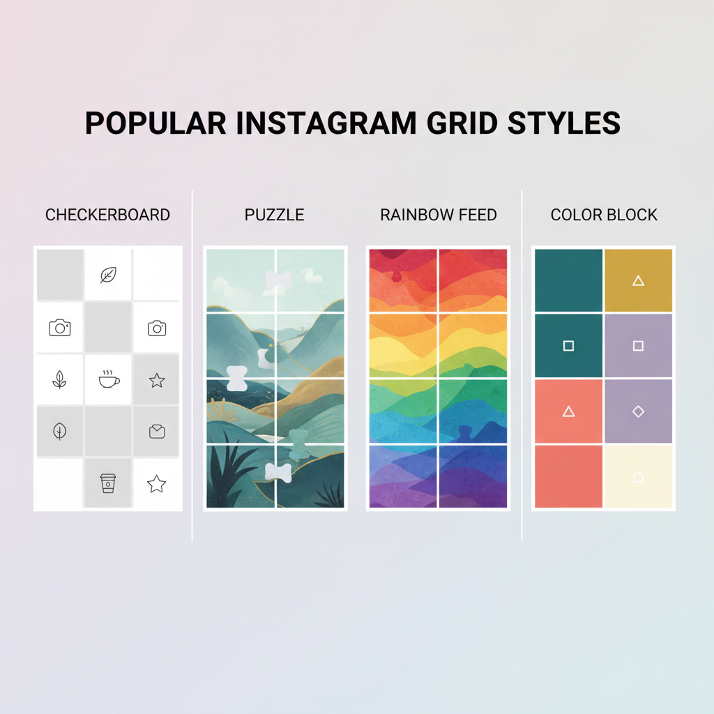
Popular Instagram Grid Styles
Before creating your own, explore common grid types that brands and influencers use. Each style can be tailored to your niche.
Checkerboard Grid
Alternate between two types of posts (e.g., photo then text, photo then quote) to produce a sleek checkerboard pattern.
Puzzle Grid
Images are split into multiple posts so the entire feed forms one large image—a bold way to attract attention.
Rainbow Feed
Each row or section transitions in color, creating a gradient as followers scroll.
Color Block Grid
Groups of posts share the same background or dominant color. This is especially helpful for seasonal campaigns.
| Grid Style | Best For | Pros | Cons |
|---|---|---|---|
| Checkerboard | Quotes + Product shots | Easy to maintain | Less dynamic than others |
| Puzzle | Big campaigns | Eye-catching | Hard to update without breaking layout |
| Rainbow | Color-focused brands | Beautiful transitions | Requires careful planning |
| Color Block | Seasonal promos | Strong brand color presence | May feel repetitive |
---
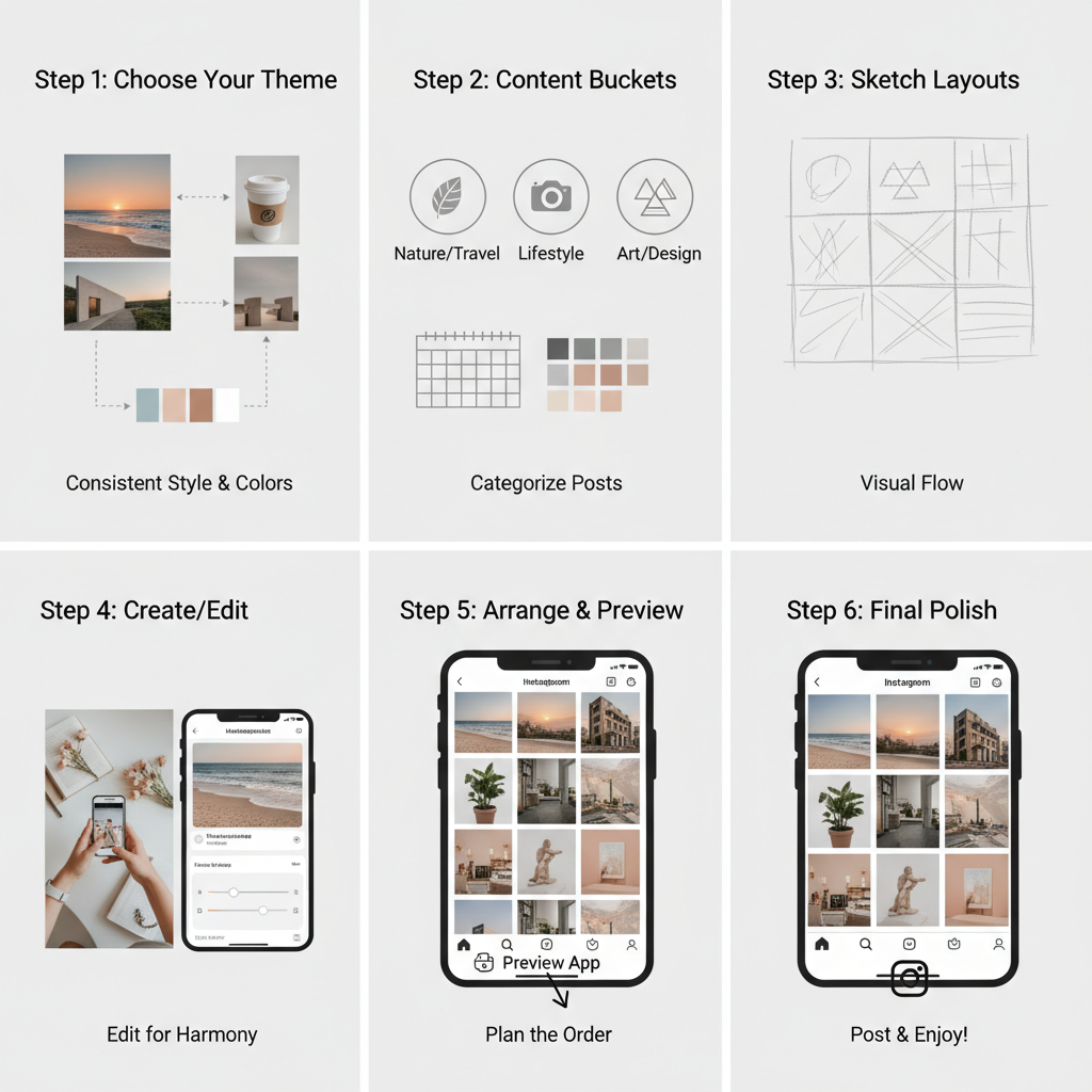
Choosing a Consistent Theme and Color Palette
Your theme represents your brand’s tone—minimalist, vibrant, editorial, playful, etc.—while your color palette ties everything together visually.
Tips:
- Select 2–4 core colors from your logo or brand guidelines.
- Decide on filters or presets to apply consistently.
- Align photography and graphic elements with your brand’s mood.
Consistency is key. Random colors and tones will make the grid look fragmented.
---
Planning Your Grid Layout
Invest time using design and planning apps like Canva, UNUM, or Preview. These tools let you drag-and-drop your future posts to visualize your feed before publishing.
Planning Strategy:
- Map out 9–12 posts at a time for a cohesive section.
- Consider seasonal or campaign-specific designs.
- Remember your captions and hashtags so they match the visual context.
You can even sketch your grid layout in a notebook before creating the digital version.
---
Preparing High-Quality Images
To ensure your grid is captivating, start with high-resolution images.
Image Best Practices:
- Use natural lighting when possible.
- Keep backgrounds uncluttered.
- Edit with consistent exposure, contrast, and saturation settings.
A well-shot image is easier to integrate into your grid without heavy post-processing.
---
Templates or Custom Designs
Templates help maintain alignment across posts—especially with grid types like checkerboard or puzzle feeds.
Advantages of templates:
- Saves time
- Ensures design uniformity
- Makes collaboration easy when you work with a team
Alternatively, you can produce custom designs tailored to each campaign, though this demands more design skills and attention.
---
Scheduling Your Posts for Flow
Posting in the correct sequence is critical for maintaining your grid’s planned look. A single misplaced post can disrupt the flow.
Steps to schedule correctly:
- Use a content calendar alongside a preview app.
- Double-check your planned layout before posting.
- Consider optimal posting times for engagement.
Scheduling tools like Later, Planoly, and Buffer can automate this process.
---
Maintaining Visual Balance
Balance matters between different content types: text-based graphics, portraits, landscapes, product images.
Balancing Tips:
- Avoid clustering similar shots together—space them out across rows.
- Use whitespace or minimal designs to break up visually heavy posts.
- Alternate between close-up and wide shots for variety.
Maintaining visual rhythm keeps your audience engaged and prevents fatigue.
---
Incorporating Brand Elements
Subtle branding makes your feed recognizable without feeling overly promotional.
How to integrate brand elements:
- Place your logo on occasional graphics, not every photo.
- Use signature fonts for quotes or announcements.
- Apply a signature filter or tone curve.
By embedding these elements intentionally, you reinforce brand recognition while keeping aesthetics intact.
---
Testing Layouts and Gathering Feedback
Social media is dynamic—what works for one audience may not resonate with another.
Ways to test:
- Create two versions of your upcoming grid, share with your team or loyal followers, and gather opinions.
- Monitor early engagement patterns after making changes.
- Be willing to adjust based on data and feedback.
Remember: perfection is a process; evolving based on input can improve retention and reach.
---
Optimizing Captions and Hashtags
Captions and hashtags play a key role in discoverability without breaking your grid’s visual harmony.
Best Practices:
- Keep captions aligned with your brand voice.
- Use targeted hashtags relevant to your niche and audience.
- Avoid placing text over images unless it’s part of your design plan.
This keeps your posts searchable while preserving the aesthetic grid.
---
Updating Your Grid Style
Staying fresh is necessary to keep followers interested—yet you must remain recognizable.
Update ideas:
- Change your palette slightly for each season.
- Introduce new grid patterns for special events.
- Experiment with trending editing styles while keeping core branding intact.
The goal is to appear dynamic without losing identity.
---
Tracking Engagement Metrics
Metrics reveal if your Instagram edit grid aligns with audience preferences and improves business results.
Key metrics to track:
- Follower growth: Are more people following since grid implementation?
- Engagement rate: Likes, comments, shares on recent posts.
- Profile visits and link clicks: Are visitors exploring more?
You can use Instagram Insights or third-party analytics tools to measure these KPIs.
| Metric | Tool | Frequency | Action |
|---|---|---|---|
| Follower Growth | Instagram Insights | Weekly | Adjust posting cadence |
| Engagement Rate | Later Analytics | Weekly | Test new content mixes |
| Profile Visits | Instagram Insights | Monthly | Improve call-to-action |
---
Conclusion and Next Steps
An Instagram edit grid is more than just a pretty feed—it’s a strategic visual narrative that can elevate your brand identity and engage your audience. By understanding grid styles, choosing a consistent theme, planning layouts carefully, and embedding subtle branding, you can ensure your Instagram presence is both aesthetically pleasing and aligned with business goals.
When executed well, your grid becomes a growth asset—enticing new visitors, converting them into followers, and keeping them engaged over time. Combine creativity with analytics, and your Instagram profile can become a powerful marketing tool that feels authentic and professional.
Ready to refine your Instagram edit grid? Start by selecting a style that fits your brand, plan your next 12 posts, and monitor audience response to perfect your visual strategy.