Create an Engaging Stats Picture for Social Media and Blogs
Learn to design shareable stats pictures that boost engagement, with guidance on audience targeting, accurate data, chart choice, accessibility, and testing.

A stats picture is a concise, shareable data visual designed to make a single insight instantly clear. When you create a stats picture that’s accurate, readable, and platform-ready, you turn complex numbers into a memorable story that drives engagement across social media and blogs.
Create an Engaging Stats Picture for Social Media and Blogs
A stats picture is a single, shareable visual that conveys one or more statistics at a glance. Done right, it turns abstract numbers into a story that people can quickly understand, engage with, and share. From quick-hit social posts to blog headers, a compelling stats picture can elevate your content and drive more clicks, saves, and discussion.
In this guide, you’ll learn how to design data visuals that capture attention, communicate clearly, and perform across platforms. We’ll cover audience targeting, data sourcing, chart choices, color psychology, labeling, sizing, accessibility, tooling, testing, and ethical design.
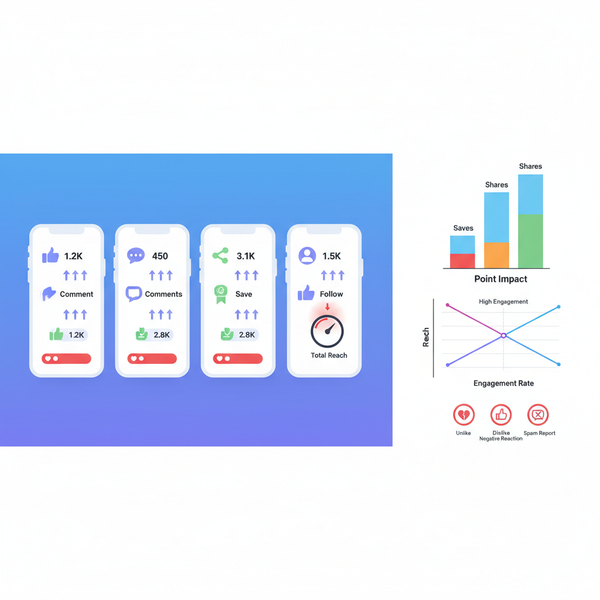
What Is a Stats Picture and Why It Boosts Engagement
A stats picture distills data into a single image—often a chart, infographic, or callout—intended for fast consumption on social feeds or as a visual anchor in articles.
Why it boosts engagement:
- It reduces cognitive load by presenting the most important number or trend first.
- It’s instantly scannable, which fits the scroll behavior of social feeds.
- It adds credibility to claims by grounding them in data.
- It’s shareable across platforms, increasing reach without requiring readers to click through.
Use cases:
- Highlight a key metric from a study or report.
- Compare performance before and after a change.
- Visualize trends over time.
- Summarize survey results or poll findings.
Identify Your Audience and the Stats They Care About
Design starts with clarity on who will see and use your stats picture.
- Define the persona: Marketers, product managers, founders, recruiters, educators, students, or consumers.
- Map their goals: What decisions do they need to make? What outcomes matter?
- Pinpoint relevant metrics: For marketers, CTR and conversion rates. For product teams, activation and retention. For employers, hiring pipeline and time-to-fill.
Ask yourself:
- What question is this picture answering?
- What one number would make them stop scrolling?
- Which context do they need to trust and act on the stat?
Choose the Right Data Sources and Verify Accuracy
Credibility underpins engagement. If people doubt the data, they ignore the visual—or worse, distrust your brand.
Reliable sources:
- Primary data: Internal analytics (GA4, Mixpanel, Amplitude), survey data, product telemetry.
- Secondary data: Government datasets, academic journals, industry reports, reputable research firms.
- Aggregators: Datawrapper’s datasets, World Bank APIs, Statista (validate methodology), Kaggle (check provenance).
Verification steps:
- Trace the original source, not just a blog quoting a report.
- Check sample size, timeframe, methodology, and limitations.
- Recalculate key figures to confirm percentages and totals.
- Avoid cherry-picking: show full ranges or note exclusions.
Add a source line: “Source: XYZ, 2025, n=1,220, weighted.” If you need to simplify, add a footnote or micro-caption to preserve transparency.
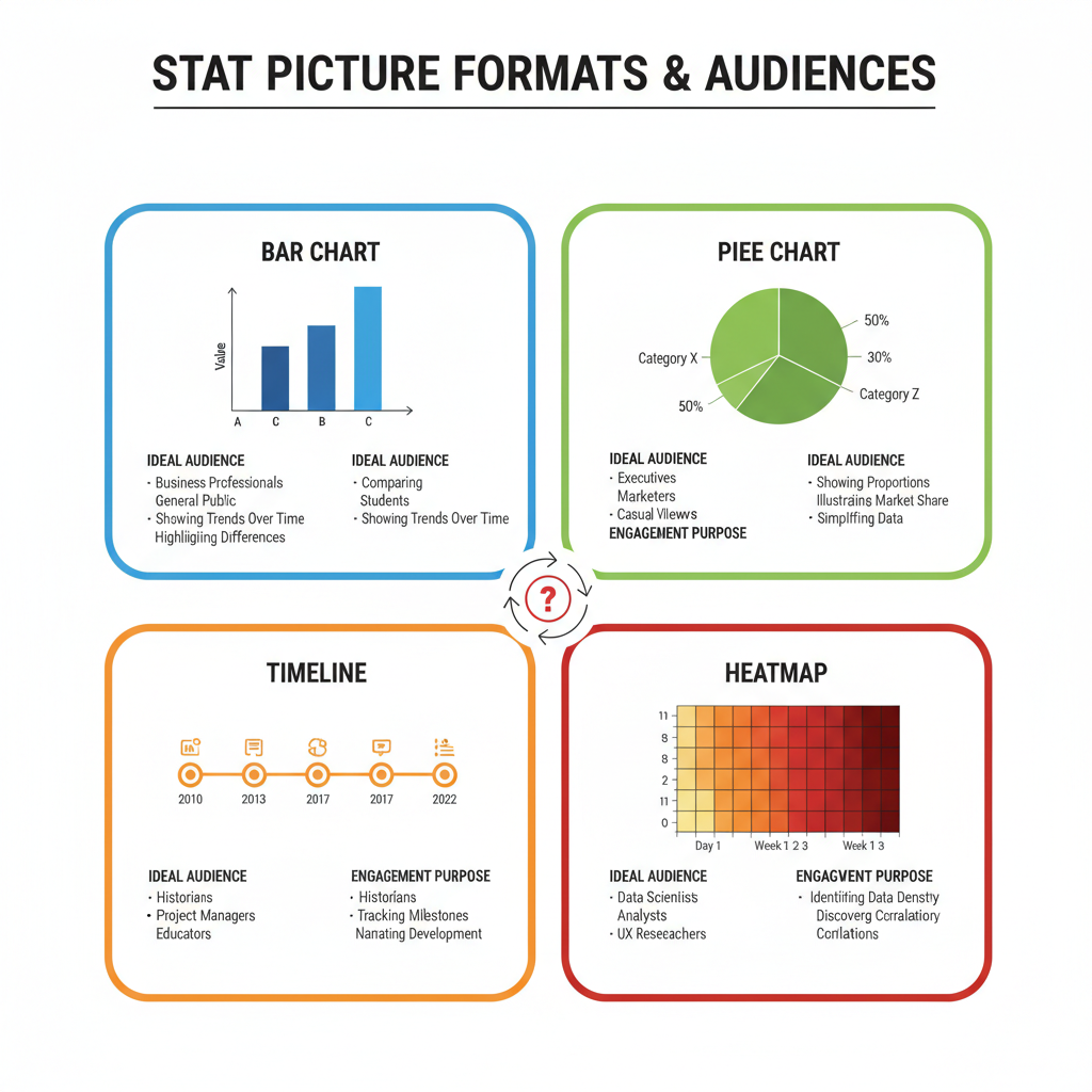
Pick the Best Visual Format for Message Clarity
Choose the chart that matches the message. A stats picture isn’t about fancy visuals; it’s about fast truth.
Common formats:
- Bar chart: Best for comparing categories side-by-side. Use horizontal bars for long labels.
- Line graph: Ideal for trends over time (time series). Keep gridlines light and axes clean.
- Pie chart: Use sparingly for parts-of-a-whole with 2–4 segments; beyond that, readability drops.
- Column chart: Good for time series with a small number of periods (monthly).
- Dot plot: Precise comparisons with many categories, less clutter than bars.
- Heatmap: Great for showing intensity across two dimensions (time vs. category).
- Infographic: Combine charts, icons, and callouts; use when you need narrative flow.
Guidelines:
- Single idea per image. If you need more, make a carousel or thread.
- Start with the headline number and a mini chart that supports it.
- Sort bars and limit categories for clarity (combine tiny segments into “Other” with disclosure).
- Use consistent axes and scales; avoid truncated baselines unless defensible and clearly labeled.
Use Color Psychology to Enhance Readability and Emotional Impact
Color guides attention, communicates meaning, and evokes emotion. Use it with intention.
Principles:
- Use neutral base colors (grays) for context, and one accent color for the key stat.
- Warm colors (red, orange) signal urgency or decline; cool colors (blue, green) signal stability or growth.
- Limit palette to 3–5 colors for coherence.
- Ensure sufficient contrast between foreground and background (WCAG AA or better).
Patterns that help:
- Blue for trustworthy, professional subjects (finance, B2B).
- Green for growth, sustainability, and positive outcomes.
- Orange for emphasis and calls to action.
- Red for warnings or loss; apply sparingly to avoid alarm fatigue.
Avoid reliance on color alone. Use patterns, shapes, or labels to distinguish series for viewers with color vision deficiencies.
Labeling Without Clutter: Titles, Legends, and Minimal Annotations
Labels should serve comprehension, not decoration.
Best practices:
- Title states the main takeaway: “Mobile traffic grew 48% in Q3.”
- Subtitle adds context: “Across 1.2M sessions, July–September 2025.”
- Legend is only used when multiple series exist; otherwise, direct labeling on lines/bars improves reading speed.
- Axis labels are concise; units are clear (%, $M, hours).
- Data values on bars work when few categories; otherwise, use selective callouts.
- Include a small source line and date. Keep footnotes under 15 words.
Microcopy tips:
- Prefer short phrases: “New users,” not “Number of newly activated accounts.”
- Use meaningful comparisons: “+18% vs. last quarter,” not “18% change.”
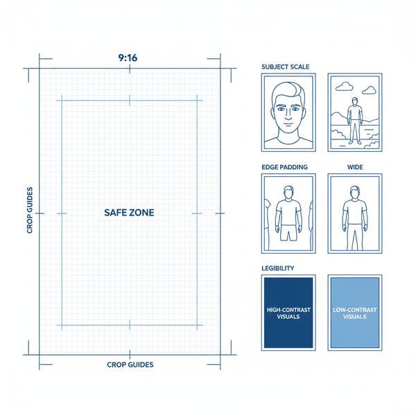
Optimize Dimensions and Resolution for Each Platform
Different platforms render images differently. Optimize export sizes to preserve sharpness, legibility, and load speed.
| Platform | Recommended Dimensions | Aspect Ratio | File Type | Notes |
|---|---|---|---|---|
| Instagram Feed | 1080×1350 px (portrait) | 4:5 | PNG or JPG | Use 1080 px width; prioritize large text for mobile. |
| Instagram Story | 1080×1920 px | 9:16 | PNG or JPG | Keep safe margins; avoid crucial text near edges. |
| X (Twitter) Post | 1200×675 px | 16:9 | PNG or JPG | Wide formats reduce cropping in timelines. |
| LinkedIn Feed | 1200×1200 px (square) or 1920×1080 px | 1:1 or 16:9 | PNG or JPG | Text-heavy slides perform well; test both ratios. |
| Blog Header | 1600×900 px | 16:9 | PNG or SVG | SVG for charts when possible; PNG for compatibility. |
| Open Graph (Link Preview) | 1200×630 px | ≈1.91:1 | JPG | Include headline and stat for share cards. |
Resolution:
- Export at 2× for retina displays. Avoid overly large files (>2 MB) to prevent slow loads.
- Use SVG for blogs when charts are simple; convert to PNG for platforms that compress heavily.
Safe areas:
- Keep titles and key numbers within central 80% of the canvas to reduce cropping risks.
Incorporate Branding Subtly
Branding should signal trust without overshadowing the data.
- Use consistent typography: one headline font, one body font.
- Apply brand colors to accents; keep charts mostly neutral.
- Add a small watermark or logo in a corner at 70–80% opacity.
- Maintain consistent grid, spacing, and corner radii across posts.
- Add a short URL or social handle for attribution when images are shared elsewhere.
Use Free and Paid Tools to Design
Choose a tool that matches your workflow and skill level.
- Canva: Fast templates, great for social. Ideal for non-designers. Quick exports in platform sizes.
- Adobe Illustrator: Precision control, custom vector charts, brand systems.
- Figma: Collaborative design, components for reusable chart layouts, export at multiple sizes.
- Datawrapper: Purpose-built charting with accessibility features and easy embeds.
- Flourish: Interactive charts, then export static versions for social.
- Google Sheets/Excel: Quick prototypes; export charts then refine in design tools.
Complementary tools:
- Color contrast checkers (WCAG).
- Palette generators (e.g., color scales).
- Image compression tools to keep file sizes small without quality loss.
Test Different Layouts and Data Displays to Check Comprehension
Before publishing, validate that viewers understand your message in under five seconds.
Methods:
- Quick hallway tests: Show the image to 3–5 colleagues; ask “What’s the main takeaway?” If answers vary, simplify.
- Compare layouts: Titles at top vs. left; vertical vs. horizontal bars; single stat vs. mini-chart plus callout.
- Assess cognitive load: Reduce elements until comprehension is instant.
Checklist:
- Is the headline stat legible on mobile?
- Is the primary message visible even if the image is seen at 50% scale?
- Are there any unnecessary gridlines, borders, or decorations?
A/B Test Performance of Stats Pictures in Posts
A/B testing helps quantify what resonates.
Variables to test:
- Chart type (bar vs. line).
- Color accents (blue vs. green).
- Title framing (“X grew 48%” vs. “X nearly doubled”).
- Image ratio (square vs. portrait).
- Inclusion of source line in the image vs. caption.
- Presence of micro-insights (top 3 categories highlighted).
How to run:
- Post variant A and B at similar times and days to matched audiences.
- Keep copy and hashtags consistent except for the image itself.
- Measure primary metrics: CTR, saves, shares, dwell time on linked content.
Ensure Accessibility
Accessible design broadens your reach and meets ethical and legal guidelines.
- Alt text: Describe the chart’s key message and structure. Provide numbers if feasible.
- High contrast: Ensure text-to-background contrast meets WCAG AA (4.5:1 for normal text).
- Non-reliance on color: Distinguish series with labels, patterns, or shapes.
- Font size: Use at least 14–16 px on desktop exports and scale larger for mobile-first formats.
- Keyboard-friendly embeds on blogs; for static social images, ensure the caption provides core context.
Example alt text:
Alt: Bar chart showing mobile traffic increased from 32% to 48% between Q2 and Q3 2025, with desktop decreasing from 68% to 52%. Source: Site Analytics, n=1.2M sessions.Optimize Image SEO for Blogs and Social
Make your stats picture easier to discover and more useful in search and previews.
- Use descriptive, hyphenated file names (e.g., stats-picture-mobile-traffic-q3-2025.png).
- Provide descriptive alt text and concise captions that echo the main takeaway.
- Add Open Graph and Twitter Card metadata for blog posts to control link previews.
- Where possible, include structured data (ImageObject) so search engines can parse image details.
- Place the image near relevant copy and use a keyword-rich figure caption for added context.
- Avoid text-only images: ensure the surrounding page also contains the key numbers in HTML.
Promote Posts with Engaging Captions That Contextualize the Stats
A stats picture attracts attention; your caption drives understanding and action.
Caption formula:
- Lead with the takeaway: “Mobile now drives nearly half of visits.”
- Add context: “Across 1.2M sessions, Q3 vs. Q2.”
- Offer a why: “New content format boosted discoverability.”
- Invite action: “Full breakdown in the blog. Save for later.”
Keep hashtags minimal and relevant. Tag collaborators or sources when appropriate to increase reach.
Analyze Post Metrics and Iterate
Measurement closes the loop.
Track:
- Engagement rate (likes + comments + shares / reach).
- Saves and bookmarks (proxy for perceived value).
- Click-through rate (if linked content).
- Time on page (for blog), bounce rate.
- Audience growth and follow-through actions (newsletter signups, downloads).
Interpretation:
- High saves, low clicks: Great reference value, add clearer CTAs.
- High clicks, low shares: Compelling curiosity, but perhaps less trust—add better sourcing.
- High shares, high comments: Keep the series; expand into a report or carousel.
Iterate by updating visuals, reframing titles, or releasing companion posts with deeper analysis.
Avoid Misleading Visuals
Ethics drive trust and long-term performance.
- Accurate scales: Start axes at zero for bar charts unless clearly noted; avoid distortions that exaggerate trends.
- Full data disclosure: Note sample sizes, periods, and exclusions. Don’t hide unfavorable segments.
- Consistent intervals: Equal spacing for time series; avoid irregular intervals that imply false acceleration.
- Appropriate aggregation: Averages can mask variability; use medians or distributions when relevant.
- Honest comparisons: Normalize where needed; avoid comparing incomparable groups without context.
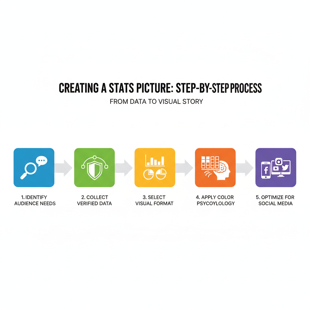
A Practical Workflow Checklist
Use this repeatable flow to ship high-performing stats pictures consistently.
- Define the audience and the single message.
- Source data; verify with methodology checks.
- Choose the visual format aligned to the message.
- Draft in Datawrapper or Sheets; refine in Figma/Illustrator/Canva.
- Apply a restrained color palette with one accent.
- Write a clear title, subtitle, and short source line.
- Export in platform-specific sizes at 2× resolution.
- Add subtle branding (logo/watermark) and consistent typography.
- Test comprehension with quick feedback.
- Publish with a contextual caption and a strong CTA.
- Monitor metrics (CTR, saves, shares) and run A/B tests.
- Iterate based on insights; document learnings for the next post.
Example: Single-Stat Visual Template
A simple template keeps production fast and consistent.
Core elements:
- Hero number: Large, high-contrast, centered or top-left.
- Micro chart: Small bar or line supporting the hero number.
- Context line: Time period, sample size, source.
- Logo watermark: Small, low-opacity in a corner.
Suggested layout sizes:
- Instagram portrait: 1080×1350 px. Hero number at 120–140 px font size; micro chart below with 4–6 bars.
- X (Twitter) wide: 1200×675 px. Hero number on the left; micro chart on the right; keep margins generous.
Accessibility:
- Alt text summarizing trend and figures.
- Labels directly on bars or lines for major ticks.
Final Thoughts
A great stats picture blends truthful data, crisp storytelling, and thoughtful design. Focus on one message, choose visuals that clarify rather than decorate, and respect your audience’s time and attention. By optimizing for platforms, testing variations, and measuring outcomes, you’ll turn numbers into narratives that people remember, share, and act on.
Summary and Next Steps
- Choose one high-impact insight and draft a stats picture using a clear title, neutral base, and one accent color.
- Export platform-specific sizes at 2×, write a concise caption, and add accurate alt text.
- Publish, track performance, and iterate with A/B tests to refine what works.
Ready to create your next stats picture? Use the checklist above, start with a single idea, and ship a clean visual today.