Create Square 1080 x 1080 Images for Social Media
Learn how to design, export, and optimize 1080x1080 square images for social media platforms to ensure sharp visuals and better engagement.

Introduction to the 1080 x 1080 Dimension for Social Media
The 1080 x 1080 dimension has become one of the most recognized formats for social media visuals. This perfect square offers optimal compatibility across major networks like Instagram, Facebook, and Pinterest, helping creators maintain consistent, visually balanced content. Leveraging this resolution ensures posts look sharp, avoid unwanted cropping, and meet platform-specific engagement goals. In this guide, you'll learn practical techniques and strategies to design, export, and optimize square images that captivate audiences.
---
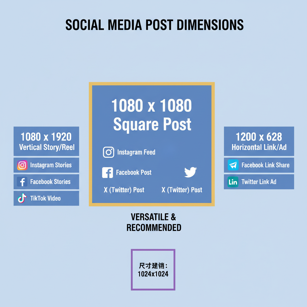
Understanding the 1080 x 1080 Dimension and Its Common Uses
The square 1080 x 1080 format has become the gold standard for social media posts, particularly due to platforms that embrace square imagery.
The 1080-pixel width and height create a perfect square, which is widely compatible and visually balanced across different devices.
Common uses include:
- Instagram Feed Posts — Instagram displays square images perfectly without cropping, making 1080 x 1080 the ideal resolution for high-quality visuals.
- Facebook Updates — Though Facebook supports many aspect ratios, square posts often gain more engagement because they occupy more space in the feed.
- Pinterest Pins — While tall pins dominate Pinterest, square posts still play a role in certain boards or group pins.
A square image ensures predictable composition, reduces unexpected cropping, and aligns with established social media design standards.
---
Choosing the Right Design Tools for Square Formats
Selecting design software suited for the square 1080 x 1080 format will streamline creation. The right tool depends on your skill level, budget, and collaboration needs.
Popular tools include:
- Canva — Web-based, user-friendly, with preset 1080 x 1080 templates.
- Adobe Photoshop — Professional-grade control over layers, effects, and pixel-perfect output.
- Figma — Ideal for collaborative design, version control, and seamless resizing.
Each tool offers unique benefits:
| Tool | Best For | Advantages |
|---|---|---|
| Canva | Beginners and marketers | Easy to use, cloud storage, template library |
| Photoshop | Professional designers | Advanced editing, pixel precision, custom actions |
| Figma | Collaborative teams | Real-time collaboration, browser-based, scalable designs |
---
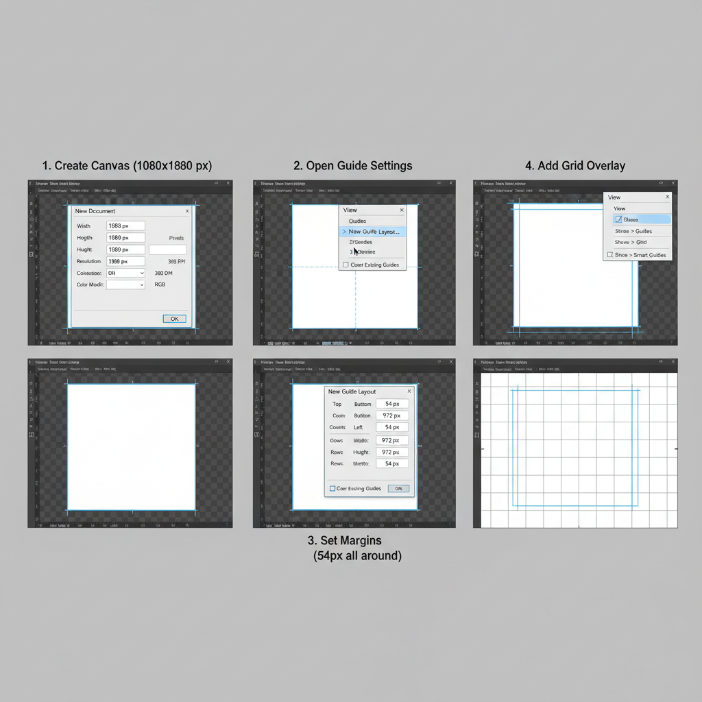
Setting up Your Canvas Correctly
An essential step when working with square designs is setting up your canvas properly:
- Dimension: 1080px width × 1080px height.
- Resolution: At least 72 PPI for web, but consider 150 PPI for sharper visuals.
- Color Mode: RGB to match screen colors.
Example in Photoshop:
File > New > Width: 1080px, Height: 1080px, Resolution: 150 PPI, Color Mode: RGB
Avoid starting from a non-square canvas and cropping later, as it can lead to composition issues and loss of key elements.
---
Using High-Resolution Source Images
Even if your final post is 1080 x 1080, start by sourcing images at a higher resolution. This prevents pixelation when cropping or scaling.
Best practices:
- Use raw or high-quality JPEGs/PNGs from licensed stock sites.
- Avoid screenshots or low-res downloads from social media.
- Aim for source images at least 2000px in width and height.
Scaling down a large image preserves sharpness, but scaling up small images can create blurry details.
---
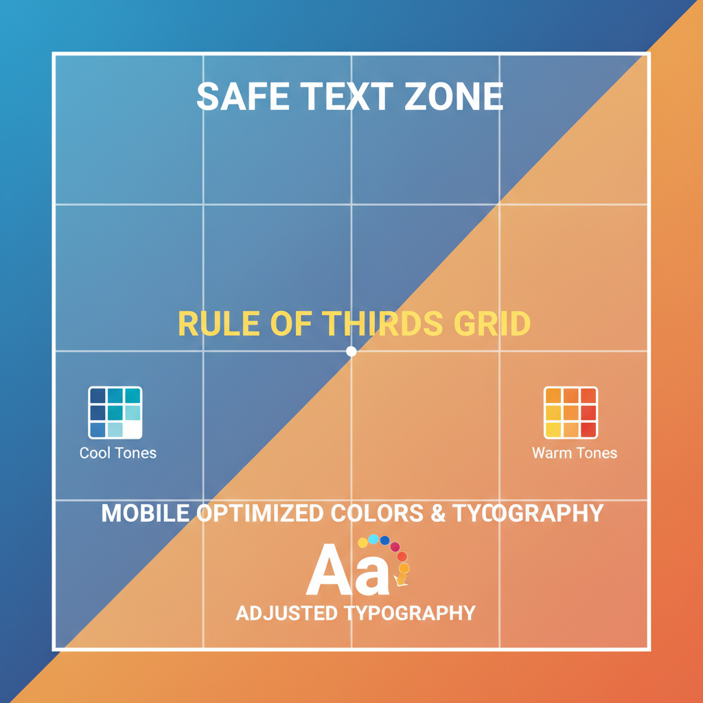
Applying Safe Margins for Text and Elements
When designing for multiple social media feeds, safe margins keep text from being cut off or hidden under interface elements.
Typical safe margin:
About 10-15% inward from each side to frame your main elements.
Why it matters:
- Instagram overlays icons at the corners in grid view.
- Facebook can reformat posts when they appear in share previews.
- Safe margins ensure legibility across devices.
---
Balancing Composition with Grid Layouts and the Rule of Thirds
A balanced design makes a post more visually appealing. Grid layouts help align elements consistently, while the rule of thirds divides your square into nine equal parts for positioning key subjects.
Benefits:
- Guides viewer’s eye naturally.
- Prevents clutter in the center while maintaining symmetry.
- Improves storytelling within a static image.
In Canva or Figma, enable grid overlays to make alignment easier.
---
Optimizing Colors and Typography for Mobile Viewing
Since most social media interactions happen on mobile devices, colors and typography must be optimized for smaller screens.
Tips:
- High Contrast — Ensures elements remain readable in bright outdoor settings.
- Minimal Fonts — Limit to 1–2 typefaces to avoid visual noise.
- Readable Size — Keep text large enough to be legible even on small phone screens.
Color psychology can influence engagement; warm tones encourage clicks, while cool tones convey calmness.
---
Incorporating Branding Elements Without Overcrowding
Branding elements—logos, watermarks, company colors—help viewers recognize your content quickly.
However, overcrowding a square 1080 x 1080 design can make it feel cramped.
Strategies:
- Use your logo subtly at one corner within safe margins.
- Keep branding consistent in style, but minimal in placement.
- Allow white space around focal points to increase visual comfort.
Remember: subtle branding can be more effective than loud placement.
---
Exporting in the Right File Type and Compression Level
When your design is complete, export settings will determine your post’s clarity and load speed.
Suggested formats:
- JPEG — Best for photos; use high-quality compression (80–90% quality).
- PNG — Best for graphics with text and transparency; avoid unnecessary large file sizes.
- WebP — Web-optimized format that retains quality at smaller sizes.
Export tips:
- Keep file size under 2MB for faster loading.
- Always check the exported image at full size before posting.
---
Testing Your Square Image Across Platforms
Testing ensures your design remains sharp and composed across different devices and platforms.
Checklist:
- Upload to a private Instagram draft and check cropping.
- Preview on Facebook Page’s unpublished post.
- Share to Pinterest board privately and verify scaling.
Even within the square 1080 x 1080 dimension, platform compression can slightly alter sharpness.
---
Scheduling Posts for Maximum Engagement
Timing plays a crucial role in reaching your audience. Use social media scheduling tools to automate posts at optimal times.
Best practices:
- Research platform-specific peak hours.
- Consider global time zones if your audience is international.
- Use tools like Buffer, Later, or Hootsuite.
Automation allows consistency without manual posting stress.
---
Analyzing Performance Metrics to Refine Future Designs
After posting, review analytics to measure success.
Focus on metrics like:
| Metric | Why It’s Important | Optimization Tip |
|---|---|---|
| Engagement Rate | Shows audience interaction level | Test different color schemes and typography |
| Click-Throughs | Measures post effectiveness in driving traffic | Add strong calls-to-action |
| Shares | Extends organic reach | Create highly relatable or valuable content |
Continuous refinement ensures your square 1080 x 1080 images stay engaging and align with evolving trends.
---
Summary and Next Steps
Mastering the square 1080 x 1080 dimension goes beyond fitting content into platform feeds—it’s about creating compelling visuals that strengthen brand identity and boost engagement. By selecting the right tools, setting up correctly, balancing composition, and analyzing results, you can consistently produce impactful social media designs.
Ready to enhance your next post? Apply these tips to your upcoming 1080 x 1080 projects and see how refined visuals can elevate your social media success.