IG Highlights Cover Photo Design Guide for Instagram
Learn how to design cohesive IG highlight cover photos that boost branding, enhance profile aesthetics, and guide followers to key content.

Introduction: Elevate Your Profile with IG Highlights Cover Photos
An Instagram profile that feels curated and cohesive is more likely to encourage visitors to follow and engage. One of the most overlooked opportunities for branding is the IG highlights cover photo—the small, clickable icon that sits proudly at the top of your profile. Thoughtfully designed covers not only improve visual appeal but also guide viewers toward your most valuable content, blending aesthetics with functionality. In this guide, you'll learn how to create highlight covers that elevate your profile and reinforce your brand identity.
---
Understanding IG Highlights and Why Cover Photos Matter for Branding
Instagram Highlights are curated story collections that live permanently on your profile, allowing followers and visitors to access important or memorable stories long after they expire from the 24-hour story timeline.
The IG highlights cover photo is the visual icon that represents each highlight. A strong cover photo is not just aesthetic—it’s a miniature branding tool that:
- Instantly signals what type of content is inside.
- Creates a cohesive look across your profile.
- Improves navigability for followers.
- Reinforces your visual identity.
When done well, highlight covers make your profile feel polished, professional, and inviting, which can boost the chances that visitors explore more of your content and follow you.
---
Choosing a Consistent Aesthetic or Theme
Consistency is critical if you want your Instagram profile to look organized and on-brand. Before creating your cover photos:
- Decide on your brand style (minimal, colorful, bold, vintage, etc.).
- Keep icon styles uniform—choose either solid shapes, outlined icons, or even text.
- Stick to one type of background (solid color, gradient, texture).
A consistent aesthetic helps your audience quickly identify and trust your content.
---
Selecting Colors and Icons That Align With Your Profile’s Vibe
Colors and icons contribute heavily to the communicative power of highlight covers.
- Colors: Match or complement your profile’s primary palette. If your brand uses pastels, don’t suddenly switch to neon tones.
- Icons: Pick symbols relevant to each highlight’s content. For example, a fork icon for food content, an airplane for travel.
- Contrast: Ensure enough contrast between icon and background so it’s readable from a small size.

---
Using Free Tools and Apps to Design Covers
You don’t need expensive software to make IG highlight cover photos. Several free tools simplify the design process:
| Tool/App | Features | Best For |
|---|---|---|
| Canva | Drag-and-drop editor, templates, color palettes | Beginner-friendly quick designs |
| Adobe Express | Professional templates, brand kits | Brand-oriented customization |
| Over | Photo editing, custom fonts | High-quality image customization |
| Crello | Animation and static design | Unique animated covers |
Each tool offers thousands of free icons and design elements. Search for “Instagram highlight cover” templates to save time.
---
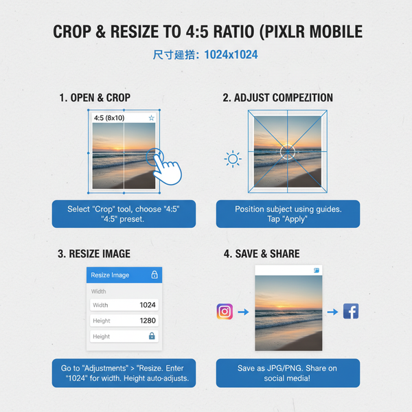
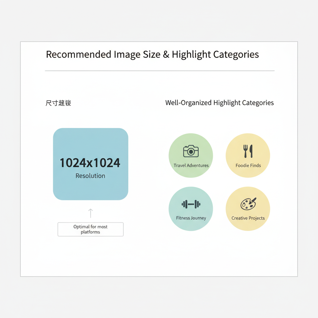
Optimal Image Size and Resolution
For clarity on mobile devices, adhere to Instagram’s image requirements:
- Size: 1080 x 1080 pixels (square) ensures crisp visuals.
- Resolution: High-quality PNG or JPEG format.
- Safe zone: Keep your icon centered; avoid important details close to the edges as they may be cropped.
Design in square format—the highlight icon will appear circular, so test your design to avoid cutting off elements.
---
Organizing Highlights Before Updating Covers
Before new covers are uploaded, organize your highlights:
- Archive irrelevant or outdated stories.
- Group similar stories together.
- Rename highlights to match covers.
This clean-up ensures that your covers truly reflect the most relevant content and that visitors can navigate easily.
---
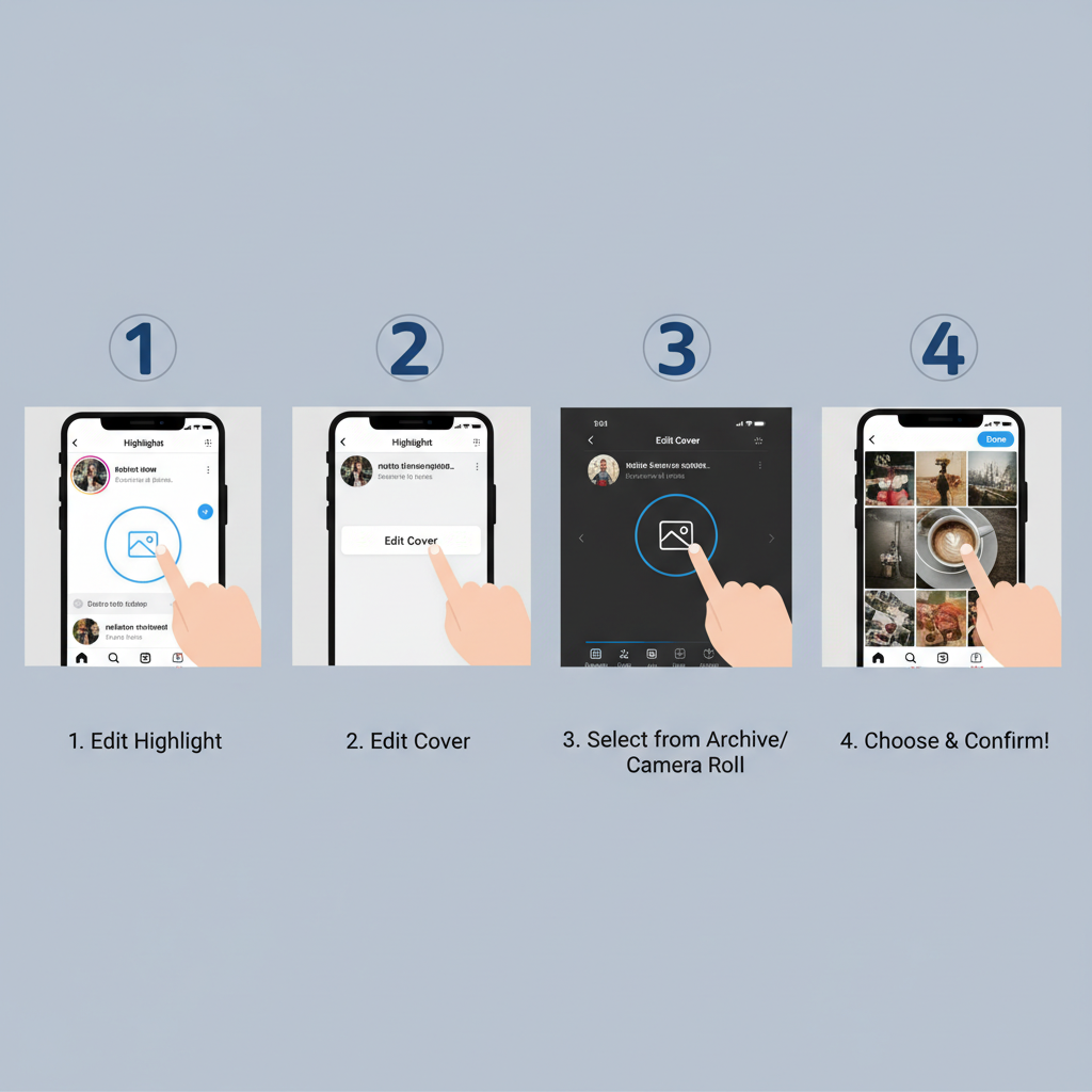
Step-by-Step Guide to Uploading New Cover Photos Without Reposting Stories
Updating highlight covers without re-adding stories is simple:
- Go to your Instagram profile.
- Tap and hold the highlight you want to edit.
- Select Edit Highlight.
- Tap Edit Cover.
- Choose a cover image from your camera roll.
- Adjust and resize to fit inside the circle.
- Save changes.
This method keeps your followers’ feeds uncluttered while still refreshing your profile’s look.
---
Tips for Readable and Eye-Catching Covers
Small preview size means less space to communicate. Make covers stand out:
- Use simple icons with bold outlines.
- Prefer minimal text or none—avoid lengthy words.
- Embrace high contrast between icon and background.
- Stick with recognizable symbols so your audience immediately understands the highlight’s content.
---
Incorporating Brand Elements Subtly
Your IG highlights cover photo is prime real estate for branding, but subtlety works best:
- Place your logo in small scale.
- Use your custom font for initial letters or monograms.
- Add brand patterns (like stripes or dots) in the background.
These touches maintain recognition without overwhelming the design.
---
Testing and Adjusting Covers Based on Engagement
Observe whether new covers increase click-through rates on your highlights:
- Use Instagram Insights to track each highlight’s views before/after the update.
- Ask followers via poll about cover appeal.
- Experiment with slightly different designs to see what grabs more attention.
Analytics and audience feedback keep your visuals evolving and aligned with followers’ preferences.
---
Creative and Minimalist Cover Photo Ideas
To inspire your next design, here are some proven ideas:
- Minimalist Icons: Single thin-line illustrations over solid pastel backgrounds.
- Flat Design: Pictograms and flat color blocks.
- Photo-Based Covers: Cropped close-ups of textures (sand, coffee foam, fabric).
- Monogram Covers: Single letter typography matching your brand font.
- Seasonal Themes: Icons or backgrounds that change with seasons for a dynamic profile.
---
Common Mistakes to Avoid
When designing IG highlight covers, avoid pitfalls that could dilute your brand:
- Overcrowding: Too many elements make icons unreadable in small sizes.
- Inconsistent Style: Mixing different icon styles creates visual chaos.
- Poor Resolution: Blurry or pixelated images harm professionalism.
- Ignored Branding: Covers unrelated to your profile aesthetic confuse followers.
- Low Contrast: Icons blending into backgrounds become invisible.
---
Summary and Next Steps
Crafting standout IG highlights cover photos is a straightforward yet powerful way to shape the perception of your Instagram profile. By applying consistent design choices, aligning colors and icons with your brand aesthetic, and leveraging free tools, you ensure your highlights remain both attractive and functional. Test, adjust, and evolve your designs regularly to keep them fresh and impactful.
Ready to give your profile a visual upgrade? Start experimenting with your own custom highlight covers today, and watch how this small detail can make a big difference in engagement.