Design an Engaging Media Poster That Captures Attention
Learn how to design an attention-grabbing media poster with effective messaging, visual hierarchy, and impactful color and font choices.
How to Design an Effective Media Poster That Captures Attention
Media posters remain one of the most versatile marketing tools, whether displayed on busy streets or shared across digital platforms. Learning how to design an effective media poster means blending strategy, creativity, and technical precision. In this guide, we’ll walk through essential steps—from defining your audience and message to applying visual hierarchy and promoting your design—so you can create posters that resonate and drive action.
---
Understanding the Purpose of Your Media Poster and Target Audience
Before diving into the creative process, it’s crucial to define the purpose of your media poster. A well-designed poster serves as a visual communication tool—it informs, persuades, or entertains. Clarify what action you want your audience to take after viewing the poster.
Ask yourself:
- Is the goal to promote an event, a product, or a cause?
- Who is the intended audience (age group, interests, location)?
- What emotions or reactions should the design evoke?
The answers will guide every decision you make, from imagery to typography. Understanding your audience ensures the message resonates and captures their attention.

---
Research Competitor Designs and Current Visual Trends
Before designing, survey the competitive landscape. Analyze posters in your niche to identify what works and what doesn’t.
Key areas to look into:
- Trending design styles (minimalist, retro, bold typography, illustrative)
- Common visual hooks or color palettes
- Layout structures that are popular in your industry
Regularly check design communities like Dribbble, Behance, and Pinterest for inspiration. Incorporating elements from successful posters—while adding your own unique twist—can give you an edge in attracting viewers.
---
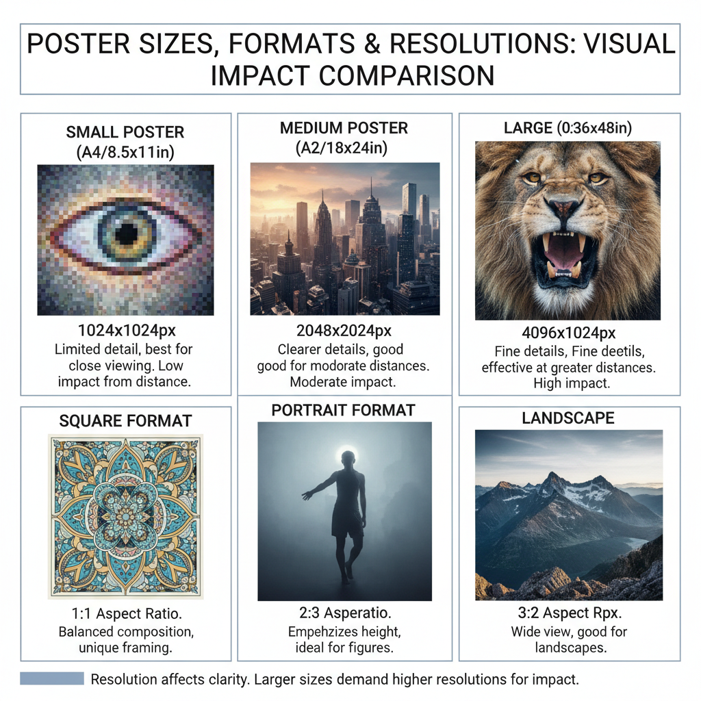
Choosing the Right Size, Format, and Resolution
Your media poster’s size and resolution should match its intended use. Printing requires different specifications than digital displays.
| Use Case | Common Dimensions | Resolution | Color Mode |
|---|---|---|---|
| A3 (297mm × 420mm), A2 (420mm × 594mm) | 300 DPI | CMYK | |
| Digital | 1080px × 1920px (vertical), 1200px × 628px (horizontal) | 72 DPI | RGB |
Choosing the wrong format can lead to pixelated visuals or off-color prints. Always confirm specs with your printer or digital platform before finalizing your design.
---
Crafting a Compelling Central Message or Hook
Your central message is the heartbeat of the poster. It must be clear, concise, and memorable—think of it as a headline in advertising that people can recall and repeat.
Strategies to create a strong hook:
- Pose a provocative question
- Use a powerful statement or command
- Highlight a unique selling point in a single sentence
For example:
"Experience Music Like Never Before" for a concert poster instantly conveys both excitement and exclusivity.
---
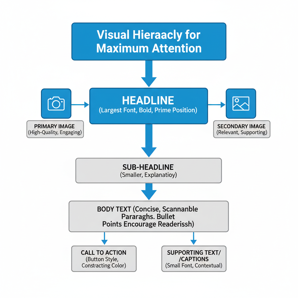
Applying Effective Visual Hierarchy
Visual hierarchy guides the viewer’s eye from the most important elements to secondary information.
Hierarchy elements include:
- Headline – largest font size, bold weight
- Imagery – strong visual aligned with the headline
- Supporting text – smaller font sizes, less visual weight
- Call-to-action – clear and easily noticeable
Apply alignment, contrast, and spacing to reinforce hierarchy. This ensures that your audience can quickly grasp the core message without feeling overwhelmed.
---
Selecting Impactful Colors and Fonts
Colors and fonts influence perception and should be used intentionally to convey brand personality and mood.
Color tips:
- Bright, contrasting colors for energetic campaigns
- Muted, neutral tones for professional or sophisticated feel
- Align with existing brand palette for consistency
Font tips:
- Limit to 2–3 complementary typefaces
- Use sans-serif fonts for modern, clean looks
- Employ serif fonts for traditional or elegant branding
Example pairing: Montserrat (headline) with Open Sans (body text) for a balanced modern style.
---
Incorporating High-Quality Visuals
Images, illustrations, and icons can dramatically improve engagement, but low-quality graphics quickly diminish trust.
Tips for visual selection:
- Use high-resolution stock photos or original photography
- Consider vector illustrations for scalability
- Ensure images support the message
Always check licensing permissions if using external images. For digital posters, add descriptive alt text for accessibility.
---
Balancing Text and Visuals for Readability
Balance is key to maintaining visual appeal and readability. Too much text can overwhelm the viewer, while overly sparse designs may lack context.
Best practices:
- Aim for at least 40% imagery and 40% text, with 20% whitespace
- Group related information together
- Keep only essential content points to avoid clutter
---
Using Whitespace Strategically
Whitespace (negative space) isn’t empty—it's a design tool that enhances clarity.
Where to use whitespace:
- Around headlines and CTAs
- Between paragraphs and text blocks
- In margins or padding between images
Proper spacing gives designs a breathable, modern feel.
---
Integrating Brand Elements
Strong media posters reinforce brand identity. Incorporate:
- Logo placement that’s visible but unobtrusive
- Tagline aligning with campaign goals
- Consistent brand colors and typography from your style guide
This strengthens recognition and builds trust.
---
Ensuring Accessibility
Accessibility improves usability, particularly for digital posters.
Checklist:
- Readable font sizes (16px+ for body text)
- Adequate color contrast between text and background
- Alt text for images online
- Avoid using color alone to convey meaning
---
Creating Multiple Variations and Testing
Design several variations with small differences—color changes, headline changes, or layout tweaks.
Ways to test:
- Gather feedback from focus groups
- Conduct A/B testing on social media
- Monitor engagement metrics like clicks, shares, or conversions
---
Finalizing and Exporting Correct Formats
When approved, export your poster in the correct format:
- Print: CMYK, PDF or TIFF at 300 DPI
- Digital: RGB, JPEG or PNG at 72 DPI
Follow platform or print guidelines to prevent distortion.
---
Promoting Your Media Poster
Distribution is as important as design. Promote online and offline:
- Social media platforms (Instagram, Facebook, Twitter)
- Email newsletters
- Flyers or bulletin boards in high-traffic areas
- Event booths or trade shows
Use hashtags and optimized captions for online sharing.
---
Measuring Engagement and Feedback
Track performance to improve future designs. Key metrics:
- Social shares and comments
- Sign-ups or sales linked to the poster
- Feedback via surveys or interviews
---
Summary
Crafting an effective media poster requires strategic planning, creative execution, and consistent promotion. By defining your audience, using compelling visuals and clear hierarchy, and ensuring accessibility, you can build designs that capture attention and inspire action.
Ready to engage your audience? Start applying these tips to your next media poster project and watch the impact grow.