Design and Use SNS Icons for Effective Brand Growth
Learn how to design, customize, and deploy SNS icons with consistent style, platform compliance, and optimal formats to grow your brand effectively.

Design and Use SNS Icons for Effective Brand Growth
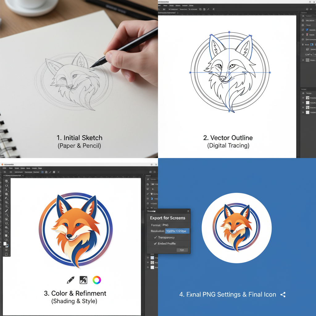
SNS icons — the small, recognizable symbols representing social networking services — are a cornerstone of modern digital branding. They act as visual gateways, guiding users directly to your brand’s social media presence. In SNS icon design, the balance between recognition, style consistency, and strategic placement can boost engagement, strengthen your identity, and streamline user navigation. This comprehensive guide explains what SNS icons are, why they matter, and how to design, customize, and deploy them for sustainable brand growth.

---
What Are SNS Icons and Why They Matter
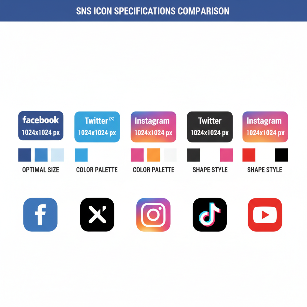
SNS icons are clickable visual elements that feature the logos of popular social networks such as Facebook, Twitter/X, Instagram, TikTok, and YouTube. They serve multiple purposes:
- Signal accessibility: Users instantly recognize and locate your social channels.
- Facilitate engagement: Easy access encourages more interactions and follows.
- Reinforce brand presence: Placement across websites, apps, and emails strengthens your brand ecosystem.
Integrated into your UI/UX toolkit, SNS icons should harmonize with your brand’s colors, typography, and shapes for an intuitive user experience.
---
Platform-Specific Design Guidelines
Every social networking platform publishes official logo usage guidelines that govern how their icons appear in public media. Respecting these not only ensures compliance but also keeps your icons visually consistent across channels.

- Use the “f” logo in official corporate blue or approved monochrome.
- Maintain minimum clear space (8px for web contexts).
Twitter / X
- Updated from bird logo to stylized “X”; download from the latest asset kit.
- Never outline or distort the icon shape.
- Default gradient logo; monochrome variants permitted for certain events.
- Use minimal padding for balanced appearance.
TikTok
- Music note logo with pink and blue accents must remain intact.
- High-resolution files prevent pixelation of neon edges.
YouTube
- Red rectangle with white play button must retain proportions.
- Avoid rotation or reshaping of the logo.
---
Choosing Consistent Style Themes
Consistency in icon style preserves brand cohesiveness and improves visual flow. Popular styles include:
- Flat — Clean, vector format without shadows, perfect for modern brands.
- 3D — Adds depth; suitable for playful or immersive designs.
- Gradient — Smooth blends, common in creative or tech brands.
- Minimal — Monochrome, refined versions for luxury or formal identities.
Align your SNS icons’ style with your overall brand design language to maintain harmony.
---
Optimal Resolution and Format for Web and Mobile
SNS icons appear in varied contexts, so ensure correct sizing and formats for each.
| Platform | Recommended Size (px) | Format | Use Case |
|---|---|---|---|
| Web | 32x32 to 64x64 | SVG or PNG | Navigation bar, footer |
| Mobile | 48x48 to 96x96 | SVG for scalability | Mobile site or app |
| 24x24 to 32x32 | PNG | Signature |
Tip: Use SVG for responsive layouts as it scales without quality loss.
---
Customizing SNS Icons for Brand Identity
Differentiating your SNS icons enhances brand personality while maintaining recognizability.
- Incorporate brand colors in icon borders or backgrounds.
- Align typography in buttons around icons to your corporate font.
- Experiment with border styles—rounded corners, outlines, or shadows—consistent with your UI theme.
All customization should adhere to official usage terms per platform.
---
Accessibility Best Practices
Accessible SNS icon design ensures inclusivity:
- Maintain contrast ratios meeting WCAG AA standards (minimum 4.5:1).
- Use descriptive alt text such as `alt="Follow us on Instagram"`.
- Choose scalable vector formats for sharp rendering across devices.
---
Strategic Placement of SNS Icons
Visibility drives click-through rates, so place icons in high-traffic zones.

Top-performing positions:
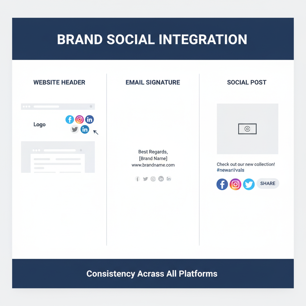
- Website — Header, footer, sidebar, or floating toolbar.
- Email signature — Compact, neat alignment after contact details.
- Digital products — App dashboards, profile sections, or "about" pages.
Make sure icons stand out while blending into your layout.
---
Linking to Relevant and Updated Profiles
Outdated or incorrect links harm trust. When linking:
- Use official, complete URLs with `https://`.
- Regularly audit for activity and accuracy.
- Direct users to localized accounts for specific regions.
---
Testing Visibility and Click-Through Rates
A/B testing placement reveals which positions work best:
Track analytics to identify which layout generates more interaction.
---
Trademark Usage Compliance
Avoid legal issues by adhering to trademark rules:
- Do not alter proportions or add unauthorized effects.
- Provide required attribution where necessary.
- Never imply you have a partnership or endorsement unless it exists.
---
Seasonal or Campaign-Specific Variations
Refreshing SNS icons with timely themes can boost engagement:
- Add winter overlays during holiday season.
- Incorporate campaign hashtags into hover states.
- Change background colors for awareness campaigns.
---
Tracking Analytics from SNS Icons
Measure how SNS icons contribute to traffic and conversions:
- Track per-icon click numbers to find the most popular channel.
- Calculate conversion rates from icon referrals.
- Compare desktop vs. mobile behavior.
Use tools like Google Analytics with UTM parameters and social insights.
---
Updating Icon Sets Periodically
Social networks update logos over time; keeping yours current maintains relevance:
- Monitor official design asset kits quarterly.
- Update all places simultaneously for visual consistency.
- Remove obsolete platforms to avoid clutter.
---
Summary
SNS icons are tiny but powerful assets in your branding toolkit. By designing them with consistency, complying with platform standards, and placing them strategically across your digital properties, you can enhance usability and boost engagement. Regular audits, accessibility compliance, and thoughtful customization ensure your SNS icons continue to support long-term brand growth.
Ready to streamline your social media touchpoints? Audit your current SNS icon usage today, adjust designs for consistency and accessibility, and track the results to optimize your brand’s online impact.


