Cómo diseñar un logo de redes sociales efectivo
Aprende a crear un logo de redes sociales efectivo con diseño escalable, uso estratégico de color y adaptación a requisitos de cada plataforma.
Understanding the Role of Logos in Brand Identity Across Social Media
A logo de redes sociales is more than a graphic—it’s a strategic asset that drives brand recognition and trust across digital platforms. Profiles on Instagram, Facebook, TikTok, LinkedIn, and others give users mere seconds to form impressions. In an ocean of fast-scrolling feeds and small screens, your logo must instantly convey personality, professionalism, and uniqueness while adapting fluidly across different devices and layouts.
This guide explains how to research platform requirements, design scalable shapes, use color intentionally, and maintain consistency so your social media logo works effectively as both a visual calling card and a persuasive marketing tool.

A strong logo in social media contexts:
- Reinforces brand recall.
- Creates visual cohesion between different marketing channels.
- Establishes credibility in competitive niches.
- Works as a mini-advertisement every time it's displayed.
---
Research Platform-Specific Logo Requirements
Not all social media platforms treat logos equally. Each has specific dimensions, safe zones, and preferred file formats. Ignoring these can lead to cropping, distortion, or loss of clarity.
Below is a quick reference table for common profile image recommendations:
| Platform | Recommended Size | Format | Safe Zone Considerations |
|---|---|---|---|
| Facebook Page | 170×170 px | PNG/JPG | Circular display crops |
| 320×320 px | PNG/JPG | Circular; keep key elements centered | |
| 400×400 px | PNG/JPG | Circular; high-resolution for desktop | |
| Twitter/X | 400×400 px | PNG/JPG | Circular; small app icon view |
| YouTube | 800×800 px | PNG/JPG | Circular; scales to small thumbnails |
Pro Tip: Always check the latest guidelines in each platform’s help center before finalizing.
---
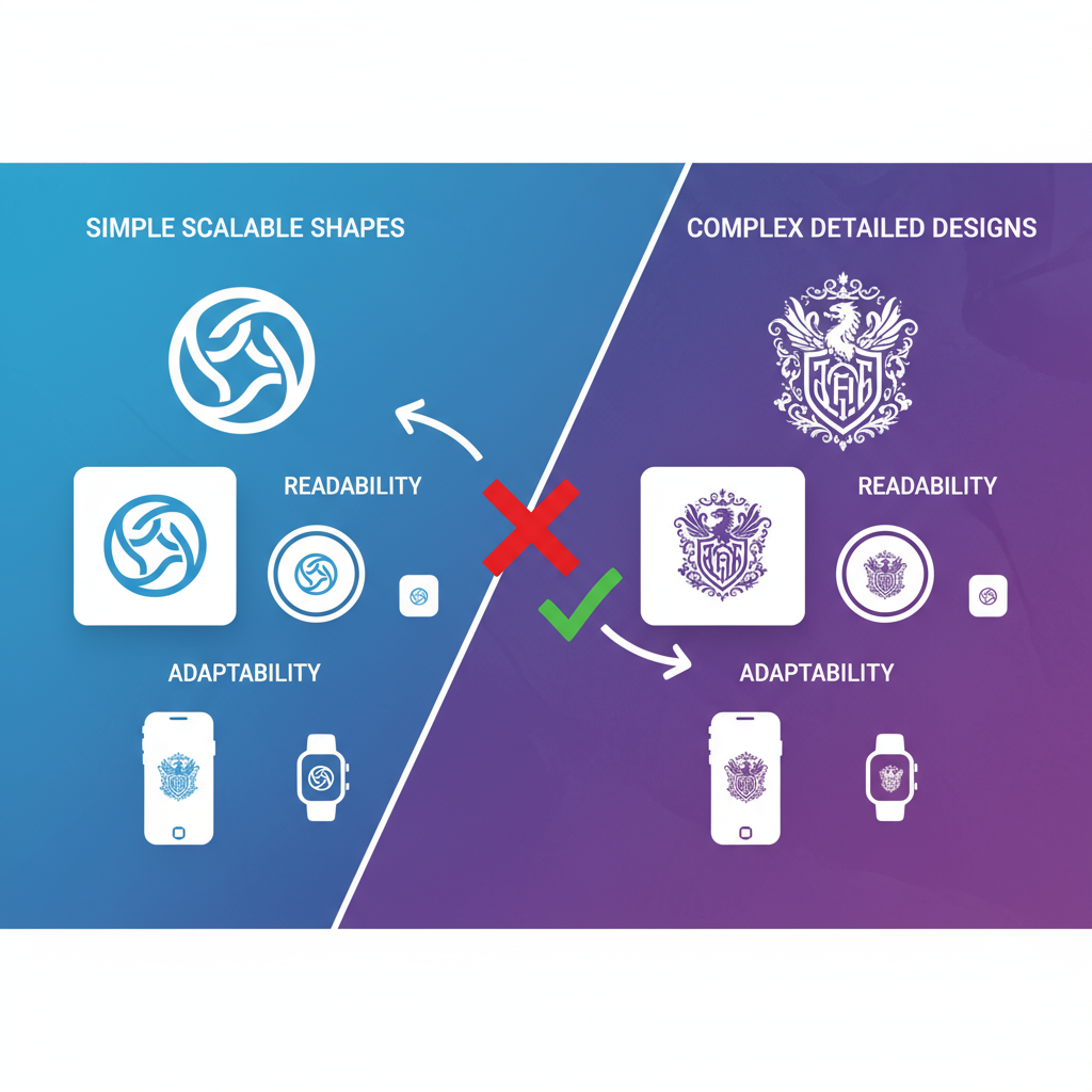
Choose Scalable Shapes and Simple Elements
Overly complicated graphics may look attractive in large print but become unrecognizable when scaled down. Scalable, simple shapes help maintain clarity and ensure your logo de redes sociales stays identifiable at any size.
Key principles include:
- Simplification: Reduce visual clutter to amplify recognition.
- Balanced proportions: Symmetrical or well-balanced designs scale more predictably.
- Vector-based formats: Create in vector tools like Adobe Illustrator or Figma for infinite scalability.
---
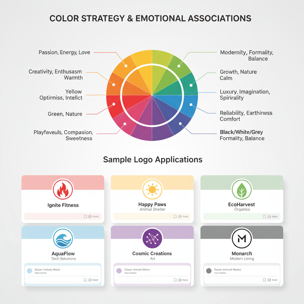
Use Colors Strategically to Convey Emotion
Colors trigger emotional responses—especially in visually driven environments like social media. Aligning your logo’s color scheme with your overall brand palette promotes harmony across posts, ads, and stories.
Emotional associations:
- Red: Energy, passion, urgency.
- Blue: Trust, stability, professionalism.
- Green: Growth, health, renewal.
- Yellow: Optimism, warmth, creativity.
- Black/White: Sophistication, balance.
---
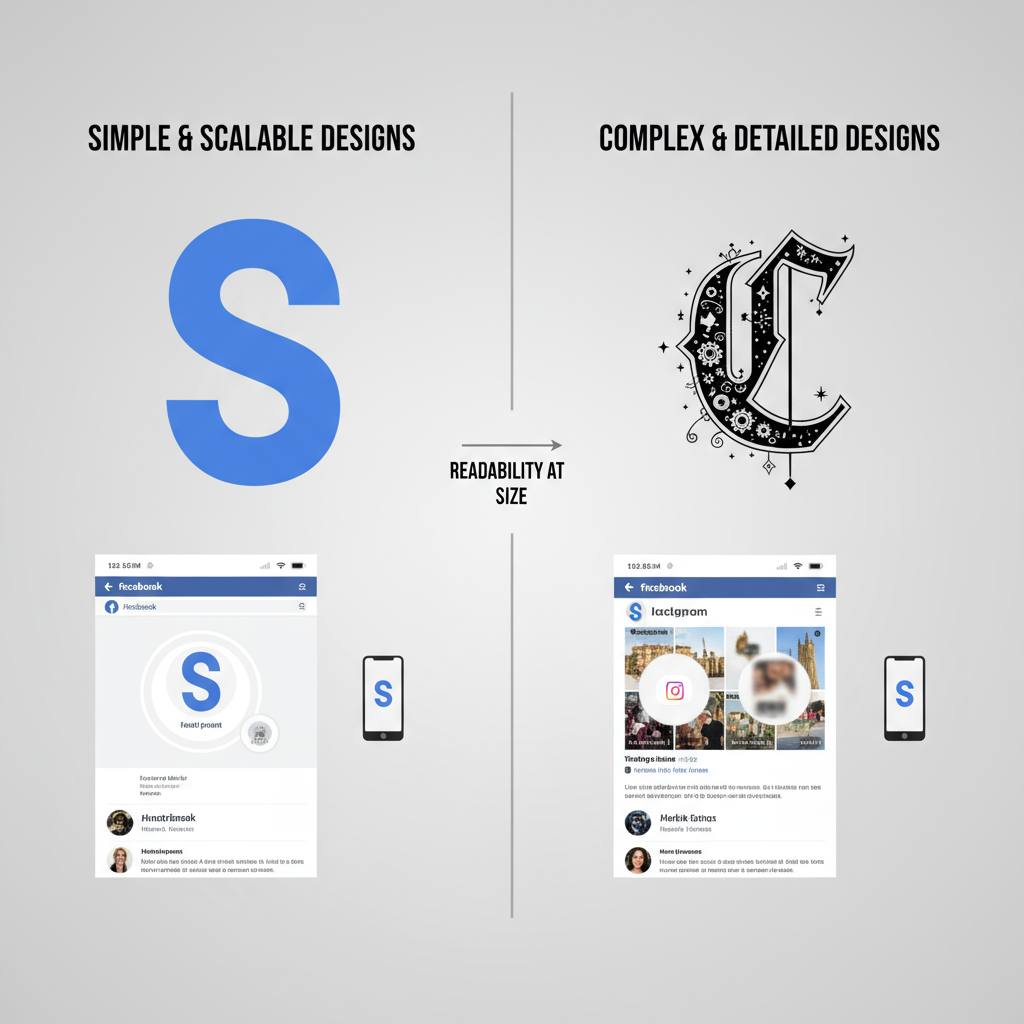
Ensure Readability at Small Sizes
Your logo de redes sociales should remain clear even at sizes as small as 16×16 pixels. Minimalism and bold core shapes are essential to accessibility.
Strategies:
- Use bold typographic treatments for initials or monograms.
- Avoid thin lines and excessive detail.
- Test extreme downscaling to catch readability issues early.
/* Example CSS for scaling profile logo on web */
.profile-logo {
  max-width: 48px;
  height: auto;
}
---
Create Responsive Logo Variations
A responsive logo system ensures the right format for every placement:
- Primary Logo – Full detail for high-visibility contexts.
- Compact Mark – Emblem or monogram for micro uses.
- Horizontal Layout – Ideal for banners or cover photos.
- Stacked Layout – Suited to vertical applications like highlights.
---
Test Visibility Against Varied Backgrounds
Feeds and headers vary widely—light, dark, or image-based. Test your logo in multiple contexts.
Best practices:
- Prepare light and dark versions.
- Add subtle outlines or shadows for separation.
- Avoid overly transparent elements that may disappear.
---
Optional: Add Subtle Animation for Dynamic Brands
Subtle motion can make a modern brand stand out on TikTok or Instagram Reels.
Ideas:
- Slow fade-ins/outs.
- Gentle rotations or zooms.
- Minimal line drawings morphing into the logo.
---
Gather Pre-Launch Feedback
Engage your audience before finalizing:
- Conduct A/B tests across platforms.
- Post drafts in customer community groups.
- Request insights from your internal team.
---
Optimize Logo Files for Web Performance
Fast-loading logos improve UX and SEO.
Tips:
- PNG for sharp, transparent graphics.
- SVG for scalable vector graphics.
- Compress files via tools like TinyPNG or SVGOMG.
## Example CLI compression using ImageMagick

magick input.png -strip -quality 85 output.png
---
Keep a Clear Branding Guideline
Document usage rules in a brand guide to prevent misuse:
- Variations and contexts.
- Color codes (HEX, RGB, CMYK).
- Minimum size requirements.
- Safe zones and margins.
- Correct vs incorrect examples.
---
Summary and Next Steps
Creating an effective logo de redes sociales means balancing aesthetics with technical precision. By aligning with platform specifications, sticking to scalable and readable design principles, and enforcing a consistent brand guideline, you can ensure your logo communicates powerfully in every feed.
Ready to elevate your social media branding? Start auditing your existing logo today—test its scalability, adapt variations for each channel, and watch your digital presence become more cohesive and memorable.
![Why Luck Matters More Than Talent for Success in Life | [Jingwei Insight]](/content/images/size/w600/2025/10/img_001-103.jpg)