How to Edit Instagram Grid for a Cohesive Aesthetic
Learn how to edit your Instagram grid with layout styles, color palettes, and planning tools to create a cohesive, professional feed that boosts engagement.
How to Edit Instagram Grid for a Cohesive Aesthetic
Creating a cohesive Instagram grid is more than just posting beautiful images—it’s about strategically editing your Instagram grid so it delivers a lasting first impression, strengthens your brand identity, and boosts audience engagement. In this guide, we’ll explore proven layout styles, color strategies, and scheduling methods to help you design a professional, eye-catching feed.
---
Understanding the Instagram Grid and Why It Matters
When someone visits your Instagram profile, they see your grid—a 3-column arrangement of recent posts. This grid acts as your digital portfolio, instantly communicating who you are and what you offer.
Key branding benefits:
- First impressions: A clean, strategic grid conveys professionalism.
- Brand recognition: Consistent colors, filters, and themes make posts recognizable.
- Visual storytelling: Layouts can reflect your messaging or mood.
- Instagram SEO advantage: A captivating grid can increase retention and interaction.
---
Planning Your Grid Layout
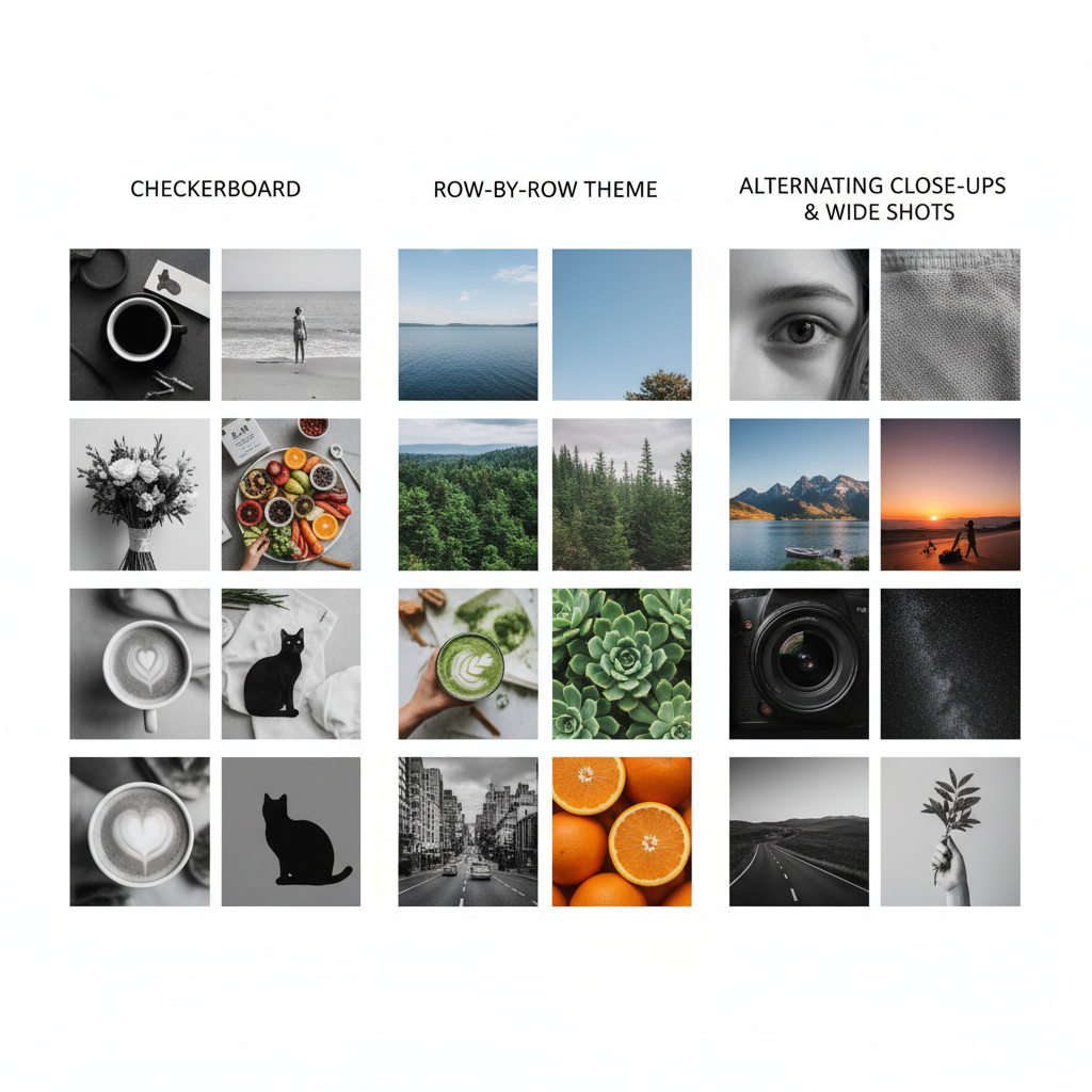
The best grids are intentional. Before editing your Instagram grid, choose a layout style aligned with your content goals.
- Checkerboard – Alternating post types, such as text graphics and lifestyle images.
- Puzzle – One large image split into multiple posts for dramatic impact.
- Row-by-row theme – Entire rows dedicated to a single theme or color.
- Color-block – Solid background colors for strong brand identity.
- Diagonal pattern – Similar posts arranged diagonally for visual interest.
Examples of Grid Layouts
| Layout Style | Visual Impact | Best For |
|---|---|---|
| Checkerboard | Balanced contrast between styles | Brands mixing photography with quotes |
| Puzzle | Giant, captivating visual | High-impact campaigns or launches |
| Row-by-row | Clear thematic organization | Lifestyle bloggers, product showcases |
| Color-block | Bold, minimalistic | Fashion, modern art pages |
| Diagonal pattern | Dynamic, less common | Creative portfolios |
---
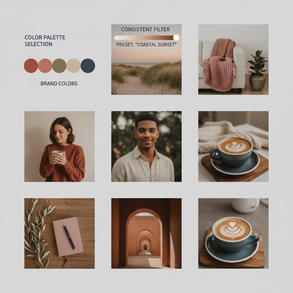
Choosing a Consistent Color Palette and Filter Style
A strong visual identity depends on consistent colors and tones. Select 2–4 core brand colors and use them through all posts.
Consistency tips:
- Apply the same Lightroom preset or Instagram filter to every image.
- Adjust brightness, contrast, and saturation uniformly.
- Keep background tones neutral to avoid visual clutter.
---
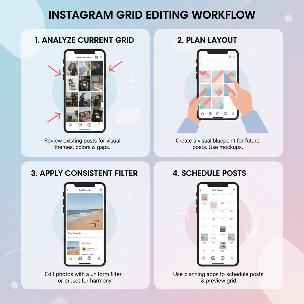
Using Content Planning Apps to Visualize Your Grid
Pre-visualizing posts prevents aesthetic missteps. Content planning apps let you drag and drop upcoming posts to test visual flow.
Recommended tools:
- Planoly
- UNUM
- Later
- Preview App
With these tools, you can simulate your feed, rearrange posts, and schedule strategically.
---
Mixing Post Types for Variety While Staying Cohesive
Variety sustains interest; cohesion maintains brand clarity. Blend different formats while following your guidelines.
- Static images – Crisp photos aligned with palette and style.
- Reels covers – Custom covers that match grid colors and tone.
- Carousels – Series of related visuals in one post.
- Quote graphics – On-brand typography over consistent backgrounds.
---
Cropping and Sizing Images for Visual Symmetry
Proper cropping ensures harmony in the grid.
- Use a 1:1 ratio for all posts.
- Center focal points.
- Maintain uniform borders.
- Preview within Instagram before posting.
---
Batch-Creating Content for Coherence
Producing content in batches ensures visual uniformity over time.
Best practices:
- Use consistent lighting in photo sessions.
- Edit in one go with unchanged settings.
- Store pre-cropped images ready to post.
Batching also reduces last-minute, mismatched uploads.
---
Scheduling Posts Strategically
Post sequence maintains your planned layout. A single misplaced post can distort a checkerboard or puzzle.
Plan ahead:
- Use scheduling apps with visual feed previews.
- Arrange a week or month in advance.
- Post consistently to maintain rhythm.
---
Updating Older Posts or Archiving
Refine past content to match your current style.
Options:
- Archive mismatched posts without deleting.
- Replace old visuals with updated designs.
- Re-edit images with new presets or colors.
---
Analyzing Engagement Impact of Different Grid Styles
Measure the performance of each style using Instagram Insights.
| Grid Style | Avg. Engagement Rate | Notes |
|---|---|---|
| Checkerboard | 3.8% | Contrast encourages scrolling |
| Puzzle | 4.5% | High impact yet demanding |
| Row-by-row | 3.5% | Strong storytelling potential |
| Color-block | 3.9% | Clean and easily recognizable |
| Diagonal | 3.2% | Unique but subtle |
Regularly review metrics to guide future grid decisions.
---
Conclusion
Mastering how to edit Instagram grid is about balancing creativity with strategy. Your grid should showcase your brand’s personality, capture attention instantly, and lead followers to engage more deeply. By selecting a layout, committing to a color scheme, leveraging planning tools, and tracking results, you can build a visually consistent feed that grows your influence.
Ready to transform your Instagram profile? Start planning your next nine posts today, choose your layout style, and watch your engagement climb.


