Mastering the Instagram Square Grid Layout for Stunning Prof
Learn how to design a cohesive Instagram square grid with themes, planning tools, and posting strategies to boost your profile’s visual appeal.
Mastering the Instagram Square Grid Layout for Stunning Profiles
Instagram has evolved far beyond a simple photo-sharing app. The Instagram square grid—its default 3-column profile view—has become a powerful branding canvas for creators, businesses, and influencers. A polished and strategic grid layout can transform casual visitors into engaged followers, showcasing your creativity, professionalism, and brand identity at a glance.
By understanding how the grid works, selecting themes, and strategically planning your approach, you can take control of your profile aesthetics and make a memorable impact. This guide covers the essential techniques, tools, and strategies to make your Instagram square grid stand out.

---
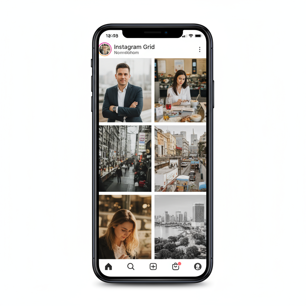
Understanding the Instagram Square Grid
When someone visits your profile, they see your posts arranged in a three-column grid. This layout automatically crops images into squares in the profile view, which makes advance planning critical.
Impact on Profile Aesthetics:
- First impressions happen within seconds—harmonious grids make visitors want to scroll deeper.
- Consistency builds brand recognition.
- A thoughtfully arranged grid can tell a visual story across rows and columns, not just single posts.
The square grid acts as your portfolio; every square is a puzzle piece in your larger brand image.
---
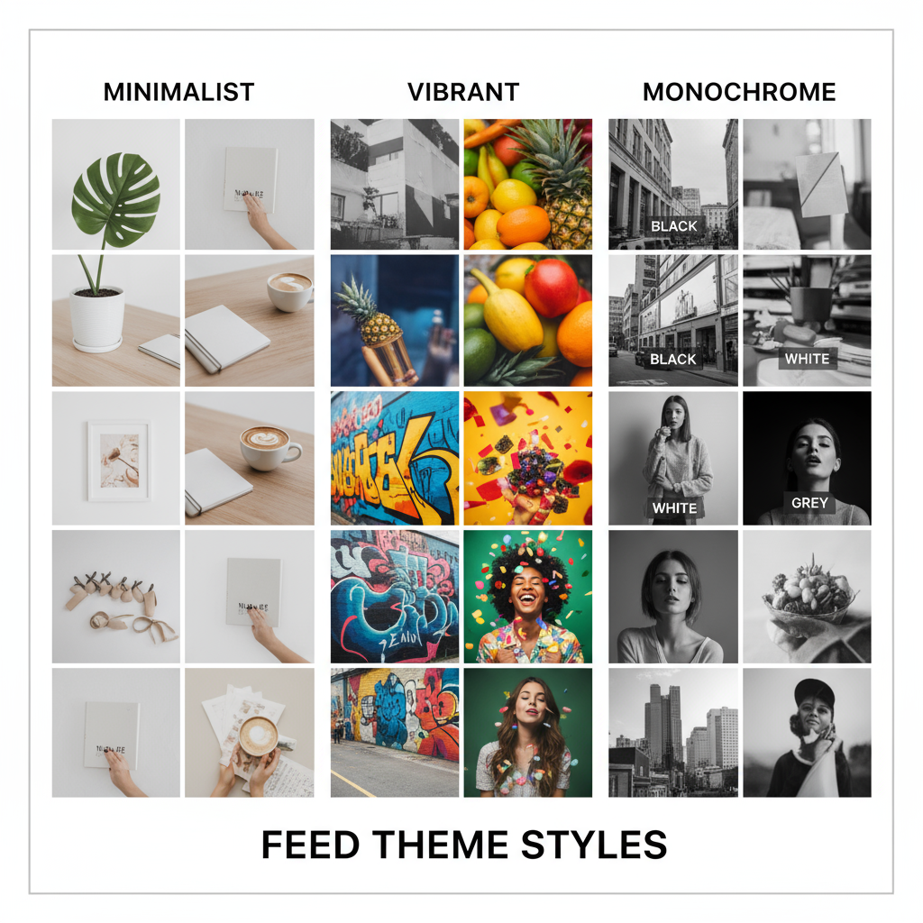
Planning Your Feed Theme
Your theme ensures that every post aligns with your brand or personal aesthetic. It includes decisions about color palette, filters, and typography style.
Steps to Define Your Theme:
- Choose a primary color scheme (e.g., warm tones, monochrome, pastels).
- Select consistent filters to unify your imagery.
- Incorporate typography that reflects your voice if you add text overlays.
For example, a food blogger might stick to bright, naturally lit photos with a white background, while a fashion brand might blend earth tones and elegant serif typefaces.
---
Choosing the Right Content Types
Within a square grid, you can:
- Post single images that stand on their own.
- Create split images (one photo split into multiple posts) to form larger visuals when viewed on your profile.
- Alternate between photo, video, and text-based posts for variety.
When to Use Split Images:
- Launching campaigns or announcements that need impact.
- Storytelling through one panoramic visual.
- Showcasing detailed product photos.
---
Using Planning Tools
Before publishing, arrange and preview your content with planning apps. These allow you to see how upcoming posts will fit into your existing grid.
Popular Tools:
- Preview App
- Planoly
- Later
- UNUM
Benefits include:
- Avoiding clashing colors or redundant post types.
- Pre-scheduling for optimal posting times.
- Maintaining overall visual balance.
---
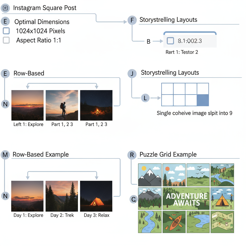
Mastering Image Dimensions and Resolutions
Instagram crops profile view images into 1:1 squares, but in the feed, you can use slightly different ratios. For a flawless grid, design with this in mind.
| Type | Optimal Size (pixels) | Aspect Ratio |
|---|---|---|
| Square | 1080 × 1080 | 1:1 |
| Portrait | 1080 × 1350 | 4:5 |
| Landscape | 1080 × 566 | 1.91:1 |
Best Practices for Crisp Visuals:
- Upload the highest resolution allowed—Instagram compresses images, but starting high minimizes loss.
- Avoid text or critical details too close to the edges, to prevent unwanted cropping in grid view.
---
Creating a Consistent Posting Schedule
Consistency is key for a cohesive grid. Posting at random intervals can disrupt thematic flow and audience expectations.
Tips:
- Align posts in batches corresponding to your row design (three posts make one row).
- Maintain a predictable posting rhythm—daily, twice a week, or weekly.
- Use analytics to identify optimal posting times for maximum engagement.
---
Experimenting with Row-Based Storytelling and Puzzle Grids
Row-based storytelling involves designing each horizontal row to tell a specific story or fit a theme. Puzzle-style grids extend this idea across several rows and columns to create a striking larger image.
Example Approaches:
- Row 1: Product shots
- Row 2: Behind-the-scenes
- Row 3: User-generated content
Puzzle Grid Considerations:
- A single puzzle tile in the feed may lack context, so balance beauty with standalone value.
- Puzzle grids are ideal for reveals, promotions, or artistic statements.
---
Balancing Promotional, Value-Based, and Lifestyle Shots
A winning grid mixes different content types for variety and depth.
| Content Type | Purpose | Example |
|---|---|---|
| Promotional | Directly market products/services | Product images, sale announcements |
| Value-Based | Educate or inspire your audience | Tips, tutorials, quotes |
| Lifestyle | Show brand personality and culture | Behind-the-scenes, team activities |
Rotating among these categories keeps followers engaged without the feed feeling overly “salesy.”
---
Optimizing Captions and Hashtags
While the grid focuses on visuals, captions and hashtags are essential for discoverability and engagement.
Caption Tips:
- Keep them consistent with your brand voice (formal, playful, motivational).
- Use line breaks for readability.
- Place hashtags at the end or in the first comment to preserve clean layouts.
Hashtag Strategy:
- Combine branded hashtags with niche and trending ones.
- Research hashtag performance—avoid banned or spammy tags.
---
Measuring Engagement and Refining Layout Strategy
Your Instagram square grid is not static. Analytics reveal which layouts and themes resonate most.
Metrics to Track:
- Likes, comments, shares, and saves on posts.
- Follower growth trends after grid changes.
- Engagement rate by grid style.
Refinement Steps:
- Review your last 12–18 posts in grid format.
- Compare engagement data before and after design adjustments.
- Adjust palette, content type, or posting frequency to reflect performance insights.
---
Final Thoughts
Your Instagram profile is a living, evolving portfolio. By mastering the Instagram square grid, you can design a feed that is visually striking, strategically engaging, and unmistakably aligned with your brand identity.
The key is to plan ahead, post consistently, balance content types, and refine based on performance data. Start implementing these strategies today to create a scroll-stopping presence and grow your audience.


