Instagram Stories Text Tips to Boost Engagement
Learn how to optimize Instagram Stories text with font choices, placement, captions, and CTAs to boost engagement, accessibility, and brand identity.

Instagram Stories Text Tips to Boost Engagement
Instagram Stories are a dynamic way to connect with your audience, share narratives, and inspire action. While eye-catching visuals are important, Instagram Stories text is equally vital for communicating context, reinforcing your message, and steering engagement. The right words, style, and placement can transform how viewers interact with your content.
In this comprehensive guide, you’ll discover strategies for improving text readability, strengthening brand identity, and boosting conversions — all while keeping your Stories fresh and engaging.
---
Understanding the Role of Text in Instagram Stories
Text in Instagram Stories isn't just decoration — it's a storytelling tool that drives clarity, focus, and emotional resonance.
- Context: Summarize location, event, or purpose to avoid confusing viewers.
- Emphasis: Draw attention to critical points or takeaways.
- Storytelling: Help visuals flow into a narrative arc through captions or inline annotations.
Well-crafted Instagram Stories text ensures message delivery without overwhelming the visual experience.
---
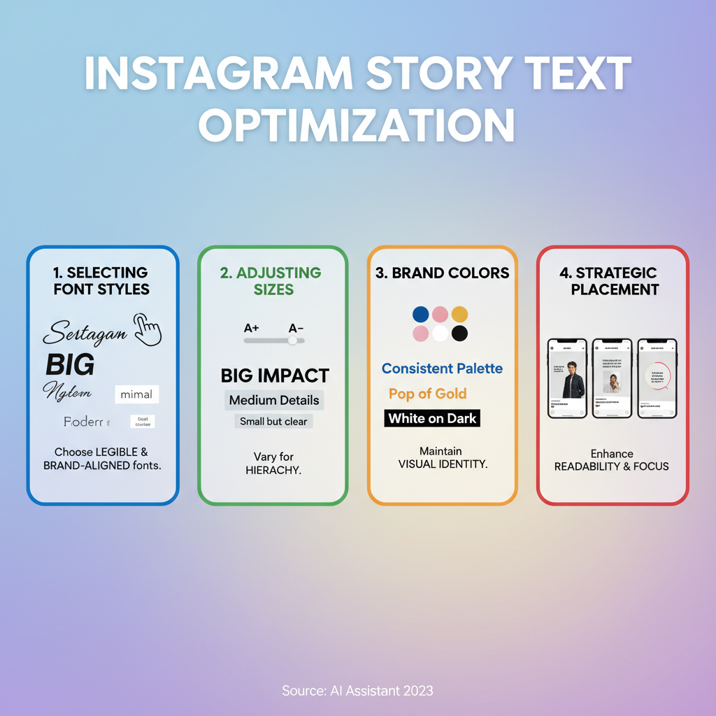
Choosing the Right Font Styles and Sizes for Clarity and Brand Alignment
Instagram includes font options such as Classic, Modern, Neon, Strong, and Typewriter. Your selection should match both readability and brand mood.
Tips for font usage:
- Opt for high-contrast fonts against your background.
- Limit yourself to 2–3 font styles for consistency.
- Adjust text size for varying device hold distances.
If built-in options feel limiting, upload custom brand fonts via images or videos to maintain visual identity.
---
Strategic Text Placement to Guide the Viewer’s Eye
Placement influences how audiences progress through your Story. Poor positioning can hide essential visuals or hinder comprehension.

Best practices:
- Avoid Instagram’s UI zones (top name area, bottom reply box).
- Use alignment to create a logical reading pattern.
- Keep adequate space around text elements for comfort and clarity.
---
Adding Captions to Videos for Accessibility and Silent Viewers
With up to 85% of social videos watched without sound, captions are essential.
To add captions:
- Use Instagram’s auto-caption sticker.
- Or manually add text with strong contrast backgrounds.
- Keep captions naturally short and synced to speech for smoother reading.
Captions broaden accessibility and engage silent viewers effectively.
---
Combining Text with Visuals for Emotional Impact
Text and imagery should work synergistically.
Considerations:
- Color psychology: Warm hues create excitement; cool tones evoke trust.
- Contrast: Ensure adequate contrast for visibility.
- Couple strong language with visuals that reinforce your message emotionally.
---
Highlighting Key Messages with Animated Text
Animations can spotlight announcements without overwhelming viewers.
Uses:
- Product launches
- Limited-time offers
- Inspirational quotes
Experiment with Instagram’s animated text styles — keeping effects subtle to avoid distraction.
---
Using Text Overlays for Calls-to-Action
Calls-to-action (CTAs) are vital for converting interest into action.
CTA Examples:
- Swipe Up (for link-enabled accounts)
- Link sticker with compelling phrasing
- Collaborative mentions and tags
Integrating CTAs directly into your Instagram Stories text ensures they leave a lasting impression.
---
Creating Consistent Text Style Templates for Brand Recognition
Text style consistency builds familiarity.
Standardize:
- Fonts and sizes
- Placement rules
- Color palettes and backgrounds
Your followers should recognize your Stories instantly, even without seeing your username.
---
Leveraging Hashtags and Mentions Inside Text for Discoverability
Clickable hashtags and mentions embedded in text can expand reach.
Advantages:
- Hashtags feed into discovery channels.
- Mentions encourage engagement from tagged profiles.
Blend these naturally into sentences for a conversational tone.
---
Maintaining Balance Between Text and Imagery
Excess text can overwhelm; too little risks ambiguity.
Balance rules:
- Deliver one primary message per frame.
- Add concise context text.
- Let visuals carry mood while text adds precision.
---
Examples of High-Performing Story Text Layouts
Below is a quick reference for layout ideas:
| Layout Type | Purpose | Example Use |
|---|---|---|
| Centered Bold Headline + Subtext | Draw instant attention to a core message | “FLASH SALE” with small text: “Ends tonight” |
| Split Screen Text + Visual | Guide eye between words and imagery equally | Left side text, right side product image |
| Caption Overlay at Bottom | Provide context for a video clip | “Behind the scenes at our shoot” |
| Diagonal Text Placement | Create dynamic, modern feel | “Summer Vibes” over beach shot |
---
Tracking Metrics and Refining Text Usage
Optimize your text strategy through metrics found in Instagram Insights:
- Views and reach
- Taps forward/back
- Exits
- Link clicks & sticker interactions
Use insights to:
- Identify styles that hold attention.
- Experiment with font, color, and placement shifts.
- Measure CTA conversion rates.
Refinement over time will reveal how Instagram Stories text influences engagement.
---
Final Thoughts
Effective text in Instagram Stories is more than decoration — it’s the structure that connects visuals to action. When you balance clarity, brand alignment, and intentional placement, you create compelling, share-worthy Stories.
Start applying these strategies today to increase viewer retention, improve accessibility, and keep your brand top-of-mind. Ready to elevate your Stories? Test a new text layout now and watch your engagement grow.