How to Use the Compound Components Pattern in React: From Prop Passing to Flexible UI
# Why React Code Sometimes Feels Messy — And How the Compound Components Pattern Can Help

## Introduction

Have you ever:

- Opened a React project and thought: *"Why is this code so messy?"*
- Tried adding a feature but felt you needed to **rewrite the component**?
- Struggled with managing **state** and **props** between a parent and its children?

If yes, you’re not alone. These frustrations affect countless React developers — but **React itself isn't to blame**.
The culprit? Common **code smells**, such as:

- Props drilled down multiple layers
- Bloated components that try to do everything
- Duplicate logic scattered across files
- Careless rendering causing performance hits

---

## Understanding Code Smells in React

A **code smell** isn't broken code — it’s a warning that your design could cause long-term headaches. Symptoms include:

- Poor maintainability
- Low reusability
- Difficult scalability
- Complex debugging

---

## Why Use Design Patterns?

**Design Patterns** are proven, reusable solutions for common problems.
Benefits in React include:

- Cleaner, more maintainable codebases
- Easier debugging and enhancements
- Better scalability
- Improved composability and reusability

---

## Introducing the Compound Components Pattern

One of the most powerful solutions for **prop-drilling hell** is the **Compound Components Pattern**:

- Lets related components **work together** without endless props
- Builds naturally **composable UI** that shares context & state
- Improves maintainability and flexibility

---

**Tip:** Mastering this pattern — and spotting code smells — can transform your architecture and developer experience.

For tutorial creators, platforms like [AiToEarn官网](https://aitoearn.ai/) let you **generate**, **publish**, and **monetize** programming content across Douyin, Kwai, WeChat, Bilibili, Facebook, Instagram, LinkedIn, YouTube, Pinterest, and X. You can even track [AI模型排名](https://rank.aitoearn.ai) to keep improving.

---

## Table of Contents

1. [React 19 Code Set Up](#react-19-code-set-up)
2. [A Messy Modal Component](#a-messy-modal-component)
3. [Problems with the Messy Modal](#issues-with-this-modal-implementation)
4. [The Compound Components Pattern](#introducing-the-compound-components-pattern)
5. [Building a Modal with Compound Components](#how-to-build-a-modal-component-using-the-compound-components-pattern)
   - [Why Keep Subcomponents in the Same File](#why-didnt-we-create-separate-files-for-the-subcomponents)
   - [Using the Modal](#how-to-use-the-modal-component)
   - [Building an Accordion](#how-to-build-an-accordion-component-using-the-compound-components-pattern)
   - [Embed Accordion in Modal](#adding-the-accordion-to-the-modal)
6. [Use Cases](#the-use-cases)
7. [Pitfalls & Anti-Patterns](#the-pitfalls-and-anti-patterns)
8. [15 Days of React Design Patterns](#15-days-of-react-design-patterns)
9. [Wrapping Up](#final-note)

---

## React 19 Code Set Up

We'll start by setting up a React 19 environment so we can refactor messy code step-by-step.

**Source Code:** [GitHub repo](https://github.com/tapascript/15-days-of-react-design-patterns/tree/main/day-03/compound-components-patterns)

### Step 1 — Install Node.js
node -v
If not installed: [Download Node.js](https://nodejs.org/en/download) (v18+ recommended).

### Step 2 — Create React Project with Vite
npx degit atapas/code-in-react-19#main compound-components-pattern
### Step 3 — Install Dependencies
cd compound-components-pattern
npm install
or yarn install / pnpm install
### Step 4 — Open in Your Editor

---
## A Messy Modal Component
Inside `src/messy/Modal.jsx`:
function Modal({ title, body, primaryAction, secondaryAction }) {
return (
{title}
{body}
{secondaryAction}
{primaryAction}
);
}
export default Modal;
Usage in `App.jsx`:
import Modal from "./messy/Modal";
import "./App.css";
function App() {
return (
title="Delete Account"
body="Are you sure you want to delete your account?"
primaryAction={Delete}
secondaryAction={Cancel}
/>
);
}
export default App;
Add styling in `App.css` for backdrop, header, footer, etc.

---
## Issues with This Modal Implementation
- **Rigid structure** — Hard to customize layout without adding multiple props
- **Mixed responsibilities** — Layout + state handled together
- **Poor reusability** — Can't use different content types easily
- **Scalability limits** — Would need multiple component variations
- **Testing challenges** — Strong coupling increases complexity
---
## Introducing the Compound Components Pattern
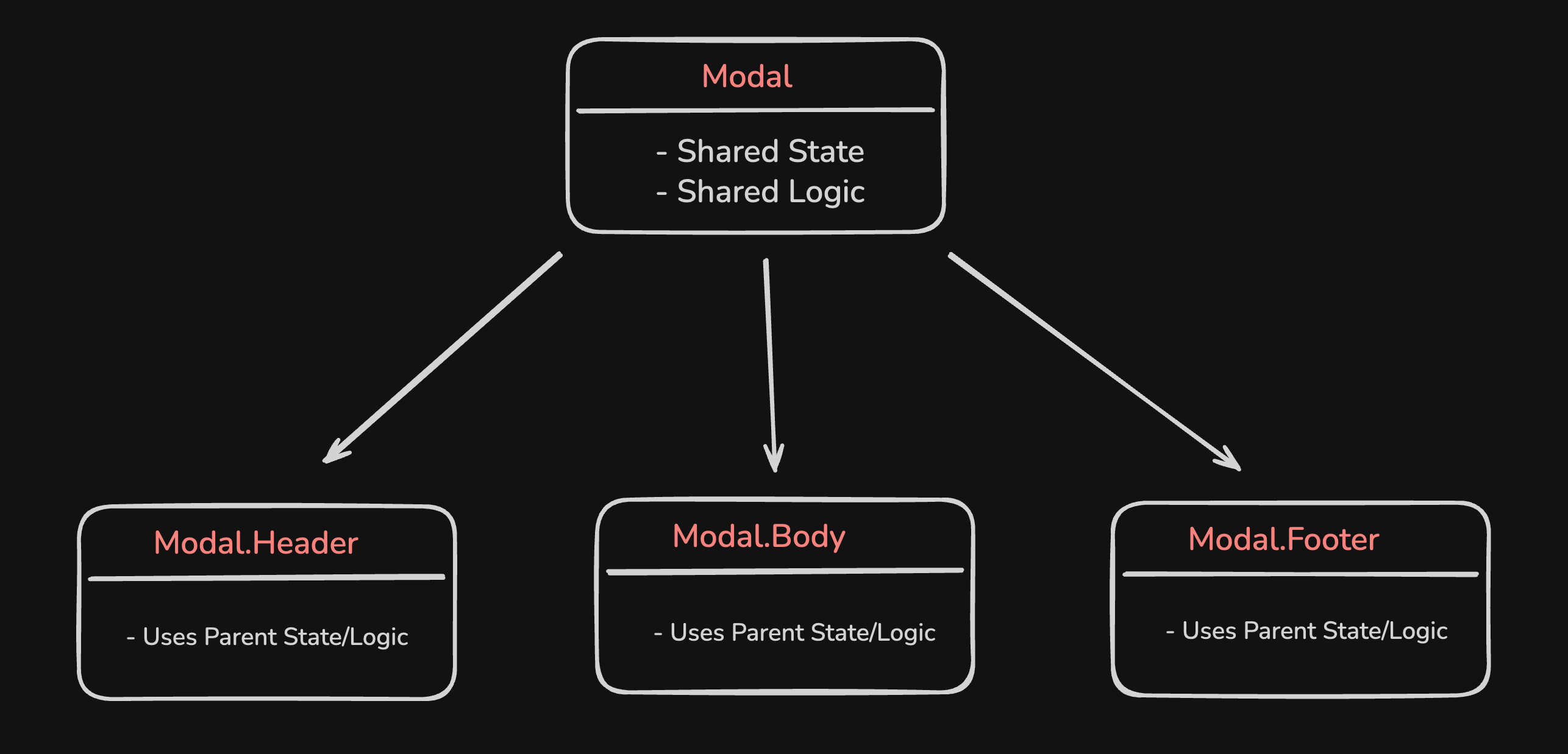
Think of it like LEGO:
- **Parent** = Base plate (provides structure & rules)
- **Children** = Lego pieces (can be arranged freely)
- No need for endless props — **just compose elements as needed**
---
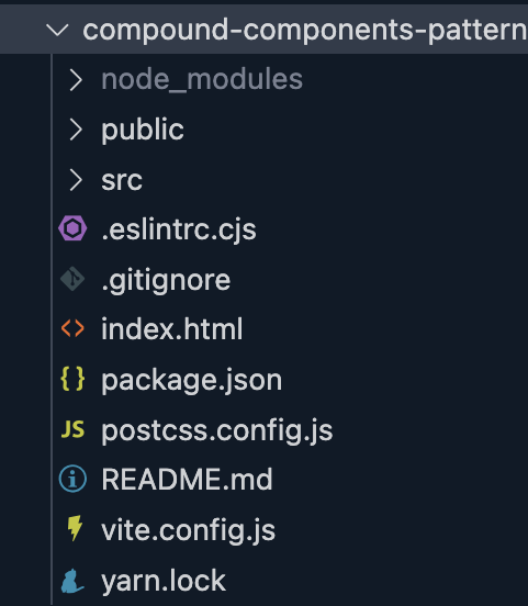
## How to Build a Modal Component Using the Compound Components Pattern
### Step 1 — Structure
src/with-pattern/modal/Modal.jsx
### Step 2 — Implementation
const Modal = ({ children, isOpen, onClose }) => {
if (!isOpen) return null;
return (
{children}
✖
);
};
function ModalHeader({ children }) { return
{children}; }
function ModalBody({ children }) { return
{children}; }
function ModalFooter({ children }) { return
{children}; }
Modal.Header = ModalHeader;
Modal.Body = ModalBody;
Modal.Footer = ModalFooter;
export default Modal;
---

## Why Didn’t We Create Separate Files for the Subcomponents?

- Used **only within** the `Modal` context
- Small helper components unlikely to be reused elsewhere
- Keeping them together improves **discoverability** and prevents misuse

---

## How to Use the Modal Component
import { useState } from "react";
import Modal from "./with-pattern/modal/Modal";
import "./App.css";
function App() {
const [isOpen, setIsOpen] = useState(false);
return (
setIsOpen(true)}>Open Modal
setIsOpen(false)}>
Welcome!
This is a modal built with the Compound Component pattern.
setIsOpen(false)}>Close
);
}
export default App;
---

## How to Build an Accordion Component Using the Compound Components Pattern

`src/with-pattern/accordion/Accordion.jsx`:
import { useState } from "react";
function Accordion({ children }) { return
{children}; }
function AccordionItem({ title, children }) {
const [isOpen, setIsOpen] = useState(false);
return (
setIsOpen(!isOpen)}>
{title}
{isOpen &&
{children}}
);
}
Accordion.Item = AccordionItem;
export default Accordion;
### Basic Styling
.accordion-item {
margin-bottom: 0.5rem;
border: 1px solid #ddd; border-radius: 4px;
}
.accordion-title {
width: 100%; text-align: left; padding: 0.5rem;
font-weight: bold; cursor: pointer; background: #f9f9f9; border: none;
}
.accordion-content {
padding: 0.5rem; background: #fff;
}
---
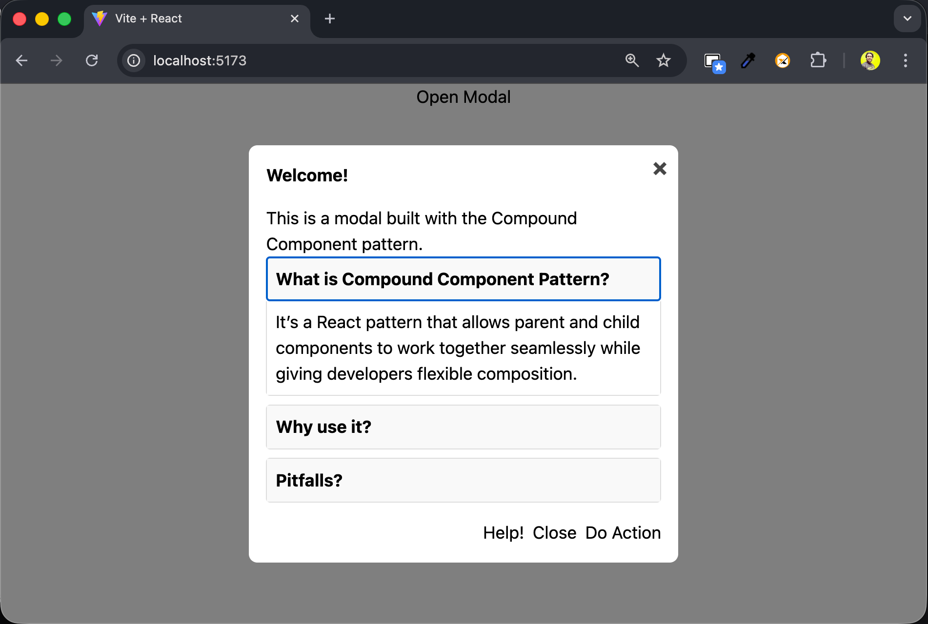
## Adding the Accordion to the Modal
import { useState } from "react";
import Modal from "./with-pattern/modal/Modal";
import AccordionDemo from "./with-pattern/accordion/AccordionDemo";
import "./App.css";
function App() {
const [isOpen, setIsOpen] = useState(false);
return (
setIsOpen(true)}>Open Modal
setIsOpen(false)}>
Welcome!
This is a modal built with the Compound Component pattern.
Help!
setIsOpen(false)}>Close
);
}
export default App;
---
## The Use Cases
Works best for:
- Modals
- Accordions
- Tabs
- Steppers
- Tables (`Table.Head`, `Table.Row`, `Table.Body`)
---
## The Pitfalls and Anti-Patterns
Avoid:
- Attaching unrelated subcomponents to a parent
- Using subcomponents out of context
- Overusing compound components unnecessarily
---
## 15 Days of React Design Patterns
This is part of the [**15 Days of React Design Patterns**](https://www.youtube.com/playlist?list=PLIJrr73KDmRyQVT__uFZvaVfWPdfyMFHC) series — covering essential React patterns to level up your skills.
---
## Final Note
The **Compound Components Pattern** enables:
- Clean composition of complex UIs
- Flexibility without endless props
- Better maintenance & scalability
For sharing your work widely, tools like [AiToEarn官网](https://aitoearn.ai/) connect **AI generation**, **multi-platform publishing**, analytics, and monetization into one open-source workflow — perfect for developers aiming to grow an audience while building sustainable income.
---
**Stay Connected:**
- [YouTube](https://www.youtube.com/tapasadhikary?sub_confirmation=1)
- [Newsletter — The Commit Log](https://tapascript.substack.com/subscribe?utm_medium=fcc)
- [LinkedIn](https://www.linkedin.com/in/tapasadhikary/)
- [Discord](https://discord.gg/zHHXx4vc2H)
Keep learning, keep building 🚀