How to Write on Instagram Stories with Text Tools and Tips
Learn how to write on Instagram Stories with built-in text tools, creative formatting, and proven tips to boost readability, branding, and engagement.
How to Write on Instagram Stories with Text Tools and Proven Tips
Instagram Stories have become a powerhouse for brands, creators, and everyday users who want to connect authentically and creatively. While compelling visuals can grab attention, strategic use of text can amplify your message, guide the viewer’s eye, and boost engagement. This guide will show you exactly how to write on Instagram Stories using built-in tools, creative formatting, and best practices so your content stands out in a busy feed.
---
Understanding Instagram Stories Text Tools
When you open Instagram Stories, you’ll find a set of native text options designed to help you style your words for maximum impact.
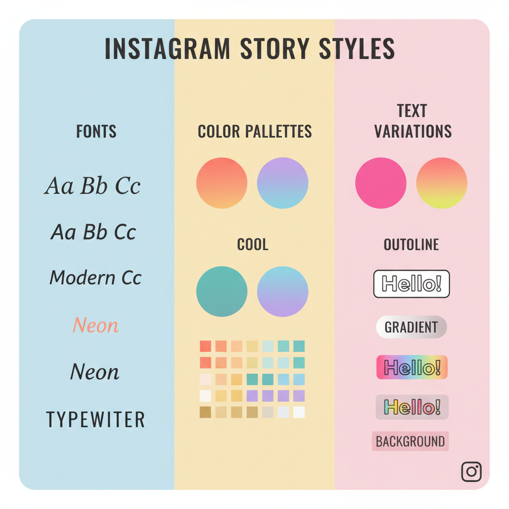
Fonts
Instagram offers several pre-set fonts such as Classic, Modern, Neon, Typewriter, and Strong. Each has its own personality, from clean and minimal to bold and dramatic.
Colors
At the bottom of the text editor, you can:
- Pick preset swatches from Instagram’s palette.
- Long-press a color circle for a gradient spectrum and custom shades.
- Use the eyedropper tool to sample colors directly from your image or video.
Styles
You can enhance your text with:
- Bold
- Shadow
- Outline
- All caps (applies automatically with some fonts)

---
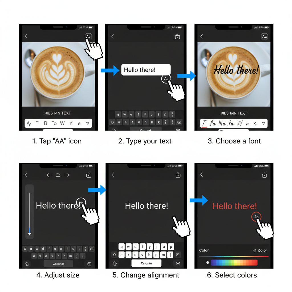
How to Add Text to a Photo or Video in Stories
Follow these steps to add text quickly:
- Open Instagram and swipe right to access Stories.
- Capture a new photo/video or upload from your gallery.
- Tap the "Aa" icon in the top right.
- Enter your text, then adjust font, color, and style as needed.
---
Using the "Aa" Text Button and Customizing Size/Alignment
After tapping "Aa":
- Type your message.
- Use a pinch gesture to resize.
- Drag to reposition anywhere on screen.
- Tap the alignment icon to left, center, or right align.
Pro tip: Double-tap placed text to edit instantly.
---
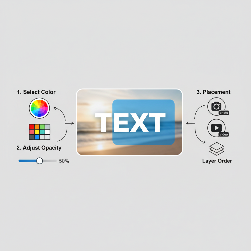
How to Change Background Color Behind Text
To increase readability:
- Tap "Aa" and type your text.
- Tap the "A" in a rounded square icon for a highlight background.
- Select any color from the palette or custom spectrum.
This is essential for text on complex or bright imagery.
---
Adding Multiple Text Layers for Emphasis
Layered text creates visual hierarchy:
- Place your headline in bold, large type.
- Add secondary details in a smaller, muted style.
- Use the Aa tool again for each text block.
---
Using Stickers and Captions for Accessibility
To make Stories inclusive and interactive:
- Use the Captions sticker to auto-generate video subtitles.
- Add @mentions, hashtags, and location tags using stickers.
- Prioritize high-contrast text for important information, aiding viewers with visual impairments.
---
Creative Formatting Ideas
Want to boost visual interest? Try:
Gradients
Highlight each letter individually and assign different shades for a rainbow effect.
Shadows
Duplicate your text in a dark color and offset it beneath your main text for depth.
Outlines
Use fonts with outline options or layer contrasting duplicates to simulate an outline.
---
Combining Text with GIFs, Polls, and Question Boxes
Interactive features attract engagement:
- Insert GIFs behind or around text.
- Pair polls directly below a bold question.
- Place a question box beside your headline to prompt replies.
Keep adequate spacing between text and interactive elements.
---
Tips for Keeping Text Readable on Busy Backgrounds
Avoid lost or unreadable words by:
- Applying solid background highlights.
- Adding shadows or outlines.
- Using blur filters under text areas.
- Selecting high-contrast color combinations.
---
How to Save and Reuse Branded Text Styles
For consistent branding:
- Choose fonts, colors, and sizes that reflect your identity.
- Save reference templates or screenshots.
- Pre-build designs in tools like Canva for quick application.
- Archive successful Stories in Highlights.
---
Best Practices for Engaging Copy
Start with a Hook
Lead with a striking question or statement.
Use CTAs (Calls-to-Action)
Examples:
- “Swipe up for more” (when link feature is available)
- “Tap to see the next tip”
- “DM us your thoughts”
Keep it Concise
Minimize text for quick comprehension as viewers tap rapidly.
---
Common Mistakes to Avoid
- Overloading the screen with text.
- Using font sizes too small for mobile viewing.
- Choosing clashing colors that strain the eye.
- Placing text in unsafe zones where UI covers it.
---
Instagram Stories Text Tools Cheat Sheet
| Feature | Action | Best For |
|---|---|---|
| Fonts | Swipe left/right in text editor | Matching mood and tone |
| Colors | Tap palette or long-press for spectrum | Brand-specific colors |
| Alignment | Tap alignment icon | Structured layouts |
| Background Highlight | Tap "A" in rounded square | Readability on busy scenes |
| Multiple Layers | Re-open text tool for new block | Headlines + subtext |
| Stickers | Swipe up to access sticker tray | Interactive elements |
---
Final Thoughts
Mastering how to write on Instagram Stories is about blending technical know‑how with creative flair. The built-in fonts, colors, and layouts give you endless opportunities to tailor your message visually, but success lies in clear, concise, and audience‑focused text. Experiment with layering, highlights, and interactive stickers while maintaining consistency with your brand style.
Start incorporating these tips into your next Story and watch your engagement rise. Your words can do more than narrate — they can inspire clicks, conversations, and community growth.


