Ideal Image Size for Web to Boost Speed and Quality
Learn how to choose ideal image sizes, formats, and compression techniques to boost website speed, improve SEO, and enhance visual quality.

Ideal Image Size for Web to Boost Speed and Quality
Selecting the ideal image size for web is one of the most impactful ways to enhance both your site’s speed and visual appeal. Well-optimized images can dramatically improve page load times, strengthen your SEO, and deliver a seamless experience to visitors across devices. In this guide, we’ll cover the essential practices and standards for preparing web images that look great while performing efficiently.
Whether you manage a blog, run an e‑commerce store, or maintain a corporate site, understanding the principles behind image sizing, compression, and format choice will pay dividends in site performance and search rankings.
---
Why Image Size Matters for Web Performance and SEO
Large, unoptimized images are among the most common causes of slow-loading websites. Even just a couple of extra seconds can increase bounce rates and frustrate users. Site speed is a confirmed ranking factor for Google, so faster pages often gain better visibility.
Lightweight, properly sized images contribute to:
- Shorter Time to First Byte (TTFB) and faster Largest Contentful Paint (LCP).
- Reduced bandwidth costs for visitors.
- Stronger Core Web Vitals metrics, directly tied to improved search rankings.
---
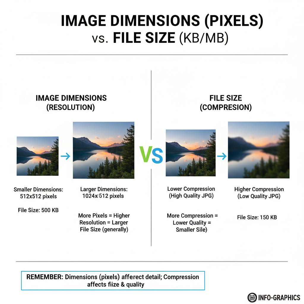
Image Dimensions vs. File Size
It’s important to differentiate between the pixel dimensions of an image and its file size:
- Dimensions: The resolution in pixels (e.g., 1920 × 1080).
- File Size: The storage space the file occupies (e.g., 250 KB or 1.2 MB).
Remember: Even if CSS or HTML scales an image down, the browser downloads the full file. Uploading excessively large originals wastes bandwidth and slows the page.
---
Recommended Image Dimensions for Common Uses
Match your image dimensions to their context. Here’s a quick reference chart:
| Use Case | Recommended Dimensions (px) |
|---|---|
| Hero Banner / Full‑Width Header | 1920 × 1080 |
| Standard Blog Post Image | 1200 × 800 |
| Thumbnail | 150 × 150 |
| Social Sharing (Open Graph Image) | 1200 × 630 |
| Profile Picture (Square) | 400 × 400 |
Adjust these based on your theme, layout, and platform requirements.
---
Optimal File Sizes and Compression Techniques
As a general guideline:
- Hero banners: ≤ 300 KB
- Blog images: ≤ 200 KB
- Thumbnails/icons: ≤ 50 KB
- Logos: ≤ 30 KB
Compression options:
- Lossy: Best for photos; slightly reduces quality but greatly reduces size.
- Lossless: Keeps full quality; good for graphics and text‑heavy images.
Popular tools:
- TinyPNG / TinyJPG
- Squoosh.app
- ImageOptim
- RIOT
---
Best Image Formats for Web
Choosing the right format is critical:
- JPEG: Ideal for photos, supports high compression.
- PNG: Good for graphics, transparency, or sharp edges.
- WebP: Modern, excellent compression, wide browser support.
- SVG: Vector; perfect for logos/icons; infinitely scalable.
| Format | Transparency | Scalability | Best Use |
|---|---|---|---|
| JPEG | No | No | Photos, backgrounds |
| PNG | Yes | No | Logos, sharp‑edge graphics |
| WebP | Yes | No | Mixed content, responsive designs |
| SVG | Yes | Yes | Logos, simple illustrations |
---
Responsive Design Considerations
Different devices demand different image sizes. Avoid serving large desktop images to mobile users.
Techniques:
- Use `` for art direction.
- Leverage CDNs such as Cloudinary or Imgix for automatic resizing.
Use `srcset` and `sizes` in `
` tags.
Example:
---
Tools for Resizing and Compressing
Online:
- TinyPNG / TinyJPG
- Compressor.io
- Squoosh
Desktop:
- Adobe Photoshop (Save for Web)
- GIMP (Free)
- Affinity Photo
Automation:
## Using ImageMagick

magick input.jpg -resize 1200x800 -quality 80 output.jpg
---
Alt Text and SEO Benefits
Good alt text improves accessibility and SEO:
- Describes images for screen readers.
- Enables images to rank in Google Images.
- Provides contextual relevance for your content.
Tips:
- Describe concisely.
- Include keywords naturally.
- Avoid stuffing.
---
Common Mistakes to Avoid
- Uploading overly large source images.
- Skipping compression.
- Choosing wrong format for the content.
- Not using responsive image techniques.
- Neglecting alt attributes.
---
Step‑By‑Step Checklist for Web‑Ready Images

- Determine required pixel dimensions.
- Resize to those dimensions.
- Select the optimal format.
- Compress appropriately.
- Save with an SEO‑friendly filename.
- Add relevant alt text.
- Implement responsive loading (`srcset`, ``, CDN).
- Test performance in PageSpeed Insights.
- Upload and QA on devices/browsers.
---
Conclusion and Next Steps
By applying these ideal image size for web best practices—correct dimensions, optimized file size, suitable format, and responsive loading—you’ll achieve a site that’s both visually stunning and lightning‑fast. This benefits your SEO, user experience, and overall site credibility.
Ready to optimize your site images? Start by auditing your current assets and re‑saving them with the right settings to see immediate performance gains.