Ideal Image Size for Website Performance and Quality
Learn how to choose the ideal image size for your website to improve load speed, SEO, and user experience with formats, dimensions, and compression tips.

Why Image Size Matters for Website Performance and SEO
Images are among the most visually engaging elements on a website. However, they are also one of the largest contributors to slow page load times. Choosing the ideal image size for website use is essential not only for performance but also for SEO.
Search engines like Google consider page load speed as a ranking factor. Heavy, oversized images can increase your site's Time to First Byte (TTFB) and Largest Contentful Paint (LCP), negatively impacting Core Web Vitals scores.
Slower websites:
- Frustrate users
- Increase bounce rates
- Reduce conversion rates
Optimizing image sizes ensures your site feels fast, responsive, and provides a superior user experience.
---
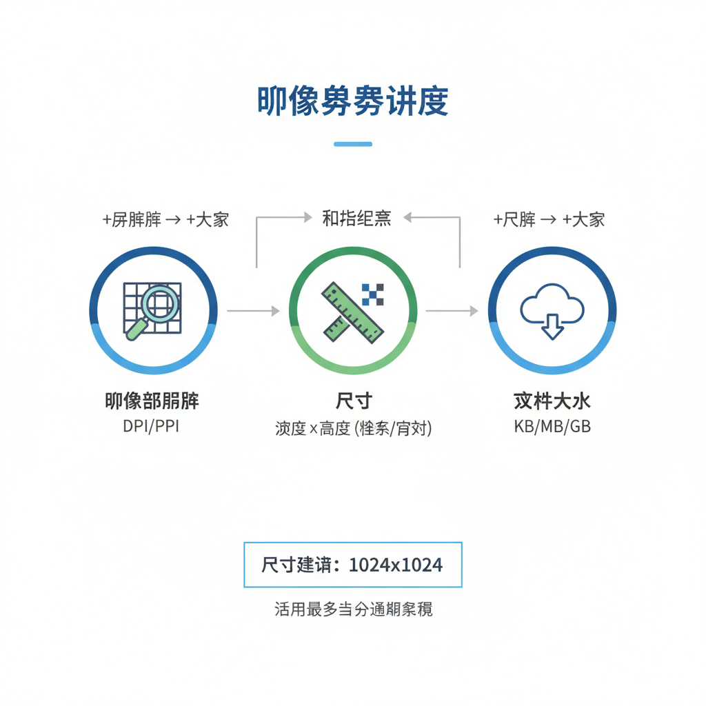
Understanding Image Resolution vs Dimensions vs File Size
Many confuse resolution, dimensions, and file size, but each plays a distinct role:
- Resolution: The density of pixels in the image, measured in PPI (pixels per inch) or DPI (dots per inch). Web displays typically require 72 PPI, whereas print requires 300 DPI.
- Dimensions: The width and height of the image in pixels (e.g., 1920×1080).
- File Size: The amount of storage the image occupies, measured in kilobytes (KB) or megabytes (MB).
The three are interrelated: larger dimensions usually mean larger file sizes, but compression and file format also influence size.
---
Common Display Sizes for Various Website Elements
When selecting the ideal image size for website assets, consider where they'll appear:
- Hero banners: Large, full-width background or feature images.
- Product images: Medium-sized visuals showcasing items in an eCommerce store.
- Thumbnails: Small preview images used for categories or blog post lists.
Below is a guide to some common use cases:
| Image Type | Common Dimensions (px) | Notes |
|---|---|---|
| Hero Banner (Desktop) | 1920 × 1080 | Full HD, looks sharp on most displays |
| Product Image | 800 × 800 | Square format ideal for catalogs |
| Thumbnail | 150 × 150 | Small yet clear for grids |
---
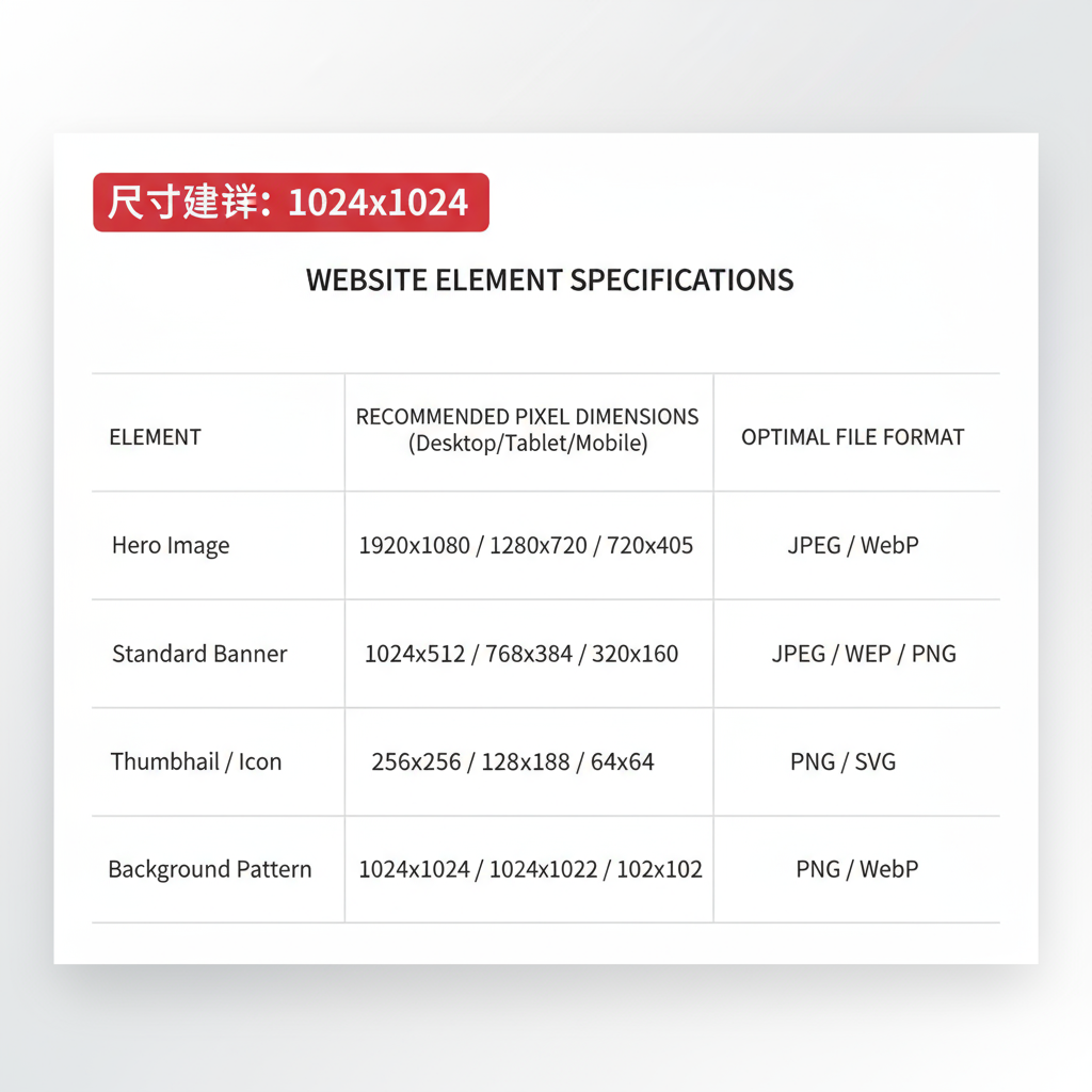
Recommended Pixel Dimensions Across Devices
Your website must be responsive, meaning images should adapt smoothly to screens of different sizes.
| Device | Hero Image | Product Image | Thumbnail |
|---|---|---|---|
| Desktop | 1920 × 1080 | 800 × 800 | 150 × 150 |
| Tablet | 1200 × 628 | 600 × 600 | 100 × 100 |
| Mobile | 800 × 600 | 400 × 400 | 80 × 80 |
Example: If you’re displaying a blog’s featured image, prepare multiple versions for different breakpoints to ensure speed and clarity.
---
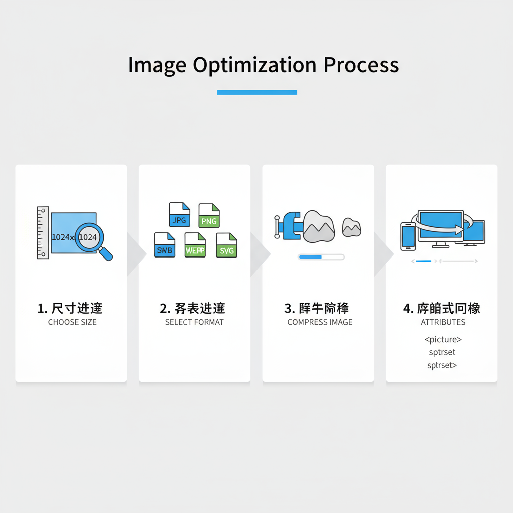
Optimal File Formats and When to Use Each
Choosing the correct file format impacts size, quality, and transparency support:
- JPEG: Best for photos and complex images; supports lossy compression.
- PNG: Great for transparent backgrounds or sharp graphics; larger file sizes.
- WebP: Modern format with superior compression; supports transparency and animations.
- SVG: Ideal for logos, icons, and illustrations; infinitely scalable without loss.
Pro Tip: Use WebP for high-performance modern browsers, falling back to JPEG/PNG for compatibility.
---
Compression Techniques: Lossy vs Lossless
Compression reduces image size, but methods differ:
- Lossy: Removes some data permanently to shrink file size. Quality may degrade slightly (JPEG, WebP).
- Lossless: Preserves original data with no quality loss (PNG, some WebP configurations).
Best Practice: Use lossy compression for photos where slight quality reduction is acceptable and lossless for graphics or brand assets.
---
Tools for Resizing and Compressing Images Without Losing Quality
You don’t have to be a Photoshop expert to adjust image sizes effectively:
- Online Tools: TinyPNG, Squoosh, Optimizilla
- Desktop Apps: Photoshop, Affinity Photo, GIMP
- CMS Plugins: Smush (WordPress), ImageKit, ShortPixel
These tools allow batch processing, custom dimension setting, and format conversion—perfect for achieving the ideal image size for website usage without sacrificing quality.
---
Responsive Image Practices (`srcset` and `sizes`)
Modern HTML provides techniques to serve different images based on viewport size:
Benefits:
- Sends smaller files to mobile users
- Saves bandwidth
- Improves loading speed on slow connections
When implemented sitewide, `srcset` ensures you’re always delivering the optimal size for each user scenario.
---
Balancing Quality and Load Time: Case Studies
Case studies show the tangible benefits of image optimization:
- E-commerce Site: Reduced average image size from 1.2 MB to 200 KB → Increased conversions by 14% due to faster page loads.
- News Portal: Implemented WebP format and lazy loading → Improved LCP by 1.2 seconds.
Statistics from Google suggest that sites loading within 2 seconds have a significantly lower bounce rate compared to those taking 5+ seconds.
---
Common Mistakes to Avoid
Avoid these pitfalls when handling images:
- Uploading Full-Resolution Originals: A 5000px-wide photo is overkill for most web uses.
- Skipping Compression: Even minor compression can save hundreds of KB.
- Neglecting Mobile Resizing: Mobile users are especially sensitive to slow loads.
- Unoptimized Background Images: Backgrounds can silently bloat your page weight.
---
Quick Optimization Checklist
Before uploading an image, ask yourself:
- Have I resized to appropriate pixel dimensions per device target?
- Did I choose the right file format (JPEG, PNG, WebP, SVG)?
- Have I applied compression with minimal quality loss?
- Does the file naming follow SEO best practices (`keyword-description.jpg`)?
- Have I created multiple image versions for responsive loading?
- Is the `alt` attribute descriptive for accessibility and SEO?
- Have I tested load performance with tools like Google PageSpeed Insights?
---
Optimizing images is one of the easiest and most effective ways to improve site performance and SEO rankings. By understanding dimensions, formats, and responsive strategies, you’ll ensure both quality visuals and fast-loading pages—delighting users and search engines alike.