Ideal Size for Website Images to Improve Speed and Quality
Learn the optimal sizes, formats, and compression methods for website images to boost load speed, maintain quality, and improve SEO performance.
Ideal Size for Website Images to Improve Speed and Quality
Selecting the ideal size for website images is critical to balancing fast load speeds with captivating visual quality. Images are often the largest assets on a webpage, and without proper optimization they can harm performance, reduce SEO rankings, and frustrate users. This guide explains best practices for image sizing, formats, compression, and responsive delivery so your website remains both beautiful and efficient.

---
Why Optimizing Website Images Matters
Images often make up over 50% of a webpage’s total size. A single uncompressed image can add unnecessary weight, which:
- Increases page load time
- Causes higher bounce rates
- Negatively impacts Core Web Vitals
- Reduces search engine ranking potential
A fast, visually compelling site boosts user experience (UX), conversion rates, and search visibility.
---
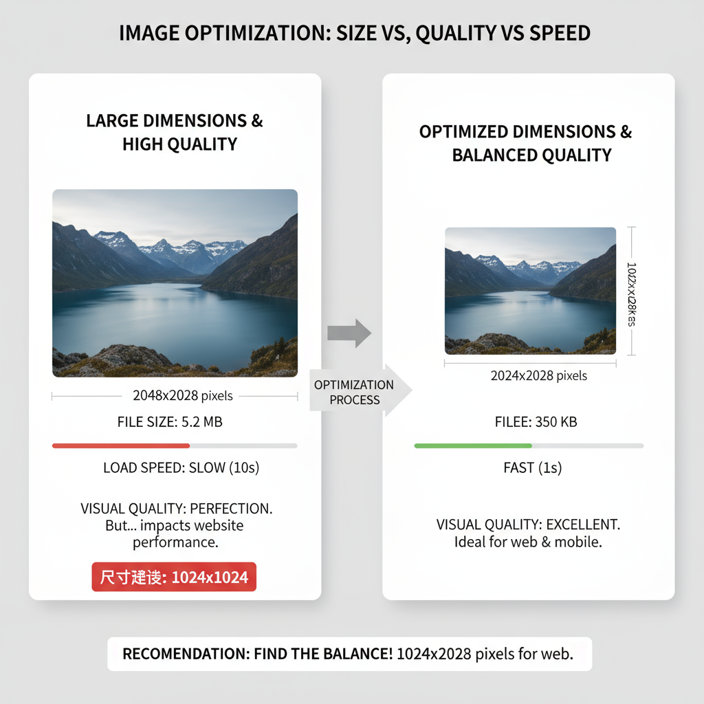
Image Dimensions vs. File Size
Many confuse image dimensions (width and height in pixels) with file size (measured in KB or MB).
- Dimensions: Determine how many pixels the image contains and how it appears visually.
- File Size: Determines how much data must be loaded, affecting performance.
Key Takeaway
You might have a small-dimensioned image that is heavy in file size due to poor compression, or a large-dimensioned image that's still light thanks to optimized formats.
---
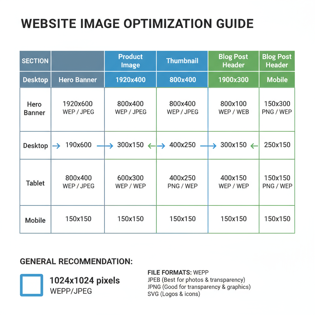
Recommended Image Sizes by Website Section
Choosing the right image size depends on where the image will be displayed. Oversized images waste resources, while undersized images appear blurry.
Here are general recommendations:
| Website Section | Recommended Dimensions (Desktop) | Notes |
|---|---|---|
| Hero Image | 1920 × 1080 px | High-resolution for full-width headers; compress for web. |
| Banner | 1600 × 500–800 px | Adjust height depending on design; wider for horizontal banners. |
| Blog Post Featured Image | 1200 × 630 px | Optimized for social media sharing and blog layouts. |
| Thumbnail | 150 × 150 px | Small square for grids and previews. |
| Product Image | 800 × 800 px | Square ratio works well for e-commerce catalogs. |
---
Ideal File Formats and When to Use Them
Each format serves a unique purpose:
- JPEG/JPG: Best for photographs with complex colors; supports high compression with minimal quality loss.
- PNG: Best for graphics with transparency or sharp edges (e.g., logos, icons).
- WebP: Modern format offering superior compression while maintaining quality; supported by most browsers.
- SVG: Best for vector graphics like logos, icons, and illustrations; scales infinitely without loss of quality.
---
Recommended Pixel Dimensions for Different Devices
With responsive design, you must adapt images for desktop, tablet, and mobile.
| Device | Hero Image | Banner | Blog Image |
|---|---|---|---|
| Desktop | 1920 × 1080 px | 1600 × 600 px | 1200 × 630 px |
| Tablet | 1280 × 720 px | 1200 × 500 px | 1000 × 550 px |
| Mobile | 800 × 600 px | 800 × 400 px | 800 × 420 px |
By serving different sizes based on device, you save bandwidth and enhance UX.
---
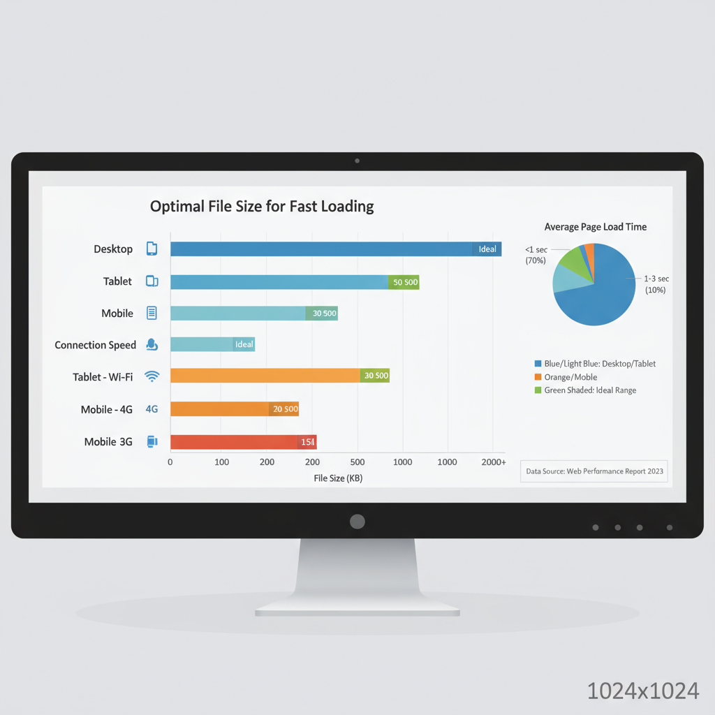
Ideal File Size for Fast Loading
File size has a direct impact on page speed.
General guidelines:
- Thumbnails: 10–30 KB
- Small Icons: 5–15 KB
- Blog images: 100–200 KB
- Hero/Banner images: 200–400 KB
- Large product shots: up to 500 KB (if truly necessary)
Aim for under 1 MB for any single image unless it’s a high-resolution gallery.
---
Tools for Resizing and Compressing Images
Both online tools and software can efficiently reduce file sizes.
Online Tools:
- TinyPNG
- Compressor.io
- Squoosh.app
Desktop Software:
- Adobe Photoshop (`Save for Web` feature)
- GIMP
- Affinity Photo
Command-line Tools (for developers):
- ImageMagick
- cwebp (for WebP conversion)
Example ImageMagick command to resize:
magick input.jpg -resize 1200x630 -quality 85 output.jpg---
Using Responsive Images with `srcset` and ``
Instead of loading one large image for all devices, you can load the most appropriate version dynamically.
Example:
For advanced art direction, use the `` element:
This ensures the browser downloads only the best-fit image.
---
SEO Impact and Core Web Vitals
Optimized images improve Largest Contentful Paint (LCP), a critical metric for Core Web Vitals. This directly affects SEO because Google factors page speed and mobile usability into ranking.
Benefits include:
- Higher Google rankings
- Improved mobile experience
- Reduced server bandwidth load
Using descriptive file names and optimized alt text also boosts image search visibility.
---
Common Mistakes to Avoid
- Uploading huge images without compression
- Not using responsive images
- Storing multiple images in unoptimized PNG format
- Forgetting to add alt attributes for accessibility
- Using incorrect aspect ratios, leading to stretched or cropped visuals
- Not testing load speed after optimization
---
Conclusion
The ideal size for website images comes from a deliberate mix of correct pixel dimensions, optimized file sizes, and appropriate file formats. Leveraging responsive techniques like `srcset` and `` ensures that users on all devices enjoy sharp, fast-loading visuals.
By adopting these best practices, you can improve UX, enhance SEO performance, and keep your site ahead of competitors. Start optimizing your images today to achieve a perfect balance between beauty and speed.