IG and Facebook Logo History, Design, and Usage Guide
Learn the history, design elements, and official Meta usage guidelines for Instagram and Facebook logos to ensure consistent, compliant branding.

Introduction to Social Media Branding (IG & Facebook Logos)
In today’s digital landscape, social media branding plays a pivotal role in shaping how audiences perceive and interact with a platform. Among the most iconic symbols in the world are the IG and Facebook logos. These instantly familiar visual marks condense years of innovation, culture, and brand identity into simple, scalable designs.
The Instagram (IG) logo, with its vibrant gradient hues, and the Facebook logo, with its instantly recognizable lowercase “f” on a blue background, go beyond being just app icons. They encapsulate evolving design trends, signal trust to billions of users, and reinforce the corporate identity of their parent company, Meta.

Whether you’re a brand strategist, UI designer, or small business owner creating promotional content, understanding the history, design principles, and official usage guidelines of these logos will help ensure your communications remain professional, distinctive, and legally compliant.
---
Brief History of the Instagram Logo Evolution
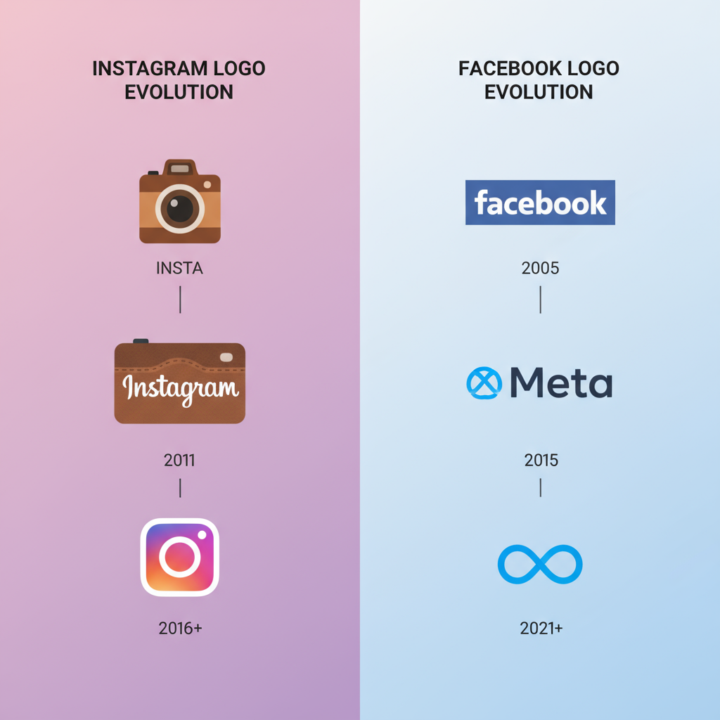
Instagram debuted in 2010 with a logo inspired by a retro instant camera, reflecting its early passion for nostalgic, filter-heavy photography.
Timeline Highlights
- 2010–2016: Polaroid-style camera with rainbow stripe; a skeuomorphic nod to analog photography.
- May 2016 Redesign: A bold shift to a minimalist camera outline with a vibrant gradient background — a clean, modern, scalable emblem.
- 2019–2023: Subtle gradient refinements for improved rendering on high-definition screens and better accessibility.
The 2016 redesign polarized users — some praised its simplicity, while others missed the charm of the original. Ultimately, the flat design aligned perfectly with contemporary mobile app aesthetics.
---
Brief History of the Facebook Logo Evolution
Facebook’s logo journey reflects a strategy of subtle refinement over radical change, ensuring sustained brand recognition.
Timeline Highlights
- 2004–2005: “thefacebook” in a white wordmark over a light blue banner.
- 2005–2015: Transition to “Facebook” in Klavika font, white-on-blue.
- 2015–2019: Font modifications softened the appearance, aligning with a friendlier brand tone.
- 2019–Present: Under Meta, the core blue “f” icon remains, preserving familiarity while integrating with the parent brand's visual framework.

Consistency has been Facebook’s strength, leveraging minute changes to keep the identity fresh without alienating its user base.
---
Key Design Elements and Symbolism of Each Logo
Design elements convey subtle yet impactful brand messages.
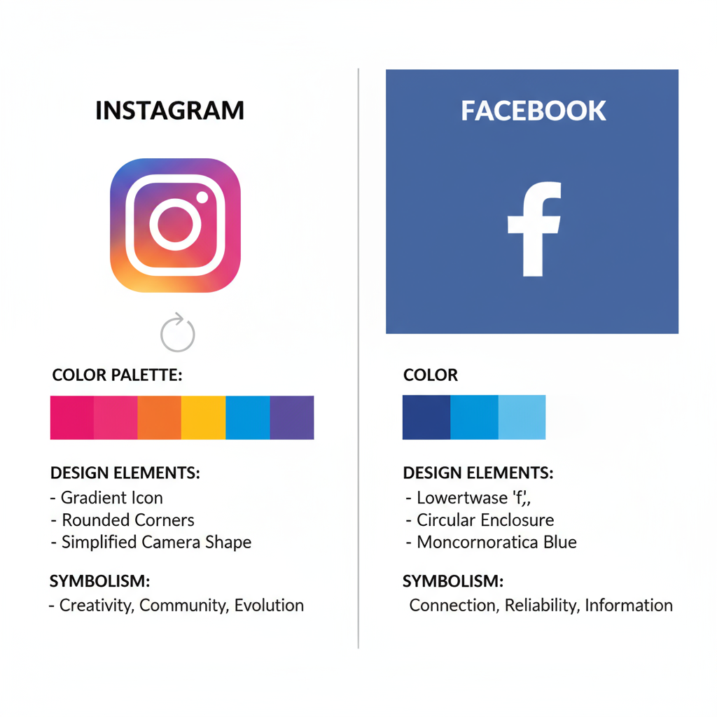
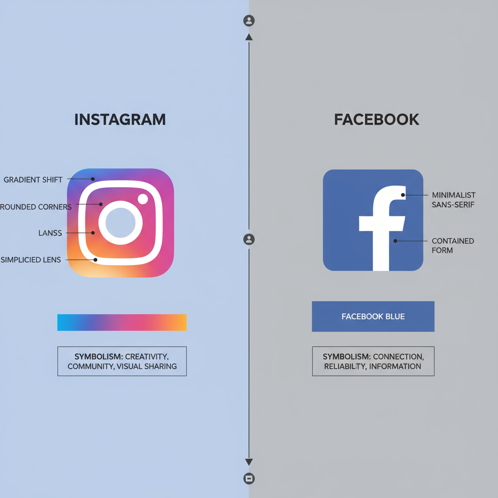
Instagram Logo Elements
- Gradient Hue: Represents creativity, diversity, and vibrancy.
- Camera Outline: An homage to Instagram’s photography roots.
- Clean Minimalism: Highly recognizable even at small display sizes.
Facebook Logo Elements
- 'f' Monogram: Friendly, minimal, and cross-cultural.
- Blue Background: Evokes stability, trust, and reliability.
- Flat Design: Ensures adaptability for web and mobile environments.
---
Differences and Similarities Between IG & Facebook Logos
Despite belonging to the same corporate family, both logos have intentional stylistic differences.
| Aspect | ||
|---|---|---|
| Primary Color Scheme | Rainbow-like gradient | Single-tone blue |
| Shape | Rounded square | Rounded square/circle |
| Main Symbol | Camera outline | Lowercase "f" |
| Design Approach | Expressive and dynamic | Minimal and formal |
---
Official Usage Guidelines per Meta Brand Resources
Meta enforces strict brand usage policies for both the IG and Facebook logos to preserve brand consistency.
Key Rules
- Always download the latest official logo files from Meta’s Brand Resource Center.
- Maintain clear space equal to the height of the icon around the logo.
- Do not distort, rotate, or recolor without explicit permission.
- Avoid combining IG and FB logos into a single composite symbol.
These measures protect trademark integrity and visual cohesion across media.
---
Common Mistakes to Avoid When Using Logos in Marketing Materials
Brand misuse can harm both credibility and compliance. Watch for:
- Stretching or compressing the logo, disrupting proportions.
- Unapproved color changes beyond sanctioned variations.
- Applying special effects like shadows or glows.
- Embedding within body text or altering placement.
- Using low-contrast backgrounds that undermine visibility.
---
How the Logos Contribute to Brand Recognition and Trust
The IG and Facebook logos are visual shorthand for each platform’s experience and community. Repeated exposure:
- Builds trust via familiarity (mere exposure effect).
- Distinguishes official apps from imitations.
- Sparks emotional resonance tied to past interactions.
Consistency in the logo’s look and placement deepens this recognition over time.
---
Best Practices for Incorporating Logos in Content (Digital + Print)
Digital Media Recommendations
- Use transparent PNG or SVG formats for optimal clarity.
- Position logos strategically in navigation bars, banners, or footers — visible but not intrusive.
Print Media Recommendations
- Work with vector files for banners, signs, or merchandise.
- Follow CMYK color codes or Pantone standards per Meta’s brand kit.

---
Impact of Logo Changes on User Perception and Platform Identity
Logo changes evoke varying responses:
- Positive: Fresh designs can renew interest and perceived modernity.
- Negative: Sudden, unexplained changes risk alienating loyal audiences.
Meta usually opts for incremental Facebook updates to ease transitions, whereas Instagram’s 2016 overhaul was bold but ultimately accepted.
---
Future Trends in Social Media Branding and Logo Design
Emerging branding directions include:
- Adaptive Logos: Simplified variants for small or dynamic displays.
- Dark Mode-Friendly Palettes: Optimized visibility in dark user interfaces.
- Motion Design: Animated icons to enhance app interactions.
- Potential AR/VR integration for immersive branding in Meta’s metaverse ambitions.
---
Conclusion and Key Takeaways for Marketers and Creators
The IG and Facebook logos serve as strategic brand assets that bridge corporate identity and audience trust.
Key points:
- Respect and follow Meta’s official usage guidelines.
- Appreciate the history and symbolism behind each design.
- Apply logos thoughtfully across platforms for maximum visual harmony and impact.
Leveraging these logos correctly enhances brand recognition, communicates professionalism, and strengthens audience engagement. For marketers and creators, mastering social media logo usage is a small but crucial step toward building enduring, trustworthy brand presence.


