Optimal Image Sizes for Websites and Web Performance
Learn how to choose optimal image sizes, formats, and compression methods to improve website speed, user experience, and search engine rankings.

Why Image Sizes Matter for Website Performance and SEO
Optimizing image sizes for websites is a critical step for boosting both performance and search engine rankings. Since images are often the largest assets on a page, failing to optimize them can lead to sluggish load times, frustrated visitors, and higher bounce rates. Search engines consider page speed when ranking results, so unoptimized images can directly harm your SEO.
When dealing with images online, two main aspects matter most:
- Load time: Smaller files allow pages to load faster.
- User experience: Crisp, visually appealing images encourage visitors to stay longer and engage more.
A high-performing site balances visual quality with minimal file size. This begins with selecting the correct image dimensions, formats, and compression techniques.
---
Image Dimensions vs. File Size
Understanding the difference between image dimensions and file size is essential for website optimization:
- Image dimensions: Measured in pixels (px), such as 1920 × 1080. Determines how large the image appears visually.
- File size: Measured in kilobytes (KB) or megabytes (MB), affecting how quickly a file downloads.
It’s possible to have large dimensions with a small file size via aggressive compression, or small dimensions with a large file size if saved uncompressed.
---
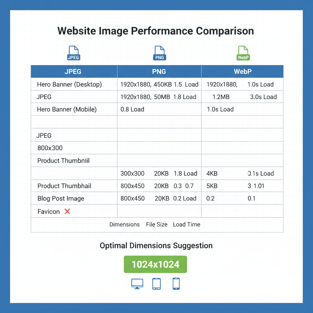
Standard Image Sizes for Common Web Elements
Choosing recommended sizes helps maintain design consistency and ensures appropriate loading speeds.
| Web Element | Suggested Dimensions (px) | Notes |
|---|---|---|
| Hero Banner | 1920 × 1080 | Full-width background images for desktops |
| Thumbnail | 150 × 150 | Small preview images for lists or grids |
| Blog Featured Image | 1200 × 628 | Common social sharing dimension |
| Product Image | 800 × 800 | Square images for eCommerce catalogs |
| Background Patterns | Repeatable tiles, e.g., 256 × 256 | Optimized for seamless repetition |
Use these as starting points, then adapt to your site’s responsive grid and breakpoints.
---
Choosing Optimal Image Formats for the Web
The right file format can significantly reduce your image size without compromising quality:
- JPEG (JPG)
- Ideal for photographs and detailed images.
- Supports lossy compression for smaller files.
- PNG
- Suited for graphics, logos, or images needing transparency.
- Lossless compression preserves detail but can result in larger sizes.
- WebP
- Modern choice that combines small sizes with support for transparency.
- Widely supported across modern browsers.
- SVG
- Best for icons, logos, and scalable vector graphics.
- Infinitely scalable and lightweight.
---
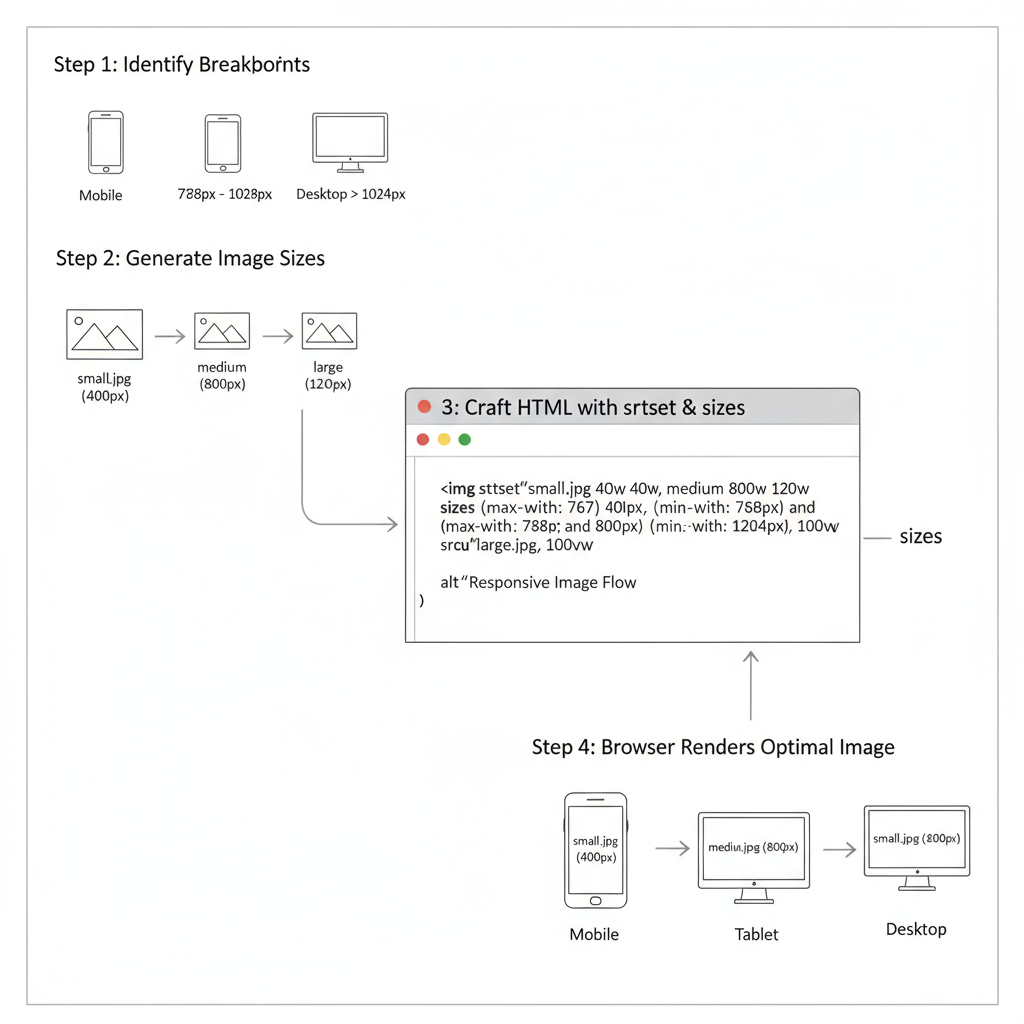
Responsive Design and Serving the Right Image Size
Different devices require different image resolutions. Serving appropriately scaled images ensures faster loads and saves mobile bandwidth.
Approach:
- Generate multiple versions of each key image—desktop, tablet, and mobile.
- Use responsive HTML and CSS to serve the right file.
Example scaling for a hero image:
- Desktop: 1920 × 1080
- Tablet: 1280 × 720
- Mobile: 768 × 432
---
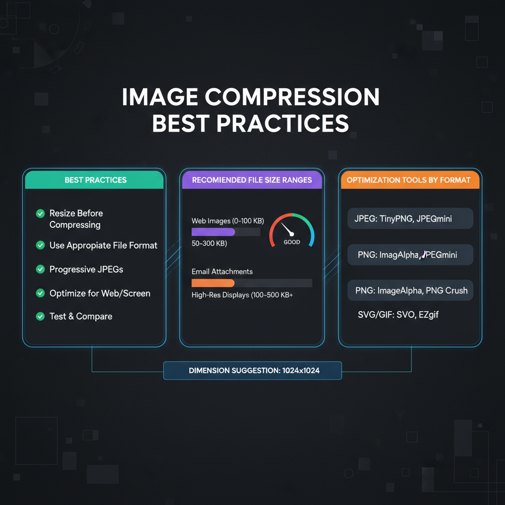
Best Practices for Compressing Images
Compression techniques keep image sizes low while retaining visual integrity.
- Lossy compression: Reduces file size by removing some data (JPEG). Aim for about 70–80% quality for balance.
- Lossless compression: Preserves all original data (PNG), with a moderate size reduction.
Tips:
- Use lossy for photographs; lossless for logos and text-based graphics.
- Avoid compressing the same file repeatedly to prevent cumulative quality loss.
---
How to Use `srcset` and `sizes` Attributes
HTML5 attributes `srcset` and `sizes` let you serve device-appropriate image resolutions dynamically.
How it works:
- srcset: Lists alternative images with their pixel widths.
- sizes: Instructs browsers which size to use based on viewport width.
---
Recommended Tools for Image Optimization
Whether you prefer desktop software or web apps, many tools can resize and compress images efficiently:
- Adobe Photoshop: Industry-standard quality with granular export controls.
- GIMP: Free and open-source; good for batch tasks.
- TinyPNG / TinyJPG: Quick online compression for PNG and JPEG formats.
- Squoosh (by Google): Browser-based tool with format conversion, including WebP.
- ImageMagick: Command-line utility for bulk optimization.
---
Common Image Optimization Mistakes to Avoid
Avoid these pitfalls to ensure fast-loading, high-quality visuals:
- Uploading overly large originals (e.g., 4000 px wide for a small thumbnail).
- Choosing inefficient formats (e.g., using PNG for photographs).
- Failing to compress files before upload.
- Neglecting descriptive alt attributes, hurting SEO and accessibility.
- Ignoring responsive scaling, forcing mobile devices to download large desktop images.
---
Image Optimization Checklist
Before adding an image to your site, verify:
- Correct dimensions for display purpose.
- Most efficient format for the type of content.
- Adequate compression applied.
- Responsiveness across devices tested.
- `srcset` and `sizes` set for adaptive delivery.
- Descriptive alt text included.
- Web-friendly color profile (sRGB) applied.
---
Summary and Next Steps
Optimizing image sizes for websites improves site speed, boosts SEO, and enhances the user experience. By understanding dimensions, selecting the best formats, applying smart compression, and leveraging responsive techniques, you can deliver a visually striking yet performance-friendly site.
Start today: Audit your most-visited pages for oversized images, compress and resize as needed, then monitor the performance boost using tools like Google PageSpeed Insights. This small investment of time will pay off with faster load times, better search rankings, and happier visitors.