Insta Highlights Cover: Sizes, Design Ideas, Free Templates, and How to Change Without Posting (2025 Guide)
2025 guide to Instagram Highlight covers: exact sizes and safe areas, proven design ideas, free templates, and how to change covers without posting.
Insta Highlights Cover: Sizes, Design Ideas, Free Templates, and How to Change Without Posting (2025 Guide)

Want your Instagram profile to feel instantly organized and on-brand? Your Highlights covers act as tiny signposts that shape first impressions and guide taps—so getting them right pays off. This 2025 guide shows you the exact sizes, safe areas, design ideas, free templates, and the no-post method to update covers fast.
Your Instagram Highlights are the first “chapters” people preview at the top of your profile. The tiny circular icons are more than decoration—they’re navigational labels, brand signals, and conversion drivers. A clean, cohesive Insta highlights cover set can make your profile feel intentional, professional, and easy to explore in seconds.
This 2025 guide covers sizes, safe areas, design principles, niche aesthetics, free tools and templates, step-by-step instructions to change covers without posting, and practical workflows to keep your set fresh and effective.
---
What is an Insta Highlights cover and why it matters
Instagram Highlights are permanent folders of your past Stories, pinned just below your bio. Each Highlight can have a custom cover image—what users see first.
Why covers matter:
- First impressions: The row of circles is your “home screen.” Cohesive covers make your profile look polished within a half-second scan.
- Brand recall: Repeating colors, shapes, and icon style enhances memorability and trust.
- Navigation: Clear iconography nudges users to the right content (e.g., FAQs, Reviews, New Drops), improving tap-through and session depth.
- Conversion: Strategic ordering and labels can guide visitors from curiosity to action (e.g., “New,” “Bestsellers,” “How it works,” “Reviews,” “Shipping”).
Real-world patterns:
- Direct-to-consumer brands often use bold, minimal icons in brand colors to increase profile-to-product clicks.
- Creators use consistent line icons and pastel backgrounds for a curated, professional feel.
- Service providers (e.g., salons, studios) surface “Booking,” “Pricing,” and “Before/After” covers to reduce friction.
---
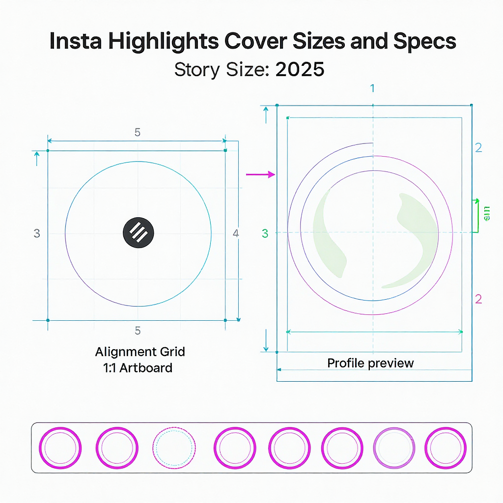
Correct sizes and specs (2025)
Aim to design once and export crisply for all displays.
| Use Case | Canvas Size (px) | Aspect | Safe Area (circle diameter) | Recommended File Type | Notes |
|---|---|---|---|---|---|
| Direct cover upload (from Camera Roll via Edit Cover) | 1080 × 1080 | 1:1 | ~70–80% of square (≈ 756–864 px) | PNG for graphics, JPG for photos | Crisp on retina displays; reduces aliasing on icon edges |
| Story frame (if you design covers inside a Story) | 1080 × 1920 | 9:16 | Center your icon; preview the circular crop | PNG or JPG | Use when publishing a Story first (not required for changing without posting) |
| Color & profile | N/A | N/A | N/A | sRGB | Ensures consistent color across mobile devices and dark mode |
Additional specs and tips:
- Safe area: Keep your icon perfectly centered with generous negative space. Avoid edge hugging. For a 1080 × 1080 canvas, keep your design inside an 800 px circle as a rule of thumb.
- Contrast: Test light and dark backgrounds. Many users browse in dark mode—ensure icons and text (if any) meet high contrast for legibility.
- File size: Keep files efficient (generally under 1 MB). PNG-24 for flat graphics, JPG 80–90% quality for photos.
- Naming: Use a consistent naming scheme to prevent mix-ups when updating (see workflow section).
---
Design principles that work
- Visual consistency: Lock in one icon style (line, filled, duotone), one stroke weight, and a limited color palette.
- Brand-first palette: Pull 2–4 primaries from your brand kit; add 1 accent for emphasis. Avoid rainbow sets unless it’s your signature.
- Simple iconography: Tiny circles punish detail. Prefer simple silhouettes over intricate shapes.
- Negative space: Give icons room to breathe; aim for ample padding inside the circle.
- High contrast: Ensure icons are clearly visible at a glance. Test on a small phone screen at arm’s length.
- Centering and alignment: Use guides; keep icons optically centered. Balance asymmetrical shapes visually, not just mathematically.
- Stroke weight: Keep consistent stroke widths across all icons; adjust for visual equity if certain icons appear heavier.
- Accessibility: Avoid color-only meaning. Use distinct shapes for categories. Check color contrast in both light and dark environments.
- Test on devices: AirDrop or send test images to multiple phones; view them in-app before committing.
---
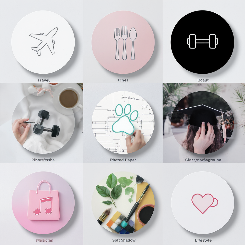
Aesthetic ideas by niche
- Minimalist line icons on solid pastels: Great for coaches, creators, wellness brands; calming and approachable.
- Duotone gradients for tech/creators: Modern and eye-catching; pair with simple white glyphs.
- Boho neutrals for lifestyle: Beige, clay, olive tones; hand-drawn icon vibe for warmth.
- Bold monochrome for e-commerce: High-impact black/white or brand color backgrounds with solid icons.
- Photo-based covers (soft overlays) for travel/food: Use slightly desaturated photos with a subtle tinted overlay and a white icon for legibility.
- Illustrated stickers for personal brands: Quirky doodles or badge-like stickers add personality.
- Editorial type-led covers: Single letter or ultra-short label in a brand typeface—clean and premium.
How to choose:
- Audience: Match the visual language your audience expects (e.g., playful for Gen Z, refined for luxury).
- Category clarity: Make it scannable—could someone guess the category in half a second?
- Platform parity: Align with your website and other social channels for cohesive brand recall.
---
Tools and free templates
- Canva: Search “Instagram highlight cover” and filter by Free. Customize colors, swap icons, export PNG.
- Figma: Create 1080 × 1080 frames with circle guides. Use components to standardize. Export with sRGB.
- Photoshop/Illustrator: Build master templates with guides and artboards; best for custom icon sets.
- Procreate: Hand-draw icons; export transparent PNGs for placement on brand backgrounds.
Where to find free icons (check licenses):
- The Noun Project (attribution or paid license)
- Material Symbols/Icons (Google)
- Flaticon (review license per icon pack)
- Iconify, Feather Icons (open-source options)
Search keywords:
- “outline icons pack,” “UI glyphs,” “duotone icons,” “minimal stickers,” “boho icons,” “travel pictograms”
Build a reusable template:
- Create a brand color library and typography styles.
- Make a master frame with a centered circle guide, grid, and export settings.
- Store icons as components for consistent stroke weight and size.
Example template meta (for your design file):
Canvas: 1080x1080 (sRGB)
Guides: Center lines; circle guide = 820 px diameter
Icon grid: 8-pt base, icon size 600–700 px
Stroke: 4–6 px (optically adjusted)
Export: PNG @1x (1080 px), backup JPG @90% quality
---
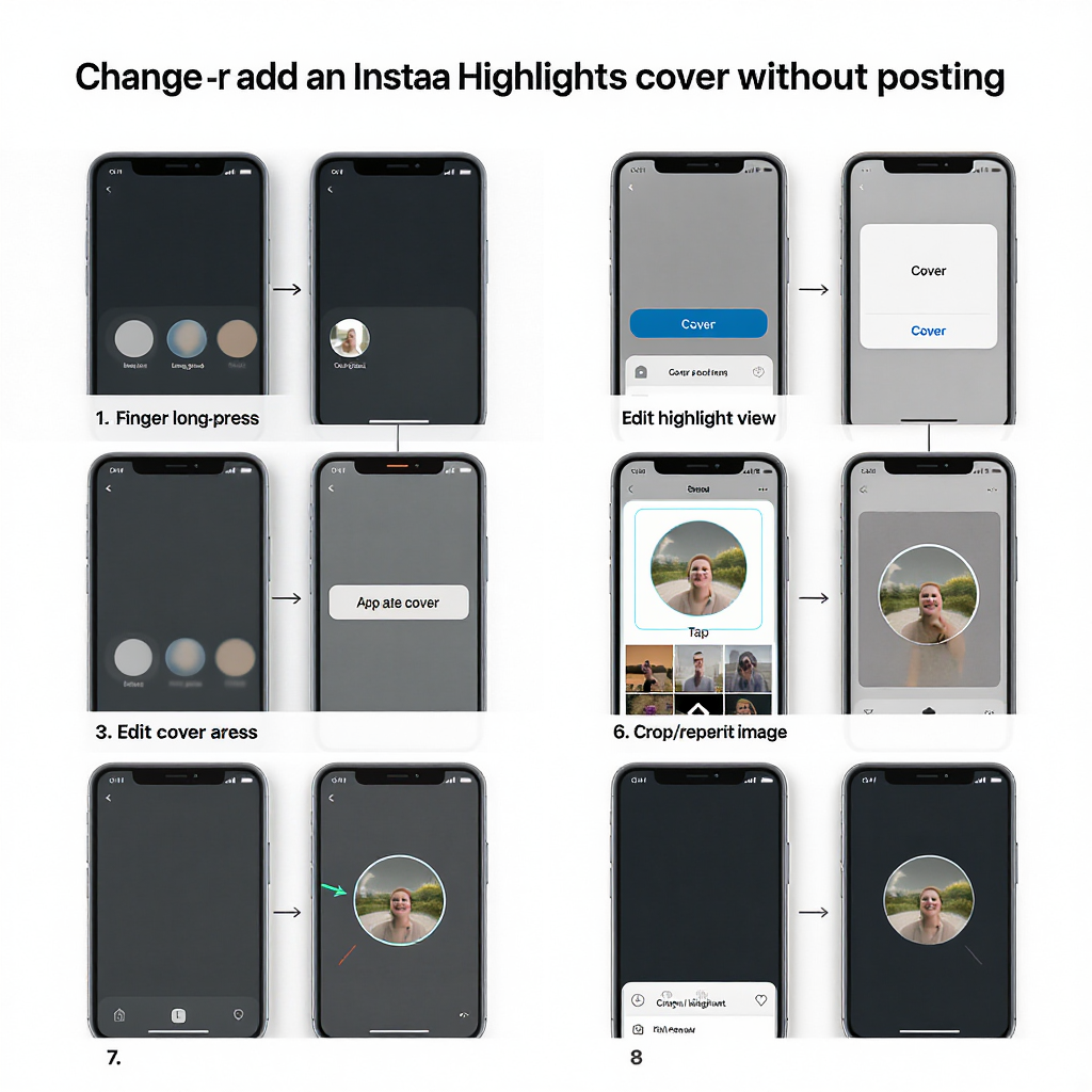
Step-by-step: change or add an Insta Highlights cover without posting (iOS/Android, 2025)
You do not need to publish a Story to update a cover.
Update an existing Highlight:
- Go to Profile.
- Long-press the Highlight you want to change.
- Tap Edit Highlight.
- Tap Edit Cover.
- Tap the photo icon to open your Camera Roll.
- Select your prepared 1080 × 1080 graphic.
- Pinch/drag to center the icon within the circular crop.
- Tap Done (iOS) or the checkmark (Android) → Done again to save.
Set a cover for a new Highlight (without posting a new Story):
- Ensure the Stories you want are archived (Settings → Privacy → Story → Save story to archive: On).
- On your profile, tap New under Highlights.
- Select archived Stories to include → Next.
- Tap Edit Cover → photo icon → choose your cover from Camera Roll.
- Name your Highlight → Add.
Reorder Highlights for visual flow:
- Long-press any Highlight → Drag to reorder (if available). If drag isn’t available on your device/version, re-add a Story to the Highlight you want to bump to the front (it moves to the first position). Remove the temporary Story if needed after it moves.
Pro tips:
- Keep a “Covers” album in your Photos app for quick access.
- Test placement to avoid icon cropping on the edges.
---
Organization and naming strategy
Choose 5–8 core categories:
- Examples: New, Bestsellers, FAQs, Reviews, Tips, BTS, Shipping, Guides
Labels vs. icon-only:
- Icon-only: Cleaner, universal; rely on intuitive imagery.
- Short labels: 8–12 characters max; avoid long words that may truncate in some UI states.
Ordering logic:
- Funnel-friendly: Left to right = awareness → consideration → proof → action (e.g., New → How it Works → Reviews → FAQs → Shipping).
- Seasonal first: Place seasonal or campaign Highlights at the front.
- Evergreen center: Keep timeless categories (e.g., About, Services) centered.
Seasonal/campaign sets:
- Create alternate cover sets for promos; archive older sets after the campaign ends to reduce visual clutter.
---
Common mistakes to avoid (and quick fixes)
- Tiny or overly detailed icons that blur:
- Fix: Use simpler shapes and thicker strokes; increase icon size within the safe area.
- Busy backgrounds that reduce contrast:
- Fix: Add a solid color or subtle gradient; place a soft overlay behind the icon.
- Off-center graphics cut by the circle crop:
- Fix: Use center guides; preview the circular crop in your design app.
- Inconsistent line weights and colors:
- Fix: Define and lock a stroke style; use a shared color library.
- Exporting at low resolution:
- Fix: Export at 1080 × 1080, sRGB; avoid upscaling later.
- Not testing on multiple screen sizes:
- Fix: Send test images to different phones; verify in dark and light mode.
---
Optimization, workflows, and maintenance
Batch-design and export:
- Plan your set on paper or in a doc first.
- Batch-create backgrounds, then place icons, then export all at once.
File naming conventions:
- Use sortable names to keep versions tidy and map to categories.
2025-01_highlight-new_v03.png
2025-01_highlight-bestsellers_v03.png
2025-01_highlight-faqs_v03.png
2025-01_highlight-reviews_v03.png
2025-01_highlight-tips_v03.png
Keep a shared asset library:
- Store masters (Figma/PSD), exported PNGs, color tokens, and icon sources in a shared folder for your team.
A/B test cover styles:
- Variant A: solid background + white line icon
- Variant B: subtle gradient + filled icon
- Rotate for 2–4 weeks each; track profile visits and Highlight taps.
Measure impact:
- Monitor Profile visits and “Taps on Highlights” directionally via Insights.
- Compare session depth: Are people tapping into multiple Highlights?
- For Stories inside Highlights with link stickers, track link clicks (available within insights lookback windows) and use UTM parameters to attribute traffic.
Refresh cadence:
- Quarterly, at minimum; instantly for major campaigns or rebrands.
- Keep a “Next Set” folder to swap quickly for seasonal pushes.
---
Quick FAQs
Do Insta highlights covers affect the algorithm?
- Not directly. Indirectly, better covers can increase taps and time spent exploring, which correlates with stronger engagement signals.
Can I use copyrighted icons?
- Use licensed icon packs or create originals. Read each pack’s license (attribution, commercial use) before publishing.
What’s the ideal number of Highlights?
- 5–8 core Highlights is a sweet spot for clarity without overwhelm. Add seasonal or campaign Highlights temporarily.
How often should I update covers?
- Quarterly or per campaign. Update when your brand evolves, color palette changes, or categories shift.
Why do my covers look blurry after upload?
- Common causes: low-res export, over-compression, tiny icon details. Re-export at 1080 × 1080, simplify the icon, use PNG for flat graphics, and ensure sRGB.
Why did colors shift on upload?
- Ensure sRGB color profile. Avoid wide-gamut profiles. Slight compression can occur—test both PNG and high-quality JPG to see which preserves color better for your art.
Can I change my Insta highlights cover without posting a Story?
- Yes. Use Edit Highlight → Edit Cover → pick from Camera Roll, then center and save.
---
Wrap-up
An Insta highlights cover set that’s consistent, high-contrast, and on-brand can meaningfully improve first impressions and guide visitors to your best content. Lock in the right size (1080 × 1080), respect the circular safe area, and keep your iconography simple. With a solid workflow—templates, naming conventions, and periodic refreshes—you’ll maintain a profile that looks great and performs even better.
Summary
Focus on a 1080 × 1080 canvas, keep icons within a generous circular safe area, and maintain high contrast and stylistic consistency. Build a reusable template, adopt clear file naming, and refresh quarterly or around campaigns. Update covers directly via Edit Highlight → Edit Cover—no Story posting required.