Instagram 4:5 Format Tips for Higher Post Engagement
Learn how to use Instagram's 4:5 format to optimize vertical posts, boost mobile engagement, and create scroll-stopping visuals for your audience.
Understanding the Instagram 4:5 Format and Why It Matters
If you want to increase visibility and engagement on Instagram, mastering the Instagram 4:5 format is essential. This popular vertical aspect ratio optimizes how your content appears on mobile devices – where the vast majority of users browse – by giving your post more on-screen real estate. In a fast-scrolling feed, larger vertical images can grab attention more effectively and encourage interaction.
By leveraging the additional height, you can showcase more detail, tell richer visual stories, and keep your audience focused on your post for longer.

Instagram supports several aspect ratios, but the 4:5 format is especially powerful for enhancing clarity, emphasizing focal points, and reducing the likelihood of unwanted cropping.
---
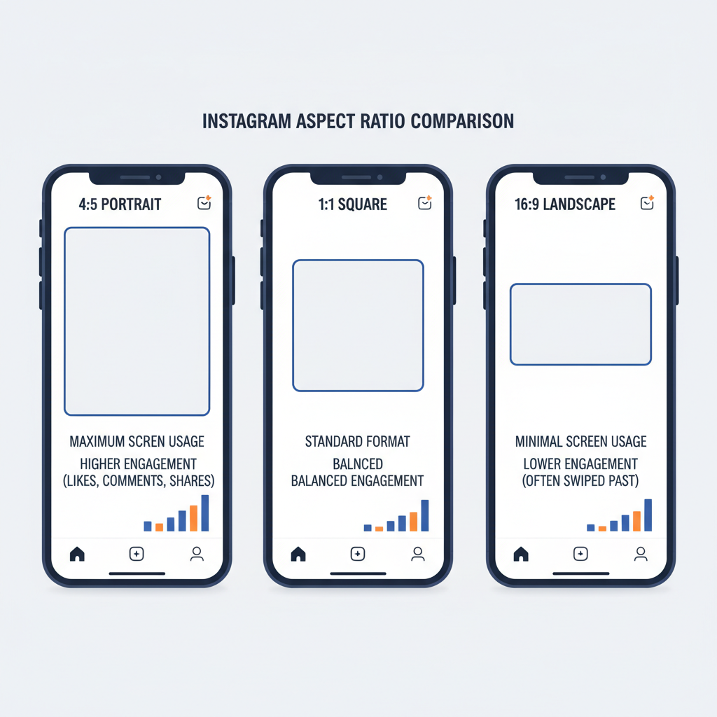
Comparing 4:5 Ratio vs Other Formats
To see why the 4:5 aspect ratio stands out, here’s how it compares with other common formats:
| Format | Aspect Ratio | Common Resolution | Feed Space Occupied | Best For |
|---|---|---|---|---|
| Square | 1:1 | 1080 x 1080 | Moderate | General posts, profile grids |
| Vertical | 4:5 | 1080 x 1350 | High | Portraits, tall infographics |
| Widescreen | 16:9 | 1080 x 608 | Low | Landscape scenes, cinematic videos |
Because 4:5 occupies more vertical space without distorting or cropping, it naturally draws the eye. This can translate into higher engagement compared to square or horizontal posts.
---
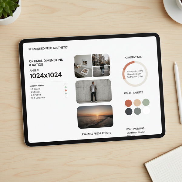
Ideal Pixel Dimensions and Resolution Settings
For the Instagram 4:5 format, use 1080 x 1350 pixels for sharp, professional-quality visuals. Matching these dimensions maximizes clarity across devices.
Best practices:
- Preferred formats: JPEG or PNG for images.
- Resolution: 72 dpi for optimal web viewing.
- Video: Edit and export at 1080 x 1350 pixels with a 4:5 aspect ratio.
- File sizes: Keep under Instagram’s limits (15MB image, 4GB video).
---
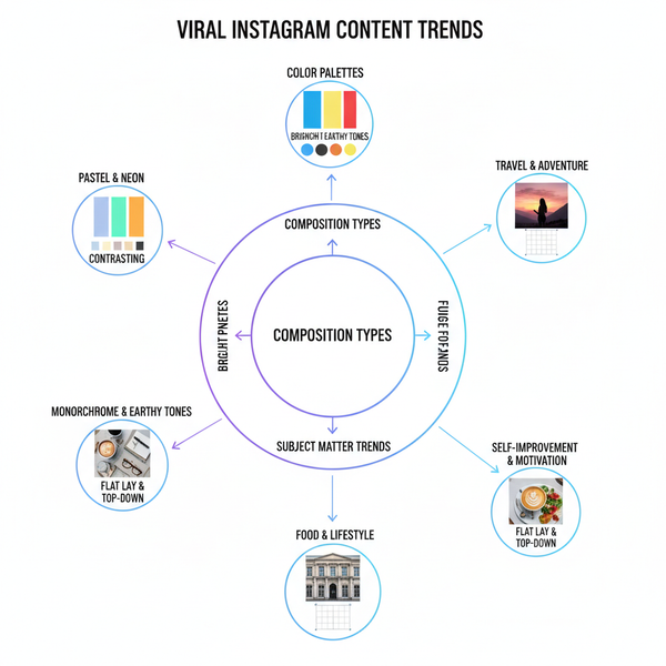
Content Types That Benefit Most
Some content categories naturally excel in the 4:5 vertical layout:
- Portrait Photography – Capture full-body or upper-body shots with more impact.
- Infographics – Reduce crowding; make text easy to follow.
- Product Images – Provide detailed views without tight cropping.
- Event Flyers – Design content for mobile-first reading.
- Teaser Content – Lead audiences toward Stories or Reels.
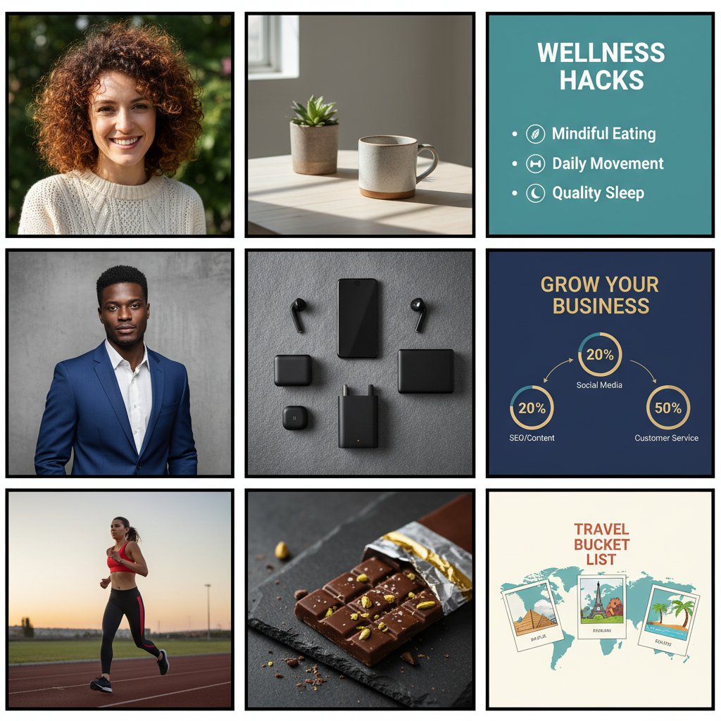
The extra height is ideal for combining imagery with text, keeping visual hierarchy clear.
---
Design Tips for Visual Balance
The tall canvas requires strategic composition:
- Rule of Thirds – Position important elements along intersecting guide lines.
- Strong Anchors – Place the focal point centrally or slightly above center.
- Text Placement – Keep crucial text in the mid-section for clear visibility.
- Negative Space – Use background spacing to avoid a crowded feel.
Remember: Viewers first see the top of your image. Make this portion visually compelling to encourage continued scrolling.
---
Cropping and Composition for Mobile-First Viewing
Since most Instagram views are on mobile devices:
- Preview on mobile before posting.
- Avoid overly fine lines or small text.
- Crop so essential elements remain clear and unobstructed.
- Keep center alignment in mind for profile grid thumbnails (1:1 crop).
---
Maximizing Feed Real Estate and Scroll-Stopping Power
The 4:5 format automatically gives you:
- More on-screen presence than 1:1 or 16:9.
- Additional opportunities to showcase detail.
- Better hooks with vibrant colors, bold text, or dynamic layouts.
Pro Tip: Motion content like short videos or cinemagraphs in 4:5 can increase dwell time and shares.
---
Best Practices for Captions and Hashtags
Complement visuals with effective text:
- Lead with your hook in the first sentence.
- Use line breaks, emojis, and formatting for readability.
- Include CTAs such as “comment below” or “save for later.”
- Mix broad and niche hashtags to widen reach.
- Consider placing hashtags strategically in captions or comments.
---
A/B Testing Different Formats
Measure the direct impact of ratio choice:
- Publish the same creative in both 1:1 and 4:5.
- Compare metrics – e.g., likes, comments, saves, impressions.
- Use Instagram Insights or analytics platforms.
- Keep other variables consistent for accurate comparisons.
Testing lets you adapt content strategy based on real-world performance.
---
Common Mistakes to Avoid
Avoid these pitfalls when using 4:5:
- Placing text outside safe zones.
- Using blurry or low-quality images.
- Overloading the frame with too many objects.
- Uploading incorrect size/ratio (risking crop issues).
- Ignoring profile grid cropping.
---
Recommended Tools and Apps for Editing
Tools that simplify 4:5 design work:
- Canva – Easy templates at 1080 x 1350.
- Adobe Photoshop – Advanced control for professionals.
- Lightroom Mobile – Streamlined color grading.
- InShot – Fast mobile video editing with ratio adjustments.
- Figma – Collaborative design platform.
- VSCO – Cohesive filter sets for branding.
---
Summary and Next Steps
The Instagram 4:5 format gives you a proven visual advantage in the feed, helping your posts stand out and perform better. By mastering optimal dimensions, choosing content well suited to vertical layouts, and refining your design and captions, you can maximize both reach and engagement.
Start experimenting with your next few posts. Track metrics, assess audience response, and refine your creative approach so that your feed consistently stops the scroll and converts attention into meaningful interactions.