Instagram and TikTok Logo History, Meaning and Evolution
Explore the history, meaning, and evolution of Instagram and TikTok logos, uncovering the design choices and branding strategies behind them.

Instagram and TikTok Logo History, Meaning, and Evolution
Instagram and TikTok are two of the most influential social media platforms of the 21st century, and their visual identities have played a key role in their global success. Each platform’s logo — whether it’s Instagram’s vibrant camera glyph or TikTok’s electric musical note — embodies its brand personality, mission, and target audience. In this guide, we’ll dive into the Instagram and TikTok logo history, symbolism, design elements, and the strategic thinking behind their evolution, offering lessons for marketers and designers alike.

---
Origins of the Instagram Logo: From Camera Icon to Minimalist Glyph
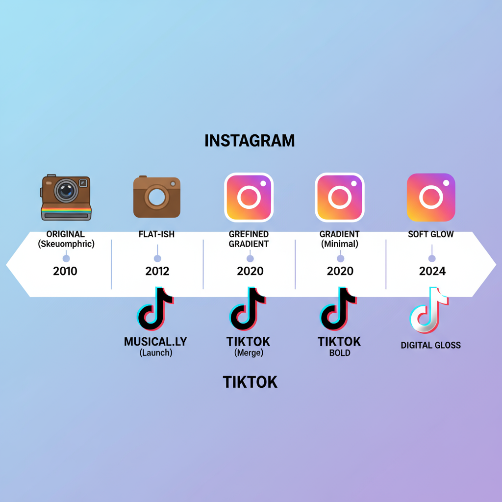
When Instagram launched in 2010, its logo was a detailed, skeuomorphic illustration of a vintage Polaroid camera. Created initially by co-founder Kevin Systrom and later refined by photographer Cole Rise, it conveyed a nostalgic nod to instant photography. The brown-and-cream tones with a rainbow stripe symbolized creativity, playfulness, and community.
In 2016, Instagram unveiled a major rebrand — a flat, minimalist camera outline set against a striking pink-to-orange gradient background. This change aligned with modern, mobile-first design trends, enhancing scalability and versatility across devices.
The Instagram logo’s evolution demonstrates a move from literal photographic imagery toward abstract, bold simplicity optimized for digital culture.
---
Origins of the TikTok Logo: Musical Note Concept and Neon Effect
TikTok, launched globally in 2017 by ByteDance, entered the social media scene with a logo rooted in music and performance culture. Designed in-house by an anonymous artist, the emblem centers on a stylized, 3D-like musical note, representing the platform’s early focus on lip-syncing and music-based content.
The use of cyan and magenta against a deep black background creates a neon concert-light effect, hinting at energy, nightlife, and youth culture. Subtle glitch motions in animations add a modern, digital edge that resonates with trend-focused users.

---
Symbolism and Meaning Behind Each Logo’s Colors and Shapes
Colors and shapes shape brand identity and trigger emotional connections. Here’s a breakdown of how Instagram and TikTok use them:
| Brand | Color Palette | Shape/Design | Symbolism |
|---|---|---|---|
| Gradient of pink, purple, orange, yellow | Rounded square with camera glyph | Warmth, creativity, diversity of content, inclusive vibe | |
| TikTok | Cyan, magenta, white, black | Stylized musical note | Energy, youth culture, music-driven creativity |
---
Major Redesigns and Rebranding Milestones for Instagram
- 2010–2011: Debut with Polaroid-inspired icon, detailed textures, retro aesthetic.
- 2011–2016: Subtle refinements, crisper leather and lens details.
- 2016: Bold rebrand to a flat glyph with vibrant gradient; initial backlash eased as users embraced its modern appeal.
- Post-2016: Small tweaks to color vibrancy and contrast for OS compatibility.
---
Major Redesigns and Rebranding Milestones for TikTok
- 2016 (Douyin in China): Musical note with neon red and blue lighting on black background.
- 2017 Global Launch: Adjusted for international appeal, improved contrast, and note definition.
- Minor Updates: Wordmark refinements, letter-spacing adjustments, and subtle 3D depth preservation.
TikTok’s visual strategy has remained remarkably consistent, prioritizing instant recognition.

---
How Both Logos Reflect Brand Identity and Target Audience
- Instagram: Broad audience, from professional creators to casual sharers. Gradient suggests inclusion, variety, and creativity.
- TikTok: Primarily Gen Z and younger millennials, with a focus on music, viral trends, and fast-moving creativity. Neon colors evoke nightlife and excitement.
Both logos thrive in mobile-first contexts, ensuring visibility at small sizes.
---
Impact of Logo Aesthetics on User Attraction and Marketing Success
Effective logos can boost brand recall, engagement, and app downloads. Instagram’s inviting gradient draws users in, while TikTok’s neon pop makes it distinct among dozens of app icons. Both companies extensively incorporate their logos into marketing — from billboards and merchandise to animated intro stings in ads.
---
Comparison of Instagram and TikTok Logo Design Philosophies
| Aspect | TikTok | |
|---|---|---|
| Design Style | Minimalist glyph over gradient | Neon note with 3D effect |
| Primary Symbol | Camera outline | Musical note |
| Emotional Tone | Warm, nostalgic, inclusive | Energetic, futuristic, youth-driven |
| Change Frequency | One major rebrand | Minor iterative updates |
---
Use of Logos in App Icons, Promotional Material, and Brand Campaigns
- App Icons: Prioritize recognizability and clarity even at minimal pixel sizes.
- Promotional Materials: Featured on physical products, event signage, commercials.
- Brand Campaigns: Instagram integrates its logo into Story formats and AR filters; TikTok frequently animates its neon note in ad creative.
Seasonal logo variants and interactive effects keep the designs fresh without losing brand equity.
---
Controversies, Parodies, and Cultural References Involving the Logos
- Instagram 2016 Gradient Backlash: Users initially criticized the shift from detailed skeuomorphism to flat design.
- TikTok Logo Memes: Creative reinterpretations of the neon note appear in dance challenges and parody art.
- Both have inspired copycat app icons, underlining their cultural impact.
---
Designer Perspectives: Why These Logos Work in Digital Contexts
Design experts often cite:
- Scalability: Works across devices from smartwatches to large displays.
- Color Theory Use: High-contrast colors improve visibility.
- Memorability: Simple, symbolic shapes make recall almost instant.
Both Instagram and TikTok demonstrate best practices for cohesive, impactful app iconography.
---
Tips for Brands: Lessons Learned from Instagram and TikTok’s Logo Strategies
- Embrace Simplicity: Avoid unnecessary complexity in symbol design.
- Ensure Adaptability: Logos must remain legible across media.
- Leverage Color Psychology: Select palettes that evoke your target audience’s emotions.
- Maintain Consistency: Establishing recognizability through steady design language is critical.
- Take Calculated Risks: An innovative rebrand can define an era of brand growth.
---
Conclusion: The Role of Logo Design in Social Media Dominance
The Instagram and TikTok logo journeys reveal that brand identity is as much visual as it is functional. Instagram’s warm, evolving camera icon and TikTok’s bold, immersive musical note go beyond aesthetics to fuel user affinity and community identity.
For brands, the lesson is simple: an effective logo must be relevant, memorable, and flexible enough to evolve with your audience. If you’re looking to elevate your brand in the fast-moving digital space, studying the strategies behind these iconic designs is the perfect place to start.
Ready to transform your logo into a powerful brand asset? Learn from Instagram and TikTok — and start building your own iconic visual identity today.


