Instagram Carousel Design Tips to Increase Engagement
Learn proven Instagram carousel design tips, from compelling hook slides to visual cues, to boost engagement, brand recall, and swipe-through rates.

Instagram Carousel Design Tips to Increase Engagement
Instagram carousels are one of the most effective post formats for boosting visibility, sharing value, and driving meaningful audience interaction. Unlike single-image posts, carousels encourage users to swipe, keeping them engaged on your content longer. This extended interaction can improve your performance in the algorithm and help you convert casual viewers into loyal followers.
Below, you’ll learn proven Instagram carousel design tips covering visual hierarchy, storytelling, visual cues, and more—so you can design posts that stop the scroll and inspire engagement.

---
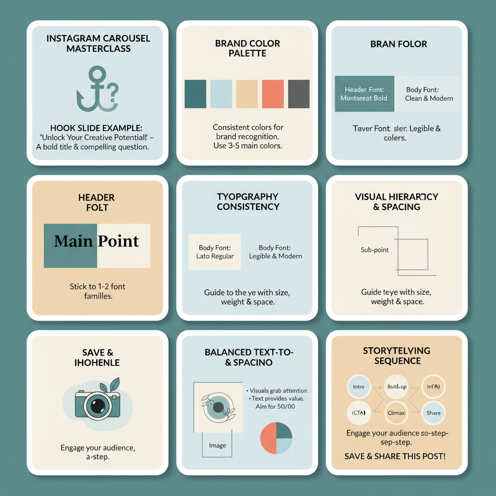
Start with a Compelling Hook Slide
The first slide is your visual headline—it determines instantly whether someone stops to swipe or scrolls past. You have mere seconds to capture attention.
Tips for a strong hook slide:
- Open with a bold statement or question that sparks curiosity.
- Use large, legible typography with high color contrast.
- Select intriguing visuals—avoid generic stock images for the opener.
- Ensure your hook delivers on the promise of the rest of the carousel.
Without a standout first slide, even the best-designed later slides will go unseen.
---
Maintain Consistent Brand Colors and Typography
Brand recognition is built through visual consistency—your audience should recognize your posts at a glance.
Why brand consistency matters
- Strengthens brand identity and recall.
- Builds familiarity and trust.
- Creates recognizability even outside your own feed.
Implementation tips:
- Develop a brand style guide with HEX color codes and approved fonts.
- Store brand kits in tools like Canva, Figma, or Adobe Express.
- Keep font sizes and styles consistent for headings, subheadings, and body text.
---
Use a Clear Visual Hierarchy and Adequate Spacing
A clean visual hierarchy allows your audience to process the key idea quickly without getting lost in clutter.
Components of strong visual hierarchy
- Headings: Large, bold introductions for each slide.
- Subheadings: Slightly smaller, offering supporting details.
- Body text: Minimal and easy to read at mobile sizes.
- Whitespace: Buffers around content to improve focus.
With proper hierarchy, your message becomes clear in seconds.
---
Balance Text and Visuals for Maximum Clarity
Overloaded slides drive viewers away. Strive for impact over volume.
Balance tips:
- Keep text between 15–30 words per slide.
- Pair text with context-rich visuals (icons, illustrations, or photos).
- Split dense information across multiple slides if needed.
- Let visuals complement—not compete with—the message.
Remember that Instagram is a visual-first platform, so design for scannability.
---
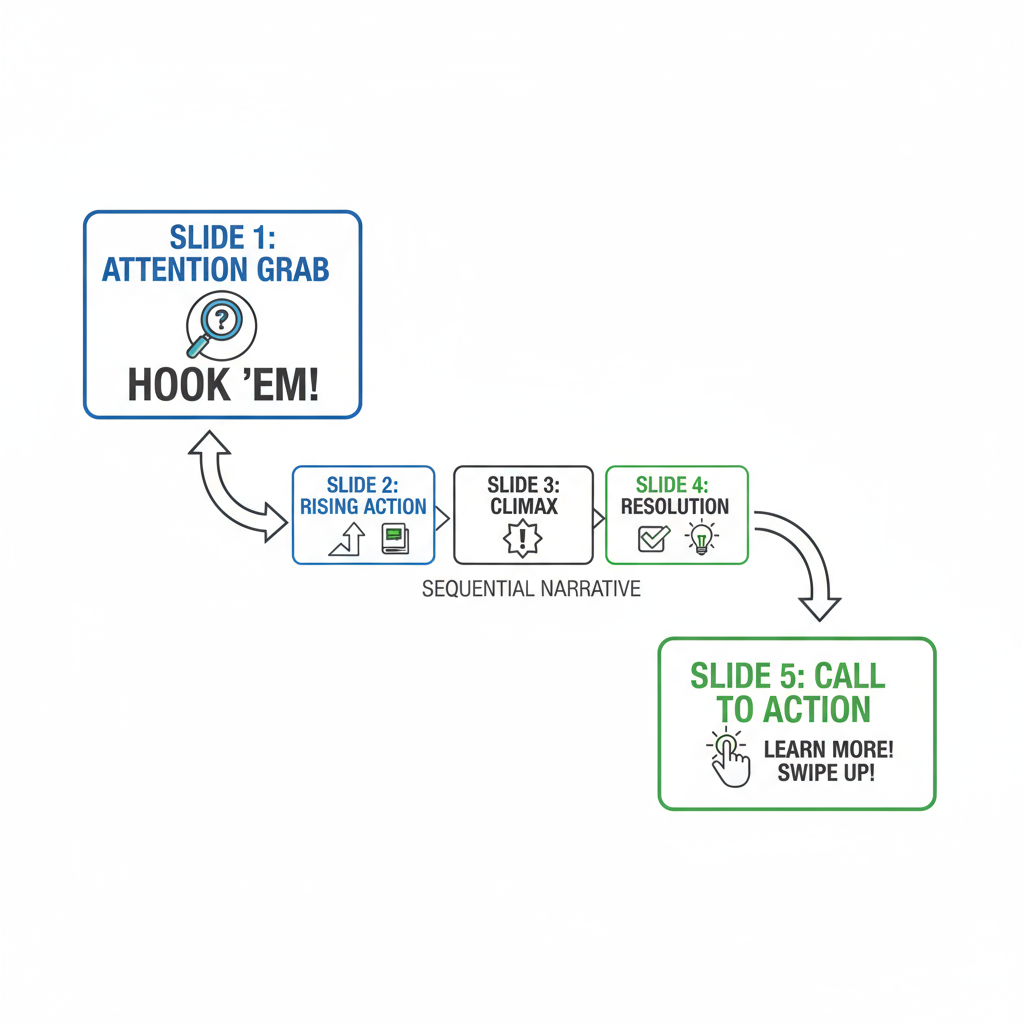
Apply Swipe-Worthy Storytelling Techniques
The most engaging carousels aren’t just collections of unrelated slides—they’re structured visual narratives.
Suggested storytelling flow:
- Hook: First slide captures attention.
- Setup: Early slides introduce problem or context.
- Value: Middle slides present solutions or insights.
- Highlight: Showcase the most impactful tip.
- Resolution: Conclude with a key takeaway or call-to-action.
Compelling stories keep audiences swiping to the end, improving completion rates.
---
Leverage Arrows, Shapes, and Other Visual Cues
Small navigation cues can significantly improve swipe-through rates.
Cue ideas:
- Arrows pointing toward the right edge.
- Progress markers such as “Slide 2/8.”
- Shapes, lines, or partial previews of the next slide.
Integrate these subtly so they guide rather than distract.
---
Focus on High-Quality Images and Custom Graphics
Your carousel visuals should reflect your brand’s professionalism and tone.
Best practices:
- Use high-resolution images (1080×1080 px minimum).
- Favor custom graphics over overused stock photos.
- Apply consistent editing styles for cohesion.
- Align design style with brand personality (playful, minimalist, luxurious, etc.).
Premium visuals elevate perceived brand value and can increase shares.
---
Use Contrast and Emphasis to Highlight Key Points
Proper contrast ensures readability and directs attention to what matters most.
| Technique | Purpose | Example Usage |
|---|---|---|
| Color contrast | Maintain text visibility | White text on dark blue background |
| Font weight | Emphasize keywords | Bold for CTAs like “Shop Now” |
| Background shapes | Highlight specific sections | Yellow outline around a featured tip |
---
End with a Strong Closing Slide
Treat your last slide as the conversion moment.
Closing slide options:
- Clear call-to-action: “Save,” “Follow for more,” “Visit link in bio.”
- Brief recap of top tips.
- Invitation for comments—pose a question visually and in the caption.
Highlight the CTA with contrast, concise copy, and an incentive to act.
---
Test Different Carousel Lengths and Monitor Analytics
Perfecting carousel design is an iterative process. Experiment with lengths from 3 to 10 slides to find the ideal balance for your audience.
Key metrics to track:
- Swipe-through (completion) rate.
- Saves and shares.
- Engagement per slide via Insights.
- Correlation between reach and engagement.
Adjust your design choices based on data for continuous improvement.
---
Summary & Next Steps
An effective Instagram carousel pairs strong visual design with purposeful content flow. Start with a magnetic hook, maintain brand consistency, structure for readability, and guide viewers seamlessly from start to finish. By applying these Instagram carousel design tips and regularly reviewing analytics, you can significantly boost engagement and brand recognition.
Call to Action:
Ready to put these strategies into action? Choose one upcoming post and rework it into a swipe-worthy carousel using these techniques—then track your results to see the difference.


