Instagram Facebook TikTok Logo Evolution and Branding Analys
Explore the evolution of Instagram, Facebook, and TikTok logos, analyzing design changes, branding strategy, and cultural impact over time.

Introduction: The Power of Social Media Logos in Modern Branding
In today’s hyper-connected digital environment, social media platforms have become household names worldwide, and their logos serve as the most identifiable brand touchpoint. Whether viewed in an app store, spotted in advertisements, or appearing as a share icon on websites, these visual symbols are the first cues to recognition and trust among billions of users.
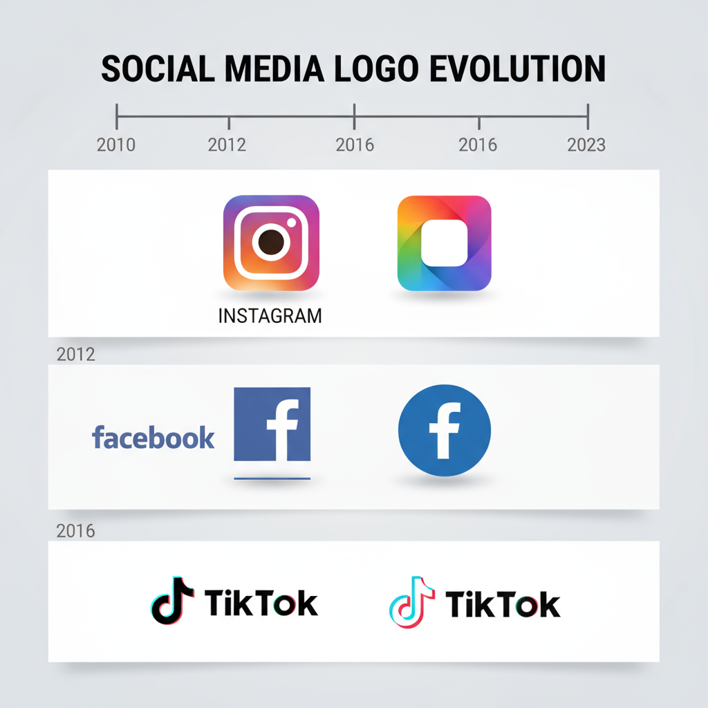
For Instagram, Facebook, and TikTok, logo design has evolved over time to accommodate changes in branding, audience, and technology trends. Understanding the Instagram Facebook TikTok logo evolution highlights how intentional design plays into marketing psychology and corporate identity.
---
Brief History of Each Platform & Their Original Logos
Launched in 2010, Instagram debuted with a vintage camera illustration—brown, cream, with a rainbow strip—signifying the nostalgic feel of instant photography. The original logo was skeuomorphic, detailed, and aimed at reflecting the app’s core purpose: sharing snapshots.
Founded in 2004, Facebook’s first logo featured white lowercase text on a deep blue background. The choice of blue stemmed from Mark Zuckerberg’s partial red-green color blindness, while the lowercase lettering suggested approachability.
TikTok
TikTok—released internationally in 2017 after merging with Musical.ly—instantly adopted a distinctive neon-style music note as its logo. The black backdrop with cyan and magenta accents conveyed vibrant energy that appealed to music lovers and creative youth.
---
Major Redesigns: Instagram’s Journey
Instagram’s biggest logo shift occurred in 2016 when its detailed photographic emblem was replaced by a flat, vivid gradient icon resembling a simplified camera. This bold leap into gradient minimalism was met with mixed reactions yet aligned with broader design trends favoring clarity on mobile devices.
Key motivations for the redesign:
- Increase scalability for small screen sizes and app icons.
- Modernize the brand to embrace diverse visual content beyond photography.
- Integrate seamlessly with evolving UI themes in iOS and Android.
---
Facebook’s Logo Evolution Toward Meta Identity
Facebook maintained its typography-focused logo for years, tweaking kerning and simplicity. In 2019, the company introduced a corporate rebrand under the name Meta, shifting emphasis from the platform-specific blue logo to a multicolor infinity symbol representing its metaverse vision.
Changes Over Time:
- Adjustments to letter shape and spacing for improved legibility.
- Slight changes in blue tone to modernize look and harmonize with website design.
- Expansion of brand usage to reflect umbrella ownership of Instagram, WhatsApp, and Oculus.
---
TikTok’s Iconic Music Note & Cultural Resonance
TikTok’s logo has remained mostly consistent since inception—a stylized ‘d’-shaped musical note that appears to vibrate thanks to layered cyan and pink strokes. This motif perfectly aligns with TikTok’s emphasis on music, dance, and rhythm-based creativity.
Cultural impact:
- Associating the brand with energetic youth culture.
- Cross-border appeal through a recognizable music symbol.
- Signature contrast colors stand out against both light and dark app themes.
---
Comparative Analysis: Colors, Shapes, and Typography
| Platform | Primary Colors | Shape/Form | Typography |
|---|---|---|---|
| Pink to orange gradient | Rounded camera silhouette | Sans-serif, bold | |
| Blue (#1877F2) | Simple wordmark | Lowercase/uppercase sans-serif | |
| TikTok | Black, cyan, magenta | Stylized music note | Custom geometric font |
Observations
- Instagram’s logo uses gradients to convey warmth and creativity.
- Facebook’s monochrome blue remains symbolic of trust and connectivity.
- TikTok’s high-contrast visuals spark excitement and quick attention.
---
Psychology of Colors & Shapes in Social Media Logos
Color psychology plays a central role in brand perception:
- Blue symbolizes trust, competence, and dependability (Facebook).
- Warm gradients evoke creativity and joy (Instagram).
- Neon contrasts stimulate energy and enthusiasm (TikTok).
Shape psychology influences audience connection:
- Rounded shapes (Instagram, TikTok) feel approachable and friendly.
- Rectangular and wordmark logos (Facebook) convey professionalism and clarity.
---
Cross-Platform Logo Consistency & Brand Loyalty
A consistent logo across web, mobile, and promotional assets reinforces recognition. Users develop implicit trust when they encounter identical symbols on different channels—critical for cross-platform campaigns where Instagram, Facebook, and TikTok content loops into each other.
Practical methods:
- Maintain fixed proportions in logo appearance.
- Consistent color codes for digital and print.
- Avoid outdated variants in new feature releases.
---
Logos in App Store Optimization (ASO) & Visual Search
Logos are pivotal in App Store Optimization:
- A clear, attractive logo increases tap-through rates.
- Distinctive design aids in visual search recognition; users remember icons before names.
- High-resolution variants improve listing quality under app marketplaces.
For Instagram, Facebook, and TikTok, logos directly affect discoverability, installation rates, and retention.
---
Impact of Logo Changes on User Engagement & Recognition
Redesigns can cause spikes or dips in engagement. When Instagram updated its logo, sentiment analysis initially indicated resistance, but metrics later showed enhanced recognition due to stronger contrast and memorability on mobile screens.
Measurement strategies:
- Compare daily active users before and after a logo change.
- Track mentions and sentiment on social platforms.
- Observe changes in app store rankings post-update.
---
Future Trends: Minimalistic Shifts
Design trends hint at future minimalism in social media logos:
- Reduction of gradients for flat tones in accessibility contexts.
- Monochrome variants for improved AR/VR adaptation.
- Responsive logos that dynamically adjust based on interface mode.
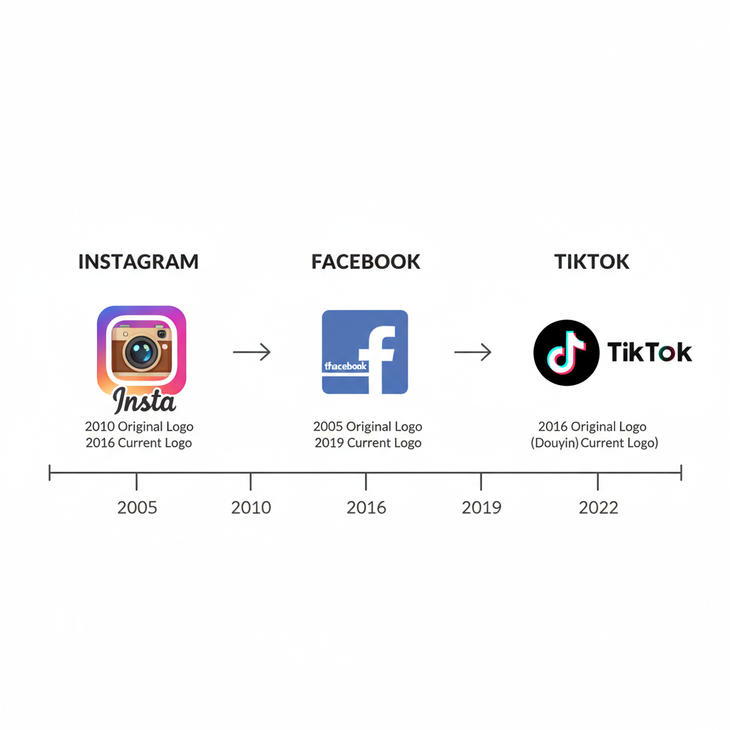
This may see Instagram’s vivid gradients, Facebook’s blue, and TikTok’s neon accents adapt to simplified palettes without losing their core brand essence.
---
Tips for Brands Adopting Social Media Logo Elements
Leveraging lessons from these giants:
- Color Strategy – select hues that align with your brand’s emotional tone.
- Scalability – design icons that remain clear at favicon size.
- Cultural Relevance – integrate shapes or symbols tied to your audience’s lifestyle.
- Consistency – never alter your core icon without a planned rollout.
- Testing – run A/B tests on logo variants before wider release.
---
Conclusion: Lessons from Instagram, Facebook, TikTok
The Instagram Facebook TikTok logo evolutions demonstrate that logos are dynamic—they adapt to technology, audience preferences, and cultural shifts. Instagram’s vibrant gradients, Facebook’s trust-inducing blue, and TikTok’s energetic neon note show how design can embody brand personality.
Key takeaway for modern brands: treat logos as living assets within a cohesive identity strategy. A well-crafted logo resonates across channels, strengthens loyalty, and remains flexible enough to evolve with its audience.
---
Summary:
From nostalgic cameras to neon notes and infinite loops, the evolution of Instagram, Facebook, and TikTok logos offers valuable lessons in visual branding and customer psychology. Whether designing from scratch or refining an existing symbol, focus on color, shape, scalability, and consistency to achieve lasting impact.
Call to Action: Explore your own logo strategy today—build a visual identity that connects, communicates, and endures in the ever-changing digital arena.


