Instagram Flyer Size and Dimensions Guide with Design Tips
Learn the optimal Instagram flyer sizes, formats, and design tips to create sharp, engaging visuals that boost promotions and mobile engagement.

Introduction to Instagram Flyers and Their Role in Promotions
In the fast-paced world of social media marketing, Instagram flyers have emerged as a powerful tool for grabbing attention and promoting offers, events, or announcements. With over a billion monthly active users on Instagram, leveraging a well-designed flyer tailored to the platform’s size requirements can significantly boost visibility and engagement. Unlike printed materials, Instagram flyers are designed for mobile screens, making correct dimensions and formatting critical to their success.
A poorly sized or formatted flyer can appear blurry, cropped, or hard to read—directly impacting performance and limiting reach. By understanding optimal Instagram flyer size guidelines, you can ensure your designs are both eye-catching and effective.
---
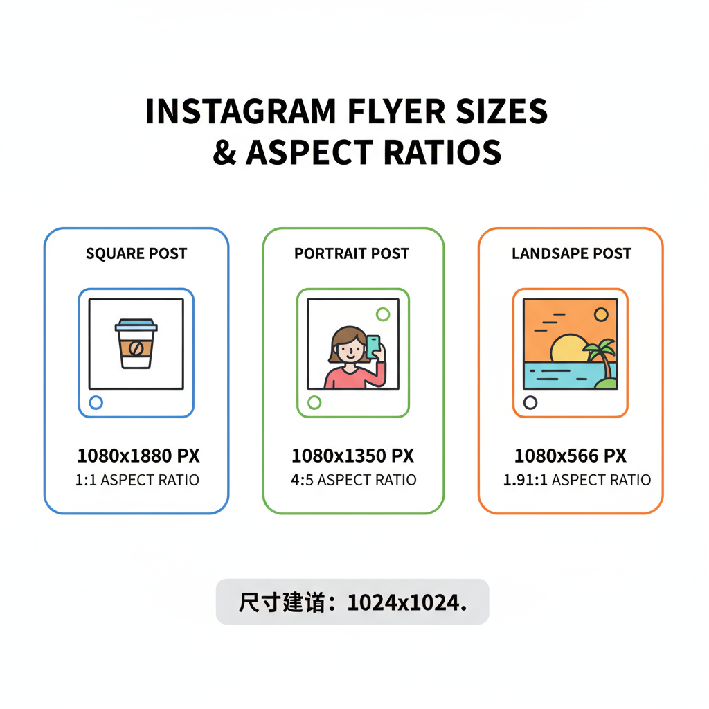
Standard Instagram Flyer Sizes (Pixels and Ratios) Explained
When you refer to Instagram flyer size, two factors matter most: dimensions in pixels and aspect ratio.
| Format | Recommended Dimensions (px) | Aspect Ratio | Best Use Case |
|---|---|---|---|
| Square | 1080 x 1080 | 1:1 | General promotions, easy viewing on all devices |
| Portrait | 1080 x 1350 | 4:5 | Maximizing vertical space for mobile screens |
| Landscape | 1080 x 566 | 1.91:1 | Event recaps, wide visuals, cinematic feel |
Instagram automatically optimizes posts to these ratios. Uploading images outside of these recommendations can result in awkward cropping or noticeable quality loss.
---
Understanding Square, Portrait, and Landscape Flyer Formats
Each flyer format offers strategic benefits:
- Square (1:1) – Balanced and versatile; works well for most types of promotional content.
- Portrait (4:5) – Captures more vertical space on mobile feeds, increasing potential engagement.
- Landscape (1.91:1) – Excellent for highlighting wide-format imagery, as in concerts, events, or real estate listings.
For text-heavy event promotions, portrait flyers typically outperform others since they are more visually dominant on mobile.
---
Optimal Resolution for Instagram Flyer Uploads
For maximum clarity, upload flyers at a minimum of 1080 pixels on the shortest side. Even though Instagram compresses images, higher-resolution originals present cleaner visuals after compression.
Pro tips:
- Keep file size under 30MB.
- Use JPEG for photographs and PNG for designs heavy in text or sharp graphics.
---
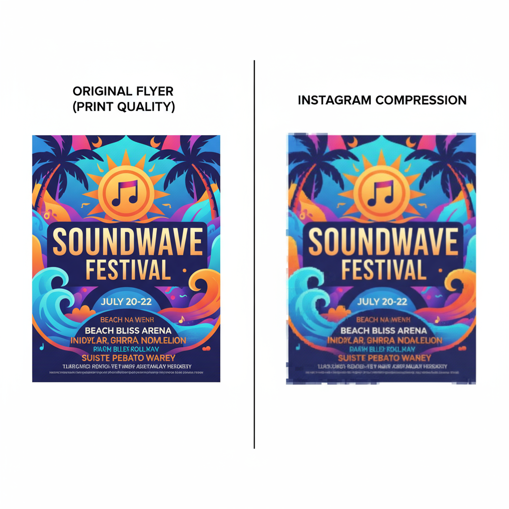
How Image Compression Impacts Flyer Quality
Instagram’s built-in compression can lead to:
- Blurred micro-text
- Reduced detail in images
- Color gradient issues (banding)
To mitigate these effects:
- Avoid using overly thin or script-style fonts at small sizes.
- Ensure high contrast between foreground and background.
- Export your final design with web-optimized settings for maximum retention.
---
Designing Within Safe Zones
Always keep essential content inside safe zones—approximately 14% margin from all edges. Devices and screen ratios vary, so this precaution ensures critical text and brand elements remain viewable.
---
Recommended Tools and Templates for Instagram Flyer Creation
You don’t have to start from scratch. Great design tools include:
- Canva – User-friendly, with Instagram-ready templates.
- Adobe Express – Quick drag-and-drop design.
- Figma – Perfect for collaborative layouts.
- Photoshop – Offers granular creative control.
Leverage templates to bypass sizing errors and maintain brand consistency.
---
Best Practices for Mobile-First Flyer Design
With over 90% of Instagram engagement coming from mobile, prioritize mobile design:
- Bold, Legible Headlines
- Concise Messaging – Limit text to key points; aim for 20–30 words.
- High Color Contrast – Ensure readability even in outdoor light.
- Clear Visual Hierarchy – One standout focal point per flyer.
---
Incorporating Brand Elements for Consistency
A cohesive brand presence improves recognition:
- Apply core brand colors consistently.
- Use no more than two complementary fonts.
- Feature a clear, compelling call-to-action (CTA).
- Keep layout tidy to guide viewer attention naturally.
---
A/B Testing Flyer Sizes and Formats
When in doubt, test:
- Run one campaign with a square flyer.
- Repeat with a portrait flyer for the same type of announcement.
- Track and compare metrics like likes, shares, saves, and clicks.
This gives you concrete insights into audience preferences.
---
Industry Examples of Effective Instagram Flyers
Practical applications include:
- Music Events – Portrait formats with bold artist names.
- Restaurants – Square close-ups of dishes set against vibrant backgrounds.
- Real Estate – Landscape shots capturing entire property exteriors.
Each aligns the creative layout with platform strengths.
---
Common Flyer Design Mistakes to Avoid
Stay clear of these issues:
- Incorrect sizing leading to blur.
- Overcrowding the flyer with text blocks.
- Poor foreground-background contrast.
- Ignoring safe zones.
- Uploading screenshots instead of original image exports.
---
Final Instagram Flyer Posting Checklist
Before posting, confirm:
- ✅ Correct size and ratio
- ✅ Minimum 1080px shortest side
- ✅ Safe zone observed for key elements
- ✅ Brand guidelines upheld
- ✅ Strong CTA included
- ✅ Optimized file size
- ✅ Mobile readability tested
---
Summary and Next Steps
Mastering Instagram flyer size specifications is a simple but crucial step toward producing eye-catching, conversion-friendly social content. By using correct dimensions, focusing on mobile-optimized design, and integrating brand consistency, you can significantly improve engagement and conversion rates.
Start applying these strategies today — experiment with different flyer formats, monitor your metrics, and refine your approach to create a visually consistent and impactful Instagram presence.