Instagram Highlight Icon Size and Design Tips
Learn the ideal Instagram Highlight icon size, design tools, and style tips to create cohesive, professional covers that boost your profile’s branding.

Instagram Highlight Icon Size Tips for a Professional Profile
Instagram has become a powerful visual branding platform, and one subtle yet impactful element of your profile is the Instagram Highlight icon. These small, circular covers under your bio can instantly communicate your style, organize content categories, and encourage deeper engagement with your Stories. Knowing the correct Instagram Highlight icon size and following design best practices will ensure your profile looks polished and cohesive.
In this guide, you’ll learn the ideal icon dimensions, styling tips, tools to design them, and practical steps for uploading — all to help you maximize the impact of your Instagram Highlights.

---
What Are Instagram Highlights and Why Icons Matter
Instagram Highlights are curated Story collections that remain pinned to your profile, unlike regular Stories which disappear after 24 hours. They’re essentially your evergreen content showcase.
Why they matter:
- First impression: Positioned right below your bio, often the first visual element visitors notice.
- Easy navigation: Well-designed icons guide followers to the content they want quickly.
- Brand consistency: A uniform icon style reinforces your personal or business brand.
Custom Highlight covers can transform your profile into a more professional, visually pleasing space.
---
Recommended Instagram Highlight Icon Size
Crisp icons start with correct sizing:
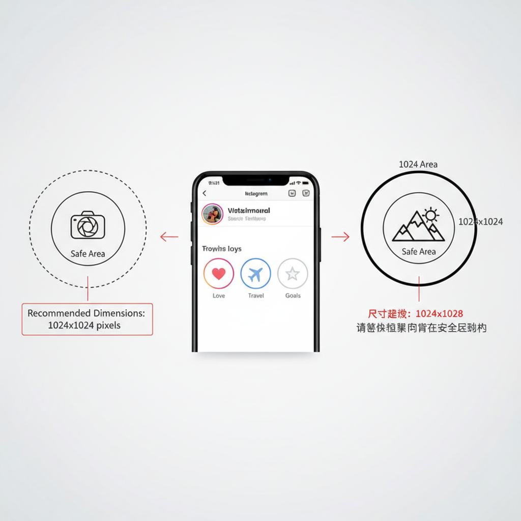
- Standard dimensions: 1080 x 1920 pixels (Instagram Story size).
- Safe zone: Keep your main icon centered within a circular area of about 1080 x 1080 pixels to prevent cropping.
Correct sizing ensures your cover is sharp in both:
- The small preview under your bio.
- The full-screen Story display.
---
Consistency in Style and Sizing
Inconsistent icons can make your profile look cluttered. Maintain uniform style by:
- Using a cohesive color palette that complements your brand or theme.
- Choosing one illustration style (line art, flat icons, solid illustrations).
- Applying consistent padding inside the circle for balance.
A uniform look helps users instantly recognize categories and improves overall aesthetics.
---
Designing Highlight Icons: Tools and Techniques
Your options range from beginner-friendly apps to professional-grade software.

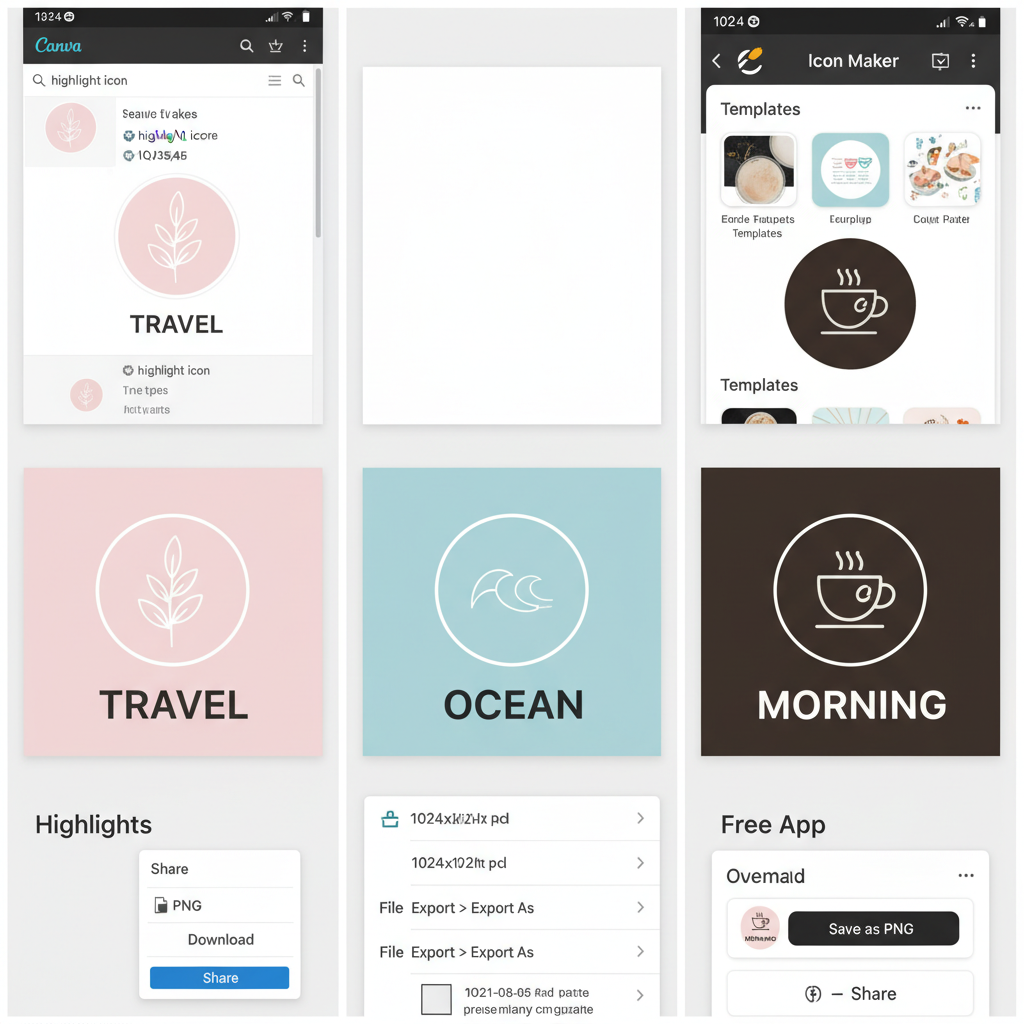
Canva
- Browser-based, simple learning curve.
- Extensive library of Story templates.
- Set precise sizes (1080 x 1920 px) for accuracy.
- Export in PNG format for transparency.
Photoshop
- Best for detailed customization and precise layout control.
- Use the Ellipse Tool to visualize the safe circle.
- Perfect for custom icon design and advanced branding.
Free Design Apps
- Over, PicsArt, and Figma (free version) are great alternatives.
- Offer built‑in graphic elements and easy export options.
Tip: Use alignment/guideline features to keep icons consistently centered.
---
Transparent vs. Solid Backgrounds
Your choice influences visibility and overall style.
Transparent
- Pros: Works on any Story background seamlessly.
- Cons: May lack contrast on certain colors.
- Ideal for: Simple line icons with dark or light outlines.
Solid Colors
- Pros: High contrast regardless of Story content.
- Cons: Fixed background color limits versatility.
- Ideal for: Strong brand color display and category differentiation.
---
Exporting for High Quality
Keep your icons sharp with correct export settings:
- Format: PNG for transparency; JPEG for solid backgrounds.
- Resolution: 72 DPI is standard for web; keep 1080 x 1920 px.
- No compression: Use “High Quality” or “Save for Web” options in apps.
Pro Tip: Avoid transferring through platforms that reduce image quality—upload directly from your device.
---
How to Upload or Update Highlight Icons

Here’s how to apply your icons:
- Visit your profile and select the highlight to edit.
- Tap More (three dots) → Edit Highlight.
- Tap Edit Cover.
- Use the photo icon to add the new design from your device.
- Adjust crop inside the circle and confirm.
Repeat for each highlight category you want to refresh.
---
Common Mistakes to Avoid
Steer clear of these pitfalls for best results:
- Distorted icons: Maintain aspect ratio when resizing.
- Overly small designs: Elements should be bold enough for tiny previews.
- Cluttered backgrounds: Avoid visual noise behind the icon.
- Low contrast: Ensure clear separation between icon elements and background.
- Mixed styles: Keep all icons in the same visual genre.
---
Optimizing for Preview and Full View
Icons look different in thumbnail and full formats.
| View | Display Size | Design Priority |
|---|---|---|
| Mobile Preview (Profile View) | ~64px circular thumbnail | Bold, simple graphics for clarity at small size. |
| Full Story View | Centered inside 1080 x 1920 px canvas | Detailed background and refined design for larger display. |
Design for the smallest state first — if it’s readable there, it’ll work perfectly in full size.
---
Creative Instagram Highlight Icon Theme Ideas
Fresh themes can boost personality and engagement.
For Personal Accounts
- Minimal line art within pastel circles.
- Hand‑drawn doodles linked to hobbies (travel stamps, recipe icons, paw prints).
- Photography cutouts with a uniform filter and frame.
For Business Accounts
- Brand color blocks paired with simple service icons.
- Flat-style illustrated props representing products.
- Branded typography covers with your custom fonts.
---
Conclusion
The ideal Instagram Highlight icon size — 1080 x 1920 pixels, with a 1080 x 1080 px safe zone — is the foundation of professional-looking covers. By keeping your designs consistent, clear, and brand‑aligned, you can transform your profile into a visually cohesive destination that invites exploration.
Invest time in:
- Planning icon style and alignment.
- Using the right design tools.
- Testing across preview and full view.
Well‑executed highlight icons keep your content discoverable and appealing, amplifying your brand presence around the clock. Ready to upgrade your Instagram aesthetic? Start designing your highlight icons today and make every first impression count.


