Download and Use the Instagram Logo Transparent White
Learn how to download and use the official Instagram transparent white logo, follow brand guidelines, and apply it effectively in various design contexts.
Introduction to Instagram Logo Variations and Branding Rules
Instagram, one of the world’s leading social media platforms, has developed a distinctive set of logo variations that express its unique visual identity. Over time, the brand mark has transitioned from a realistic camera icon to a minimalist gradient design, available in color, black, and white.
Among these, the Instagram logo transparent white variant is especially popular with designers and marketers because it blends seamlessly into a variety of backgrounds while preserving brand recognition and clarity.

Before using any logo variation, it’s essential to understand Instagram’s official branding rules. Following these guidelines ensures the logo remains instantly recognizable, undistorted, and used in a respectful context—misuse can lead to campaigns being rejected or even legal ramifications.
---
Official Instagram Brand Resources and Usage Guidelines
Instagram provides a comprehensive Brand Resources section on its website, where you can access downloadable logo files, wordmarks, and icons. These resources come with detailed usage guidelines that address:
- Minimum size requirements
- Clear space around the logo
- Background contrast standards
- Prohibited alterations (e.g., color changes, distortions, effects)
- Examples of correct and incorrect usage
The official guidelines are available at Instagram’s Brand Resource Center—always refer directly to their source page.
---
Understanding the "Transparent White" Instagram Logo
A transparent white logo is typically saved in PNG format with a transparent background. This means the white elements (the logo itself) remain visible against any backdrop without leaving a solid, colored rectangle around it.
Unlike JPEG files, which don’t support transparency, PNG images preserve both high quality and the see-through areas for a cleaner design.
---
When the Transparent White Instagram Logo Works Best
The Instagram logo transparent white is particularly effective in scenarios such as:
- Dark backgrounds — Maximizes visual contrast.
- Photo and video overlays — Works as a subtle watermark.
- Gradient or complex backdrops — Ensures brand elements don’t get lost.
- Print materials — White marks often balance dark posters or flyers.
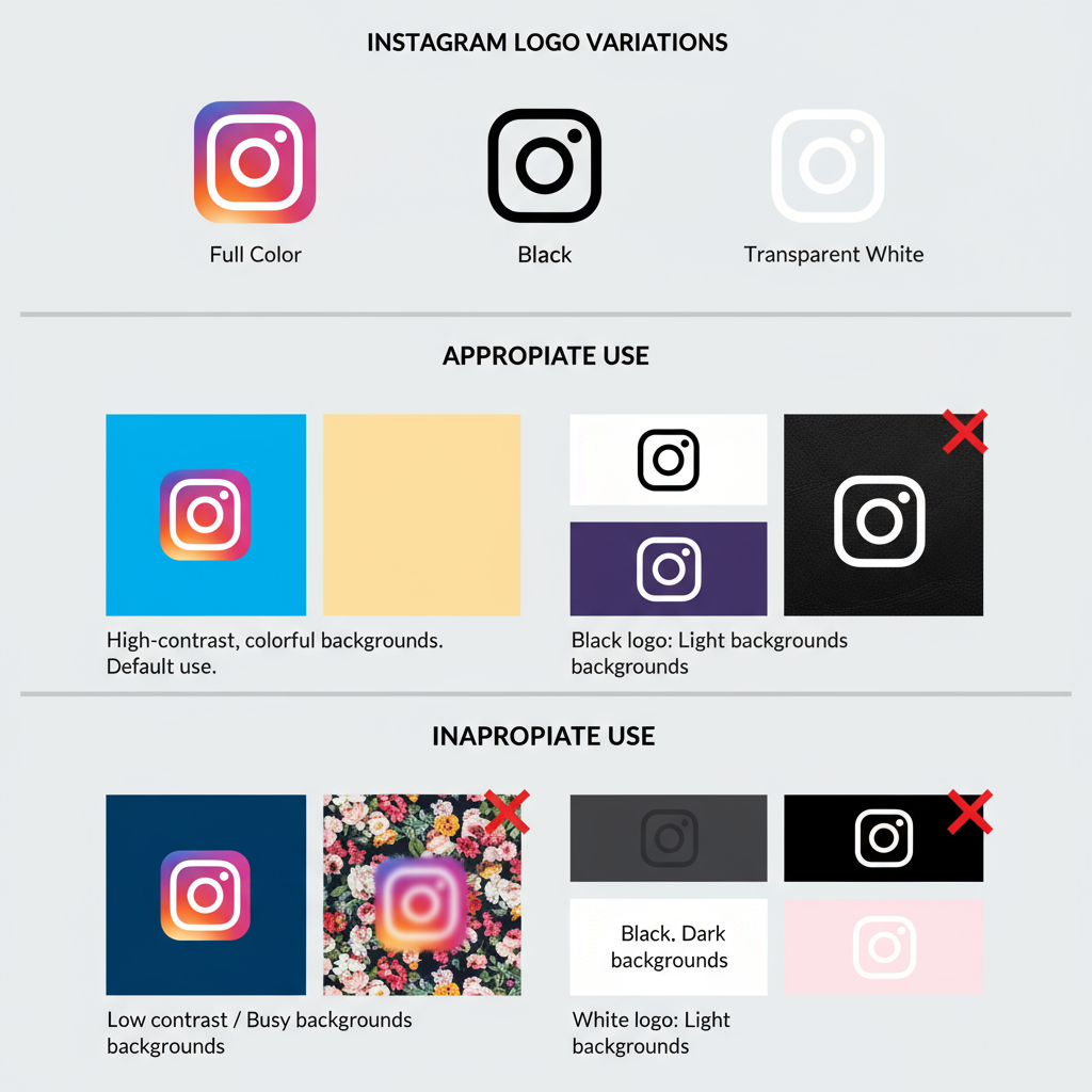
Used thoughtfully—whether in a website header, a social media image, or on merchandise—the transparent white logo delivers maximum visibility without adding visual clutter.
---
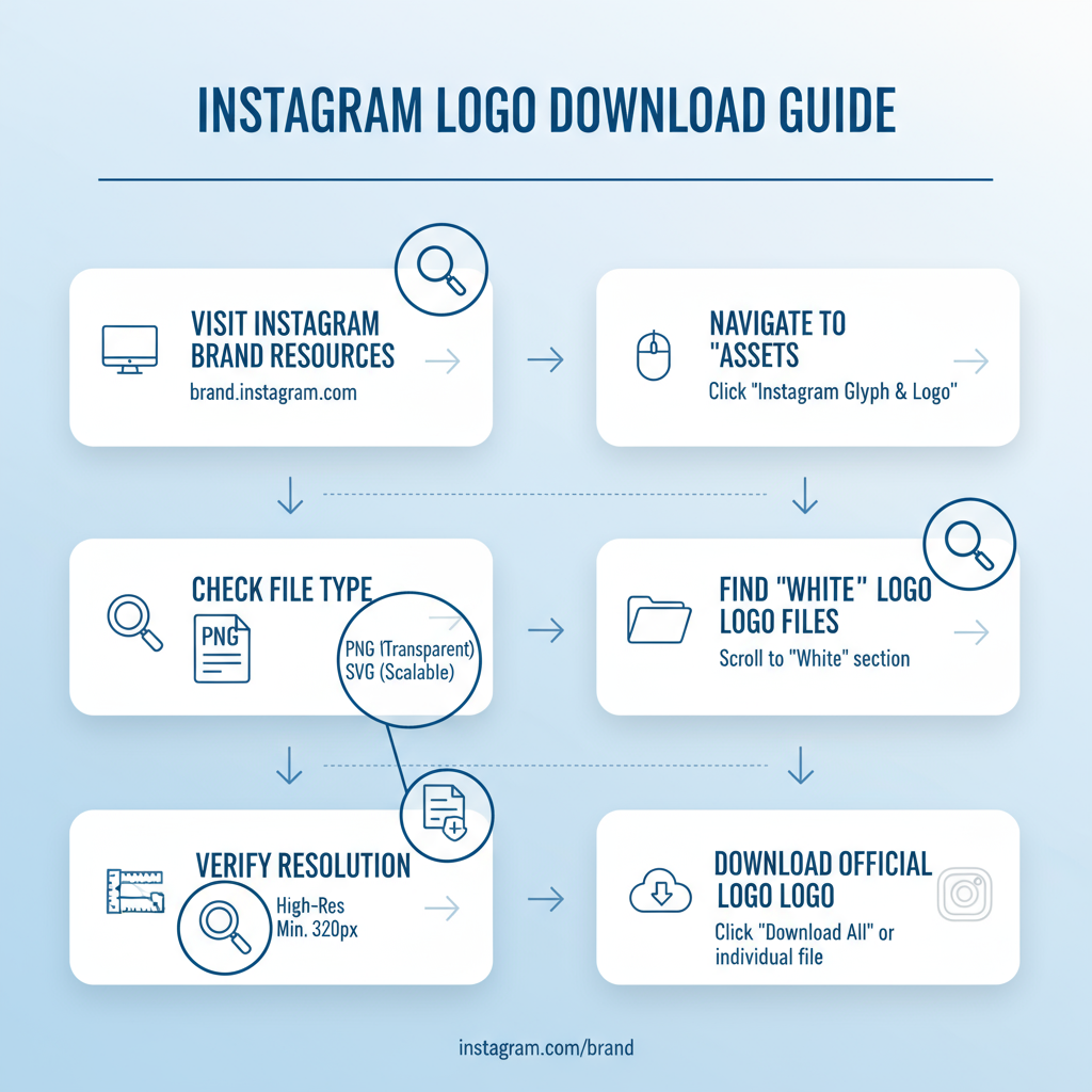
How to Download the Official Transparent White Instagram Logo
Follow these steps for a safe, compliant download:
- Visit the Instagram Brand Resource Page
- Navigate to `https://en.instagram-brand.com/`.
- Go to the Assets/Downloads Section
- Locate the logo and icon section.
- Select the White Variant
- Pick “glyph” or “white” from the available versions.
- Choose PNG or SVG
- PNG is ideal for web raster use; SVG is best for scaling in design projects.
- Revisit the Guidelines
- Check size, spacing, and placement rules before use.
---
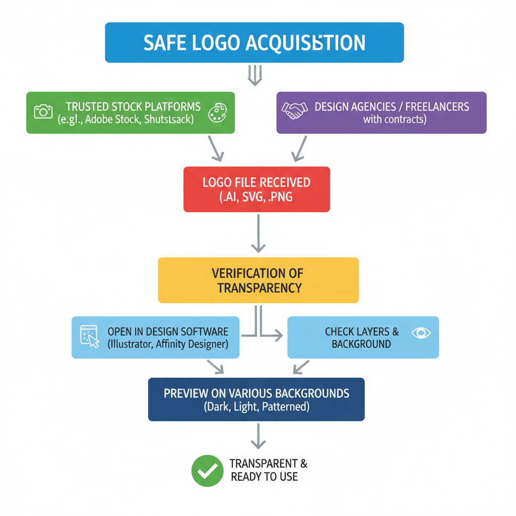
Trusted Alternatives for Logo Acquisition
If the official site is temporarily unavailable, some vetted alternatives include:
Reliable Sources
- Agency media kits — Provided by partners with permission.
- Brand asset repositories — Such as Brandfolder or Iconscout with licensing.
- Design system libraries — Figma Community or Adobe Libraries with verified assets.
> Note: Always review the license and attribution requirements, as not all sources grant unrestricted use.
---
Checking File Format, Resolution, and Transparency
Before integrating an asset into your design, confirm the following:
- File format — Check via file properties (Windows) or Get Info (Mac).
- Resolution — Minimum 300 DPI for print, 72 DPI for digital.
- Transparency — Preview in an image editor to ensure no background fill.
| Property | Recommendation | Purpose |
|---|---|---|
| Format | PNG or SVG | Ensures transparency and sharp quality |
| Resolution (print) | 300 DPI | Produces crisp print assets |
| Resolution (web) | 72 DPI | Improves online load speed |
| Color | White (#FFFFFF) | Keeps to brand specification |
---
Resizing and Optimizing the Transparent Logo
To preserve logo quality across media:
- Prefer vector SVG for scalability.
- Maintain aspect ratio when resizing to prevent distortion.
- Optimize PNGs for web via compression tools like TinyPNG.
- Maintain separate assets for print and web to match medium-specific requirements.
---
Frequent Usage Mistakes to Avoid
Even experienced designers can breach brand rules. Avoid:
- Altering the white color tone.
- Adding drop shadows, glows, or unapproved effects.
- Stretching or distorting proportions.
- Crowding the logo with other visual elements—always maintain clear space.
---
Legal Considerations and Instagram’s Trademark Policy
The Instagram logo is a registered trademark. Stick to approved use cases to avoid legal issues:
- Do not imply endorsement or partnership unless granted permission.
- Avoid creative modifications that compromise brand identity.
- Use only for linking or platform reference when relevant.
When uncertain, reference the official brand guidelines or seek professional legal advice.
---
Creative Inspiration That Stays Compliant
Some compliant ways to use the transparent white logo include:
- Photography websites — As an overlay watermark linking to your Instagram portfolio.
- Event marketing materials — Placed on darker sections of posters for visibility.
- Social media banners — Integrated into bold, contrasting layouts.
Pairing the white logo with strategic colors enhances design appeal and brand consistency.
---
Conclusion: Best Practices for Using the Instagram Logo Transparent White
The Instagram logo transparent white offers unmatched versatility, enabling bold, clean designs on both print and digital outputs.
Key takeaways:
- Source only from official or trusted repositories.
- Confirm correct format and resolution.
- Avoid unapproved alterations or decorative additions.
- Follow Instagram’s brand guidelines for placement and spacing.
- Use where high contrast and clarity benefit the design.
Following these best practices safeguards brand integrity, maintains legal compliance, and ensures polished professional visuals.
For the most accurate and authorized assets, always return to Instagram’s official brand resource pages before making design decisions.

