Instagram New Dimensions: The 2025 Complete Guide to Image and Video Sizes
Your 2025 guide to Instagram image and video sizes: dimensions, aspect ratios, safe zones, and export workflows to keep posts crisp and algorithm-friendly.

Getting Instagram sizes right in 2025 is less about memorizing numbers and more about designing for how content is rendered, cropped, and previewed across surfaces. This formatting-optimized guide lays out the core dimensions, safe zones, and export workflows that keep your visuals crisp and algorithm-friendly. Use it as a reference while designing and as a pre-flight checklist before you post.
Instagram New Dimensions: The 2025 Complete Guide to Image and Video Sizes
Instagram in 2025 is still the most visually-driven social platform—but it’s more nuanced than “upload a square and go.” Getting dimensions right is the difference between a crisp, full-bleed experience and a muddy, cropped mess. This guide breaks down the instagram new dimensions that matter now, explains how aspect ratios influence reach, and gives you export workflows that avoid softening and re-encodes.

Why Instagram new dimensions matter in 2025
- Algorithmic distribution: Instagram prioritizes formats that retain attention. Reels (9:16) and tall Feed posts (4:5) often get more on-screen real estate, which improves watch time and taps—two strong ranking signals.
- On-device rendering: Phones ship with taller screens, dynamic UI overlays, and variable resolutions. Uploading media in the correct aspect ratio reduces server-side scaling and compression.
- Clarity and brand perception: Proper pixel dimensions plus safe-zone-aware design keep text, CTAs, and faces visible behind buttons and captions.
Aspect ratio choice shapes how often your content is fully seen vs. cropped, how it’s previewed across surfaces, and how many algorithm-friendly signals (e.g., watch time, saves) you can collect.
---
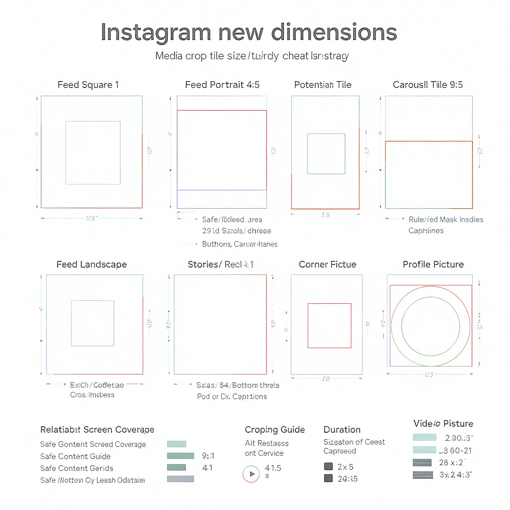
At‑a‑Glance Size Cheat Sheet (2025)
The following specs reflect widely supported dimensions as of 2025. Instagram iterates often—always confirm in-app limits when posting.
| Placement | Aspect ratio(s) | Recommended pixels | Duration | File types | Notes |
|---|---|---|---|---|---|
| Feed Photo | 1:1, 4:5, 1.91:1 | 1080×1080; 1080×1350; 1080×566 | — | JPG/PNG | 4:5 (1080×1350) maximizes screen real estate in Feed. |
| Feed Video | 1:1, 4:5, 1.91:1 | 1080 width; match ratio | Up to ~10 min supported; keep ≤60–90s for engagement | MP4 (H.264/AAC), MOV | Use a custom cover; most viewers decide in first 2 seconds. |
| Carousel (Feed) | 1:1 or 4:5 preferred | 1080×1080; 1080×1350 | — | JPG/PNG, MP4/MOV | All slides adopt the first slide’s aspect ratio; others are cropped. |
| Stories | 9:16 | 1080×1920 | Up to 60s per Story segment | JPG/PNG; MP4/MOV | Design for safe zones to avoid UI overlaps. |
| Reels | 9:16 | 1080×1920 (or 1440×2560 upscale; 1080 wide recommended) | Widely supported up to 90s (some accounts may allow longer) | MP4/MOV (H.264/AAC) | Preview in Feed crops to 4:5—keep focal content centered. |
| Reels Cover | 9:16 (displayed 1:1 on grid) | 1080×1920 | — | JPG/PNG | Ensure a 1080×1080 center crop looks great for your grid. |
| Profile Photo | 1:1 (circular mask) | 320×320 (min) | — | JPG/PNG | Keep critical content in the center circle. |
| Highlight Covers | 1:1 | 1080×1080 | — | JPG/PNG | Leave generous padding for circular cropping. |
Notes
- Photos are compressed on upload. Use JPG quality ~80–90 and sharpen slightly after resizing.
- Videos: 24, 25, 30, or 60 fps are supported. Maintain constant frame rate to avoid audio drift.
---
Safe Zones and UI Overlays
UI elements change with device, language length, and updates. Design within conservative safe areas to keep text/logo visible.

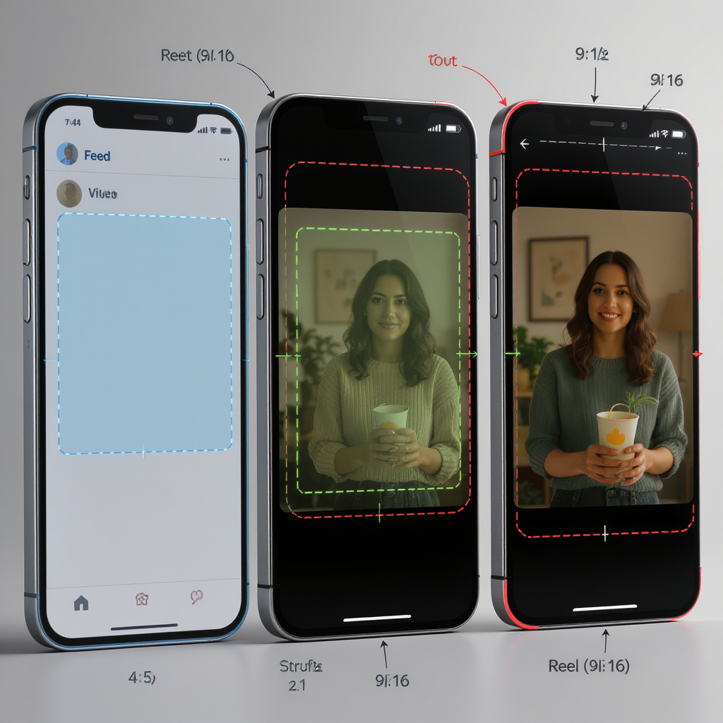
- Stories/Reels 9:16 (1080×1920):
- Keep essential text/logos within the center 1080×1420 px (approx. 250 px padding top and bottom).
- Avoid the right-side button stack: keep vital text at least ~150 px from the right edge.
- Bottom captions/music/CTA region: avoid the bottom ~210–250 px.
- Reels Feed preview (cropped to 4:5): From 1080×1920 down to 1080×1350 means roughly 285 px trimmed from both top and bottom. Keep key subjects inside the center 1080×1350.
- Profile and Highlight covers: plan for circular masks—don’t place text near corners.
Tip: Export a “safe-zone” overlay PNG and drop it on top of your designs in Figma/Canva/Premiere to verify positioning.
---
Feed Posts and Carousels
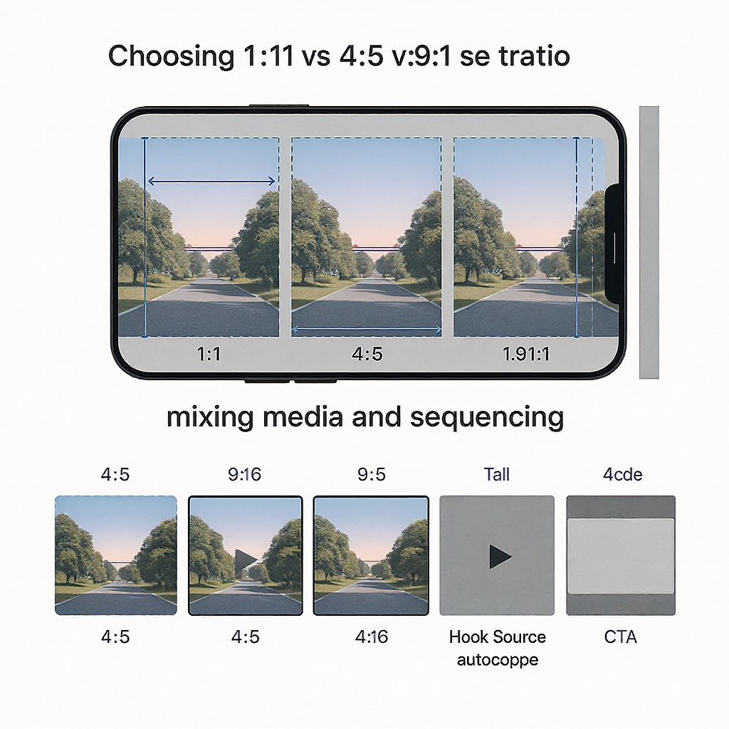
Choosing 1:1 vs 4:5 vs 1.91:1
- 4:5 (1080×1350) is the engagement workhorse. It occupies more vertical space, slowing scroll and increasing dwell time.
- 1:1 (1080×1080) is versatile and grid-friendly, ideal when repurposing square assets or when your subject fits symmetrical framing.
- 1.91:1 (horizontal, 1080×566) is best for cinematic landscapes or text that benefits from wide layouts, but it competes poorly for attention on tall phones.
Recommendation: Default to 4:5 for Feed unless the creative truly demands square or landscape.
Carousels: mixing media and sequencing
- Consistency: Instagram forces all carousel items to share the first slide’s aspect ratio. If you add a 4:5 first slide and later include a 1:1 asset, Instagram will auto-crop it to 4:5.
- Strategy:
- Choose your dominant aspect ratio up front, then crop all slides to match.
- Place your strongest hook on slide 1; many users swipe only if slide 1 promises value.
- Use 8–10 slides for educational posts; 3–5 slides for simple narratives or product showcases.
- Thumbnails:
- If the post will appear as a square on your grid, design a square-safe center for slide 1 or upload a custom cover.
- Use bold contrast and a 3–5 word promise.
---
Stories and Reels Best Practices
Vertical framing that survives previews
- Compose with the 4:5 center crop in mind for Reels; keep faces and text away from the extreme top/bottom so the Feed preview doesn’t chop them.
- Use headroom; avoid placing eyes at the very top of frame.
Captions, stickers, and cover images
- Always include captions. Many viewers watch muted; auto-captions can overlap graphics, so manually style text inside safe zones.
- Stickers: Don’t stack too many interactive elements. Space them to avoid accidental taps on the right-side button rail (Reels) or the “Send Message” area (Stories).
- Covers: Export 1080×1920 for Reels covers with a center 1080×1080 that reads clearly for the grid.
Editing workflows to avoid softening and compression
- Keep your export at 1080×1920 for 9:16. Uploading 4K vertical often triggers heavier compression.
- Convert HDR to SDR before export—mobile HDR (e.g., iPhone Dolby Vision) can look washed out after platform tone mapping.
- Maintain consistent frame rate (e.g., 30 fps) across the whole edit to prevent sync issues.
- Deliver a slightly higher bitrate than the platform’s final to preserve detail (see workflow below).
---
Ad Placements and Specs (Feed, Stories, Reels, Explore, Shop)
Ad specs resemble organic posts but with a few constraints and creative nuances. Use Ads Manager for the most current limits.
| Placement | Aspect ratio(s) | Recommended pixels | Duration | Notes (creative & copy) |
|---|---|---|---|---|
| Feed Ads | 1:1, 4:5, 1.91:1 | 1080×1080; 1080×1350; 1080×566 | Prefer ≤60s for video | Primary text truncates around 125 chars; front-load hooks. Avoid dense overlays. |
| Stories Ads | 9:16 | 1080×1920 | Up to 60s; 10–15s performs best | Strong CTAs; leave 250 px top/bottom safe zones. Add captions. |
| Reels Ads | 9:16 | 1080×1920 | Up to 90s supported | Native-feel edits win. Keep action in center 4:5. Avoid borders. |
| Explore Ads | 1:1, 4:5 | 1080×1080; 1080×1350 | ≤60s video recommended | High-contrast thumbnail; viewers are in discovery mode—clear value prop. |
| Shop Ads | 1:1 preferred | 1080×1080 | — | Clean product shots; minimal text; ensure transparent pricing in copy. |
Ad pitfalls tied to dimensions
- Overlaid text too close to edges gets hidden by UI or truncated captions.
- Wrong aspect ratio forces pillarboxing/letterboxing, which hurts performance.
- Low-resolution assets look untrustworthy; always use the recommended pixel dimensions.
---
Pro Export Workflow (Figma/Canva/Photoshop + Video Settings)
Images (Photos/Graphics)
- Canvas sizes:
- Feed 4:5: 1080×1350 (export JPG quality 80–90).
- Stories/Reels cover: 1080×1920 (export PNG for flat graphics or JPG for photos).
- Color:
- Use sRGB color space; embed the profile if your tool supports it.
- Avoid CMYK/P3 for uploads—Instagram expects sRGB.
- Sharpening:
- Apply a gentle export sharpen after resizing (e.g., Unsharp Mask amount 40–70, radius 0.4–0.6, threshold 0–2).
Video (Premiere/Final Cut/Resolve/CapCut)
- Sequence settings:
- Resolution: 1080×1920 for 9:16; 1080×1350 for 4:5; 1080×1080 for 1:1.
- Frame rate: 23.976/24/25/30/60—match your footage; avoid variable frame rate.
- Color: Rec.709 (sRGB), 8-bit. Convert HDR sources to SDR.
- Export settings (MP4, H.264, AAC):
- Profile: High; Level 4.2 or 5.1 (safe for 1080p60).
- Bitrate: VBR 2-pass; 8–12 Mbps target for 1080p; up to 16 Mbps for fast motion.
- Keyframes: Every 2 seconds (e.g., 60 at 30 fps).
- Audio: AAC, 44.1 kHz or 48 kHz; 160–192 kbps.
- Transfer:
- Airdrop or cloud drive. Avoid messaging apps that recompress.
- Disable “HDR video” capture on phones if you don’t plan SDR conversion.
Example ffmpeg commands
- Convert HDR iPhone video to SDR Rec.709 with tone mapping and export at 1080×1920:
ffmpeg -i input.mov -vf "zscale=t=linear:npl=100,tonemap=hable,zscale=t=bt709:m=bt709:r=tv,scale=1080:1920:force_original_aspect_ratio=decrease,pad=1080:1920:(ow-iw)/2:(oh-ih)/2" \
-c:v libx264 -profile:v high -level 4.2 -pix_fmt yuv420p -r 30 -x264-params keyint=60:min-keyint=60:scenecut=0 \
-b:v 10M -maxrate 12M -bufsize 20M \
-c:a aac -b:a 160k -ar 44100 output.mp4- Light, quality-first compression for 1080p vertical:
ffmpeg -i edit.mov -c:v libx264 -crf 18 -preset slow -pix_fmt yuv420p -r 30 -g 60 \
-c:a aac -b:a 160k -ar 44100 final_1080x1920.mp4
---
Cross-Platform Repurposing (IG, TikTok, YouTube Shorts)
The safest strategy: master once, deliver many.
- Master project: 9:16 at 2160×3840 (4K vertical) or 1080×1920. Keep text within the center 4:5 safe zone so Instagram’s Feed preview works.
- Deliverables:
- Instagram Reels: 1080×1920, custom cover with 1:1-safe center.
- TikTok: 1080×1920; mind bottom caption area—slightly larger than IG; keep CTAs higher.
- YouTube Shorts: 1080×1920; leave space at bottom for channel/name UI.
- No watermarks:
- Export a clean master before posting anywhere.
- If editing in a platform tool (e.g., CapCut with TikTok publish), export the watermark-free file directly from the editor rather than saving from TikTok.
- Graphics system:
- Create two title-safe variants: “Reels/Stories” (tighter right-side padding) and “Shorts/TikTok” (tighter bottom padding).
- Audio:
- If you rely on trending sounds, export a clean VO/music version and add the platform sound natively after upload.
---
QA and Iteration
Device and auto-crop checks
- Test on:
- Small iPhone (e.g., mini/SE) and tall Android device.
- Light and dark mode.
- Low-bandwidth network to see how compression artifacts appear.
- Pre-flight:
- Use a safe-zone overlay to confirm no text sits behind buttons, captions, or progress bars.
- For carousels, scrub each slide for edge crops.
Accessibility
- Captions/subtitles: Burn-in or upload captions; ensure legible font size (minimum ~42–48 px at 1080 width).
- Contrast: Aim for at least WCAG AA contrast; avoid thin, light text on bright backgrounds.
- Alt text: Write descriptive alt text for images; summarize key points for videos in captions for assistive technologies.
Analytics-driven refinement
- Reels:
- Monitor watch time, average watch percentage, and rewatches.
- If drop-off spikes in the first 3 seconds, adjust hook framing or cover promise.
- Feed/Carousel:
- Track saves and shares per impression; test 4:5 vs 1:1 for your audience.
- Stories:
- Exit rates per frame reveal cluttered slides or misplaced stickers; iterate layout spacing.
A/B test
- Same creative, different aspect ratio (1:1 vs 4:5) for Feed.
- Same Reel, two covers (bold text vs image-only).
- Carousel with 5 slides vs 8 slides.
---
Practical Templates You Can Reuse
- Feed 4:5 photo template: 1080×1350, 64 px inner padding, 18–24 pt text minimum, centered safe title block.
- Reels/Stories template: 1080×1920 with:
- 250 px top and bottom safe margins.
- 150 px right-side margin for Reels button rail.
- Central 1080×1350 guide for Feed preview safety.
- Reel cover template: 1080×1920 with a 1080×1080 center grid-safe frame.
Save these as locked guide layers in Figma/Photoshop to accelerate production.
---
Common Gotchas to Avoid
- Uploading 4K vertical to Instagram: invites extra compression; stick to 1080×1920 unless you have a specific reason.
- Mixing aspect ratios inside a carousel: Instagram will crop to the first slide—prep all slides to match.
- HDR uploads without conversion: can look desaturated; convert to Rec.709.
- Tiny body copy: If it’s hard to read on your phone at 100%, it will be skipped.
- Edge-hugging CTAs: Keep them inside safe zones—tappable areas shouldn’t sit beside UI buttons.
---
Final Word
Mastering instagram new dimensions is a leverage play: the right aspect ratio and pixel choices increase visible real estate, reduce compression, and protect your message from UI overlays. Set up templates, adopt a solid export pipeline, and use analytics to prove (or disprove) your assumptions. If you keep your content crisp, centered, and captioned, the algorithm—and your audience—will reward you.

Summary
- Use 4:5 for Feed, 9:16 for Stories/Reels, and design within conservative safe zones to avoid UI clashes.
- Export in sRGB/Rec.709 at 1080-wide, with steady frame rates and sensible bitrates to minimize platform recompression.
- Plan carousel aspect ratios from slide 1, craft square-safe covers, and preview how Reels crop in Feed.
- Test on multiple devices, caption everything, and iterate with analytics-driven A/B tests to refine performance.


