Instagram Profile Grid Size and Dimensions Guide
Learn the exact Instagram profile grid sizes, cropping rules, and pro tips to keep your feed cohesive, high-quality, and visually appealing.
Introduction to the Instagram Profile Grid and Why Size Matters
Your Instagram profile grid is often the first visual impression visitors get when exploring your account. This mini-gallery is essentially your brand’s digital storefront and can greatly influence whether someone decides to follow you or engage further with your content.
An optimised, professional grid layout makes your profile aesthetically appealing, consistent, and on-brand. Central to achieving this is knowing the Instagram profile grid size — the dimensions, cropping rules, and aspect ratios that determine how your images display.

In this comprehensive guide, you’ll discover exact Instagram profile grid size specifications, key differences between feed and profile views, common mistakes to avoid, and expert tips to keep your grid sharp, cohesive, and compelling.
---
The Standard Instagram Grid Layout
Instagram displays posts in a 3-column grid format on profile pages, with each thumbnail as a uniformly cropped square. On mobile devices, users scroll down to reveal additional rows of three images.
This structured layout creates order but also forces all thumbnails into the same dimensions, regardless of the original format. Understanding this standard is vital before designing or uploading your next post.
---
Optimal Photo Dimensions for Single Posts in the Grid
While the profile grid uses square thumbnails, Instagram supports multiple aspect ratios in the main feed. For best clarity and flexibility:
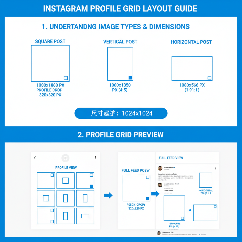
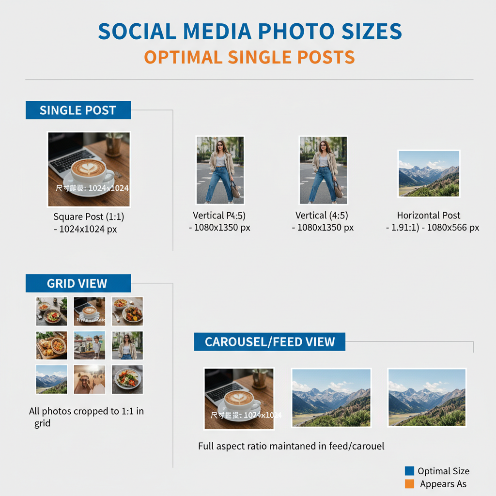
- Square posts: 1080 × 1080 pixels (1:1 aspect ratio)
- Vertical posts: 1080 × 1350 pixels (4:5 aspect ratio)
- Horizontal posts: 1080 × 566 pixels (1.91:1 aspect ratio)
On mobile profile views, Instagram renders thumbnails at approximately 161 × 161 pixels (slight variations may occur by device). Uploading in high resolution preserves detail and quality after compression.
---
How Instagram Crops Images in Profile View vs. Feed View
Instagram automatically crops all profile grid thumbnails into squares. As a result, vertical and horizontal posts are zoomed and trimmed to fit within a square frame, potentially cutting off important elements.
In the main feed:
- Vertical posts command more vertical real estate, boosting engagement potential.
- Horizontal posts display the full width, but occupy less vertical space.
In the profile grid:
- All formats are centre-cropped into a square thumbnail.
---
Importance of Consistent Sizing for a Cohesive Grid Aesthetic
Consistency in image sizing, composition, and editing style helps create a polished, professional Instagram profile grid. Random aspect ratios, inconsistent borders, or mismatched filters can make the grid look chaotic.
Some creators only use square posts to ensure consistent cropping, while others design each post with the grid crop in mind, leaving safe margins around the focal point.
---
Square vs. Vertical vs. Horizontal Images: Pros and Cons
| Orientation | Pros | Cons |
|---|---|---|
| Square (1:1) | No crop surprises in grid, balanced appearance | Occupies less feed space than vertical posts |
| Vertical (4:5) | Greater feed presence, higher engagement potential | Edges risk being cropped in grid view |
| Horizontal (1.91:1) | Ideal for landscapes or group scenes | Key details may be lost in thumbnail crop |
---
Planning a Seamless Grid Layout
To tell a story visually, many designers plan three, six, or nine posts at a time. This ensures color harmony, theme consistency, and proper alignment when new content is posted.
Popular grid-planning tools and apps:
- UNUM
- Preview App
- Planoly
- Later
These allow you to preview your Instagram profile grid, rearrange upcoming posts, and maintain your desired aesthetic flow.
---
Carousel Posts and Their Grid Appearance
Carousel posts (multi-image uploads) display in the profile grid as a single thumbnail with a stacked icon overlay. The first image in your carousel dictates how the post looks in both the feed and the profile grid.
When posting carousels, ensure the first image is well-centred and visually appealing in a square crop.
---
Designing Panoramic or Split Images Across Multiple Grid Squares
Some brands create show-stopping effects by splitting one image across 3, 6, or 9 grid squares. This transforms the Instagram profile grid into a large-format visual canvas.
Execution tips:
- Use high-resolution panoramic images.
- Employ Photoshop or dedicated split-image tools.
- Upload images in reverse order so they align correctly on your profile.

---
Avoiding Common Mistakes in Instagram Profile Grid Size
Typical errors when working with grid size include:
- Low-resolution uploads leading to pixelation or blur.
- Inconsistent borders that disrupt flow.
- Cut-off subjects due to key elements near the edges.
Pro tip: Keep a central safe zone for essential details to survive Instagram’s square crop.
---
Impact of Grid Aesthetics on Branding and Audience Perception
Your Instagram grid aesthetic is a visual shorthand for your brand’s quality and style. A cohesive grid signals professionalism, increases trust, and can help convert profile visitors into followers.
Businesses, creators, and influencers often leverage the grid to:
- Highlight products in a curated visual context.
- Build thematic storytelling.
- Maintain consistent brand colors and styles.
---
Tips for Refreshing or Updating Old Posts
If older posts disrupt your present aesthetic:
- Archive outdated content.
- Re-edit and re-upload using current size and style standards.
- Repurpose older visuals in carousels with fresh crops.
This allows you to improve your Instagram profile grid without losing valuable content.
---
Conclusion: Balancing Creativity with Size Best Practices
The Instagram profile grid is a crucial part of your social branding strategy. By understanding and applying optimal Instagram profile grid size specifications, you can avoid poor cropping, preserve image quality, and produce a cohesive grid that strengthens your brand’s impact.
Balance technical size rules with your unique creative vision—whether that means sticking to a square-only strategy, embracing vertical content for engagement, or experimenting with panoramic layouts. Thoughtful planning will keep your grid as captivating as the individual posts that comprise it.
Ready to elevate your Instagram presence? Start by reviewing your current grid, reformatting where needed, and implementing these best practices for an instantly more professional and engaging profile.


