Instagram Reel Cover Size: Exact Dimensions, Safe Zones, and Design Templates (2025 Guide)
Learn the exact 2025 Instagram Reel cover size (1080x1920), safe zones for 4:5 and 1:1, cropping across surfaces, plus templates, setup, and export tips.

Instagram Reel Cover Size: Exact Dimensions, Safe Zones, and Design Templates (2025 Guide)
Treat your Reel cover like a thumbnail and you’ll earn more taps, views, and follows. This 2025 guide gives you the exact Instagram Reel cover size, explains how cropping works across Instagram surfaces, and outlines universal safe zones so nothing important gets cut off. You’ll also get templates, tool-specific setup tips, and export settings to keep your covers crisp and clickable.
The exact Instagram Reel cover size (and why it matters)
- Canvas: 1080 × 1920 px (vertical 9:16)
- File formats: JPG (recommended) or PNG
- Color profile: sRGB, embedded
- Bit depth: 8-bit RGB
- DPI: Irrelevant for screens—pixel dimensions matter
Why resolution and clarity matter:
- Instagram compresses uploads, so starting with a sharp 1080 × 1920 export minimizes double-compression artifacts.
- Text and logos need pixel-perfect edges; upscaling later will blur them.
- sRGB prevents color shifts on mobile devices and within Instagram’s pipeline.
Pro tip: Avoid tiny text or thin hairline fonts. If you can’t read it at ~200 px tall on your phone, it won’t be legible in the feed.
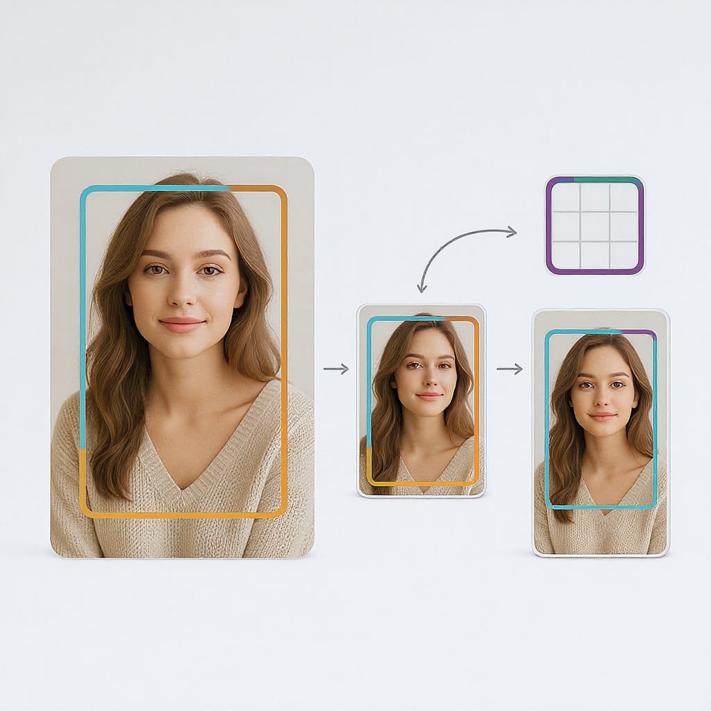
How your cover displays across Instagram surfaces
Your Reel’s single cover image will appear in different aspect ratios depending on where it’s shown:
| Surface | Displayed aspect | Crop from 1080×1920 | What gets hidden | What to plan for |
|---|---|---|---|---|
| Reels viewer (Reels tab) | 9:16 (full height) | None | UI overlays at top/bottom | Leave vertical padding for username, captions, and buttons |
| Main feed preview | 4:5 (1080×1350) | Top & bottom are cropped | ~285 px top and ~285 px bottom | Important content sits within the central 1350 px height |
| Profile grid (thumbnail) | 1:1 (1080×1080) | Top & bottom are cropped | ~420 px top and ~420 px bottom (if centered) | Keep faces/titles inside the central 1080 px height band |
Note: You can manually reposition the 1:1 grid crop when setting the cover. If you don’t, Instagram centers it by default.
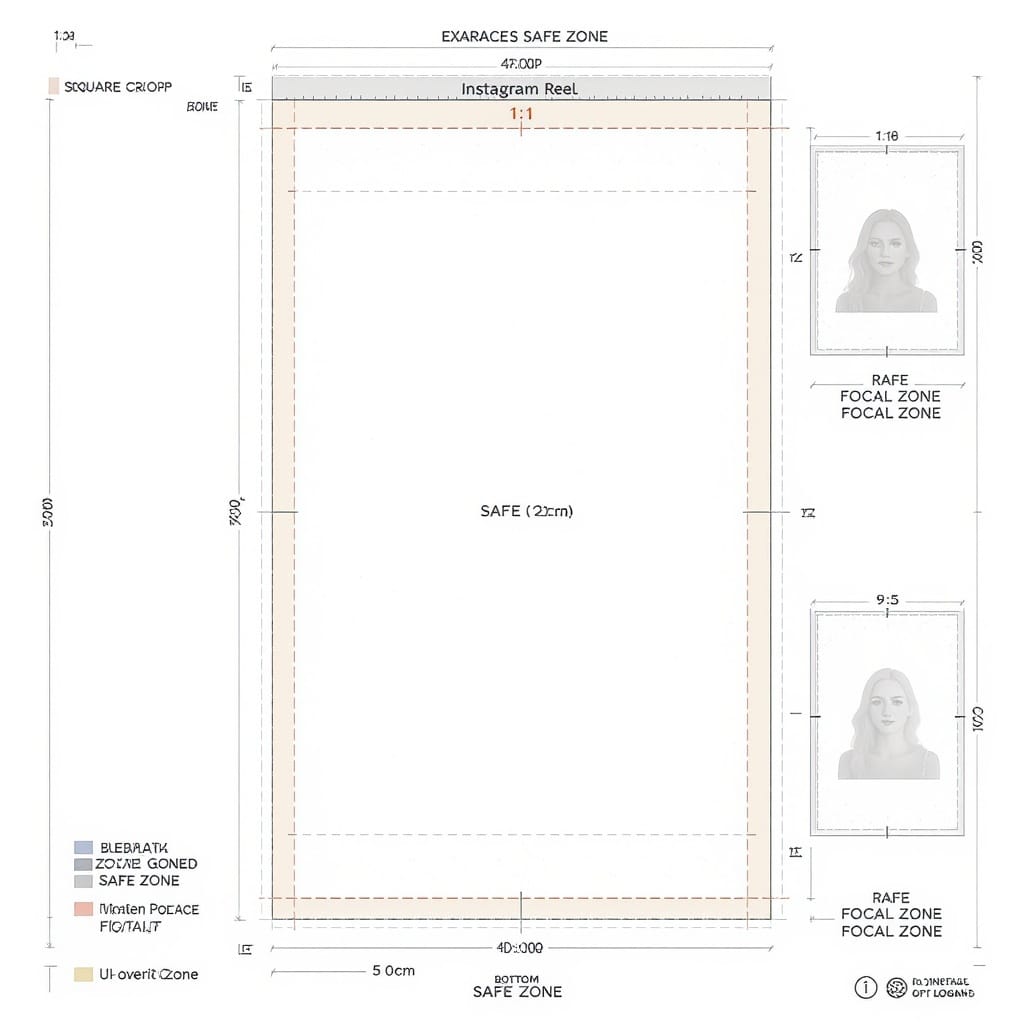
The safe‑zone blueprint
To guarantee your key subject and text survive every surface:
- Absolute canvas: 1080 × 1920 px (9:16)
- 4:5 safe area: 1080 × 1350, vertically centered
- Crop loss from 9:16: 1920 − 1350 = 570 px total = 285 px top and 285 px bottom
- 1:1 safe area: 1080 × 1080, vertically centered
- Crop loss from 9:16: 1920 − 1080 = 840 px total = 420 px top and 420 px bottom
The strictest safe zone (works for all surfaces) is the intersection: the central 1080 × 1080 square. Put faces, titles, and logos inside this band to survive 1:1 and 4:5 crops.
UI overlay padding (when viewed in the Reels player):
- Top overlay (name, follow): ~200–250 px
- Bottom overlay (caption, audio, actions): ~200–250 px
- Keep non-essential decoration in these zones; avoid text there.
Practical focal-point guide
- 9:16 (full): Place your main subject centered and slightly above center for a dynamic feel. Leave 200–250 px padding at top/bottom.
- 4:5 feed: Ensure any headline sits within y=285 to y=1635 (measured from top of the 1920 px canvas).
- 1:1 grid: Ensure the main face/logo and key words sit within y=420 to y=1500.
Tip: If your brand uses a bottom ribbon or a callout, make sure its top edge starts at y≥420 so it remains visible on the grid.
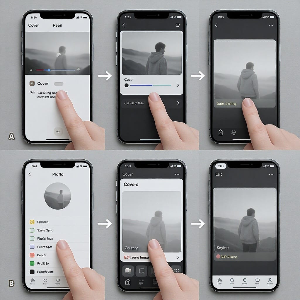
Setting and changing a Reel cover (2025)
While posting
- Create or select your Reel.
- On the Share screen, tap Cover (or Edit cover).
- Choose:
- Select from video: scrub to a frame.
- Upload from camera roll: tap Add from camera roll and pick a 1080×1920 image.
- Reposition profile grid crop:
- Tap Crop profile image (wording can vary).
- Drag the image vertically to select the best 1:1 section for your grid.
- Save and publish.
After posting (editing the cover)
Most accounts can update the cover post-publish.
- Open your Reel > tap the three dots (⋯) > Edit (or Edit reel).
- Tap Cover (or Change cover).
- Choose a new frame or upload a new image.
- Adjust the profile grid crop again if needed.
- Save. Changes can take minutes (sometimes hours) to propagate across all surfaces.
If you don’t see the option, update the app. Business/Creator accounts typically have it; some features roll out regionally.
Designing scroll‑stopping covers
- Use high-contrast typography: Bold weights, solid fills, and strong contrast (e.g., white on dark or black on light).
- Brand colors, consistently: Reserve a brand color for your title bar or accent box so your grid looks cohesive.
- Minimal text: Aim for 3–6 words. Treat it like a YouTube thumbnail—promise a benefit, tease a transformation.
- Expressive imagery: Faces, gestures, before/after frames, or a single, clear object beat cluttered collages.
- Rule of thirds: Place the subject on a third line, but keep text within the central safe band.
- Visual hierarchy: One dominant element (face or headline), one supporting element (icon or subhead), and clean negative space.
- Avoid busy backgrounds: Use a subtle blur, gradient, or solid color behind text for clean separation.
- Consistent system: Create a repeatable layout (logo corner, title band, category tag color).
Templates and tools: Canva, Figma, Adobe Express
Build a reusable template once—save hours later.
Canva
- Create a 1080 × 1920 design.
- Add guides at y=420 and y=1500 (1:1 safe zone) and at y=285 and y=1635 (4:5 safe zone).
- Lock background, add headline and brand strip components, and save as a brand template.
Figma
- Frame: 1080 × 1920.
- Create overlay rectangles for crops:
- 4:5 safe area: 1080 × 1350, centered vertically, fill none, stroke neon green.
- 1:1 safe area: 1080 × 1080, centered vertically, stroke orange.
- Convert headline, logo, and tag elements into components for quick swaps.
Suggested guide coordinates (Figma or any tool):
Canvas: 1080x1920
4:5 safe top: y = 285
4:5 safe bottom: y = 1635
1:1 safe top: y = 420
1:1 safe bottom: y = 1500
UI top padding: y ≈ 0–250 (avoid text)
UI bottom padding: y ≈ 1670–1920 (avoid text)
Adobe Express
- Start with an Instagram Story-sized canvas (9:16).
- Add brand kit fonts/colors.
- Import guide PNG overlays (exported from Figma once) and toggle them on/off during layout.
Export and compression best practices
- Format:
- JPG (80–90 quality) for photos or mixed content.
- PNG for flat graphics, logos on solid backgrounds, or heavy gradients with banding.
- Color: Export sRGB and embed the profile.
- File size target: Aim for ~300–900 KB. Instagram will recompress; smaller but clean is ideal.
- Sharpening: Add mild output sharpening for screen just before export. Avoid oversharpening, which creates halos.
- Avoid banding in gradients:
- Add a subtle 1–2% noise layer or dither.
- Prefer PNG for smooth gradients if JPG introduces artifacts.
- Don’t upscale: Design natively at 1080 × 1920. Upscaling from small assets reduces clarity.
- Keep edges clean: Leave 24–48 px padding from edges so strokes and text aren’t crushed by compression.
Testing what actually works
- Swap covers post-publish: Update the cover on a Reel that underperforms early.
- Track changes in Insights:
- Reels plays/views
- Watch time/average watch duration
- Reach and profile visits
- Saves and shares
- Document the date/time you changed the cover to correlate lift.
- Seasonal refresh: Rotate covers for evergreen Reels (e.g., holiday, back-to-school).
- Maintain a swipe file: Save screenshots of covers that made you stop scrolling, and analyze why they work (contrast, emotion, simplicity, promise).
Common mistakes and quick fixes
- Blurry or stretched covers
- Cause: Wrong size or upscaling small images.
- Fix: Always start at 1080 × 1920; use smart scaling or re-source higher-res assets.
- Text cut off in profile grid
- Cause: Headline too high/low outside the 1:1 crop.
- Fix: Keep text within y=420–1500 and reposition the grid crop before posting.
- Poor contrast
- Cause: Text blends into a busy background.
- Fix: Add a semi-opaque panel, stroke, or drop shadow; increase contrast ratio.
- Off-brand imagery
- Cause: Random stock photos/colors.
- Fix: Use a consistent palette, type system, and layout framework; build a template.
- Cover not updating (caching)
- Cause: Instagram’s CDN cache.
- Fix: Wait up to a few hours; force-quit and reopen the app; clear cache; update app; toggle cover again if needed.
- Overstuffed headlines
- Cause: Trying to say everything.
- Fix: Trim to a hook; use verbs and outcomes. Example: “Make Reels Covers That Pop” vs. “How to Design…” text blocks.
- Misaligned grid aesthetics
- Cause: Inconsistent placement or colors.
- Fix: Standardize position of logo, header bar, and category tag; use a system of 8 px spacing.
Quick checklist
- 1080 × 1920 (9:16) canvas created
- sRGB color profile, 8-bit RGB
- Subject centered; key text within y=420–1500
- Left/right margins 24–48 px for breathing room
- Previewed in 9:16, 4:5, and 1:1 crops
- High-contrast, legible typography (3–6 words max)
- Consistent brand colors and logo placement
- Exported as JPG (quality 80–90) or PNG for flat/gradient graphics
- Mild sharpening; no banding/artifacts
- Cover chosen and grid crop repositioned before posting
- Post-publish, verified updates across Reels, feed, and grid
Summary
Design your Reel cover at 1080 × 1920 (9:16), keep vital elements inside the central 1080 × 1080, and leave top/bottom padding for UI overlays. Use consistent, high-contrast layouts, export to sRGB, and test variations by updating covers post-publish. Follow the safe-zone coordinates and checklist to avoid cut-offs, compression artifacts, and off-brand visuals.