Instagram Safe Zone for 1080x1350: A Pixel-Perfect Guide
Design pixel-perfect 1080×1350 Instagram posts with safe zones, grid crop guidance, margins, and export settings. Keep text crisp in feed and carousels.
Creating Instagram posts in the 4:5 portrait format looks straightforward, but optimal results require precise layout planning. A well-defined safe zone ensures your content stays sharp in-feed and coherent on your profile grid, even with carousels and ads. Use this formatting-focused guide to set consistent guides, margins, and export settings for pixel-perfect 1080×1350 designs every time.
Instagram Safe Zone for 1080x1350: A Pixel-Perfect Guide

Designing for Instagram’s portrait post is deceptively simple: you export 1080×1350 and hit publish. But if you care about perfect crops on your profile grid, crisp text, and layouts that survive carousels and ads, you need a precise safe-zone strategy. This guide breaks down the instagram safe zone 1080x1350 with exact pixels, tool-specific setup, and a pre-post checklist you can use every time.
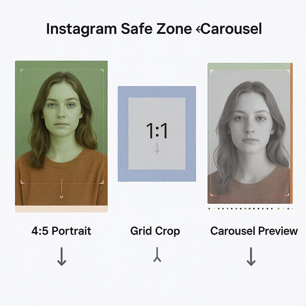
Why 1080×1350 Matters: The 4:5 Portrait Format
Instagram accepts several aspect ratios, but 4:5 portrait (1080×1350 px) consistently earns the most on-screen real estate in the feed without being cropped. That extra height:
- Pushes more of your message above the fold.
- Creates a vertical canvas ideal for product stacks, before/after reveals, and educational graphics.
- Improves thumb-stopping power versus square (1:1) or 1.91:1 landscape.
In-feed, the entire 1080×1350 image is visible. The catch? Your profile grid is strictly square, so portrait posts are center-cropped there.
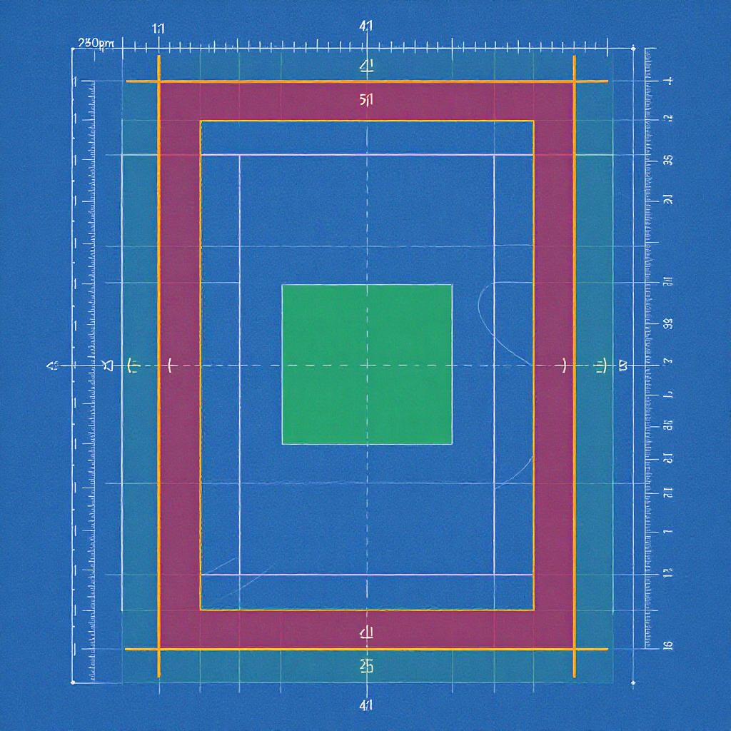
Safe Zones Defined (With Exact Pixels)
Think in three layers: full canvas, grid preview, and inner safe padding.
| Zone | Purpose | Exact Pixels | Notes |
|---|---|---|---|
| Full Canvas | Primary design area for the feed | 1080 × 1350 | 4:5 aspect ratio; all visible in feed |
| Profile Grid Crop | What shows on your profile grid | Center 1080 × 1080 | Trim is 135 px from top and 135 px from bottom (1350 − 1080 = 270 total) |
| Grid-Safe Band | Keep critical elements visible on your grid | Y from 135 to 1215 (full width) | Everything outside this vertical band is cut off on grid |
| Inner Safe Padding | Protect text/logos from edge clipping and rounded corners | 40–60 px on all sides | Use 48 px as a practical default; apply inside the area you care about (feed and/or grid band) |
Coordinate quick reference (origin at top-left):
- Full canvas: x = 0–1080, y = 0–1350
- Grid crop rectangle: x = 0–1080, y = 135–1215 (centered)
- With a 48 px inner margin for feed-safe text/logos: x = 48–1032, y = 48–1302
- With a 48 px inner margin for grid-safe text/logos: x = 48–1032, y = 183–1167
Practical Placement Rules
- Keep critical text, logos, and faces within the central 1080×1080 band (y = 135–1215) so they survive the grid crop.
- Add 40–60 px inner margin on all sides for text and logos. This avoids edge clipping, device-specific rounded corners, and carousel UI dots/chevrons. A 48 px margin is a good default.
- Allow breathing room. Text that touches edges compresses poorly and looks amateurish at 1080-wide.
- Use contrast-aware backgrounds. High-contrast text (e.g., white on dark) is crisper after Instagram’s recompression.
Composing for Both Feed and Grid
Place elements so they read in-feed and don’t get cut off in your profile grid:
- Headlines: Place in the upper-middle of the grid-safe band, roughly y = 250–600. This sits high in-feed without risking the 135 px top trim on the grid.
- Faces and products: Aim for the central column and keep eyes/primary features between y ≈ 350–950. The human eye gravitates to center-weighted compositions in a scroll.
- CTAs and price badges: Bottom-middle of the grid-safe band, but above y = 1167 minus your inner margin. For example, with a 48 px margin, keep key badges above y ≈ 1119.
- Background and decorative elements: Use top/bottom 135 px as “grid bleed.” It’s visible in-feed but sacrificial on the profile grid.
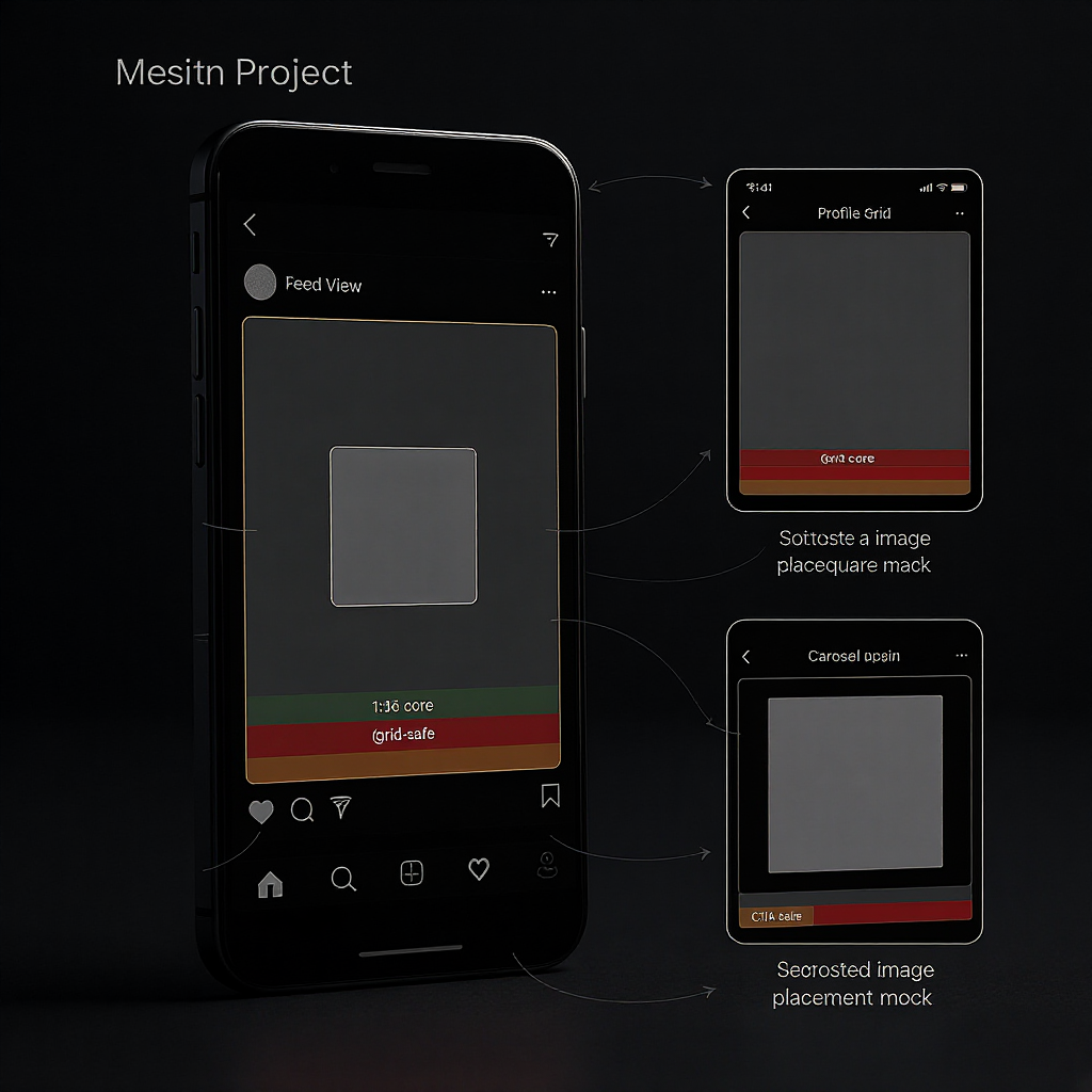
Carousels, Ads, and UI Overlays
What changes
- Carousel indicators: Dots and subtle chevrons can appear near bottom-center/right in the feed. Keep a 40–60 px bottom margin free of critical micro-text and small logos.
- Page counter: Some experiences show a small “1/3” badge near a corner. Avoid pinning critical icons to corners.
What doesn’t
- Captions: They sit below the media in feed, not over it. Still, avoid placing essential copy right at the very bottom edge to prevent visual crowding.
- Organic image posts: No hard overlays for likes/comments/CTA on the image itself in the main feed. Ads typically keep CTA buttons below the media.
Future-proofing
- Keep vital content inside the inner safe padding and the central 1080×1080 band. If UI elements shift slightly over time, your content remains legible.
- Avoid corner-dependent layouts (e.g., micro-text in extreme corners).
Designing With Guides in Figma, Canva, and Photoshop
Figma
- Create a Frame: 1080 × 1350 (Frame tool).
- Add horizontal guides at y = 135 and y = 1215 (grid crop band).
- Add inner padding guides for feed-safe text: x = 40–60 and 1080−(40–60); y = 40–60 and 1350−(40–60).
- Add inner padding guides for grid-safe text: x same as above; y = 135+(40–60) and 1215−(40–60).
- Build components: A headline text style, CTA button, and a “safe zone” overlay you can toggle.
Canva
- Custom size: 1080 × 1350.
- Use File > View settings > Show rulers and guides.
- Drag guides to y = 135 and y = 1215. Drag margin guides at 40–60 px from each edge (and from the grid band lines if you want grid-safe text guides).
- Save a template page with labeled layers: “Feed Safe,” “Grid Safe,” “Background/Bleed.”
Photoshop
- New document: 1080 × 1350, RGB, 72–144 PPI (PPI doesn’t matter for screens, but keep it standard).
- View > Rulers; View > New Guide:
- Horizontal: 135, 1215
- Vertical: 40–60, 1020–1040 (depending on your chosen margin)
- Horizontal: 40–60, 1290–1310
- Horizontal grid-safe: 135+(40–60), 1215−(40–60)
- Create a “Safe Zones” layer group with shape overlays at low opacity for reference.
Sample coordinates as reusable “spec”:
{
  "canvas": {"w":1080,"h":1350},
  "gridSquare": {"x":0,"y":135,"w":1080,"h":1080},
  "safeMargin": 48,
  "feedSafe": {"x":48,"y":48,"w":984,"h":1254},
  "gridSafe": {"x":48,"y":183,"w":984,"h":984}
}
Export and Quality Checklist
Color
- Color space: sRGB IEC61966-2.1. Convert and embed the profile to avoid shifts on mobile.
- Avoid wide-gamut profiles (Display P3) unless you’ve tested Instagram’s handling on your audience’s devices.
Format
- JPEG for photos and mixed content; quality 80–92 is a sweet spot.
- PNG for flat graphics with large flat colors and sharp text; Instagram may re-encode to JPEG, but starting clean reduces artifacts.
- Avoid over-compressing before upload; let Instagram’s pipeline do its job.
Sharpness and compression
- Resize to 1080 px width before export. Don’t rely on the app to downscale large images.
- Apply light output sharpening: Unsharp Mask Amount 60–90%, Radius 0.3–0.6 px, Threshold 0–2, or a subtle Smart Sharpen.
- Target file size: roughly 300–1200 KB. Very large files invite heavier recompression; ultra-small files look mushy.
Banding and text clarity
- Add a tiny amount of dithering or 1–2% noise to gradients to prevent banding.
- Use solid color behind small text. Thin fonts under ~36 px often blur at 1080-wide; prefer 38–42 px minimum for body copy, 72–120 px for headlines, and keep strokes >1.5 px.
Common Pitfalls and Quick Fixes
Pitfalls
- Text hugging edges: Rounded corners and scaling clip it.
- Tiny body fonts: Anything below ~36 px risks illegibility after compression.
- Low contrast: Pastel on pastel smears after recompression.
- Overcrowding: Too many elements fight for attention, especially in a 1080-wide canvas.
- Ignoring the grid crop: Key content vanishes from your profile.
Quick fixes
- Add a 40–60 px inner margin; reposition logos and CTAs inside it.
- Increase text size and weight; use bold or semi-bold for small sizes.
- Add a soft dark/light overlay behind text to boost contrast.
- Remove nonessential stickers or icons; establish a clear hierarchy.
- Recenter hero elements inside y = 135–1215.
Pre- and Post-Upload Checklist
Before export
- Canvas is 1080 × 1350 (4:5).
- Critical content inside the central 1080 × 1080 band (y = 135–1215).
- Text/logos inside a 40–60 px inner margin (feed-safe and, if needed, grid-safe).
- sRGB profile embedded; gentle sharpening applied; gradients dithered.
- File size reasonable (≈300–1200 KB).
Before posting
- Preview square crop: Does the grid still make sense? Any cut-off headlines?
- Carousel-ready: Bottom 40–60 px clear of tiny text if swiping indicators appear.
- Accessibility: Add alt text that matches the key message.
- Test on a phone: Open the export at 100% in your camera roll; check edge clarity and micro-text.
After posting
- View on your profile grid: Confirm trims (135 px top and bottom) didn’t remove critical content.
- Save as template: If it worked, lock the guides and reuse.
Summary
Set your 1080×1350 canvas with a clear grid-safe band (y = 135–1215) and a consistent 40–60 px inner margin to protect text and logos. Use guide templates in your design tool of choice, export in sRGB with mindful sharpening, and double-check square crops before posting. With this repeatable setup, your posts will stay crisp in-feed and composed on the grid—no surprises, no cut-offs.