Instagram Text Box Tips for Customization and Engagement
Learn how to use and customize Instagram text boxes in Stories and Reels with fonts, colors, effects, and branding tips to boost engagement.

Introduction to the Instagram Text Box Feature
The Instagram text box is a versatile creative tool available in Stories, Reels, and some post-editing contexts. This feature allows you to overlay captions, highlight a quote, label a product, or engage followers with interactive prompts, adding an extra layer of meaning and style to your visuals. It’s especially powerful for content creators, marketers, and brands who want to combine imagery with compelling written communication to boost engagement and storytelling.

In this guide, you’ll learn where to find and use the Instagram text box, how to customize it for maximum visual impact, and effective strategies to integrate it into your brand style.
---
Where to Find and Access the Instagram Text Box
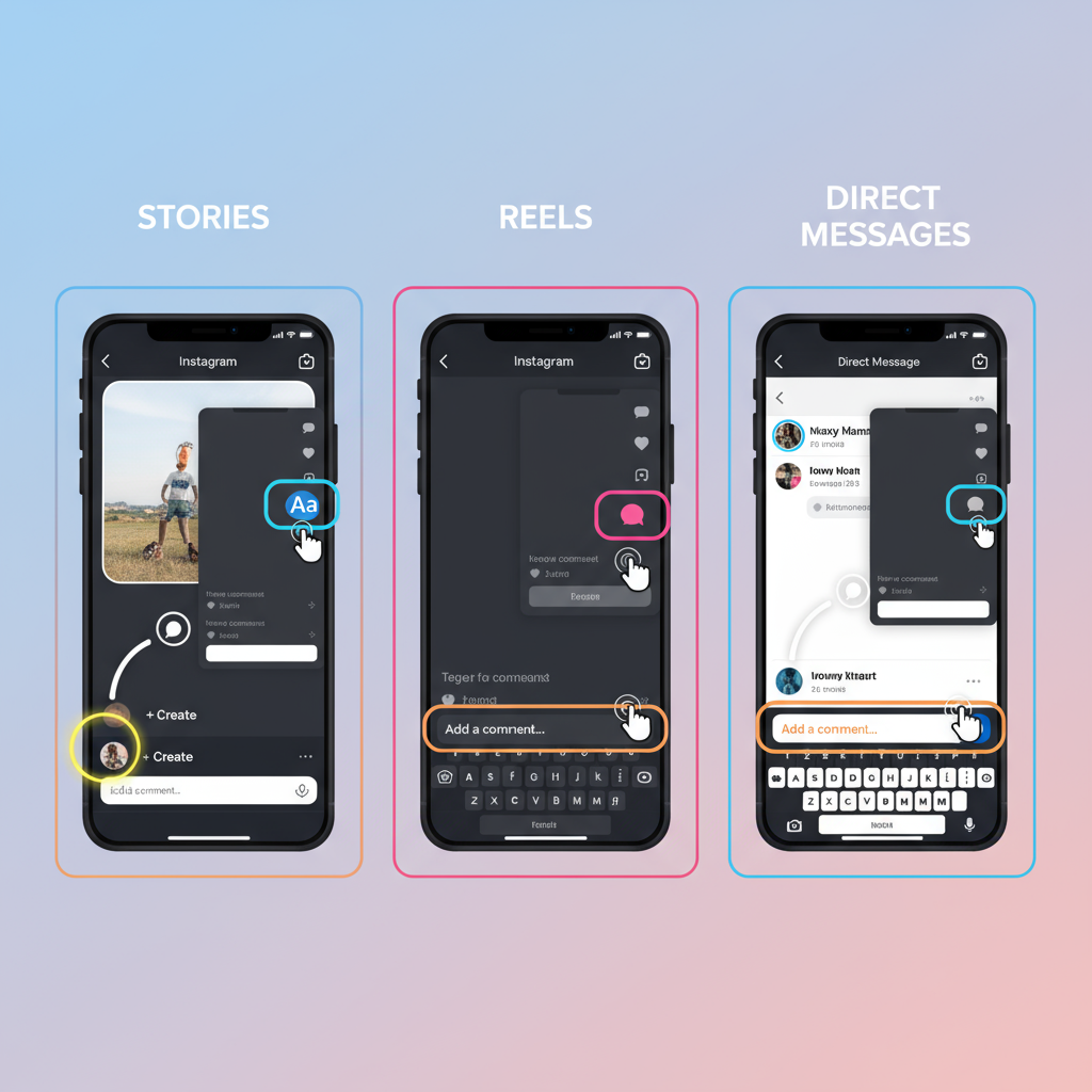
Instagram integrates the text box into several areas of the app:
1. Instagram Stories
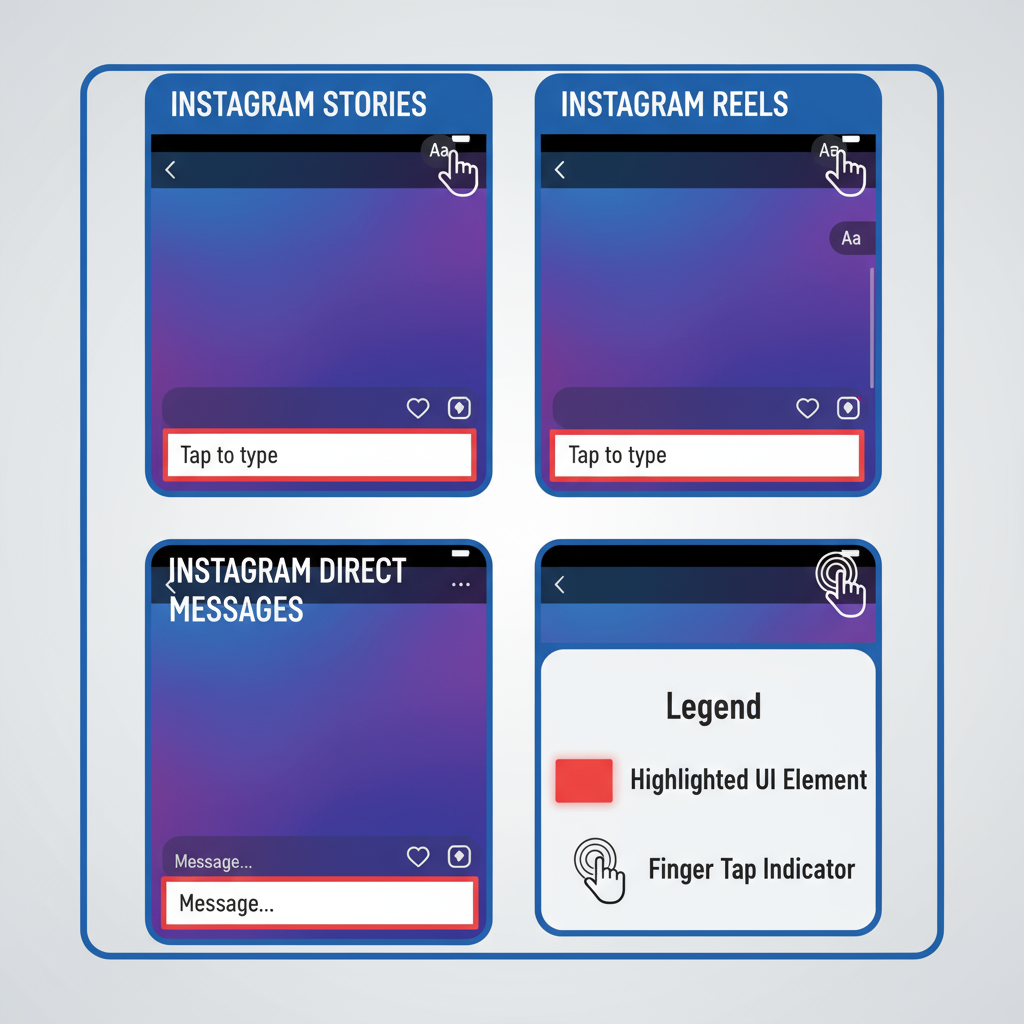
When creating a Story (via the `+` icon > Story), tap the "Aa" icon at the top of the screen to open the text editor.
2. Instagram Reels
During the editing phase after recording or uploading a Reel, tap the "Aa" icon to insert text overlays. You can set them to appear and disappear at specific timestamps for better pacing.
3. Direct Messages
In Instagram DMs, the text box appears at the bottom of the chat for sending plain or styled messages (customization is more limited here).
---
Basic Functions: Typing, Resizing, Positioning, Rotating
Using the Instagram text box starts with mastering the basics:
- Typing Text: Tap the screen (Stories/Reels) to activate the keyboard.
- Resizing: Pinch inward or outward to adjust the size.
- Positioning: Drag with one finger to move text around the screen.
- Rotating: Twist with two fingers to set a custom angle.
These tactile controls let you precisely place text to match your composition.
---
Customizing Fonts, Colors, Backgrounds, and Alignment
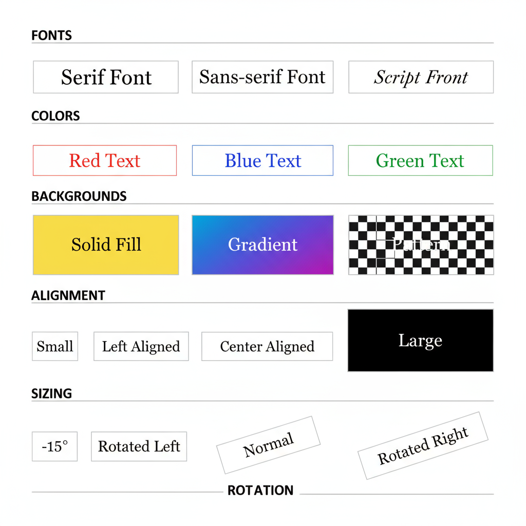
Instagram offers multiple built-in customization options. After typing your text:
- Change Fonts: Swipe through the font choices in the editor.
- Select Colors: Use the color palette or hold down to open the gradient picker.
- Background Highlight: Tap the highlighted A icon for a colored background.
- Alignment: Choose left, center, or right alignment for balance.

---
Adding Effects and Animations to Text in Stories and Reels
Animations help your Instagram text box stand out:
- Typewriter Effect: Letters appear one at a time.
- Fade In/Out: Smooth text transitions.
- Slide or Bounce: Adds dynamic movement.
Tap the sparkle icon after selecting text to preview and apply effects.
---
Best Practices for Readability and Accessibility
Ensure your content is readable for all viewers:
- Maintain strong contrast between text and background.
- Use a large and clear font for mobile viewing.
- Avoid placing text over busy imagery—use background highlights for clarity.
Accessibility improves inclusivity and retention rates.
---
Using Instagram Text Boxes for Storytelling and Branding
The Instagram text box can drive storytelling and reinforce branding:
- Micro-Narratives: Spread your message across multiple frames.
- Brand Voice: Consistent use of fonts and tone builds recognition.
- Mood Setting: Fonts and colors can evoke specific emotions.
A style guide can help maintain brand consistency.
---
Integrating Hashtags, Mentions, and Links Inside Text Boxes
Boost engagement by making hashtags and mentions part of your overlay:
- Type hashtags (`#YourHashtag`) or mentions (`@YourHandle`) inside the text box.
- Instagram auto-links them.
- In Stories, add link stickers alongside text for more click-throughs.
Including them in your Instagram text box keeps visuals cohesive.
---
Design Tips for Professional-Looking Overlays
Professional overlays elevate your Instagram content:
| Design Aspect | Recommendation |
|---|---|
| Font Choice | Limit to 1-2 fonts per Story/Reel for consistency |
| Color Palette | Stick to brand colors or complementary tones |
| Alignment | Align text visually with other elements in frame |
| Spacing | Leave adequate spacing between text and edges |
| Background | Use semi-transparent boxes for readability over images |
---
Common Mistakes to Avoid
Steer clear of these issues when using the Instagram text box:
- Too Much Text: Followers prefer quick visual cues.
- Poor Contrast: Low visibility frustrates viewers.
- Inconsistent Styles: Too much variation weakens branding.
- Blocking Visuals: Avoid overlapping important imagery.
---
Creative Examples and Inspiration from Top Creators
Get inspired by how top creators use the feature:
- Minimalist Quotes: Serif font on muted backdrops.
- Layered Text: Large transparent words with smaller details.
- Timed Overlays: Reveal text in sync with music beats.
- Interactive Prompts: Combine styled text with polls or quizzes.

Search hashtags like `#textoverlay` or `#typographydesign` for more ideas.
---
Conclusion: Consistent Style for Impactful Messaging
To get the most from the Instagram text box:
- Use a uniform font and size across content.
- Pick a consistent palette that reflects your brand identity.
- Apply standard placement rules for overlays.
- Keep accessibility a top priority.
When applied consistently, the Instagram text box can become a defining part of your storytelling and branding strategy. Start experimenting today to create visually engaging, memorable, and on-brand content that resonates with your audience.


