Instagram Twitter and Facebook Logo History and Design
Explore the history, design evolution, and color psychology behind Instagram, Twitter, and Facebook logos, and how minimalism shapes their branding.
Introduction: Social Media Branding and Visual Identity
In today’s competitive digital landscape, social media branding relies heavily on a consistent and memorable visual identity. Platforms like Instagram, Twitter, and Facebook illustrate how a thoughtfully designed logo becomes an instantly recognizable cultural marker. These designs communicate personality, values, and trust—often without text—forming powerful connections between platforms and their global audiences.
Over time, each of these companies has evolved its logo to reflect design trends, technological advancements, and user expectations. In this article, we explore the history, design principles, and future of the Instagram, Twitter, and Facebook logo to understand what makes them such enduring icons.

---
Instagram’s Logo Evolution: From Retro Camera to Gradient Glyph
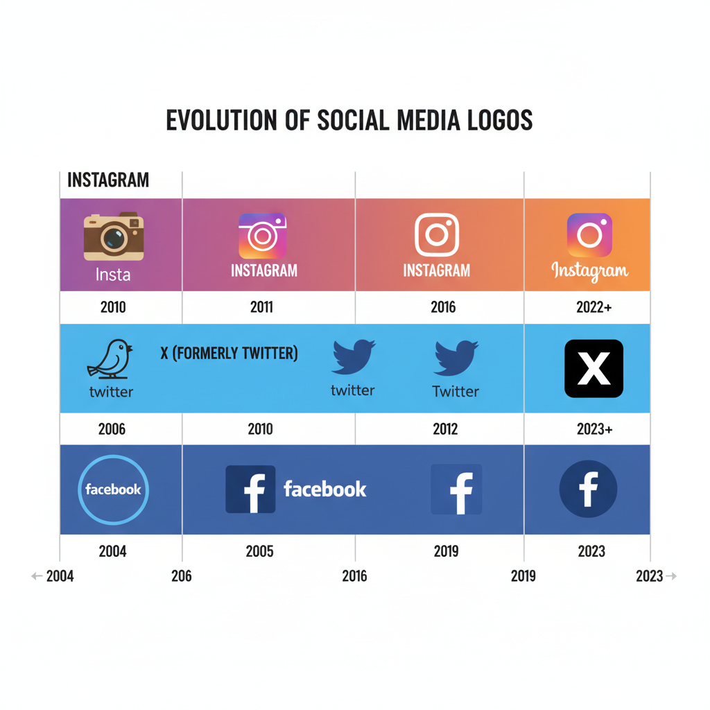
When Instagram debuted in 2010, it featured a retro Polaroid-style camera, aligning with the app’s vintage photo filter focus. This skeuomorphic design offered rich detail but was less adaptable to small screens.
The 2016 redesign transformed the brand’s look: a flat camera glyph set over a pink-orange-purple gradient. This minimalist and colorful approach enhanced scalability and modern appeal across devices, print, and media.
Key milestones in Instagram’s logo history:
- 2010–2011: Realistic retro camera.
- 2011–2016: Simplified camera icon.
- 2016 onwards: Vibrant gradient flat glyph.
The gradient’s warmth and vibrancy mirror Instagram’s emphasis on creativity and positive engagement.
---
Twitter’s Logo Timeline: Larry the Bird Simplified
Twitter’s famous blue bird—originally called Larry the Bird—made its debut in 2006 with a playful, cartoonish style, feathers, and text. Gradually, Twitter simplified its mascot:
- 2006: Bird with “Twitter” text, extra details.
- 2010: Cleaner, streamlined bird graphic.
- 2012 onwards: Minimal upward-tilt silhouette, no text.
This design evolution reinforced imagery as the sole identifier, making the logo more versatile for global use while maintaining brand recognition.
---
Facebook’s Logo Changes: From Wordmark to Meta
Launched in 2004 as “TheFacebook,” the original logo featured lowercase white lettering set against a blue rectangle, chosen due to Mark Zuckerberg’s favoring of blue tones. Significant changes included:
- Removing “The” from the name.
- Updating the blue shade and typography.
- In 2019, creating a corporate all-caps FACEBOOK wordmark to separate company identity from the app.
- In 2021, transitioning the parent company identity to Meta with an infinity-loop logo, while keeping the iconic “f” blue app icon.
This dual identity allows Facebook to retain mass-market familiarity while repositioning the parent brand for the future.
---
Color Psychology of Social Media Brand Colors
Colors send emotional cues that shape user perception. Here’s how each platform’s main colors contribute to its image:
| Platform | Primary Color(s) | Psychology |
|---|---|---|
| Pink-Purple-Orange Gradient | Creativity, excitement, warmth, energy, approachability. | |
| Sky Blue | Communication, trust, friendliness, openness. | |
| Dark Blue | Stability, trust, professionalism, dependability. |
These palettes intentionally align with each platform’s community vibe and content style.
---
Typography and Minimalism Trends in Redesigns
Typography communicates tone as clearly as color does. Instagram, Twitter, and Facebook share the sans-serif aesthetic, signaling modernity and accessibility. Their logo redesigns over time demonstrate:
- Pruning details for simplified, bolder shapes.
- Prioritizing icon-based branding over wordmarks.
- Ensuring clarity on screens from smartwatches to billboards.
Minimalism benefits performance, memorability, and visual harmony in crowded digital spaces.
---
Copyright, Trademark, and Proper Usage Rules
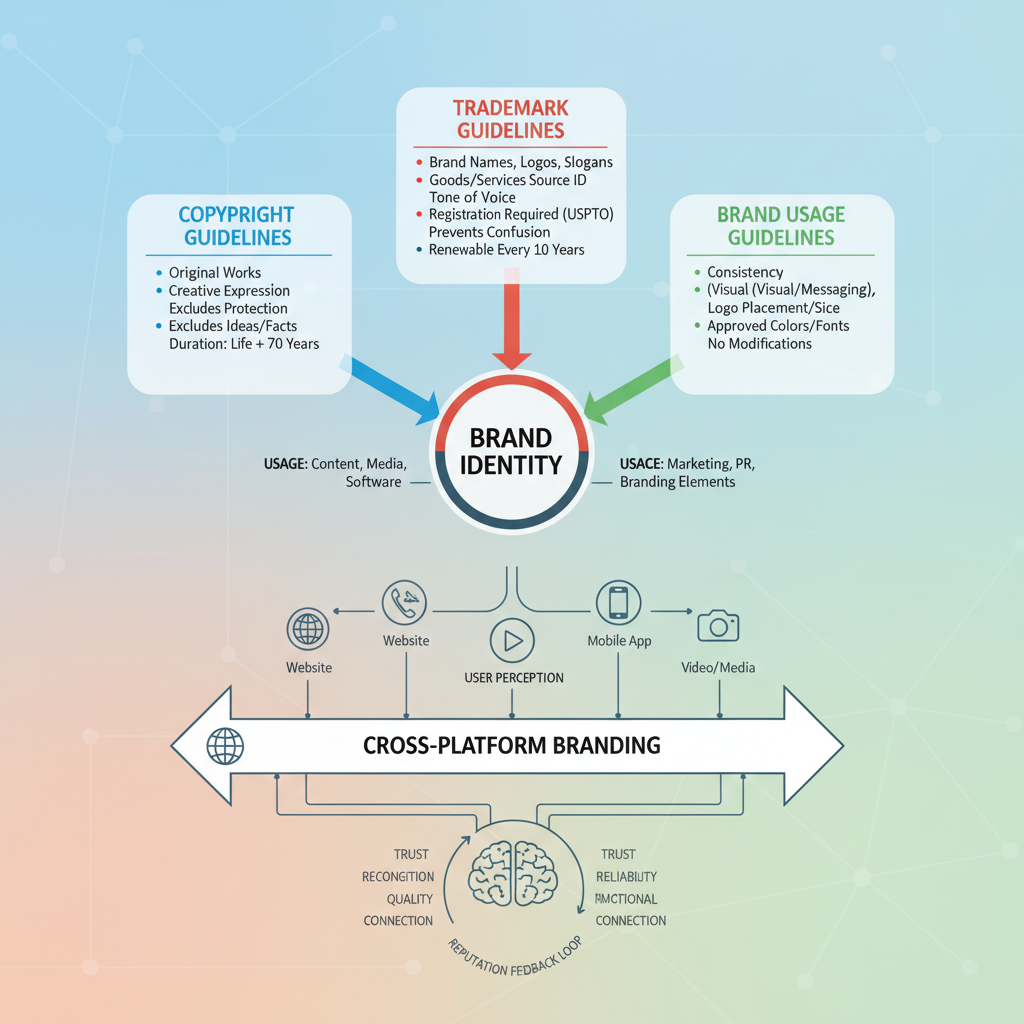
Logos are protected assets governed by strict brand guidelines. These typically include:
- No modifications to official colors, proportions, or orientation.
- Using only current official versions.
- Maintaining clear space around the logo.
- Not implying endorsement or partnership without approval.
Mishandling a logo risks legal action and damages credibility. Always refer to platform-specific brand asset resources before use.
---
Cross-Platform Branding and User Perception
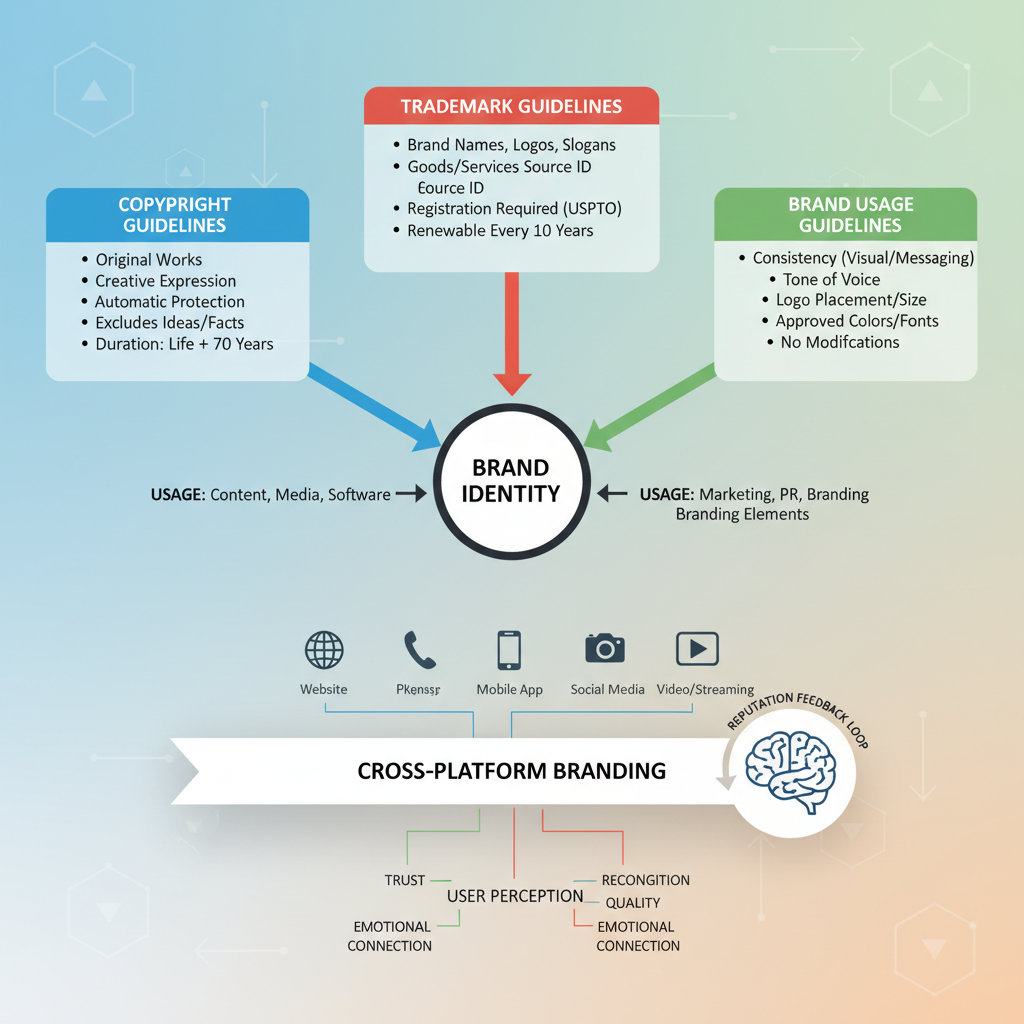
Consistent logo usage across platforms unifies marketing efforts:
- Instagram attracts creatives and influencers with dynamic visuals.
- Twitter projects immediacy and openness, suited to live dialogue.
- Facebook conveys reliability, resonating across demographic lines.
Coordinating these brand elements across campaigns strengthens recognition and message cohesion.
---
Designing Effective Campaign Graphics with Social Logos
To create professional visuals featuring multiple social media logos:
- Use official vector files for clarity at all scales.
- Match logos with contrasting backgrounds for legibility.
- Maintain proportional sizes and spacing when combining multiple icons.
- Integrate brand colors subtly into design elements for authenticity.
Following these principles ensures your creative assets look polished and respect brand standards.
---
The Future of Major Social Media Logos
Looking ahead, social media logos are likely to evolve by:
- Further simplifying form for maximum scalability.
- Adapting to immersive environments like AR and VR.
- Incorporating subtle animations for richer digital experiences.
- Experimenting with adaptive contextual designs relevant to seasons and events.
These trends will keep icons relevant in increasingly dynamic interfaces.
---
Conclusion: How Strong Logos Enhance Recognition and Trust
The evolution of the Instagram, Twitter, and Facebook logo demonstrates that great branding adapts while preserving core identity. Color choices, typography, and simplified shapes deepen user trust and signal consistency—essential in a fast-changing digital world.
Businesses and creators can learn from these examples: by respecting brand rules and leveraging recognizable, emotionally resonant designs, you can amplify your own social presence. Strong logos remain trustworthy touchpoints that drive familiarity, recognition, and long-term engagement.
Ready to strengthen your own visual identity? Start by refining your logo for clarity, scalability, and emotional impact—just like the social media giants.

