LinkedIn Banner Size Safe Zone Dimensions and Tips
Learn the latest LinkedIn banner sizes, safe zone dimensions, and design tips to ensure professional, on-brand visuals across all devices.

LinkedIn Banner Size Safe Zone Dimensions and Design Tips
Your LinkedIn banner — also called a profile cover or background image — is one of the most impactful visual elements on your LinkedIn presence. It sets the first impression for visitors, supports personal branding and company branding, and can communicate your expertise at a glance. Optimizing your banner for the correct size and safe zone dimensions ensures it looks professional across desktop, tablet, and mobile, avoiding cropping of important content.
This guide covers the latest LinkedIn banner dimensions, explains the safe zone concept, and shares actionable design tips so your profile or company page stands out.
---
Why a LinkedIn Banner Matters for Branding
Your banner acts as a digital billboard for your profile:
- Professional Presentation: A well-crafted banner signals competence and attention to detail.
- Brand Recall: Incorporate company colors, logos, or memorable taglines.
- Informational Complement: Highlight your products, services, or key events.
- Visual Differentiation: Distinguish your profile in a network of millions.
A strong, branded banner boosts trust and encourages profile engagement.
---
Current LinkedIn Banner Dimensions
LinkedIn uses different upload sizes depending on whether the banner is for a personal profile or a company page.
| Banner Type | Recommended Size (px) | Aspect Ratio |
|---|---|---|
| Personal Profile Banner | 1584 × 396 | 4:1 |
| Company Page Banner | 1128 × 191 | ≈ 6:1 |
Pro Tip: Export banners as PNG or JPEG at high resolution (under 8 MB) for sharp rendering.
---
Understanding the LinkedIn Banner Safe Zone
The safe zone is the central area where text, logos, and essential visuals remain visible on all devices. Designing within this zone is vital because:
- LinkedIn crops banners differently on desktop, tablet, and mobile.
- Profile pictures overlap the lower-left section on desktop.
- Mobile views trim more from the sides, hiding edge content.
A safe zone strategy protects your message from unintended cropping.
---
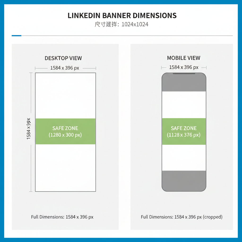
Safe Zone Pixel Measurements Across Devices
Tested approximate safe zone dimensions:
| Device View | Total Banner Size (px) | Safe Zone Width (px) | Safe Zone Position |
|---|---|---|---|
| Desktop (Profile) | 1584 × 396 | 1350 × 250 | Centered horizontally; ~234 px left covered by profile photo |
| Tablet | 1584 × 396 | 1300 × 250 | Centered; slightly reduced horizontal crop |
| Mobile | 1584 × 396 | 1280 × 250 | Centered; more aggressive side cropping |
Design Tip: Keep critical text/images within ~1280 px width × 250 px height in the horizontal center.
---
Profile Picture Overlay Impact
On desktop, the profile photo overlaps the banner’s lower-left area:
- Overlay Diameter: ~234 px
- Position: Left edge, vertically centered near bottom
- Impact: Obscures content placed behind it
Avoid placing key visuals in this overlay zone to keep them visible.
---
Smart Text Placement in the Safe Zone
For optimal readability and engagement:
- Center Alignment: Locate vital text centrally.
- Typographic Hierarchy: Larger fonts for the core message, smaller for details.
- Whitespace: Add breathing space for clarity.
- Avoid Borders: Keep away from safe zone edges for mobile compatibility.
| --------- CROPPED AREA --------- |
|---|
| Text/logo fully inside safe zone |
SAFE ZONE MOCKUP:
---
Color and Contrast for Banner Readability
Effective color use keeps your banner legible:
- High Contrast: Dark text on light backgrounds or vice versa.
- Consistent Brand Colors: Reinforce your identity.
- Overlay Use: Semi-transparent overlays make text pop.
- Minimal Background Detail: Simplify areas behind text.
---
Real-World Examples of Safe Zone Design
Example 1: A personal profile banner with a centered tagline and decorative elements on the far edges that can safely crop.
Example 2: A company page banner featuring a centrally placed logo and minimal text, with background imagery extending beyond the safe zone.
---
Recommended Tools for Banner Design with Safe Zone Guides
Reliable design resources include:
- Canva: LinkedIn banner templates with built-in safe zone guides.
- Figma: Custom frames and adjustable overlays.
- Adobe Photoshop: Layered templates with marked safe zones.
- Snappa: Easy web-based tool with correct dimensions.
Start by importing a safe zone PNG overlay to guide your layout.
---
Testing Banner Appearance Across Devices
Before publishing your banner:
- Desktop Check: Upload and view on a large monitor.
- Mobile Check: Use the LinkedIn mobile app for preview.
- Tablet Check: Test on a tablet or simulator.
- Responsive Testing: Use browser dev tools in responsive mode.
These steps confirm your design’s versatility.
---
Common LinkedIn Banner Mistakes to Avoid
Watch out for:
- Text at Edges: Almost always cropped on mobile.
- Ignoring Overlay: Leads to important elements being blocked.
- Busy Background Under Text: Makes reading difficult.
- Low Resolution: Results in blurred or pixelated visuals.
---
Updates to Safe Zone Guidelines
LinkedIn occasionally adjusts banner cropping. In early 2023, mobile trimming increased by ~15 px per side, narrowing the safe zone width recommendation to 1280 px. Keep track via LinkedIn’s official help pages.
---
Summary and Next Steps
By applying the correct LinkedIn banner size safe zone measurements, respecting profile picture overlays, and using high-contrast, centered layouts, you can ensure your banner delivers brand consistency across devices. Leverage safe zone templates, preview your design thoroughly, and refresh your visuals as LinkedIn updates their display formats.
Ready to create a standout LinkedIn presence? Start designing your banner today — and let your profile make the best possible first impression.