LinkedIn Carousel Post Dimensions and Size Guidelines
Learn optimal LinkedIn carousel post dimensions, aspect ratios, and design tips to create sharp, engaging slides for maximum audience interaction.

Introduction to LinkedIn Carousel Posts and Their Benefits
If you want to stand out on LinkedIn and keep your audience engaged, LinkedIn carousel posts are an excellent tool. They allow you to share multiple slides in one post, perfect for storytelling, tutorials, case studies, and visual reports. By mastering LinkedIn carousel post dimensions, you can ensure your designs are always crisp, professional, and optimized for viewing on both desktop and mobile.
Unlike single-image posts, carousel posts increase dwell time and interaction, which can improve reach and visibility across the platform.
Overview of LinkedIn Carousel Formats
LinkedIn carousels currently support two main content formats:
1. Document Carousels (PDF Uploads)
You can upload a multi-page PDF that LinkedIn converts into swipeable slides. This format is commonly used for educational guides, whitepapers, or slide decks.
2. Image-Based Carousels
Although there’s no dedicated image carousel post type, you can upload multiple images into a single post. Each image appears in its own frame, and users click to view them individually.
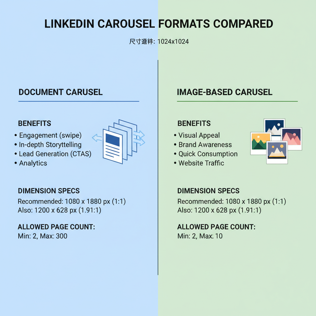
Each format comes with specific dimension needs, so designing with these in mind will prevent pixelation and layout issues.
Optimal Dimensions for Document Carousels (PDF Upload)
For PDF-based LinkedIn carousels, LinkedIn scales your pages to fit its feed. Starting with appropriate dimensions ensures clarity and readability:
- Recommended size: 1080 × 1080 pixels per page (square)
- Alternative: 1920 × 1080 pixels (landscape) – ideal for wide infographics or slides
- File format: PDF
- Orientation: Square slides work best for mobile and maintain visual balance
Recommended Image Sizes for Single Slides Within Carousels
Many designers prefer creating each PDF page as an image first, then exporting to PDF. If you choose this route:
- Square: 1080 × 1080 px
- Vertical emphasis: 1080 × 1350 px
- Maintain 96 DPI+ (dots per inch) for sharp visuals
- Keep aspect ratio consistent to avoid awkward cropping
Aspect Ratios and Resolution Guidelines
Correct aspect ratio ensures your content fits without being cut off or stretched. Common LinkedIn ratios include:
| Aspect Ratio | Pixel Dimensions | Best Use Case |
|---|---|---|
| 1:1 | 1080 × 1080 | Mobile-first designs, balanced layouts |
| 16:9 | 1920 × 1080 | Wide infographics, video-style slides |
| 4:5 | 1080 × 1350 | Tall formats for increased mobile visibility |
Pro tip: Use at least 150 DPI for sharp text and export from vector-based design tools when possible.
File Size Limits and Number of Pages Allowed
Before uploading, be aware of LinkedIn’s technical constraints:
- Max file size: 100 MB (documents)
- Max pages: 300 per PDF
- Supported file format: PDF only for carousel documents
- Reduce unused slides to keep files lean

Tips for Designing Carousel Slides to Maximize Engagement
To ensure viewers swipe through your entire carousel:
- Open with a strong first slide—grab attention with a bold statement or question
- Keep a consistent visual style (fonts, colors, layout)
- Chunk content—spread information over multiple slides to encourage deeper engagement
- End with a clear call-to-action (CTA) such as “Follow for more insights” or “Download the report”
Accessibility and Text Readability Considerations
Accessibility improves both usability and reach:
- Use high-contrast text and background
- Maintain at least 16px body text size
- Add backgrounds or overlays behind text placed over complex images
- Provide meaningful alt text for each document upload
Branding Consistency Across Carousel Slides
Brand recognition builds trust:
- Apply approved brand colors and fonts
- Place your logo discreetly and consistently
- Match imagery style to brand voice (illustrations, photography, icons)
Mistakes to Avoid When Preparing LinkedIn Carousel Assets
Avoid these pitfalls:
- Uploading low-resolution images that appear blurry
- Using random aspect ratios that create uneven spacing
- Overloading slides with text
- Ignoring mobile readability
- Forgetting a final CTA
Tools and Templates for Creating Correctly Sized Slides
Save time and maintain accuracy by using:
- Canva – Ready-made LinkedIn carousel templates
- Adobe Illustrator / Photoshop – For precision design
- Figma – Ideal for collaborative design workflows
Consider creating a master template at 1080 × 1080 px or 1920 × 1080 px.
Testing and Previewing Before Publishing
Always preview your design before posting:
- Check on desktop and mobile
- Test with a private/draft post to see how slides render
- Ensure key text isn’t positioned too close to edges
Best Practices to Increase Reach and Conversion via Carousel Posts
Boost your carousel’s impact with these tactics:
- Post during peak hours for your industry
- Write strong captions that set context
- Use targeted hashtags (#b2bmarketing, #designinspiration)
- Tag collaborators to reach new audiences
- Repurpose carousel slides into blogs, PDFs, or social snippets
Conclusion + Quick Reference Dimension Cheat Sheet
Mastering LinkedIn carousel post dimensions helps maintain professionalism, boost engagement, and enhance brand credibility. By using correct sizes, respecting aspect ratios, and keeping design consistent, you ensure your content delivers maximum value.
Dimension Cheat Sheet:
| Format | Aspect Ratio | Pixel Dimensions | Max File Size | Max Pages |
|---|---|---|---|---|
| Document Carousel (PDF) | 1:1 | 1080 × 1080 | 100 MB | 300 |
| Document Carousel (PDF) | 16:9 | 1920 × 1080 | 100 MB | 300 |
| Image Carousel | 4:5 | 1080 × 1350 | 5 MB/image | Multiple images per post |
Next step: Apply these sizing and formatting best practices in your upcoming LinkedIn carousel to boost visibility, engagement, and conversions.