LinkedIn White Logo Usage Guide for Branding and Marketing
Learn best practices for using the LinkedIn white logo on dark backgrounds, ensuring brand consistency, accessibility, and compliance with guidelines.
LinkedIn White Logo Usage Guide for Branding and Marketing
LinkedIn is one of the most recognized professional networking platforms worldwide, making its logo a powerful symbol of trust and credibility. The LinkedIn white logo offers a clean, minimal version of the standard brand mark, perfect for scenarios where the standard blue logo might clash with your design or lose visibility. In this guide, you'll learn best practices for using the LinkedIn white logo in branding and marketing, ensuring your visuals stay professional, consistent, and legally compliant.
---
Understanding LinkedIn Brand Guidelines and Logo Variations
LinkedIn's official brand guidelines outline exactly how their logos should appear across both digital and print media. Core variations include:
- Standard LinkedIn Logo – Blue-based, recommended for light backgrounds.
- White LinkedIn Logo – A monochromatic variant designed for dark backgrounds or minimalist layouts.
- Icon-only Mark ("in") – Used where space is limited, such as social media icons and app buttons.
These guidelines specify correct usage, including minimum sizing, spacing, and safe area rules, ensuring consistent and recognizable branding in all contexts.
---
Difference Between LinkedIn Standard Logo and White Logo Version
The standard logo features LinkedIn's signature blue (`#0A66C2`) with white lettering, working best on light backgrounds.
The white logo replaces all colored elements with pure white, enhancing visibility on dark or saturated designs.
Key Differences:
| Feature | Standard Logo | White Logo |
|---|---|---|
| Background Compatibility | Light backgrounds | Dark backgrounds |
| Color Palette | Blue + White | White Only |
| Use Case | General marketing | Minimalist designs, dark themes |
---
When to Use the LinkedIn White Logo
Use the white logo in the following scenarios:
- Dark backgrounds – Black, navy, charcoal, or gradient designs.
- Minimalist layouts – Clean, modern presentations and portfolio showcases.
- Print materials – Flyers, posters, and brochures with dark sections.
- Overlay graphics – Video lower thirds, banners, or infographic elements.
Ensure your chosen background color meets recommended contrast ratios for accessibility.
---
Download Official LinkedIn White Logo from Brand Resources Page
To remain compliant with LinkedIn's trademark rules:
- Visit LinkedIn's official brand resources page.
- Navigate to the "Logos" section.
- Download the white logo version in formats such as PNG, SVG, or EPS.
- Review and follow usage instructions in the provided guidelines PDF.
Avoid third-party sources; they may supply incorrect file formats or unauthorized modifications.
---
Correct Sizing, Spacing, and Safe Area Requirements
LinkedIn specifies a safe area—the minimum space around the logo that must remain free of text or graphics.
General Rules:
- Maintain spacing equal to the height of the lowercase “in” in the logo.
- Respect minimum digital size guidelines (often 24px wide).
- Scale proportionally; avoid any warping or stretching.
---
Ensure Accessibility and Contrast Compliance for the White Logo
Accessibility is key to engagement and inclusivity. When using the white logo:
- Follow WCAG (Web Content Accessibility Guidelines) contrast ratio recommendations.
- Set the logo against sufficiently dark backgrounds for clarity.
- Test visibility across multiple devices and in printed materials.
For web use, add alt text and ARIA labels for screen reader compatibility.
---
Integrating the White Logo into Social Media Graphics and Banners
On platforms like LinkedIn, Twitter (X), or Instagram, the white logo works especially well in bespoke banners and promotional visuals.
Tips:
- Align logos to composition edges for impact.
- Use consistent margins in multi-post campaigns.
- Optimize image file sizes for quick load times.
---
Adapting the White Logo for Presentations, Pitch Decks, and Portfolios
For professional presentation decks:
- Position the logo in footers for subtle reinforcement.
- Feature it on cover slides with solid dark backgrounds.
- Adhere to LinkedIn's typography and layout recommendations.
This ensures your visual message matches the polished professionalism associated with LinkedIn.
---
Best Practices for Co-branding with the LinkedIn White Logo
When pairing your own logo with LinkedIn's:
- Provide clear spacing between logos.
- Keep each logo visually distinct; never blend design elements.
- Balance alignment to avoid one logo overpowering the other.
---
Common Mistakes to Avoid
- Unauthorized edits – Do not redraw or animate without formal approval.
- Distortion – Keep proportions intact; no stretching or skewing.
- Color changes – Use pure white (`#FFFFFF`) only.
- Poor contrast – Avoid placing on busy or textured backgrounds that hinder clarity.
---
Legal Considerations and Respecting Trademark Rules
The LinkedIn logo is a registered trademark. Misuse can have legal consequences.
Key rules:
- Only use official, provided assets.
- Do not suggest LinkedIn endorsement unless granted.
- Comply with LinkedIn's trademark policies and terms of service.
---
Examples of Successful Campaigns Using the LinkedIn White Logo Effectively
Campaigns that excel with the white logo:
- Displayed it prominently on event stage backdrops.
- Used dark-themed ads with crisp logo visibility.
- Strictly followed guidelines, maintaining brand trust.
Tech conferences, for instance, often feature the white logo on LED walls for maximum visibility under varied lighting conditions.
---
Step-by-Step Guide to Adding White Logo in Canva
1. Upload the official white logo PNG into Canva.
2. Select your chosen design canvas (e.g., social media post).
3. Place the logo in a dark area for contrast.
4. Resize proportionally via corner handles.
5. Apply safe-area spacing before final export.
---
Step-by-Step Guide to Adding White Logo in Photoshop
1. Open your dark background project in Photoshop.
2. Import the official white logo SVG.
3. Use "Free Transform" (Cmd/Ctrl + T) for proportional resizing.
4. Position within safe margins.
5. Export (JPEG/PNG) for intended use.
---
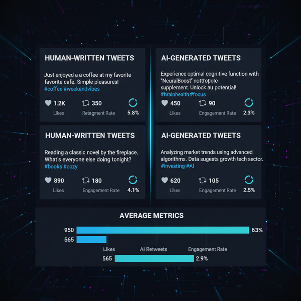
Tracking Engagement Impact When Using Brand-Consistent Visuals
Measure how consistent brand visuals influence audience responses:
- Compare metrics (impressions, CTR) before and after white logo use.
- Leverage LinkedIn analytics or other tracking tools.
- Refine future visual strategies based on performance data.
Combining strong branding with clear messaging boosts reach and credibility.
---
Summary: The LinkedIn white logo is a sleek alternative to the standard blue logo, ideal for dark backgrounds, minimalist designs, and high-contrast marketing materials. By following LinkedIn's brand guidelines—covering sourcing, spacing, accessibility, and legal requirements—you can ensure a consistent, professional impression across all platforms. Now start integrating the white logo into your campaigns and elevate your brand presence today.