Facebook and Twitter Logo Evolution and Meaning
Explore the evolution and meaning behind Facebook and Twitter logos, their design philosophies, color symbolism, and impact on brand recognition.

Introduction to Brand Logos for Digital Marketing Success
In the fast‑paced world of digital marketing, a brand logo serves as more than a decorative emblem—it is a strategic asset that conveys identity, values, and trust. Across websites, social media, and mobile apps, logos are the most consistent visual touchpoint between a brand and its audience. When we explore the logo of Facebook and Twitter, we uncover powerful examples of how thoughtful design and controlled evolution can amplify recognition, foster loyalty, and maintain relevance in a constantly shifting marketplace.

---
Brief History of the Facebook Logo (2004 to Present)
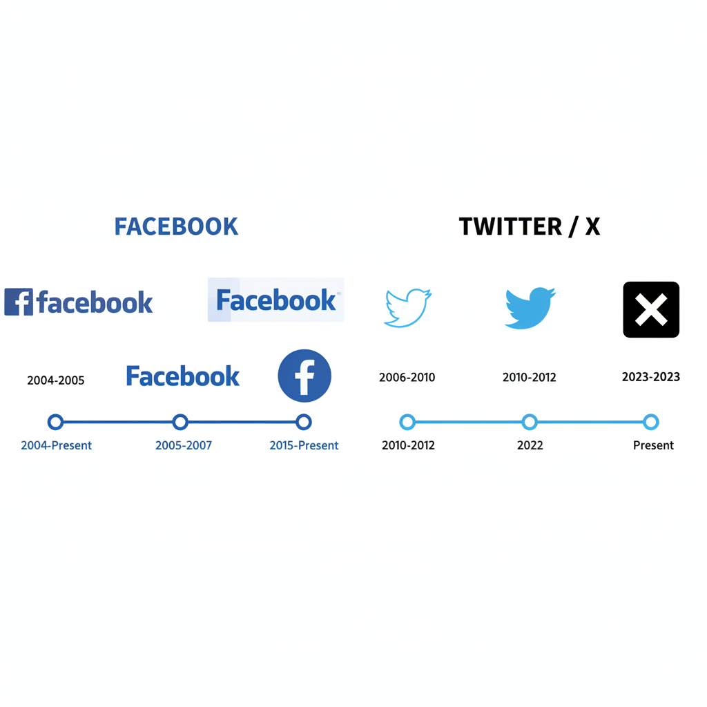
Facebook debuted in 2004, originally targeting Harvard University students, with a lowercase wordmark in white positioned over a deep blue rectangle. Over the years, visual revisions have been subtle, prioritizing familiarity while modernizing the aesthetic for digital screens.
Key milestones:
- 2004 – Original logo: “Facebook” in Klavika typeface on a blue rectangle.
- 2005‑2015 – Minor spacing and edge refinements; dropping “Thefacebook” to simply “Facebook.”
- 2015 Update – Softer, rounded typeface to project approachability.
- Current Iteration – Streamlined version optimized for responsive, small‑scale digital use.
---
Meaning and Symbolism Behind Facebook’s Color and Typography
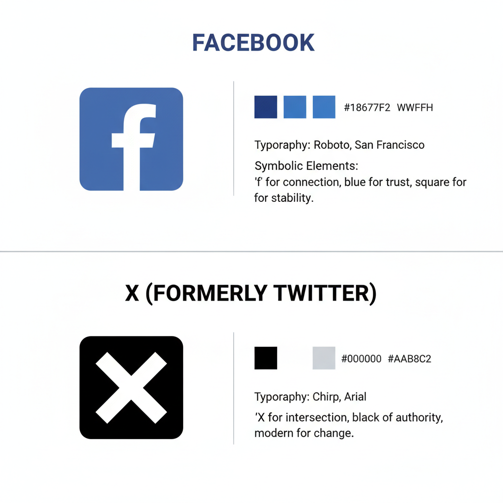
Facebook’s signature deep blue conveys trust, dependability, and professionalism—qualities critical for a social networking giant processing vast personal data. Mark Zuckerberg’s red‑green colorblindness also influenced the choice, as he perceives blue most vividly.
Typography strengthens the brand message: a clean sans‑serif wordmark communicates clarity and accessibility. The rounded letters in the latest design evoke warmth and human connection, balancing the perception of a large tech corporation.

---
Evolution Timeline of the Twitter Logo: Bird Icon from 2006 Onward
Twitter’s visual journey shows a more dramatic evolution compared to Facebook’s consistency. Initially launched in 2006 with a bubbly text‑based logo, the brand introduced its bird icon in 2010—a now‑iconic symbol recognized worldwide.
Notable stages:
- 2006‑2010 – Playful typography without icon.
- 2010‑2012 – Cartoonish “Larry the Bird” alongside text.
- 2012 Refresh – Sleek bird silhouette in upward flight, replacing text to indicate optimism.
- 2019 Update – Geometric refinements for proportion and balance; entirely icon‑based branding.
---
Twitter’s Minimalist Strategy and Global Recognition
Twitter’s pared‑down identity revolves around a single stylized bird, free of text, harnessing universal visual communication. Crisp lines, balanced geometry, and a consistent sky‑blue tone enhance adaptability.
Advantages of this minimalist branding:
- Instant, cross‑cultural recognition.
- Scalability for various formats—app icons, favicons, print.
- Emotional appeal via symbolism of freedom, connectivity, and movement.

---
Comparison of Logo Philosophies Between Facebook and Twitter
While both logos achieve strong recognition, their approaches differ fundamentally:
| Aspect | ||
|---|---|---|
| Primary Logo Type | Wordmark (Typography) | Icon (Bird Symbol) |
| Color Scheme | Deep blue, white lettering | Sky blue, white or transparent background |
| Evolution Pace | Incremental changes | Noticeable redesigns |
| Symbolism | Trust, stability, connectivity | Freedom, communication, global reach |
| Typography Role | Central to brand | Phased out over time |
---
Impact of Logo Changes on Brand Perception and User Engagement
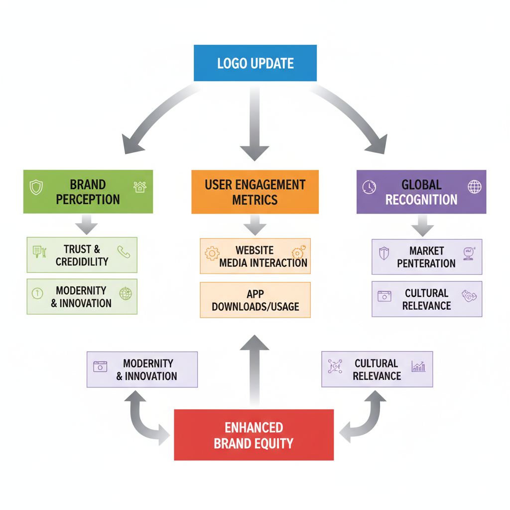
Logo adjustments influence brand perception. Facebook’s careful refinements reassure its vast user base while adapting to contemporary aesthetics. Twitter’s more visible shifts often accompany feature updates or shifts in strategic vision.
Benefits of thoughtful logo updates:
- Assert relevance in evolving markets.
- Spark renewed interest.
- Signal innovation or change.
Risks of excessive redesigns include user alienation and diluted brand cues.
---
Legal Protection: Trademark and Usage Rights
Both brands secure their logos through trademark registration, controlling commercial use. Using the logo of Facebook and Twitter for marketing or merchandise requires explicit consent. Each provides brand guidelines detailing:
- Precise color codes and proportions.
- Approved placement and context.
- Prohibited modifications.
Violating usage rules can lead to takedown actions or financial penalties.
---
Logo Updates as Reflections of Vision and Trends
Logos often mirror corporate goals. Facebook’s softened typography and consistent palette signal stability blended with human‑centric engagement. Twitter’s clean bird icon embodies agile, borderless communication.
Trends influencing logo evolution:
- Mobile‑first design needs.
- Multi‑format scalability.
- Minimalist, uncluttered aesthetics.
- Cultural neutrality for global audiences.
---
Lessons Businesses Can Learn from Facebook and Twitter
Marketers and SMBs can apply these practices for stronger logo impact:
- Maintain Consistency – Preserve recognizability through gradual changes.
- Leverage Symbolism – Align form and color with brand values.
- Evolve Strategically – Update alongside growth and shifts in market trends.
- Embrace Simplicity – Clean designs perform better across channels.
- Protect Legally – Trademark logos to secure brand assets.
A well‑designed logo narrates your brand’s story without words.
---
Conclusion: The Lasting Power of Iconic Logos
The enduring appeal of the logo of Facebook and Twitter lies in their clarity, strategic design evolution, and consistent application. Facebook’s typographic wordmark and Twitter’s minimalist bird prove distinct styles can both achieve global resonance when rooted in authentic brand values.
In today’s competitive digital ecosystem, view your logo as a dynamic brand asset—update it thoughtfully to reflect your mission, match design trends, and sustain recognition. Strong logo design is not just visual branding; it’s long‑term equity for your business.
Ready to refine your logo and elevate your digital presence? Start by evaluating your current design for clarity, symbolism, and adaptability to ensure it speaks effectively to your target audience.


