Logos of Facebook and Twitter: History and Design Evolution
Explore the history, design evolution, and branding strategies behind Facebook's wordmark and Twitter's bird icon, and their lasting blue color impact.

Introduction to the Logos of Facebook and Twitter
The logos of Facebook and Twitter have become some of the most recognisable brand symbols in the digital age. These visual identities power billions of daily interactions, shaping user trust, brand perception, and cultural impact. From subtle typographic refinements to bold icon shifts, each redesign tells a story about the company’s vision and adaptation to global market trends.

In this guide, we explore the history, design evolution, and strategic thinking behind the logos of Facebook and Twitter, highlighting how two different approaches have cemented their positions among the most influential global social media platforms.
---
Brief History of Facebook and Twitter Branding Evolution
Facebook launched in 2004 as "The Facebook," aimed at Harvard students before expanding worldwide. Twitter entered in 2006 as a microblogging service for short updates, quickly becoming a hub for breaking news and public discourse.
From the outset, both invested in building recognisable visual identities. Over time, the logos of Facebook and Twitter have been refined to align with user expectations, design trends, and corporate developments.
---
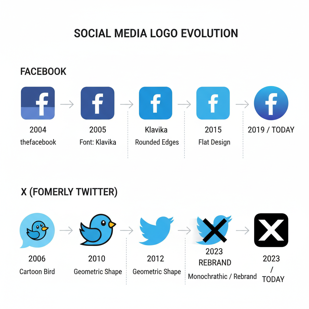
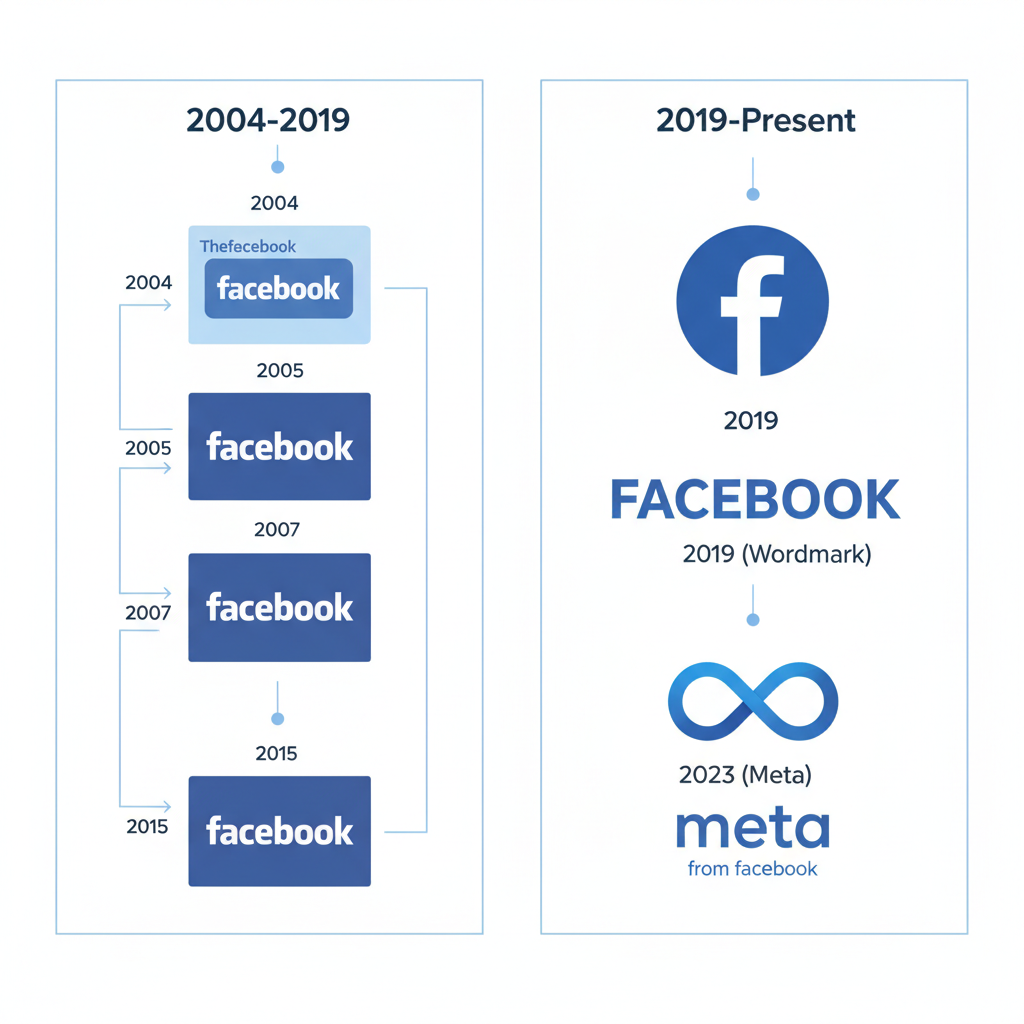
Timeline of Logo Changes for Facebook
Facebook’s logo reflects its growth from a student network to a global tech company.

Early Stage (2004–2005)
- 2004: "The Facebook" in white lowercase on a bold blue background.
- 2005: Dropped "The," shifting focus to the concise “Facebook” wordmark.
Design Maturation (2005–2015)
- Typography adjusted to improve readability across screens.
- Consistent deep blue background reinforced identity.
Contemporary Update (2015–2019)
- Friendly aesthetic through subtle letterform tweaks.
- Custom typeface introduced for scalability.
Recent Version (2019–Present)
- Multi-colour corporate branding introduced alongside the iconic blue logo.
- Signalled expansion into VR, social commerce, and other sectors.
---
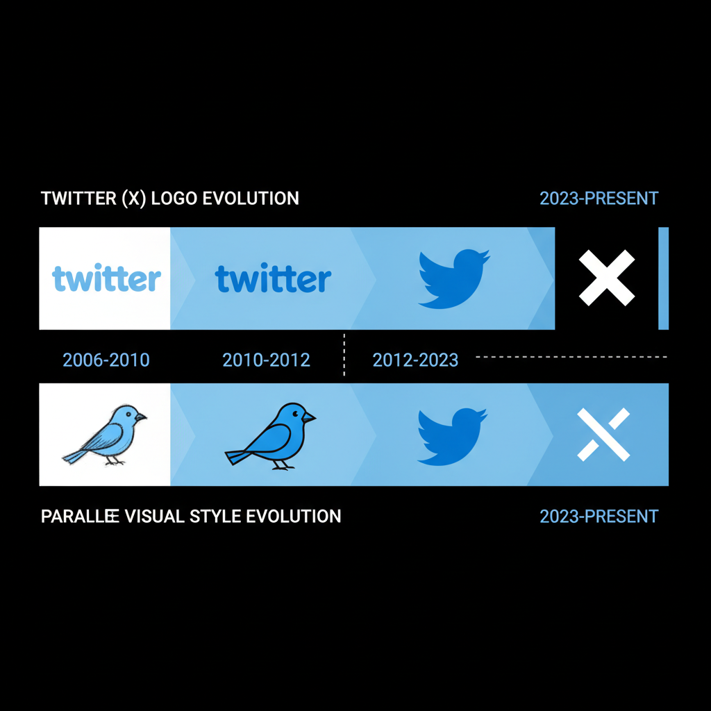
Timeline of Logo Changes for Twitter
Twitter’s transformation features simplification and reliance on its bird icon.
Founding Years (2006–2010)
- 2006: Text “twitter” plus whimsical bird icon named “Larry.”
- Playful colours and gradients in early versions.
Streamlining (2010–2012)
- Lowercase sans-serif type adopted.
- Bird refined for sleek, modern appeal.
Icon-Only Era (2012–Present)
- Text removed entirely.
- Bird became sole brand icon in flat design, optimised for digital use.

---
Design Elements: Colors, Typography, Iconography
Key design attributes of both logos remain highly distinctive.
Colors
- Facebook: #1877F2 deep blue.
- Twitter: Lighter sky blue.
- Blue evokes trust and professionalism in branding psychology.
Typography
- Facebook: Custom geometric sans-serif, readable yet warm.
- Twitter: Rolled back text to focus on icon.
Iconography
- Facebook: Text-based wordmark for name recognition.
- Twitter: Bird symbol to convey freedom and conversation.
---
Psychological Impact of the Blue Color Scheme in Social Media Branding
Blue is linked to stability, safety, and friendliness, making it ideal for platforms requiring user trust.
- Serenity: Creates a calm environment for interaction.
- Reliability: Strengthens credibility in content sharing.
- Universality: Approachable across cultures.
These factors explain why the logos of Facebook and Twitter remain blue despite design trend shifts.
---
Comparison of Facebook and Twitter Logo Strategies
| Aspect | ||
|---|---|---|
| Primary Branding | Wordmark | Bird icon |
| Color Palette | Dark blue | Sky blue |
| Evolution Strategy | Subtle typography shifts | Reduction to pure symbol |
| Brand Recognition | Text-based trust cue | Visual metaphor for dialogue |
---
Role of Logos in User Trust and Recognition
Logos are often the first contact point with a digital brand. Facebook’s wordmark fosters direct name recall, whereas Twitter’s bird builds emotional and symbolic connection.
For product adoption:
- Clear logos speed up user familiarity.
- Consistent colour palettes instil subconscious trust.
- Minimalistic icons perform well in small interface contexts.
---
How Logo Changes Reflect Company Vision and Market Positioning
Redesigns mirror strategic priorities:
- Facebook’s small changes signal stability while its parent explores innovation.
- Twitter’s icon-only model reflects its conversational focus and preference for streamlined visuals.
---
Public Reception and Controversies Around Logo Redesigns
Reaction to branding changes is often mixed:
- Facebook’s corporate colour shift raised scepticism as users linked it to reputation management.
- Twitter’s simplification won design accolades but puzzled some long-time users accustomed to the text logo.
---
Lessons for Brands from Facebook and Twitter Logo Design
Businesses can draw valuable insights:
- Maintain Consistency: Anchor your design in core colours and motifs.
- Gradual Simplification: Strip unnecessary elements for better scalability.
- Emotionally Relevant Icons: Align with brand values.
- Cross-Platform Adaptability: Ensure logos work on mobile, wearable tech, and emerging devices.
- Stakeholder Feedback: Engage audiences before rollout to gauge perception.
---
Future Directions for Facebook and Twitter Brand Identities
Evolving tech trends suggest:
- Animated, interactive logos for AR/VR.
- Minimalist formats for wearable tech interfaces.
- Dynamic gradients to complement immersive experiences.
These innovations will refresh the logos of Facebook and Twitter while staying true to their core identity.
![diagram]()
---
Conclusion: The Value of Strategic Logo Evolution
The stories of the Facebook and Twitter logos highlight the power of consistent yet adaptable branding.
Both follow key principles:
- Loyalty to core colours as trust indicators.
- Strategic simplification for multi-device recognition.
- Alignment of logo evolution with corporate mission.
For any brand, understanding the logos of Facebook and Twitter illustrates why visual identity matters: it’s about trusting the familiar while embracing change. Studying their paths can inspire businesses to create designs that endure, adapt, and resonate.
Ready to elevate your own visual identity? Start by defining colours, typography, and symbols that authentically represent your brand, then commit to evolving them with intention.


