1080 x 1920 Image Guide for Social Media and Web
Learn how to create and optimize 1080 x 1920 vertical images for stories, reels, and mobile platforms with design, cropping, and file size tips.

Introduction to 1080 x 1920 Resolution (Aspect Ratio 9:16)
The 1080 x 1920 image resolution, defined by a 9:16 aspect ratio, is a vertical orientation optimized for today’s mobile-first world. This size has become the go-to format for immersive content on smartphones, where vertical space is maximized for user engagement. Understanding how 1080 x 1920 works not only ensures your images fit perfectly without awkward cropping but also boosts visual impact across social media stories, reels, and vertical ads.
Simply put, 1080 pixels wide and 1920 pixels tall deliver a crisp, high-definition display tailored to vertical viewing. With more users consuming content on their phones, mastering this format is crucial for keeping your visuals competitive and compelling.
---
Why 1080 x 1920 Works Best for Stories, Reels, and Vertical Content
Vertical content naturally aligns with how users hold their smartphones. Social media giants like Instagram, TikTok, Facebook, and Snapchat have embraced full-screen vertical interfaces, making 1080 x 1920 the standard.
Advantages of 1080 x 1920:
- Maximized screen space without borders or letterboxing.
- Greater immersion leading to stronger engagement.
- Cross-platform consistency with minimal reformatting needs.
This uniformity means creators can design once and distribute broadly, streamlining production workflows.
---
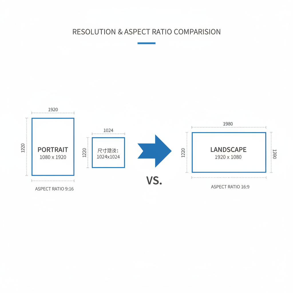
Differences Between Portrait and Landscape Resolutions
Portrait and landscape setups contrast in orientation, aspect ratio, and use cases. Portrait (1080 x 1920) is taller, perfect for mobile, while landscape (1920 x 1080) is wider and suited to desktops and cinematic experiences.
| Resolution | Orientation | Aspect Ratio | Best Use Case |
|---|---|---|---|
| 1080 x 1920 | Portrait (Vertical) | 9:16 | Stories, Reels, TikTok, Pinterest |
| 1920 x 1080 | Landscape (Horizontal) | 16:9 | YouTube videos, Presentations, Desktop banners |
Choosing the correct orientation from the outset saves editing time and prevents loss of quality from resizing.
---
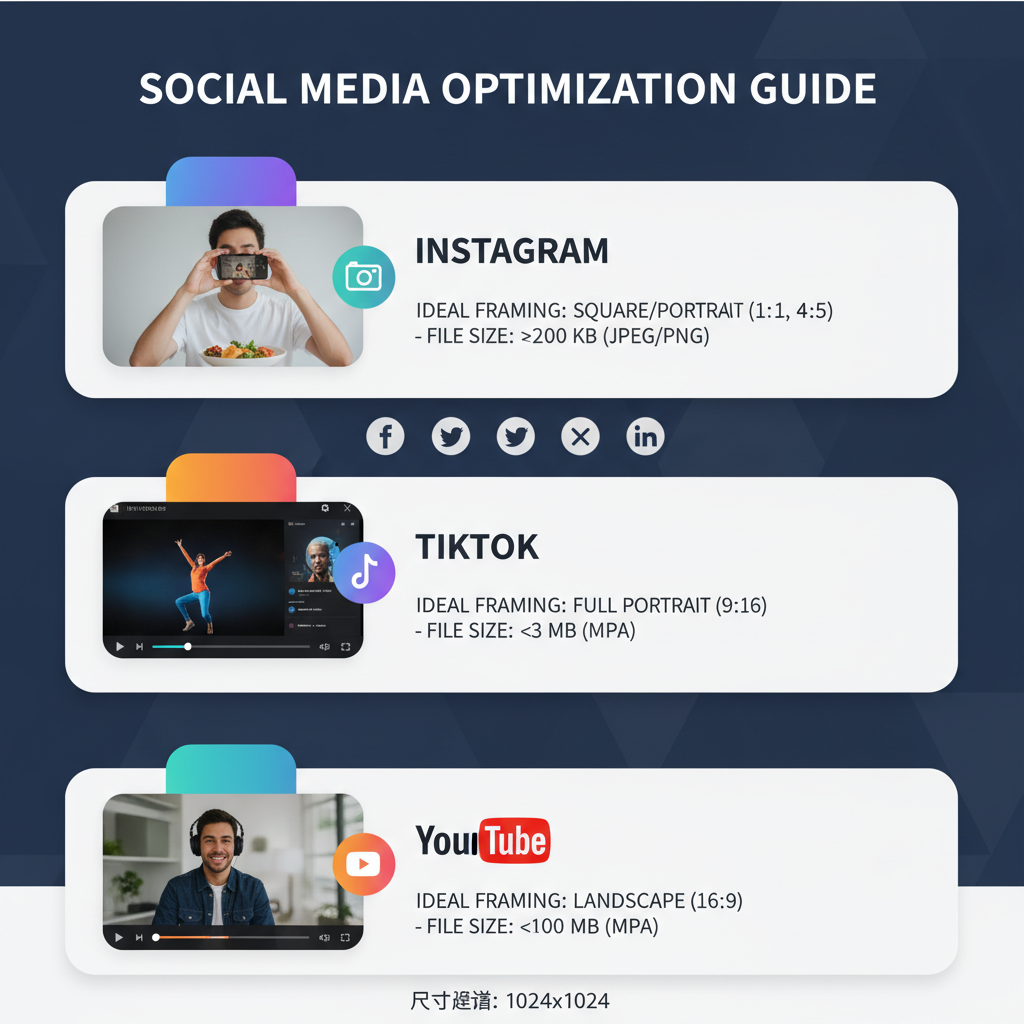
Common Platforms Leveraging 1080 x 1920
1080 x 1920 is accepted or recommended by multiple channels:
- Instagram Stories & Reels
- TikTok short videos
- Pinterest Idea Pins
- Snapchat Discover
- Facebook Stories
This breadth of compatibility lets creators maximize reach with consistent, high-quality vertical designs.
---
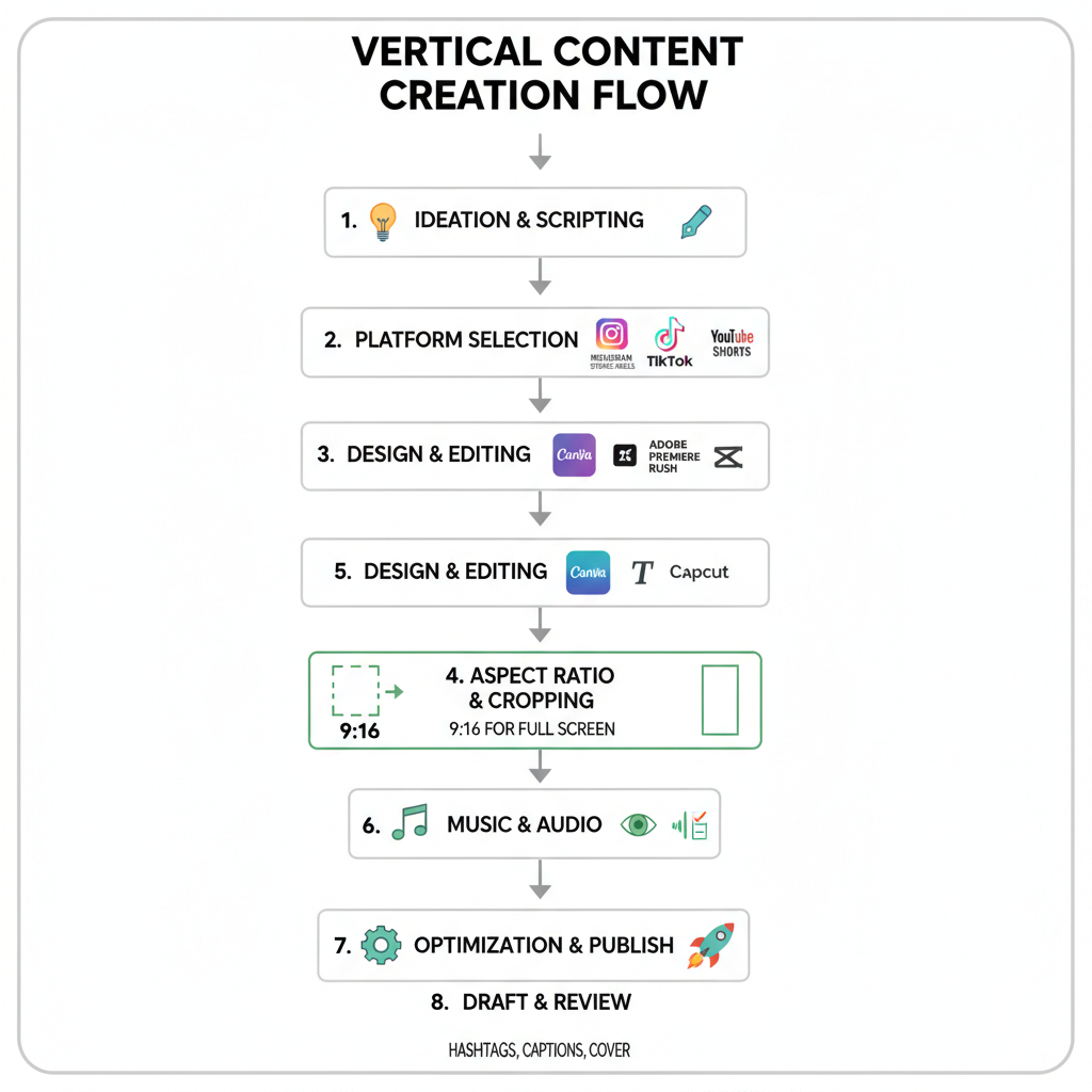
Best Practices for Creating High-Quality Vertical Images
To craft visuals that stand out:
- Start with high-resolution photos for clarity.
- Keep branding consistent—colors, fonts, logos.
- Test on varied device sizes to ensure readability.
- Balance composition vertically by considering key focal areas.
This ensures your image quality holds across all platforms and screens.
---
Recommended Tools for Designing Vertical Content
Popular tools include:
- Canva – pre-set vertical templates.
- Adobe Photoshop – granular control.
- Adobe Express – quick online editing.
- Snapseed & PicsArt – mobile-friendly editing apps.
These resources often have built-in dimensions for 1080 x 1920, helping prevent scaling errors.
---
Optimizing Image Files for Fast Loading
High-quality doesn’t have to mean heavy files. To keep 1080 x 1920 images web-friendly:
- Compress smartly with TinyPNG or Squoosh.
- Use WebP for speed benefits.
- Implement responsive image markup.
Target under 500 KB while maintaining visual integrity for mobile SEO wins.
---
Cropping and Framing Tips for Vertical Shots
Avoid errors by:
- Centering key elements in frame.
- Leaving breathing room for overlays.
- Experimenting with focal lengths during shooting.
- Resisting extreme zooms that degrade sharpness.
Well-composed vertical frames draw attention and maintain clarity where it matters.
---
Strategically Placing Text Overlays in Safe Zones
To avoid UI interference:
- Keep text in the central 80%.
- Avoid top/bottom edges occupied by controls.
- Preview designs in-platform before rollout.
Proper text placement preserves legibility and strengthens your messaging.
---
Converting Other Resolutions to 1080 x 1920 Without Distortion
When adapting from formats like 1920 x 1080:
- Crop thoughtfully to remove unnecessary sides.
- Scale proportionally and fill gaps with neutral backgrounds.
- Use professional tools like Photoshop Canvas Size or Canva Resize.
These protect image proportions while meeting vertical display specs.
---
SEO Benefits of Proper Image Sizing and Alt Text
Well-optimized 1080 x 1920 images:
- Enhance mobile user experience.
- Reduce bounce rates.
- Promote sharing on mobile-first platforms.
Write alt text that’s descriptive and keyword-rich:
This aids accessibility while reinforcing SEO relevance.
---
Troubleshooting Blurry Vertical Uploads
Common causes:
- Over-compression before posting.
- Incorrect resolution scaling.
- Platform downsampling.
Solutions:
- Export at the right resolution and quality (JPEG 80–90%).
- Use PNG for sharp text.
- Check official guidelines for upload requirements.
---
Conclusion: Perfecting the 1080 x 1920 Image for Mobile Audiences
Ensure consistently high-impact vertical visuals by:
- Designing with the 1080 x 1920 resolution from the start.
- Using tool presets to simplify formatting.
- Optimizing images for both mobile and web speed.
- Keeping text safely within visible zones.
- Testing across platforms to verify presentation.
Mastering the 1080 x 1920 image format puts you ahead in the mobile-focused content race. Apply these best practices today to make your vertical visuals sharper, faster, and more engaging—then watch your audience interaction grow.