Guide to Creating and Optimizing 16:9 Aspect Ratio Images
Learn how to create, crop, and optimize 16:9 aspect ratio images for web, social media, and presentations without losing quality or speed.
Understanding the 16:9 Aspect Ratio
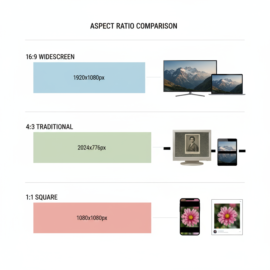
The 16:9 aspect ratio—also written as 16 9 aspect ratio—is the width-to-height proportion where for every 16 units of width, there are 9 units of height. This format has become the global standard for most visual media over the last two decades, including televisions, computer monitors, and streaming video platforms.
Historically, earlier TV formats such as 4:3 dominated until the early 2000s, when the film and gaming industries transitioned to widescreen. The 16:9 ratio emerged as a balanced compromise between cinematic widescreen and older squarer formats, offering a wider field of view without awkward cropping.

---
Common Resolutions for 16:9 Images
The 16:9 format is applied across a range of resolutions. Understanding these options helps you create 16 9 aspect ratio images that display consistently across devices.
| Resolution Name | Pixel Dimensions | Typical Use |
|---|---|---|
| HD | 1280 × 720 | Basic YouTube videos, entry-level streaming |
| Full HD | 1920 × 1080 | Standard for web videos and presentations |
| Quad HD | 2560 × 1440 | High-resolution monitors, premium video content |
| 4K UHD | 3840 × 2160 | Modern TVs, high-end YouTube uploads |
| 8K UHD | 7680 × 4320 | Cinema production, future-proof media assets |
---
Why 16:9 is Popular Across Devices and Platforms
Reasons for the ongoing dominance of 16:9 include:
- Versatility – Works equally well for video and still imagery.
- Compatibility – Natively supported by modern cameras, smartphones, and streaming services.
- Viewing Comfort – Closer to the human field of vision than square formats.
- Standardization – Simplifies production and distribution for media companies.
From Netflix series to YouTube videos and even corporate presentations, 16:9 is the ratio you’ll most often encounter.
---
Ideal Use Cases for 16:9 Images
- Websites and Landing Pages – Hero banners and sliders benefit from the widescreen effect.
- YouTube Thumbnails – Keeps the preview format consistent with the video ratio.
- Facebook Covers – Scales smoothly between desktop and mobile.
- Presentations – Default aspect ratio for Google Slides and Microsoft PowerPoint.
---
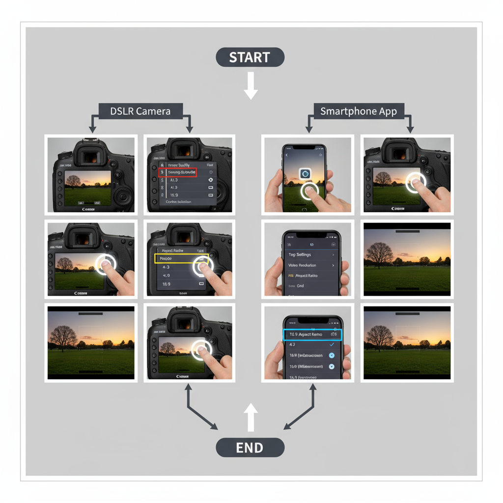
How to Shoot Photos in 16:9
Camera Settings
- Many DSLRs and mirrorless cameras allow you to select 16:9 in the image quality menu.
- Shooting directly in 16:9 reduces the need for post-capture cropping.
Smartphone Settings
- Most current smartphones include aspect ratio presets.
- Look for 16:9, 1:1, or Full icons; selecting 16:9 ensures minimal cropping later.
---
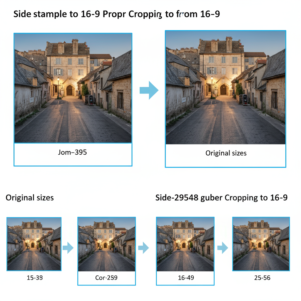
Resizing and Cropping Tips without Losing Quality
When preparing images:
- Maintain Ratio – Enable “constrain proportions” to prevent stretching.
- Start with Originals – Crop from the highest resolution possible.
- Avoid Over-Compression – First resize to your target resolution, then compress.
Example of using CSS to preserve the 16:9 format in web embeds:
.aspect-16-9 {
  position: relative;
  width: 100%;
  padding-top: 56.25%; /* 9/16 * 100 */
}
.aspect-16-9 iframe,
.aspect-16-9 img {
  position: absolute;
  top: 0;
  left: 0;
  width: 100%;
  height: 100%;
}
---
Best Tools for Creating and Editing 16:9 Images
Free Options
- Canva – Templates for social media and slides.
- GIMP – Robust free image editing with custom dimensions.
- Pixlr – Browser-based editing with crop presets.
Paid Options
- Adobe Photoshop – Professional-grade control.
- Affinity Photo – Affordable, powerful alternative.
- Figma/Sketch – For web and UI design.
---
Optimizing 16:9 Images for Fast Web Loading
Recommended File Types
- JPEG – Ideal for photos.
- PNG – For graphics with transparency.
- WebP/AVIF – Modern formats offering strong compression.
Compression Tips
- Balance quality and size—ideally keep under 200 KB for web.
- Try TinyPNG, Squoosh, or ImageOptim.
- Implement lazy-loading with the `loading="lazy"` attribute.
---
Accessibility Considerations
For each 16:9 image:
- Include descriptive alt text.
- Ensure strong contrast for text overlays.
- Avoid images containing text; if unavoidable, replicate the text in HTML.
Accessibility best practices make your media inclusive for users with visual impairments.
---
Common Mistakes to Avoid with 16:9 Visuals
- Stretching or Squashing – Always maintain proportions.
- Overcrowding – Minimize excessive detail.
- Ignoring Safe Zones – Keep text away from edges to prevent cutoff.
- Skipping Device Tests – Check layouts on multiple screen sizes.
---
Tips for Designing 16:9 Graphics that Stand Out
- Rule of Thirds – Place focal elements off-center.
- Negative Space – Improves composition clarity.
- High Contrast Colors – Enhances text readability.
- Consistent Branding – Use brand colors, fonts, and styles.
For social posts, preview your design to avoid unexpected cropping on different platforms.
---
Future Trends: Will 16:9 Remain Dominant?
While 16:9 is entrenched, emerging ratios include:
- 21:9 – Ultra-wide cinematic look.
- 9:16 – Vertical content for mobile-first apps like TikTok.
- 1:1 – Square format for Instagram.
As device diversity grows, mastering responsive image delivery in multiple ratios will become increasingly important.
---
Conclusion
Mastering the 16 9 aspect ratio means knowing its origins, choosing the right resolution, using suitable tools, and following best practices for cropping, compression, and accessibility. This format remains the most versatile across devices, making it essential for photographers, designers, and marketers.
By creating optimized 16:9 visuals, you ensure your content looks professional, loads quickly, and engages viewers—whether it appears on a widescreen TV, a smartphone, or a presentation slide. Start applying these tips today to elevate your media across every platform.