Optimizing 16:9 Images for Web and Social Media
Learn how to optimize 16:9 images for web and social media, from cropping and scaling to platform-specific dimensions and responsive design.
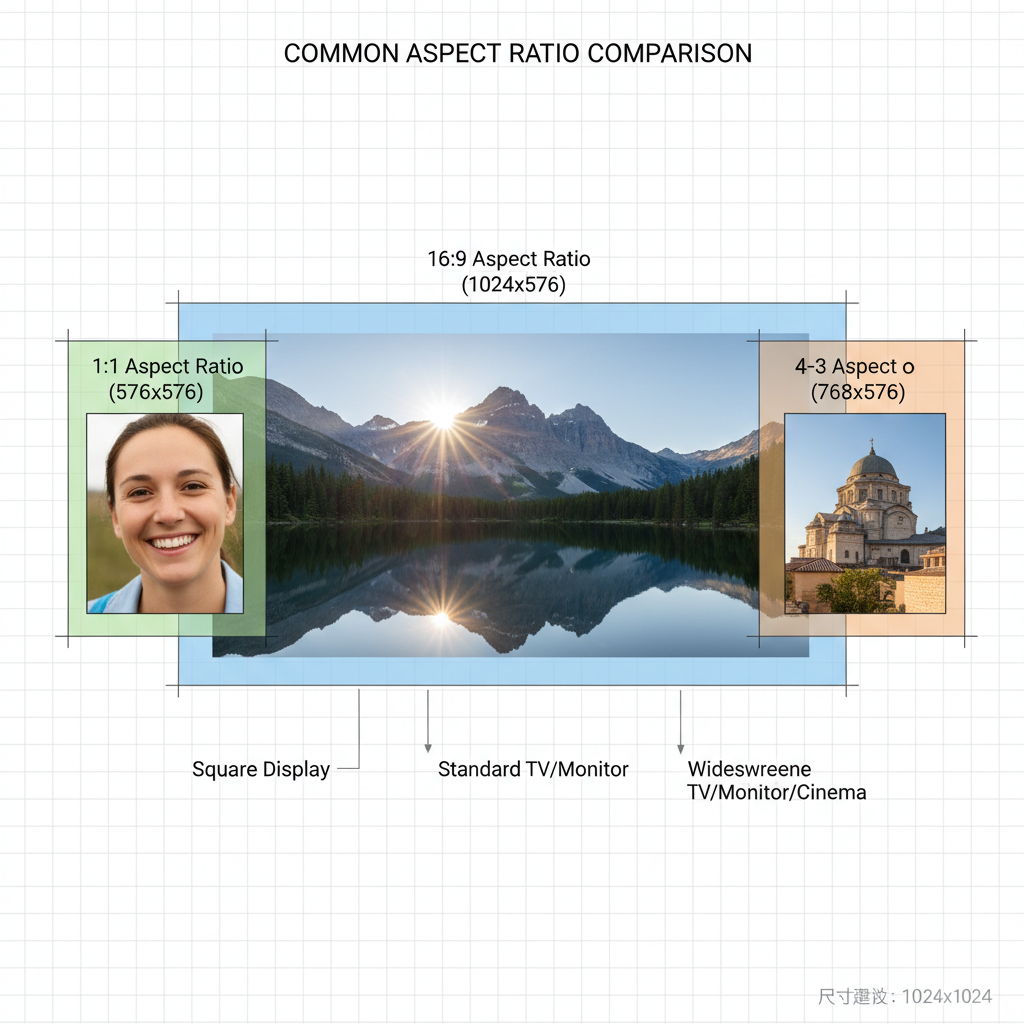
Understanding the 16:9 Aspect Ratio
The 16:9 aspect ratio is one of the most important standards in modern digital visuals, used extensively in video production, photography, responsive web design, and social media graphics. This proportion means for every 16 units of width, there are 9 units of height, creating a widescreen format that feels natural and immersive to the viewer.
Common 16:9 dimensions include:
- 1920×1080 (Full HD)
- 1280×720 (HD)
- 3840×2160 (4K UHD)
- 2560×1440 (QHD)
For content creators, designers, and marketers, mastering this ratio ensures visual consistency across devices and platforms.

---
Why 16:9 Dominates Digital Media
The widescreen format became the global default with the rise of HD television and online streaming. Today, it powers nearly every visual platform for several reasons:
- Cinematic Appeal – Its panoramic view matches the human field of vision better than the older 4:3 ratio.
- Cross-Device Compatibility – Works seamlessly on TVs, monitors, tablets, and smartphones.
- Platform Standard – Required by YouTube, Zoom, and most video players for optimal playback.
- Modern Aesthetic – Creates an immersive feel compared to square or vertical formats.
---
Benefits of 16:9 for Responsive Web and Mobile Viewing
When developing responsive websites, 16:9 images and videos adapt smoothly across screen sizes, offering:
- Proportional Scaling – Maintains visual integrity without unwanted letterboxing or cropping.
- Predictable Breakpoints – Easier media query handling in CSS.
- Better UX – Full-width banners and embedded videos look natural on both desktop and mobile.
A 16:9 hero image scales proportionally, offering consistent visual impact whether viewed on a large UHD monitor or a compact smartphone screen.
---
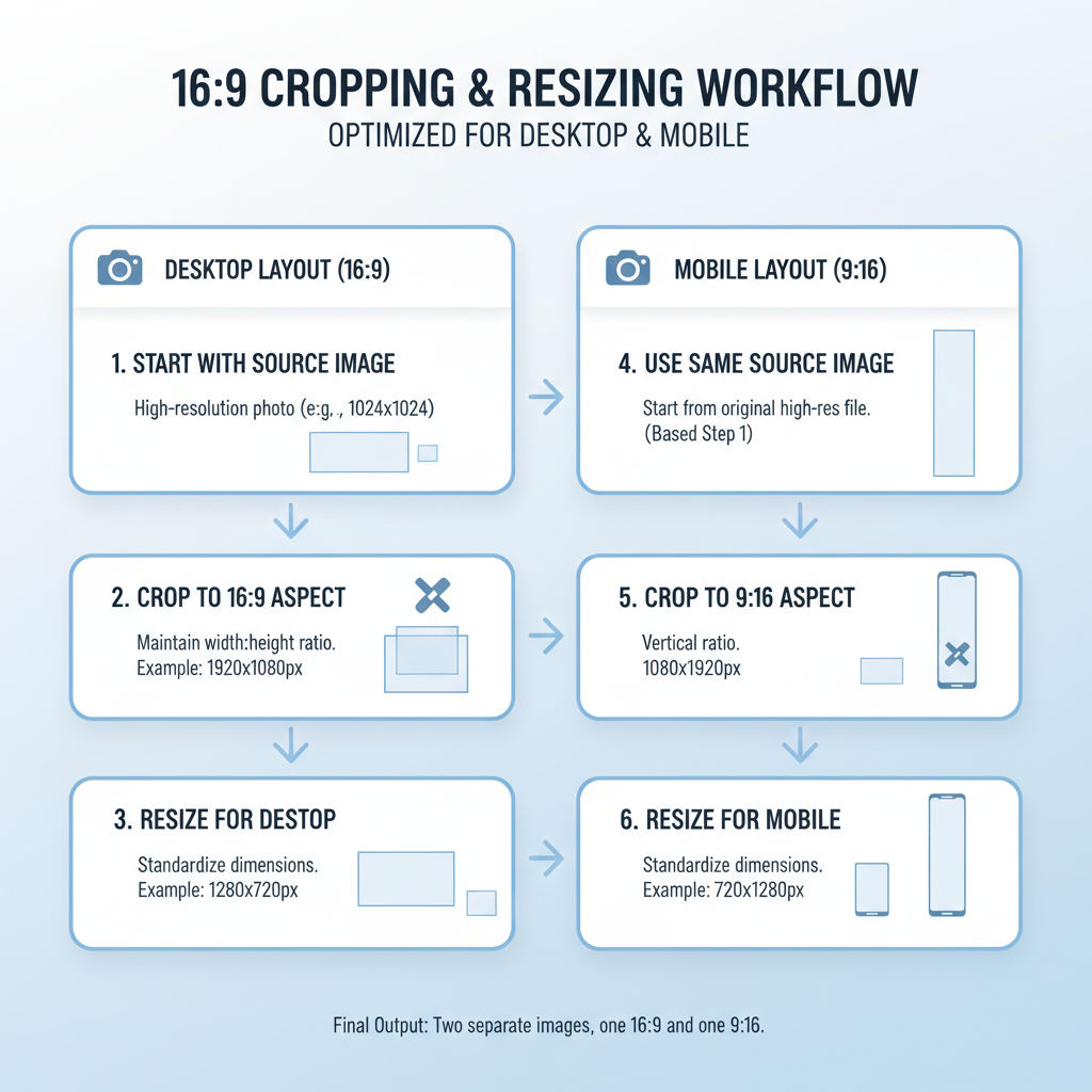
Maintaining the 16:9 Ratio When Cropping or Resizing
Preserving the aspect ratio ensures you avoid distortion and maintain professional quality.
Steps to crop or resize correctly:
- Lock aspect ratio in your photo or video editing software.
- Anchor the focal point to keep the subject centered or strategically placed.
- Export at optimal resolution for your target platform—avoid upscaling to prevent quality loss.
Example CSS for a responsive 16:9 container:
.aspect-16-9 {
  position: relative;
  width: 100%;
  padding-top: 56.25%; /* 9/16 = 0.5625 */
}

.aspect-16-9 img,
.aspect-16-9 iframe {
  position: absolute;
  top: 0;
  left: 0;
  width: 100%;
  height: 100%;
  object-fit: cover;
}
---
Recommended Tools for Creating 16:9 Designs
Choosing the right tools ensures precise control over your visuals:
| Tool | Strengths | Ideal For |
|---|---|---|
| Adobe Photoshop | Advanced editing, precise cropping | Professional design, photography |
| Canva | Templates, drag-and-drop ease | Social media graphics, quick designs |
| Figma | Collaborative UI/UX design | Web/app layouts with 16:9 imagery |
| Pixlr | Free online editing | Lightweight adjustments |
| Snappa | Social media focus | Marketers, small business owners |
---
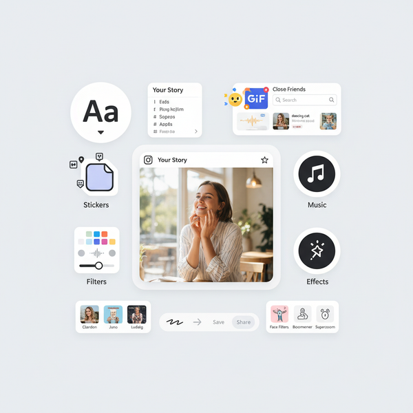
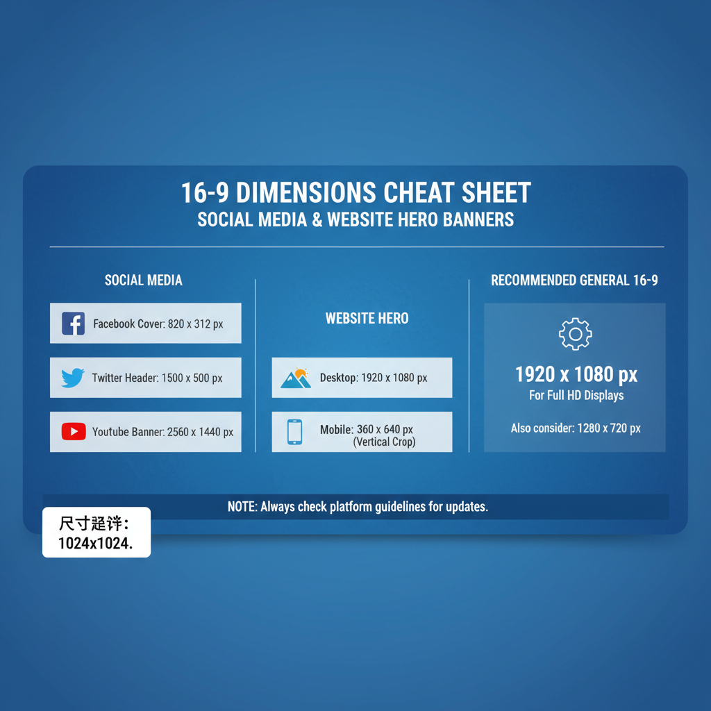
Best Practices for Social Media Platforms
Different social channels use 16:9 imagery in unique ways:
- YouTube thumbnails – 1280×720 is ideal; keep text large and readable.
- Facebook posts – Inline videos and images display well at 1200×675.
- Twitter banners – A 16:9 layout ensures balanced visuals across devices.
- LinkedIn cover images – Works well for company pages and shared articles.
---
Creating Optimized 16:9 Hero Images for Websites
Hero images set the tone for any webpage and, in a 16:9 format, they:
- Ensure cross-device consistency
- Support high-resolution devices (consider 2× sizes for retina displays)
- Boost load speed when compressed properly
Image optimization checklist:
- Export in modern formats (WebP, AVIF).
- Keep file size under ~300 KB for speed.
- Lazy-load off-screen images.
Use responsive `
` with `srcset` in HTML.
---
Accessibility Considerations for 16:9 Images
Accessibility is vital in visual design:
- Alt text – Provide clear descriptions for assistive technology.
- Contrast – Text overlays should meet WCAG contrast ratios (≥ 4.5:1).
- Avoid text-only images – Make key information HTML-based for screen readers.
---
SEO Image Optimization Tips
Proper image SEO boosts visibility:
- Descriptive file names – Use keywords, e.g., `sunset-beach-16x9.jpg`.
- Relevant alt tags – Include target keywords naturally.
- Image schema markup – Helps search engines index visuals.
- Clean EXIF metadata – Remove private info and irrelevant data before upload.
---
Common Mistakes to Avoid
Watch out for these errors in 16:9 design:
- Stretching visuals to fit ratio, leading to distortion.
- Poor focal point choice causing awkward cropping.
- Overcompression introducing artifacts.
- Platform neglect without testing across devices.
---
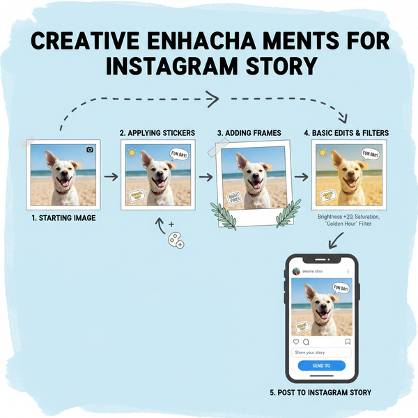
Advanced 16:9 Use Cases: Infographics & Storytelling
Creative applications include:
- Interactive infographics – Offers space for complex data layouts.
- Presentation slides – Matches projection standards and streaming specs.
- Split-screen storytelling – Balanced whitespace for text and visuals.
- Scrollytelling sequences – Sequential panels guide audience engagement.
---
Why 16:9 Remains the Universal Visual Standard
The 16:9 aspect ratio is now the universal visual standard because it:
- Aligns with modern display technology.
- Adapts effortlessly across print, web, and dynamic media.
- Enhances user comfort and engagement.
- Offers creative freedom for professionals.
By learning how to crop, optimize, and integrate 16:9 images effectively, you ensure your digital content stays sharp, loads quickly, and engages your audience wherever they view it.
---
Summary: The 16:9 aspect ratio isn’t just a technical specification—it’s a design foundation that shapes how audiences see and interact with your visuals. From social media banners to hero images and infographics, mastering 16:9 ensures your content looks professional and platform-ready. Start using optimized 16:9 visuals today to elevate your brand’s online presence.