Guide to 16:9 Ratio Images for Web and Social Media
Learn how to use, crop, and optimize 16:9 ratio images for web design, social media, and presentations, ensuring sharp visuals across devices.
Introduction to the 16:9 Aspect Ratio and Its Importance
The 16:9 aspect ratio — meaning 16 units of width for every 9 units of height — is one of the most prevalent image and video formats in modern media. It’s a standard that underpins everything from high-definition television and YouTube content to website hero banners and presentation slides.
Its widespread adoption stems from its ability to balance immersive visual storytelling with compatibility across devices of all shapes and sizes.
Whether you're creating a YouTube thumbnail, designing a homepage hero image, or editing a cinematic video, understanding the principles behind the 16:9 ratio ensures your work looks professional, consistent, and engaging.

---
History and Evolution of the 16:9 Format in Photography and Video
The 16:9 ratio became a global video standard with the rise of HDTV in the late 1990s and early 2000s, replacing the older 4:3 television format. Before that shift, 4:3 dominated TV broadcasts, while cinema relied on wider formats like CinemaScope (2.35:1).
Adopting 16:9 was a practical compromise. It offered a widescreen experience for home viewers without excessive letterboxing or cropping, while still aligning well with cinematic proportions.
As digital photography matured and online content platforms grew, creators embraced 16:9 for both static images and video frames. Today, it’s the go-to choice for media intended to look sharp and consistent across devices.
---
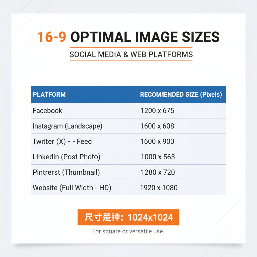
Pixel Dimensions for Common 16:9 Resolutions
Accurate pixel dimensions are essential for producing sharp visuals without unnecessary file bloat. Below is a quick reference guide:
| Resolution Name | Width (px) | Height (px) | Common Usage |
|---|---|---|---|
| HD | 1280 | 720 | Web videos, small embeds |
| Full HD | 1920 | 1080 | Standard YouTube, website hero banners |
| 4K UHD | 3840 | 2160 | High-quality video production |
| 8K UHD | 7680 | 4320 | Advanced cinema, large marketing displays |
---
When and Why to Use 16:9 Ratio Images for Different Platforms
Choosing a 16:9 aspect ratio is ideal when your image needs to be displayed on various devices and platforms without distortion or awkward cropping.
- Web Design: Hero images, slides, and full-width banners scale well and look balanced.
- Social Media: Sites like YouTube, Facebook video covers, and LinkedIn background banners rely on 16:9 visuals.
- Presentations: Widescreen templates in PowerPoint and Google Slides align perfectly with 16:9 images.
This consistency improves cross-device compatibility and preserves focal points across layouts.
---
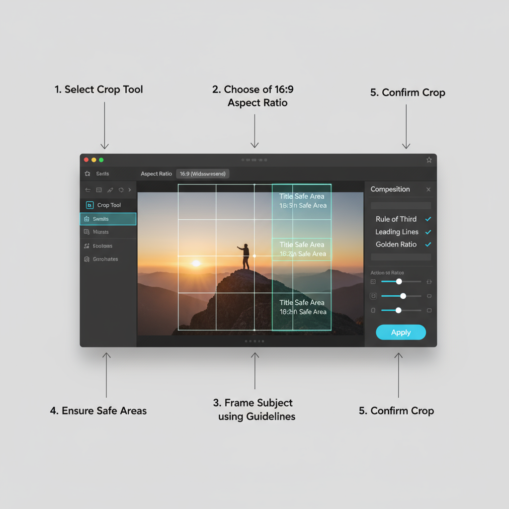
How to Crop or Resize Images to 16:9 Without Losing Quality
To crop an image to 16:9:
- Calculate target dimensions based on your desired width or height.
- Use a high-resolution original to maintain detail.
- Apply non-destructive editing when using Photoshop or similar tools.
Here’s a simple JavaScript formula to find the height from a given width:
function getHeightFor16by9(width) {
    return (width / 16) * 9;
}

console.log(getHeightFor16by9(1920)); // Outputs 1080
This calculation ensures proportions stay exact.
---
Recommended Tools and Software for Creating 16:9 Ratio Images
Popular options for creating and manipulating 16:9 visuals include:
- Adobe Photoshop / Lightroom – Full creative control.
- Canva – Quick, template-based edits.
- GIMP – Open-source alternative for image editing.
- Figma – UI/UX mockups with adjustable aspect ratio frames.
Video editors like Premiere Pro and DaVinci Resolve also offer precise export settings for 16:9 stills and graphics.
---
Optimizing 16:9 Images for Faster Website Load Times
High-quality images are a must, but file size impacts user experience and SEO.
Optimization tips:
- Compress Images: Use TinyPNG, ShortPixel, or Imagify.
- Choose the Right Format: JPEG for photos, PNG for transparency, WebP for next-gen compression.
- Implement Lazy Loading: Only load images when needed.
For example:
---
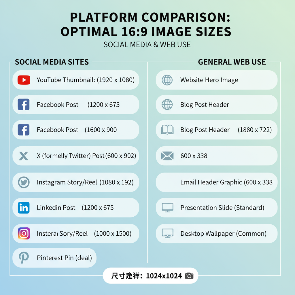
Best Practices for 16:9 Images in Social Media
Platform-specific recommendations help avoid quality loss or poor visual framing:
| Platform | Recommended Size | Notes |
|---|---|---|
| YouTube Thumbnail | 1280x720 | Keep under 2MB; use bold text |
| Facebook Event Cover | 1920x1080 | Avoid text near the edges |
| LinkedIn Background | 1584x396 | Horizontal crop; aligns within 16:9 grid |
| Twitter Inline Image | 1600x900 | Displays well in previews |
---
Responsive Design Tips for Using 16:9 Images Across Devices
Key strategies for maintaining aspect ratio in responsive design:
- CSS Aspect Ratio Boxes: Use `aspect-ratio: 16/9`.
- Background Images: Apply `background-size: cover` with `background-position: center`.
- Srcset Attributes: Serve scaled images for different breakpoints.
Example:
.responsive-frame {
    aspect-ratio: 16 / 9;
    background-image: url('banner.jpg');
    background-size: cover;
    background-position: center;
}
---
Common Mistakes to Avoid When Working With 16:9 Formats
- Low-resolution sources – Causes pixelation when scaled.
- Ignoring safe zones – Text near edges may be cropped.
- Overlooking file size – Slows load time.
- Mixing ratios – Creates uneven layouts.
---
Conclusion: Blending Creativity and Technical Precision with 16:9 Images
Perfecting 16:9 ratio images means combining creative composition with technical mastery. From its historical roots to modern responsive applications, the format remains a cornerstone of visual media.
By following cropping formulas, leveraging the right tools, and optimizing for speed, designers and content creators can ensure every 16:9 visual is impactful, professional, and adaptable.
Want your visuals to stand out and scale flawlessly? Master the 16:9 aspect ratio today — and make every pixel count.