Instagram 3:4 Aspect Ratio Guide for Higher Engagement
Learn how to use the Instagram 3:4 aspect ratio to boost engagement, improve visual storytelling, and optimize portraits, products, and carousels.
Mastering the Instagram 3:4 Aspect Ratio for Higher Engagement
The Instagram 3:4 aspect ratio is a powerful yet often underutilized format that can enhance your content’s visual impact and boost engagement rates. This slightly taller-than-square dimension offers extra space for storytelling without dominating the feed, making it ideal for portraits, product shots, and educational carousels. In this guide, you’ll learn what 3:4 means, how it compares to other formats, and the best practices for using it effectively in your Instagram strategy.

---
What Does 3:4 Mean?
The term “3:4” describes the proportional relationship between width and height: for every 3 units of width, there are 4 units of height. On Instagram, this translates to a vertical frame that’s taller than a square (1:1) but shorter than a full portrait (4:5).
Why it matters for Instagram marketing:
- More screen real estate — Taller images naturally command more attention in the feed.
- Improved storytelling space — More vertical height means more visual narrative per post.
- Composition flexibility — A sweet spot for portraits, product displays, and vertical infographics.
---
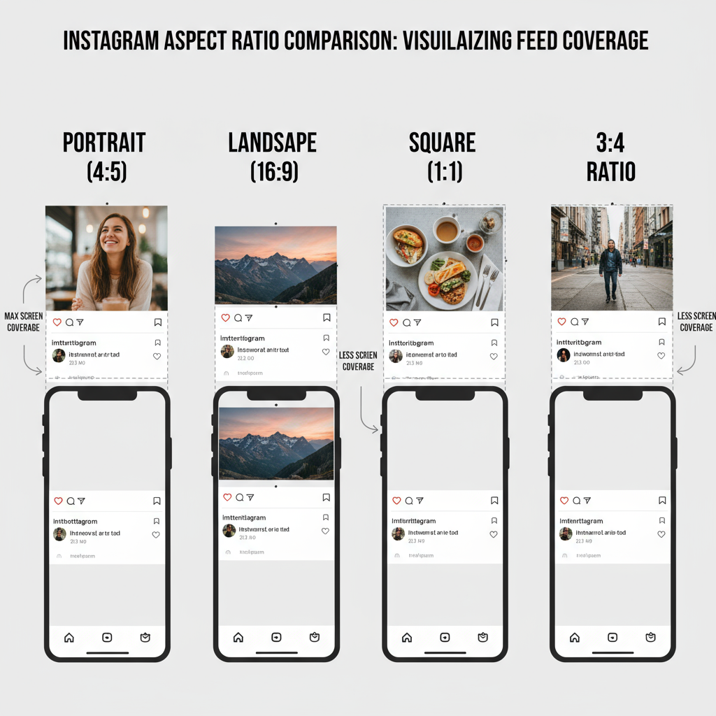
Portrait, Landscape, Square, and 3:4 Formats Compared
Each Instagram aspect ratio offers distinct benefits and should be chosen based on your creative goals.
| Format | Aspect Ratio | Best For | Feed Space Taken |
|---|---|---|---|
| Square | 1:1 | General posts, balanced composition | Moderate |
| Landscape | 1.91:1 | Widescreen images, cinematic shots | Least |
| Portrait | 4:5 | Full-height portraits, vertical subjects | High |
| 3:4 | 0.75 | Portraits, product detail shots | Between square and full portrait |
The 3:4 ratio achieves a balance between the compact square and the dominant portrait — making it excellent for high-engagement, visually rich content.
---
Visibility Benefits of 3:4 on Instagram
Instagram’s feed is designed for vertical scrolling. The 3:4 format takes advantage of this flow:
- Large enough to stand out without awkward cropping.
- More storytelling room than landscape.
- Enhanced Explore Page previews showcasing more detail in thumbnails.
---
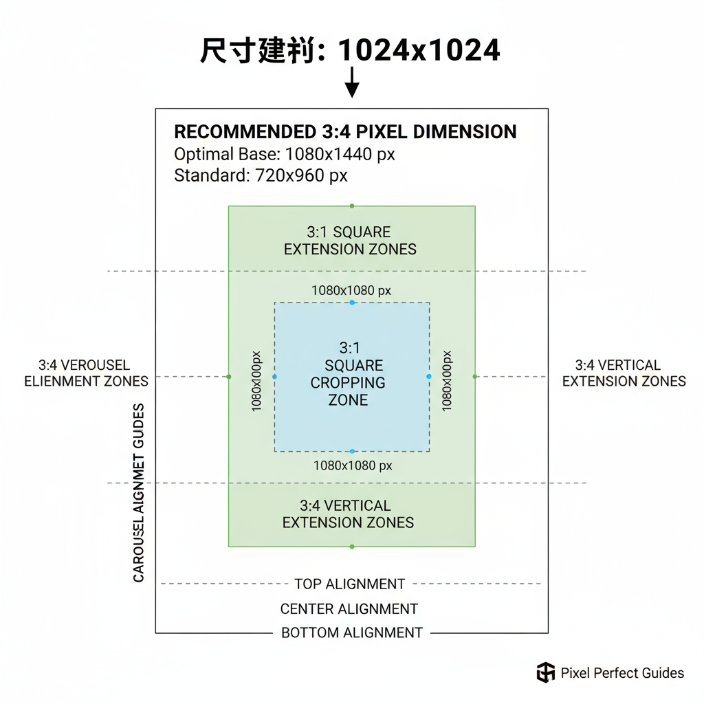
Recommended Pixel Dimensions for 3:4 Content
While the ratio handles proportions, getting the resolution right ensures clarity after Instagram’s compression.
Suggested Instagram sizes:
- Photos: 1080px × 1440px
- Videos: 1080px × 1440px, H.264 MP4 format optimal
- Keep images at 72 DPI for web clarity.
---
Editing and Cropping for High-Quality 3:4 Output
To maintain professional results:
- Shoot or design at higher resolution than the target size.
- Use cropping tools in Photoshop, Lightroom, Canva, or similar apps to lock in 3:4.
- Follow the rule of thirds for subject placement.
> Pro tip: Avoid top or bottom crops that cut off facial features or key product elements.
---
Maintaining Consistency in Carousel Posts
Carousel posts flow better visually when all slides share the same aspect ratio:
- Guarantees a uniform swipe experience.
- Simplifies editing and brand overlay positioning.
- Keeps visual storytelling smooth from first to last slide.
---
Best Content Types to Use the 3:4 Aspect Ratio
1. Portrait Photography
Framing subjects with background context while keeping them the focal point.
2. Product Photography
Providing space for detail while leaving room for branding or text overlays.
3. Tutorials and Step-by-Steps
Ideal for stacking instructions vertically without losing user attention.
---
Tools and Apps for Resizing to 3:4
Use apps that preserve quality and ratio:
- Canva — Instagram-ready crop templates.
- Adobe Express — Efficient resizing without quality drop.
- Figma — Pixel-perfect control for designers.
- InShot — Mobile-friendly with proportion lock and background blur.
---
Designing 3:4 Vertical and Portrait Videos
While Reels and Stories often default to 9:16, 3:4 is great for posts and cross-platform compatibility:
- Keep important elements in the center 80%.
- Ensure captions and CTAs remain in safe zones.
- Design with cropping flexibility in mind.
---
Testing Engagement: 3:4 vs Other Ratios
Run simple A/B tests:
- Post similar content in 3:4, 1:1, and 4:5.
- Track likes, comments, saves, shares, and profile visits.
- Identify which format consistently drives the highest engagement.
---
Crafting Captions and CTAs for 3:4 Visuals
Strong visuals deserve compelling copy:
- Lead with an attention-grabbing hook.
- Use short paragraphs and line breaks for readability.
- End with a direct call to action.
---
Common Mistakes to Avoid with 3:4 Instagram Posts
- Accidental subject cropping from incorrect alignment.
- Ignoring the grid view, where center-only previews may hide edges.
- Neglecting quality control against Instagram’s compression.
- Mixing ratios in carousels, causing jarring transitions.
---
Recap: When to Use the Instagram 3:4 Aspect Ratio
The Instagram 3:4 aspect ratio offers a versatile middle ground that enhances visual presence without overwhelming users:
- Strikes balance between space usage and audience comfort.
- Brings out storytelling potential in portraits, products, and tutorials.
- Boosts engagement by using the feed’s vertical space effectively.
By embracing the 3:4 format with the right dimensions, editing, and consistency, you can elevate your Instagram strategy, improve aesthetics, and better capture your audience’s attention.
Next step: Try posting your next portrait or carousel in 3:4 and track the impact — you might find it becomes your go-to format for higher performance.