Instagram Grid View Tips for a Cohesive Profile Layout
Learn proven strategies to design a consistent and engaging Instagram grid layout using themes, planning tools, and storytelling for better branding.

Introduction: Mastering Your Instagram Grid View for Lasting First Impressions
Optimizing your Instagram grid view is critical for creating a strong first impression on potential followers. The grid is the gallery of your brand—each square contributing to an overall narrative that communicates professionalism, creativity, and cohesion. In this guide, you’ll learn proven strategies to design a consistent, engaging, and conversion-driven Instagram grid layout that reflects your unique identity and makes visitors want to follow and interact.
---
Understanding the Importance of the Instagram Grid View
When visitors land on your profile, the Instagram grid view serves as their initial glimpse into your style, values, and content quality. This visual mosaic can instantly convey your personality or brand message. A well-curated grid builds trust, invites curiosity, and encourages deeper exploration of your profile.
Whether you’re a creator, brand, or influencer, remember: the grid is not simply about individual posts—it’s about the sum total of your visual presentation.

---
Choosing a Consistent Theme: Color Palette, Tone, and Style
A consistent theme is the foundation of an impactful Instagram grid. Your visual identity should include:
- Color Palette: Choose 3–5 signature colors aligned with your brand or mood.
- Tone: Select an emotional feel—warm, cool, bright, muted—and maintain it.
- Style: Define a style such as minimalist, rustic, or futuristic to ensure cohesion.
For example, a travel blogger may use bright blues and sunny yellows to evoke coastal adventures, while a tech brand might embrace monochrome or sleek metallic hues.
---
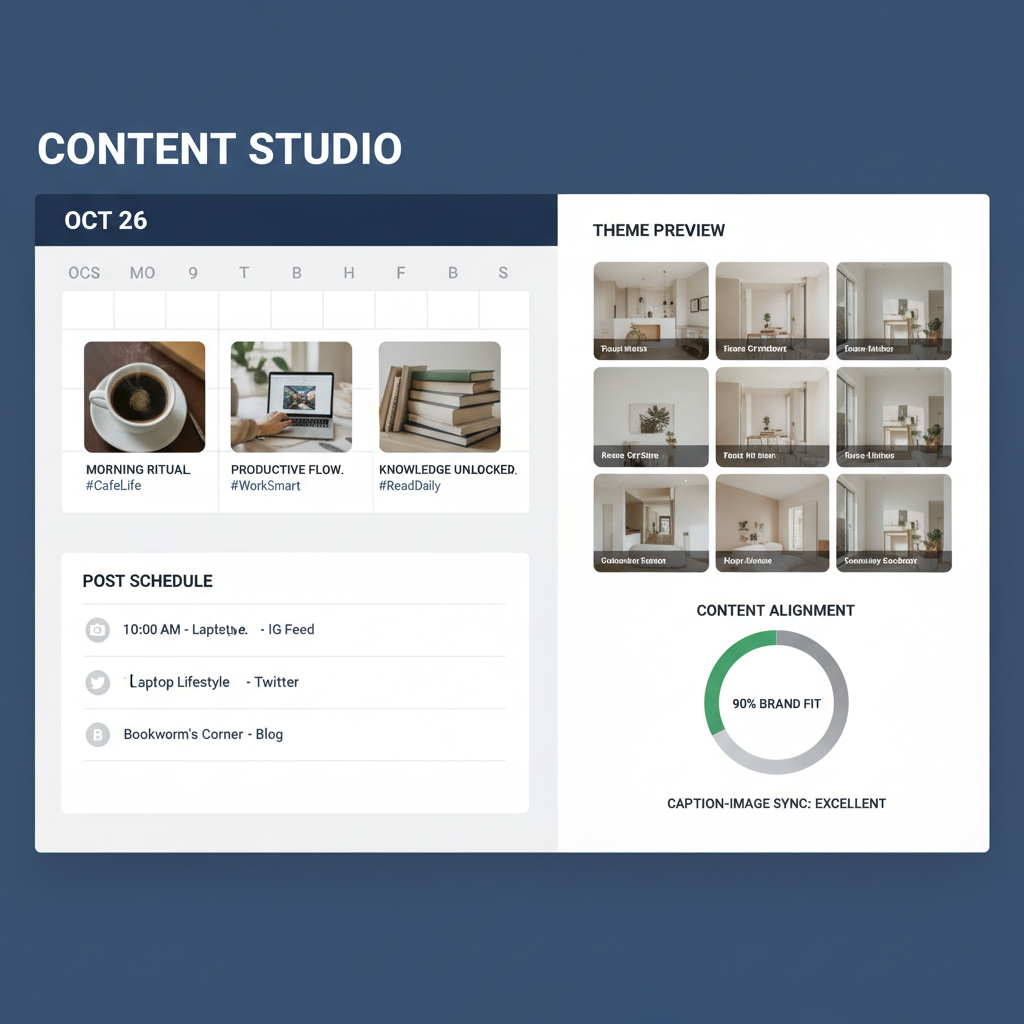
Planning Posts in Advance With Visual Planning Tools
Polish your grid by planning ahead. Use tools such as Preview, Later, or Planoly to visually arrange upcoming content before publishing.
Benefits:
- Avoid mismatched colors or styles.
- Preserve a smooth aesthetic flow.
- Identify gaps or redundancy before content goes live.
---
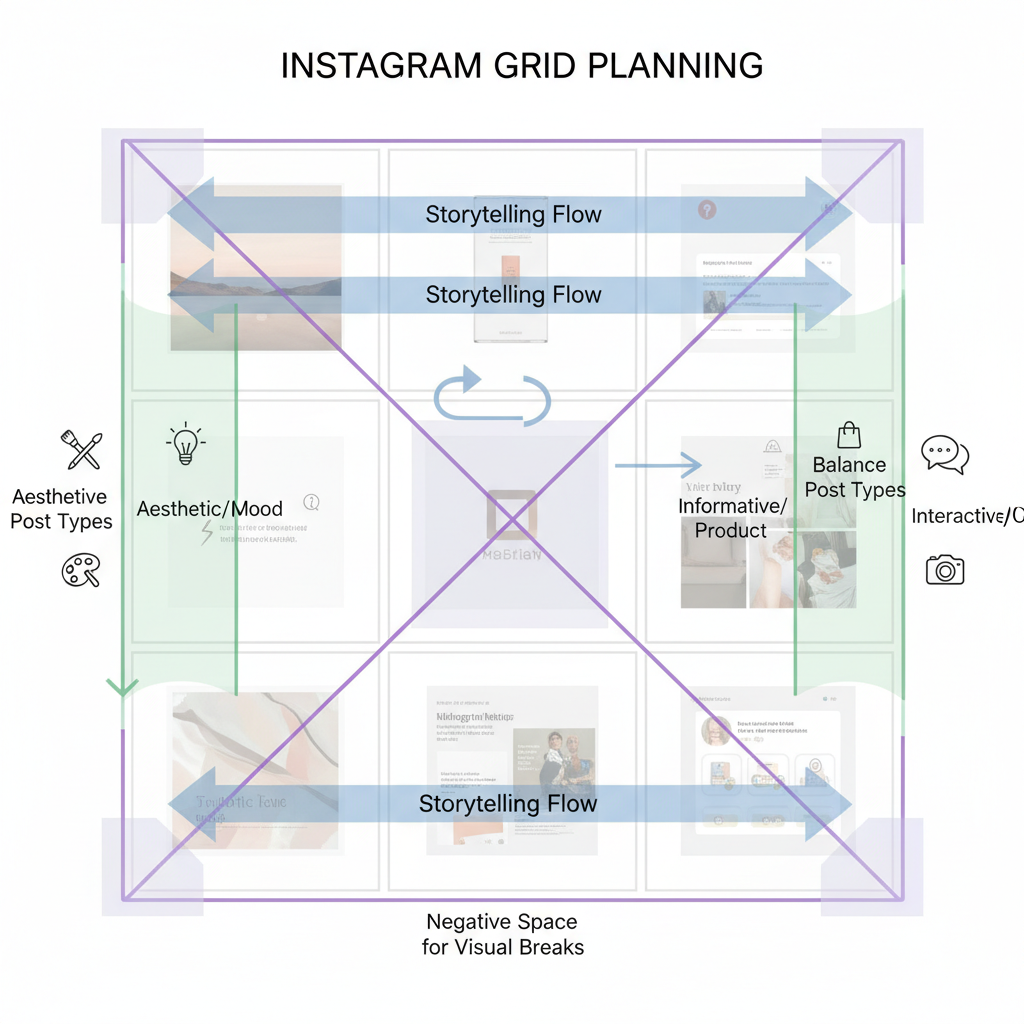
Using Rows and Columns to Tell a Story
The grid’s default 3-column structure offers storytelling potential:
- Row-based Narratives: Use three aligned posts to depict steps in a process, like a product launch.
- Column Themes: Dedicate each column to a specific content type—for example, quotes, lifestyle shots, and product images.
| Grid Pattern | Description | Example |
|---|---|---|
| Checkerboard | Alternates between post types (e.g., image/text) | Creates rhythm and balance |
| Vertical Lines | Consistent type of content in each column | Supports clear thematic storytelling |
| Diagonal Flow | Images follow a diagonal color or design progression | Gives dynamic movement |
---
Balancing Lifestyle, Product, and Personal Posts
Audiences crave variety without losing cohesion. Balance content types by blending:
- Lifestyle: Behind-the-scenes, daily snapshots.
- Product: Focused showcases and feature highlights.
- Personal: Relatable human moments that build connections.
This variety keeps your feed fresh and multidimensional.
---
Incorporating Negative Space
Negative space provides breathing room and emphasizes focal points. Use blank backgrounds, minimalistic graphics, or isolated subjects strategically.
Advantages:
- Prevents visual overcrowding.
- Directs attention to featured content.
- Enhances aesthetic clarity.
---
Aligning Captions With Visual Branding
Captions may not alter your grid layout but can strengthen brand perception:
- Elegant Designs: Adopt refined language and structured formatting.
- Playful Themes: Use casual tone, emojis, and humor.
Ensure your voice matches your visual theme for cohesive branding.
---
Scheduling for Symmetry and Flow
Maintaining symmetry requires precise timing. For patterned grids—like checkerboards—sequence matters.
Tips:
- Use a content calendar.
- Stick to regular posting intervals.
- Align posts with promotions or events.
Social media management tools can automate scheduling for consistent results.
---
Adapting Based on Engagement Data
Your grid should evolve with audience response. Track and analyze:
- Likes: Reflect visual appeal.
- Comments: Indicate engagement depth.
- Shares/Saves: Signal relevance and memorability.
Optimize by emphasizing popular content patterns and moving away from underperformers.
---
Utilizing Seasonal and Campaign-Specific Layouts
Refreshing your grid for special occasions keeps it engaging:
- Holiday Themes: Use seasonal color palettes like reds and golds.
- Summer Campaigns: Incorporate tropical motifs and vibrant tones.
- Awareness Initiatives: Include symbolic visuals with a consistent look.
These temporary shifts can spark excitement without losing your core identity.
---
Avoiding Overly Complex Patterns
While creativity is valuable, too much complexity disrupts cohesion. Avoid:
- Excessive competing visual elements.
- Frequent theme changes without explanation.
- Hard-to-sustain posting patterns.
A clean and consistent Instagram grid view is more pleasing and easier to maintain.
---
Conclusion and Next Steps
Your Instagram grid view is more than a collage—it’s the visual handshake of your brand. By harnessing consistent themes, planning posts strategically, balancing varied content, and responding to audience engagement, you can craft a grid that captivates and converts.
Start implementing these tactics today to turn casual profile visitors into loyal followers. For more ideas on elevating your visual strategy, explore additional social media design resources and continue refining your aesthetic over time.


