Instagram Post UI Design Tips for Higher Engagement
Learn Instagram post UI design tips from layout and color schemes to visual hierarchy, branding, and CTAs to boost engagement and recognition.
Instagram Post UI Design Tips for Higher Engagement
If you want your content to rise above the endless scroll on Instagram, Instagram post UI design is a crucial factor. A compelling interface determines how effectively your visuals attract attention, communicate your message, and drive interaction. This guide walks you through the essential components, aspect ratios, hierarchy techniques, and branding strategies that will elevate your posts, improve engagement, and strengthen your brand identity.

---
What Is Instagram Post UI and Why It Matters
Instagram post UI is the visual framework of your post — its layout, imagery, typography, colors, and supplemental design features like stickers or graphics. It translates content into a format viewers can quickly digest.
Key benefits of a strong UI:
- Captures attention in a crowded feed within seconds
- Builds brand consistency for easy recognition
- Improves clarity of key messages or promotions
- Influences interactions such as likes, shares, comments, and saves
---
Core Components of an Instagram Post UI
A refined UI brings together multiple design elements into a cohesive visual experience.
Layout
Structure content using symmetry, alignment, and intentional spacing for balance and easy scanning.
Imagery
Select high-quality, relevant photos or illustrations; for products, show detail, for lifestyle shots, convey emotion.
Typography
Fonts should reflect brand style while staying highly legible on mobile screens. Establish size and weight hierarchy.
Color Schemes
Choose colors aligned with your brand and intended mood — warm tones energize, cool tones calm.
---
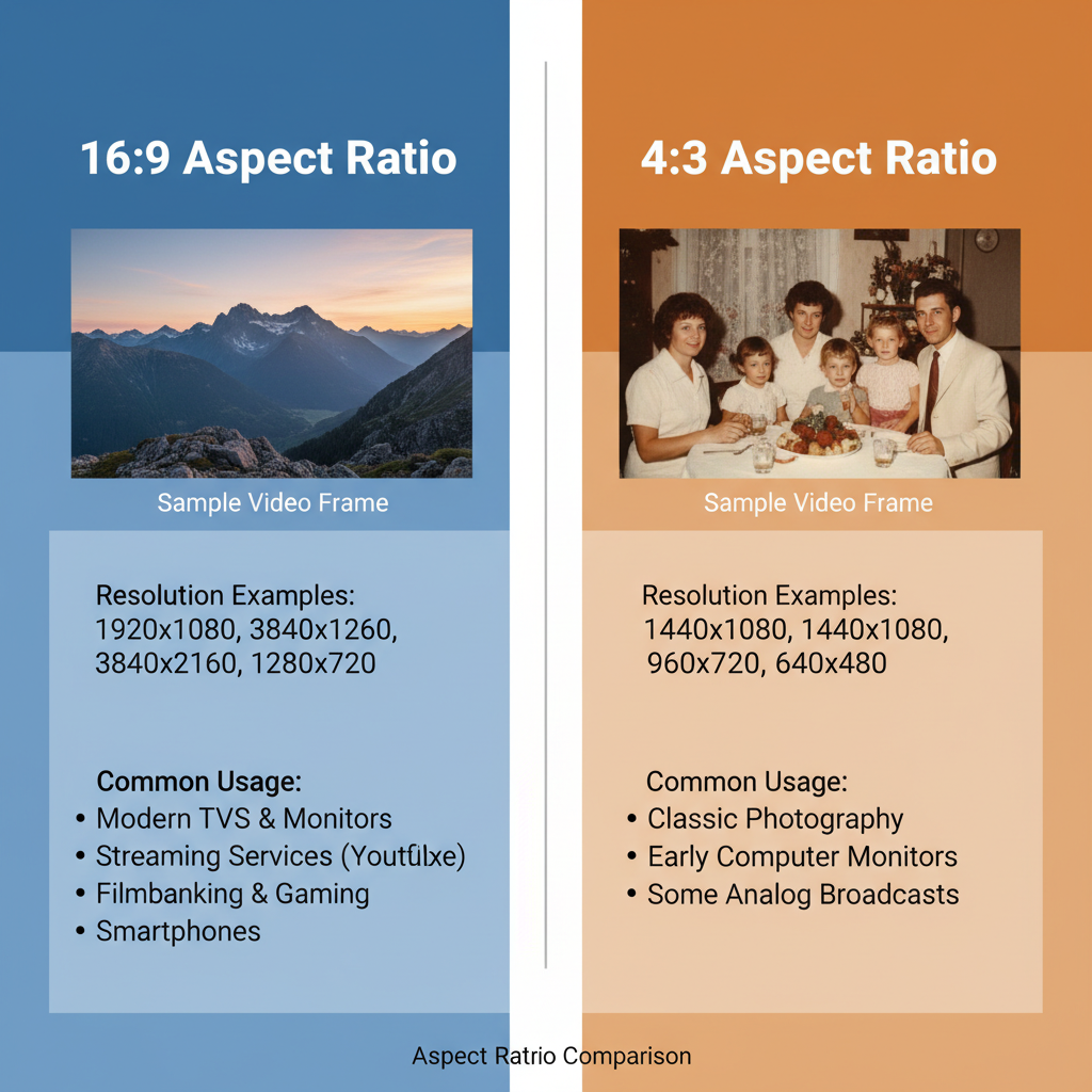
Optimal Aspect Ratios and Safe Zones
For feed posts, the 4:5 vertical ratio captures more screen space, enhancing visibility.
Safe zones are clear areas in your design free from overlapping UI components like captions and buttons. Keep text and focal imagery inside these zones for maximum impact.
| Content Type | Optimal Aspect Ratio | Resolution (px) | Safe Zone Considerations |
|---|---|---|---|
| Single Photo (Vertical) | 4:5 | 1080 x 1350 | Center text away from edges |
| Square Post | 1:1 | 1080 x 1080 | Equal margins all sides |
| Story | 9:16 | 1080 x 1920 | Keep text clear of top/bottom 250px |
---
Creating Visual Hierarchy for Quick Comprehension
Visual hierarchy directs the viewer’s attention.
- Size large elements for first-glance impact
- Weight bold fonts for titles, lighter for body text
- Position critical content centrally or at entry points
- Contrast colors to separate layers and emphasize

A clear hierarchy ensures users grasp your main message within seconds, boosting the likelihood of engagement.
---
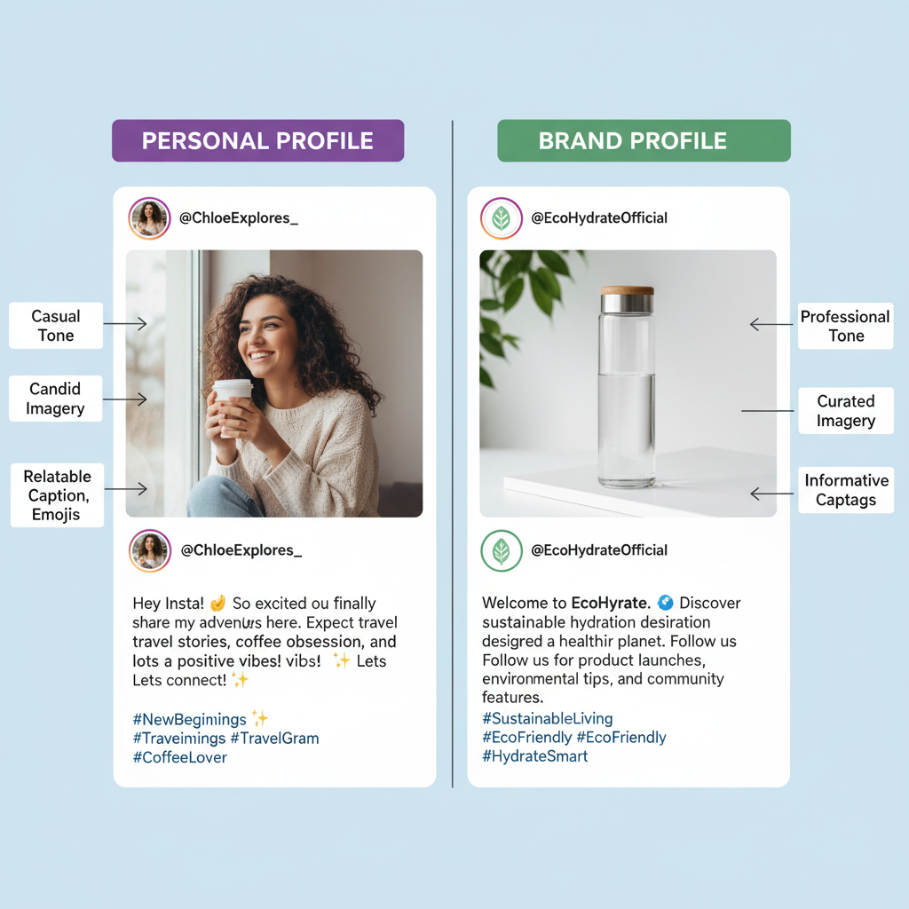
Incorporating Subtle Branding
Subtle but consistent branding fosters recognition without overpowering:
- Apply signature color palettes consistently
- Place logos or watermarks unobtrusively
- Use uniform typography across posts
- Repeat visual motifs like specific shapes or borders
---
Using Call-to-Action (CTA) Elements
Strategically embedded CTAs encourage desired actions.
- Visual CTAs: Arrows, buttons, highlighted text
- Caption CTAs: “Tap to shop,” “Save for later”
- Combine with urgency: “Limited time offer!”
---
Accessibility in Instagram Post UI
Include accessibility in your design to reach wider audiences.
- Maintain strong contrast between text and background
- Choose readable fonts for core information
- Use Instagram's alt text
- Avoid flashing animations for visual comfort
---
Leveraging Carousel Posts for Storytelling
Carousels let you sequence a narrative across multiple images.
- Outline intro, body, and conclusion
- Maintain color and type consistency
- Add micro-CTAs to swipe through
- Finish with a bold frame reinforcing the message

---
Adapting UI for Different Content Types
Different formats demand unique UI considerations.
Reels Covers
- 9:16 ratio
- Centralized text within safe zone
- Bold, attention-grabbing cover visuals
Static Posts
- Blend photos and graphics
- Favor vertical ratios in feed
Infographics
- Use icons to condense complex data
- Clearly divide sections
---
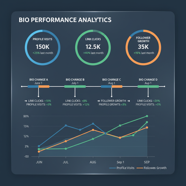
Testing UI Iterations to Optimize Engagement
Experimentation refines your content’s performance.
- Create multiple variants with tweaks to layout, color, CTA style
- Track metrics like likes, saves, shares, comments, CTR
- Use Instagram Insights or third-party tools
- Adjust design based on results
---
Understanding Algorithm Behavior
Instagram favors posts that:
- Gain early engagement — prompt interaction fast
- Retain viewers — storytelling and detail boost retention
- Inspire saves/shares — valuable content is reshared more
---
Auditing Competitors’ Post UI
Competitor analysis highlights strengths and gaps.
- Find posts with strong engagement in your niche
- Break down their layout, images, typography, colors, and CTAs
- Identify unique elements in their design
- Adapt ideas to set your content apart
---
Summary and Next Steps
Improving Instagram post UI design blends creativity with strategic thinking. Layout, imagery, typography, color palettes, safe zones, CTAs, accessibility, and adaptive formatting all contribute to attracting and retaining audience attention.
Regularly test and refine designs, understand algorithm nuances, and learn from competitor successes. With a well-structured UI approach, your posts can go beyond looking good — they can spark conversations, inspire action, and grow your community.
Start applying these tips to your next post and watch your engagement climb.