Optimize Your Instagram Profile Grid for Visual Impact
Learn how to design a cohesive Instagram profile grid using themes, colors, and layouts to boost visual impact, brand recognition, and engagement.
Optimize Your Instagram Profile Grid for Visual Impact
Creating a strong profile grid in Instagram is essential for making a compelling first impression. More than just a collection of individual posts, your profile grid is a unified visual portfolio that can attract followers, convey your brand identity, and keep visitors engaged. By strategically planning colors, themes, and layouts, you can transform your feed into a cohesive, eye-catching story.

---
Understanding the Instagram Profile Grid and Its Importance
The Instagram profile grid is displayed in rows of three images, allowing visitors to see your latest 9–12 posts without scrolling too far. Think of it as your brand’s storefront.
Why is it important?
- First impressions — It’s the first thing potential followers see when visiting your profile.
- Branding — A consistent grid communicates professionalism, recognition, and style.
- Storytelling — The arrangement can guide a viewer’s gaze and convey narratives through visual flow.
Consider the grid a preview of your creativity and messaging—an impactful snapshot that represents your brand at a glance.
---
Assessing How Your Grid Appears to First-Time Visitors
Before making adjustments, assess the current state of your grid:
- Color balance — Do your colors harmonize?
- Style consistency — Are filters, lighting, and edits uniform?
- Layout flow — Does the viewer’s eye move naturally across posts?
Quick tip: view your grid as a whole without reading captions. Does it look cohesive, or is the visual story fractured? If the answer leans toward the latter, it’s time for refinement.
---
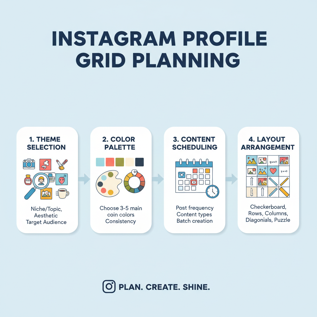
Choosing a Consistent Theme and Color Palette for Brand Recognition
A defined theme establishes visual unity and strengthens brand identity. Decide your signature look:
- Color tone — Warm pastels, bold primaries, or monochrome
- Mood — Minimalist vs. vibrant
- Texture style — Film grain, matte, or crisp clarity
A fixed brand palette allows followers to instantly recognize your content. For instance, a health coach might lean on whites and blues for a fresh vibe, while an artist could favor earthy hues for a calming effect.
Pro Tip: Use your brand’s hex codes during editing for color precision.
---
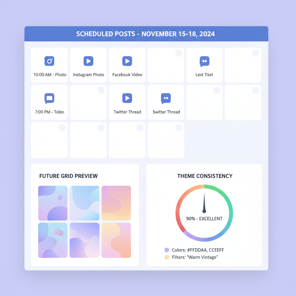
Planning Content in Advance Using a Grid Planner Tool
Spontaneous posting can disrupt visual flow. Avoid this by:
- Planning 3–6 posts ahead
- Using grid planner apps like Preview, UNUM, or Plann
- Visualizing the upcoming layout to maintain cohesion
Advance planning ensures each post complements neighboring ones, preventing jarring shifts.
| Planner Tool | Key Features | Best For |
|---|---|---|
| Preview | Drag-and-drop grid preview, hashtag storage | Creators wanting quick visibility of upcoming posts |
| UNUM | Advanced analytics, flexible layout tests | Brands with ongoing campaigns |
| Plann | Content scheduling, bulk uploads | Businesses seeking automation |
---
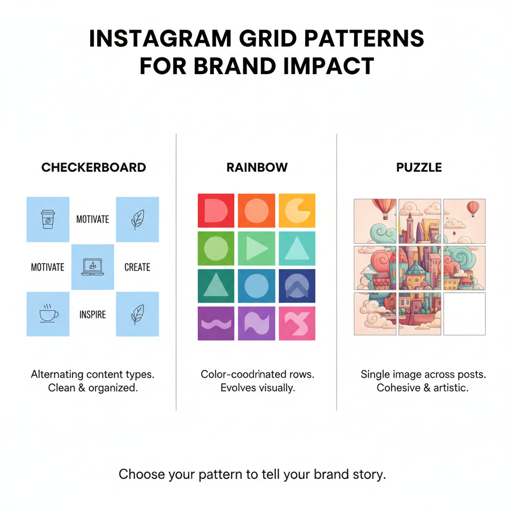
Experimenting with Grid Patterns
Patterns create rhythm and visual intrigue:
- Checkerboard — Alternate between image-heavy and text-based posts.
- Row-specific topics — Each horizontal row presents a mini-story.
- Puzzle grid — A set of posts that form a single large image.
These techniques can increase anticipation among followers, as they start recognizing your structured posting style.
Example: A travel blogger could create a 9-post puzzle showcasing a panoramic beach scene.
---
Balancing Variety and Cohesion
Variety keeps content fresh, while cohesion ensures clarity of brand:
- Mix media types (photos, Reels, graphics, quotes)
- Stick to uniform fonts, border styles, and filter settings
- Avoid mixing clashing editing styles
Ask yourself: does every post feel like it belongs within the larger visual sequence?
---
Optimizing Captions and Hashtags Without Breaking Grid Aesthetic
Captions and hashtags influence engagement, but can subtly impact visual appeal:
- Maintain clean on-image text design
- Only add text overlays if they blend with the chosen theme
- Use niche-specific hashtags for discoverability
- Hide excessive hashtags in comments to keep captions uncluttered
This approach maximizes reach without compromising your grid’s elegance.
---
Using Carousel Posts Strategically
Carousel posts allow more creative freedom inside a single feed spot:
- Make sure the cover photo aligns with your brand style
- Use inside slides for alternative content like behind-the-scenes shots or infographics
- Preserve external grid harmony while diversifying internal content
Think of carousels as “hidden layers” that add depth beyond the visible grid tile.
---
Integrating Seasonal or Campaign-Specific Designs
Seasonal or promotional variations keep your content timely:
- Adapt brand elements to seasonal colors
- Keep repeating features like logo placement or borders consistent
- Slowly integrate seasonal posts to avoid abrupt visual changes
The result is relevant, timely content without losing brand cohesion.
---
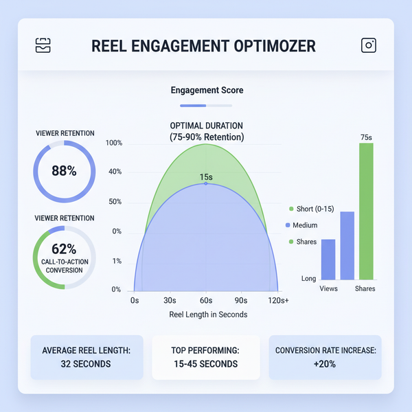
Analyzing Engagement Metrics by Position on the Grid
Post position affects engagement:
- Top row gets the most views and activity.
- Middle rows remain visible but have moderate reach.
- Lower rows get fewer views, relying on evergreen attraction.
Track performance data:
| Grid Position | Average Engagement Rate | Insights |
|---|---|---|
| Top Row | 8–12% | Freshest content, highest visibility |
| Second Row | 5–8% | Still relevant, benefits from recent activity |
| Third Row+ | 3–5% | Lower visibility, depends on evergreen appeal |
Use analytics to decide where to place bold experimental posts versus safe, reliable content.
---
Refreshing and Adapting Grid Style Quarterly
Social media trends evolve quickly—review your grid quarterly:
- Identify styles or formats losing engagement
- Introduce new patterns or palettes strategically
- Adapt based on audience feedback and changes in Instagram features
This keeps your feed modern and appealing.
---
Avoiding Common Mistakes
To sustain an attractive profile grid in Instagram, avoid:
- Inconsistent edits — Mid-week filter changes disrupt harmony.
- Off-theme posts — Irrelevant content breaks brand narrative.
- Posting gaps — Absence can decrease grid flow and engagement.
- Overly cluttered images — Excessive text or elements muddle visual messaging.
Consistency helps build a recognizable and respected visual brand.
---
Final Thoughts
An optimized Instagram profile grid is more than cosmetic—it’s a strategic visual handshake to your audience. By carefully choosing themes, aligning patterns, planning content ahead, and staying adaptable, you create a feed that is consistent yet dynamic. Followers will learn to expect quality and style, while occasional surprises keep interest alive.
Ready to transform your profile? Start planning your next nine posts with visual impact in mind and watch your follower engagement grow.