Social Media Layout Tips for Strong Brand Identity
Learn how to craft cohesive social media layouts with aesthetic themes, platform-specific strategies, and design tips to strengthen brand identity.
Social Media Layout Tips for Strong Brand Identity
Creating a cohesive social media layout takes more than simply arranging attractive posts—it’s about crafting a strong, recognizable brand identity that immediately resonates with your audience. In today’s competitive digital environment, a strategic layout shapes perception, fuels engagement, and differentiates your brand. This guide covers proven layout techniques, platform-specific tactics, and tools to help you master the art of branded feeds.

---
What Is a Social Media Layout and Why It Matters for Branding
A social media layout refers to the visual arrangement and sequence of posts within a platform's feed or page, including the order, style, colors, and composition of all content elements.
Why it matters:
- Boosts brand recognition: A consistent appearance makes your account instantly recognizable in crowded feeds.
- Improves user experience: Visually balanced layouts make browsing enjoyable, encouraging higher engagement.
- Supports storytelling: Sequenced visuals can guide followers through your brand’s narrative journey.
Think of your layout as a digital storefront window—the first impression that influences whether someone stays, follows, or clicks away.
---
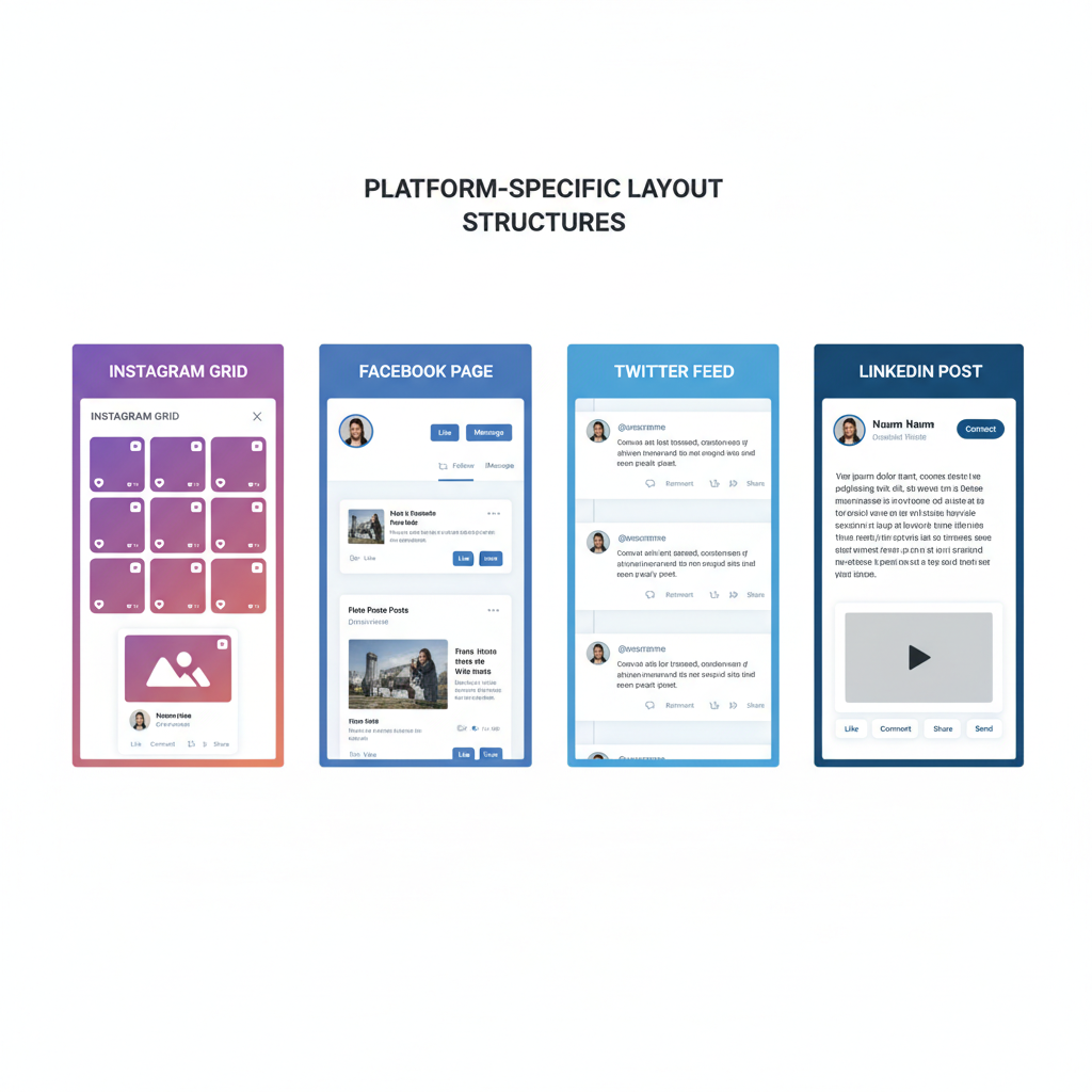
Platform-Specific Layout Differences
Understanding how each social media platform presents content helps you design more effective layouts that align with native viewing patterns.
| Platform | Layout Style | Key Considerations |
|---|---|---|
| Grid (3-column) | Sequence matters; ensure visual balance across rows. | |
| Timeline posts + Page cover | Align cover image & profile picture; vary post formats. | |
| Twitter (X) | Feed-based chronological | Images appear as previews; vertical compositions often stand out. |
| Single-column feed | Maintain professional tone; blend text-graphics with rich visuals. |
---
Instagram Grid
The Instagram feed is ideal for pattern play—checkerboards, color gradients, thematic rows—where each post complements the whole grid.
Facebook Page
The layout combines static elements like the cover and profile photos with dynamic post flow. Cohesion between these assets builds trust at a glance.
Twitter Feed
Content stacks vertically, so each image or card must stand out individually. While themes are less visible, brand tone consistency remains crucial.
LinkedIn Posts
Professional branding shines on LinkedIn with clean layouts, concise messaging, and consistent fonts that emphasize credibility.
---
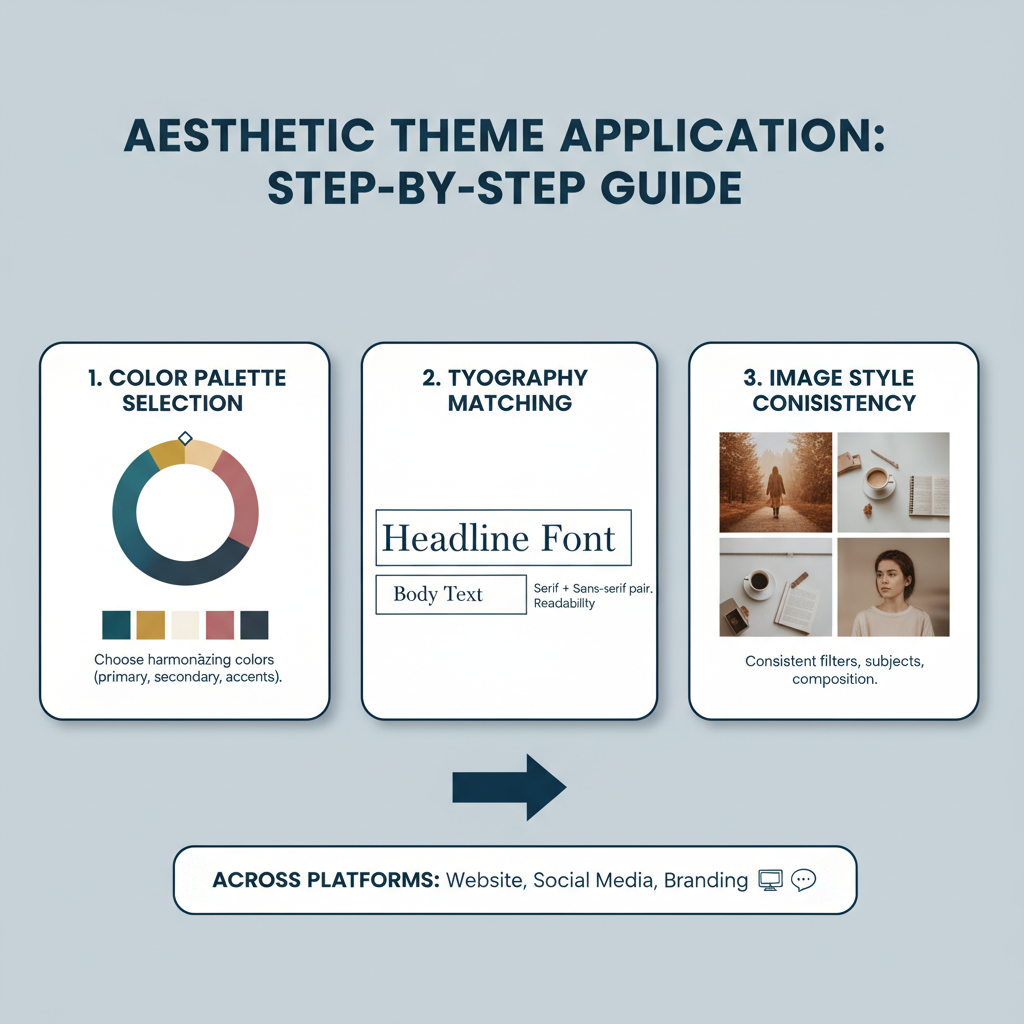
Choosing an Aesthetic Theme and Visual Identity
Your aesthetic theme forms the backbone of an effective social media layout, comprising:
- Color palette – Select 3–5 brand colors and apply them across visuals.
- Typography – Use fonts that reflect your brand’s voice.
- Image style – Determine whether to focus on photography, illustration, or a hybrid approach.
Consistency across these elements ensures your layout feels unified. For example, a fitness brand may lean into bold sans-serif fonts, energetic high-contrast colors, and action-packed photography.
---
Planning Content Pillars and Layout Order
Content pillars represent the core topic categories in your strategy. Assign each pillar a distinct visual style that integrates seamlessly into the feed.
Example content pillars:
- Education – Infographics, how-to tips, tutorials.
- Engagement – Quizzes, polls, interactive graphics.
- Promotion – Product launches, limited offers.
- Community – User-generated content, testimonials.
Layout order tips:
- Avoid grouping similar post types too closely; mix for variety.
- Use high-impact visuals as anchors in each row or segment.
---
Crafting a Grid or Posting Schedule
A consistent posting schedule maintains feed balance and rhythm.
Sample Instagram Grid Schedule
- Row 1: Product photo, Tip graphic, Team spotlight
- Row 2: Event photo, Quote, Behind-the-scenes
- Row 3: Tutorial video, Lifestyle shot, CTA image
Rotation between formats and topics keeps engagement high while sustaining brand flow.
---
Incorporating Storytelling into Layout Decisions
Storytelling can be visual as well as textual. Structured sequences strengthen narratives:
- Product reveals in progressive stages
- Event build-ups with thematic teasers
- Behind-the-scenes progress snapshots
Visual connections—like similar backgrounds, repeating props, or color sequences—invite audiences into your brand journey.
---
Optimizing Layouts for Desktop and Mobile Viewing
Feeds render differently on desktop and mobile:
- Mobile – Smaller screens mean early posts carry more impact.
- Desktop – Larger preview grids emphasize overall cohesion.
Design images to fit multiple aspect ratios so crops appear intentional and polished on any device.
---
Using Branded Templates for Efficiency
Branded templates streamline production and reinforce visual identity.
Top tools:
- Canva – Beginner-friendly drag-and-drop layouts.
- Adobe Express – Professional template quality.
- Figma – Collaborative design for teams.
---
Tracking Engagement Metrics to Refine Layout Strategy
Measure layout success through:
- Likes & shares – Gauge visual appeal.
- Save rate – Reflects perceived value.
- Profile visits – Indicates how layout draws new viewers.
Analyzing which layouts or sequences boost interaction enables data-backed refinements.
---
Exploring Creative Layout Trends
Inject freshness while retaining brand cohesion:
- Checkerboards – Alternate image and text posts.
- Row storytelling – Mini narratives per row.
- Seasonal themes – Color schemes matching holidays or seasons.
Strategic trend use keeps feeds relevant without compromising identity.
---
Best Tools for Planning Layouts
Preview and scheduling tools help visualize and execute layouts:
- Preview App – Drag-and-drop Instagram feed testing.
- Planoly – Automates post scheduling.
- Later – Manages multi-platform feed consistency.
---
Common Mistakes to Avoid
Steer clear of these pitfalls:
- Brand inconsistency – Sudden style shifts confuse audiences.
- Overloaded visuals – Clutter reduces focus.
- Poor spacing – Minimal white space impacts readability.
- Ignoring mobile previews – Leads to misaligned crops.
---
Conclusion
A consistent social media layout is a powerful brand asset. By blending platform-specific formatting with cohesive themes, steady scheduling, and data-driven adjustments, you can transform your feed into a compelling, story-rich visual experience. Treat every post as part of a bigger, orchestrated brand symphony where each element enhances the whole.
Keep iterating, leverage design and scheduling tools, and let analytics guide your creative evolution. Start refining your layout today—your audience will notice, and your brand identity will grow stronger with every scroll.