MeWe Banner Size: The Complete 2025 Guide to Dimensions, Safe Areas, and Cropping
Get 2025 MeWe banner sizes, safe areas, and cropping tips. See overlay cautions, desktop vs mobile, and Canva/Photoshop/Figma workflows for crisp results.
Whether you’re setting up a new MeWe presence or refreshing an existing one, getting banners to look right on both desktop and mobile can be tricky. This guide compiles practical, design-tested sizes, safe-area rules, and overlay cautions so your headers survive cropping and compression. You’ll also find ready-to-use workflows for Canva, Photoshop, and Figma, plus export and testing tips to ensure reliably sharp results.
MeWe Banner Size: The Complete 2025 Guide to Dimensions, Safe Areas, and Cropping

If you’ve ever uploaded a MeWe cover and found your logo clipped on mobile or the avatar covering your tagline, this guide is for you. Below is an up‑to‑date, design‑tested overview for 2025 of recommended banner sizes, safe areas, and export best practices—plus workflows for Canva, Photoshop, and Figma.
Note: MeWe does not publish highly detailed, official banner specs. The recommendations below reflect widely tested creator practices aimed at minimizing cropping issues across desktop and mobile.
Quick answer (at a glance)
- Recommended working canvases:
- Profile cover: 1920 × 1080 px (16:9)
- Group header: 1920 × 1080 px (16:9) or 1920 × 640 px (3:1) if desktop emphasis
- Page header: 1920 × 1080 px (16:9)
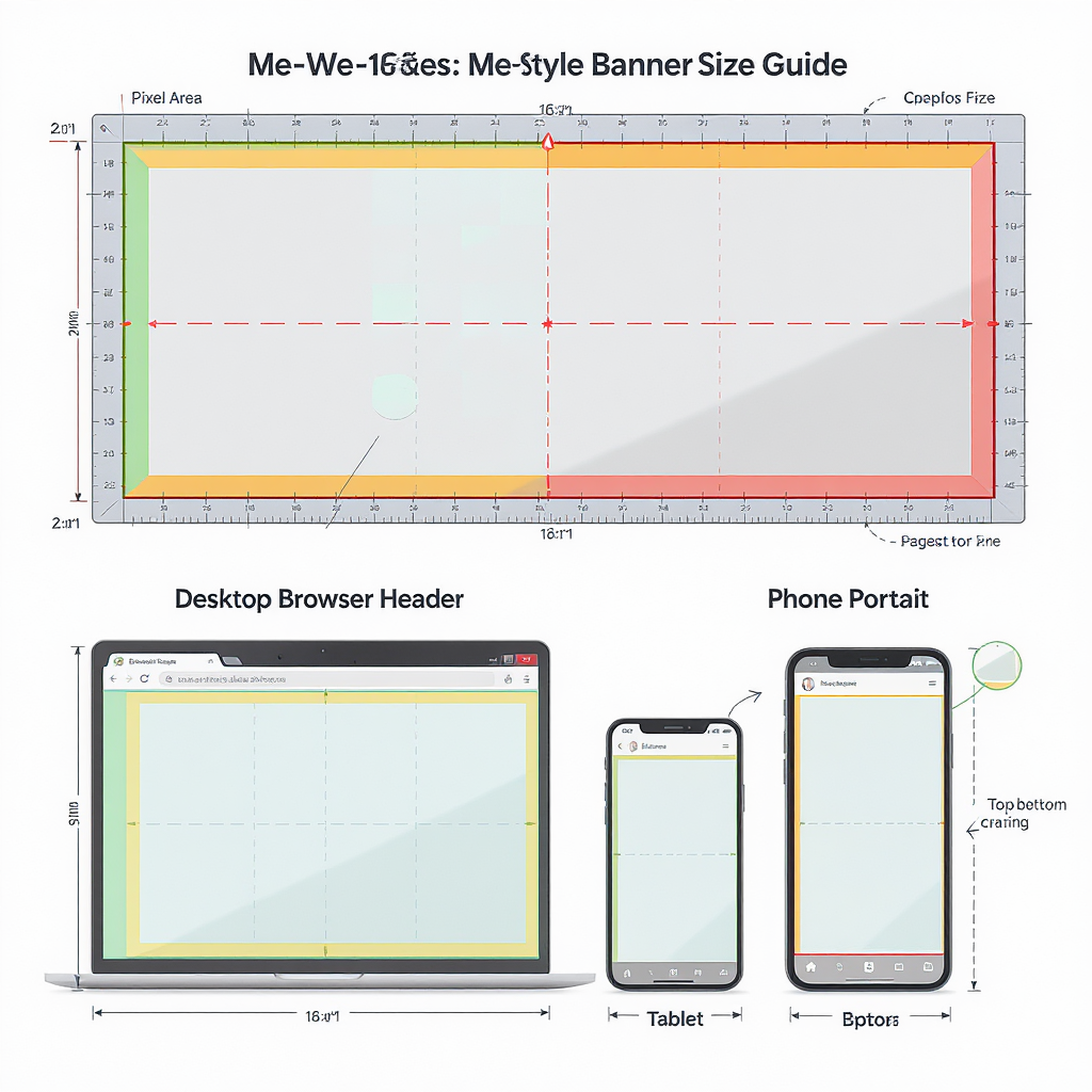
- Safe area (keep critical text/logo inside):
- Center 70% width × 45–50% height. As a pixel guide for 1920 × 1080: keep essentials within roughly 1340 × 540, centered.
- Overlays to anticipate:
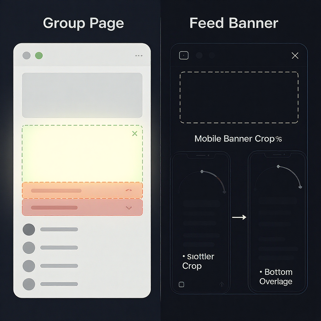
- Profile: circular avatar overlaps lower-left; profile name/handles and action buttons can sit near top-left/top-right.
- Group/Page: title and buttons often occupy top-left/top-right zones.
- Supported formats (most reliable):
- JPEG (sRGB), PNG (sRGB). WebP may be accepted but can be inconsistent; test before rollout.
- File size target:
- Aim for ≤ 2 MB (ideal) and ≤ 5 MB (max) for fast loading. Larger files may upload, but slow and risk failure.
- Desktop vs. mobile cropping:
- Desktop tends to show more width with moderate top/bottom crop depending on viewport height.
- Mobile tends to crop vertically tighter; left/right overlays (avatar, buttons) cover more visual real estate.
MeWe banner size summary
| Banner type | Recommended canvas | Aspect ratio | Safe area (centered) | Overlay zones to avoid | Desktop crop tendency | Mobile crop tendency | Best formats | Target file size |
|---|---|---|---|---|---|---|---|---|
| Profile cover | 1920 × 1080 px | 16:9 | ~1340 × 540 px | Lower-left (avatar), top corners (title/buttons) | Light top/bottom crop | Heavier top/bottom crop; tighter vertical field | JPEG, PNG | 2–5 MB (≤ 5 MB max) |
| Group header | 1920 × 1080 px or 1920 × 640 px | 16:9 or 3:1 | ~1340 × 540 px (16:9) or ~1340 × 360 px (3:1) | Top-left (title), top-right (buttons) | 3:1 looks great on wide screens | 16:9 adapts better to phones | JPEG, PNG | 2–5 MB (≤ 5 MB max) |
| Page header | 1920 × 1080 px | 16:9 | ~1340 × 540 px | Top-left (title), top-right (buttons) | Similar to group | Similar to group | JPEG, PNG | 2–5 MB (≤ 5 MB max) |
Where banners appear on MeWe (and how they scale)
- Profile covers:
- Layout: Circular avatar overlaps the banner at lower-left. Profile name and actions can occupy top corners.
- Scaling: The image scales responsively to container width. Expect mild letterboxing/cropping depending on viewport height.
- Group headers:
- Layout: Group title typically sits top-left; join/share or menu buttons at top-right.
- Scaling: On wide desktop viewports, a 3:1 composition reads cleanly. On mobile, MeWe tends to crop vertically tighter; 16:9 is more forgiving.
- Page headers:
- Layout: Very similar to groups—title and controls near the top edges.
- Scaling: Behaves like groups; center-weight your subject for reliability.
Practical implication: keep visuals centered; reserve space in the top corners and in the lower-left quadrant for overlays.
Safe area guide (keep text and logos visible)
- Margins that work:
- Left and right: keep a minimum of 15% inner margin.
- Top and bottom: keep a minimum of 25–27% inner margin.
- Focal area recommendation:
- Place key text, logos, and CTAs within the center 70% width × 45–50% height.
- Avatar overlap (profile):
- Avoid placing text and logos within the lower-left 25–30% width of the canvas and the bottom 20–25% height.
- Edge safety:
- Don’t align important edges flush to the canvas; reserve at least 24–40 px padding on a 1920‑px canvas.
- Sample grid overlay strategy:
- Divide the canvas into a 12×6 grid. Keep critical content within columns 2–11 and rows 2–5.
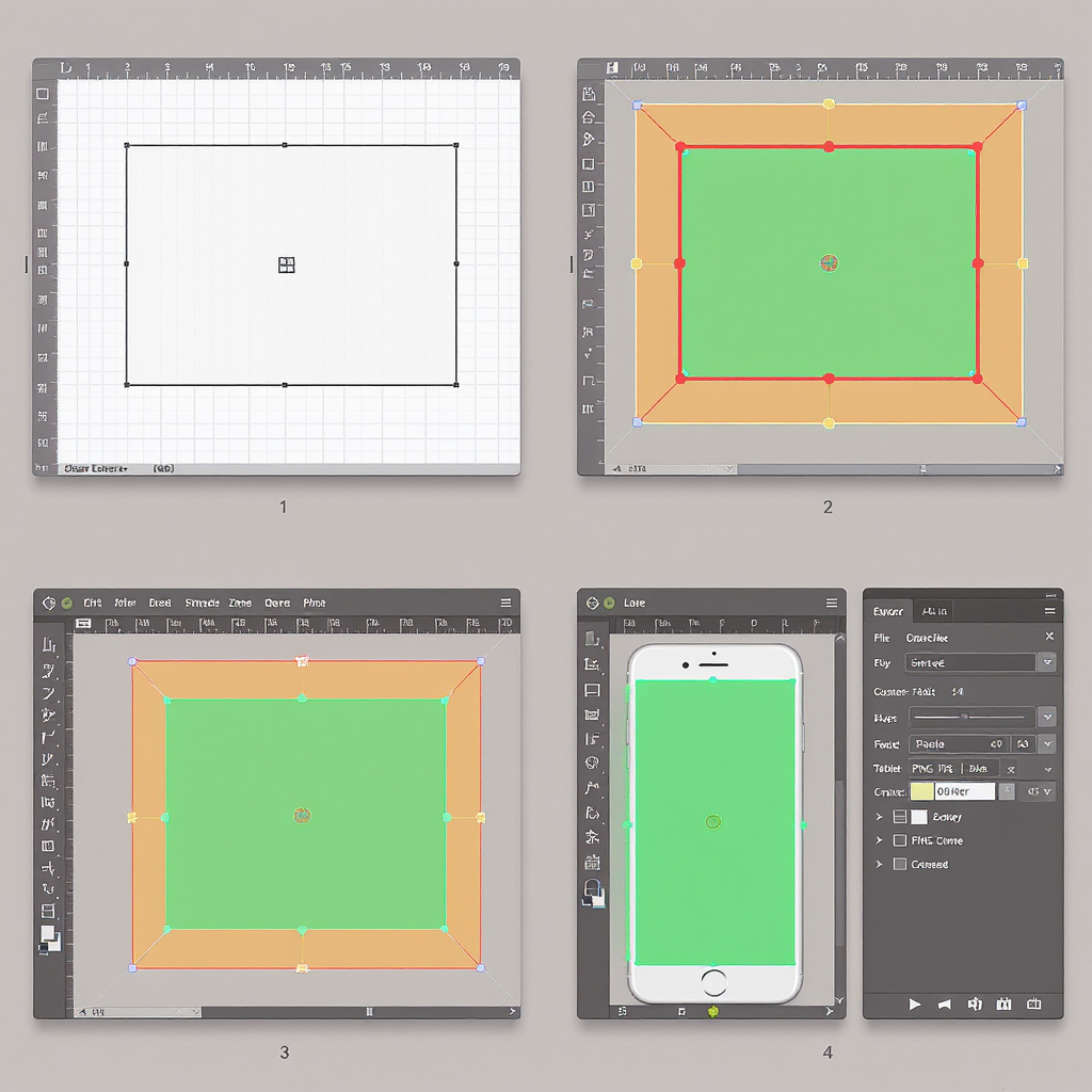
DIY safe-area overlay (SVG)
Drop this vector on top of your banner while designing. The green rectangle is a ~70% × 50% centered safe zone for 1920 × 1080.
Designing a pixel-perfect MeWe banner
Canva workflow
- Create a new design at 1920 × 1080 px.
- Add guides at 15%/85% (left/right) and 25%/75% (top/bottom).
- Place logo and key text inside the guide rectangle; keep secondary elements outside caution zones.
- Use brand kit: set brand colors, fonts, and logo to ensure consistency across profile, group, and page banners.
- Export as JPG (Quality 80–90) or PNG; enable “Compress file” if available.
Photoshop workflow
- File → New → 1920 × 1080 px, RGB, 72–144 ppi, sRGB IEC61966-2.1.
- View → New Guides:
- Vertical: 288 px and 1632 px (15% from edges).
- Horizontal: 270 px and 810 px (25% from edges).
- Place artwork; ensure text layers sit within the inner guides.
- Filter → Sharpen → Smart Sharpen (Amount 20–40%, Radius 0.3–0.6 px) after final downscale.
- File → Export → Export As → JPEG Quality 75–85 or PNG; Embed Color Profile (sRGB).
Figma workflow
- Create a Frame 1920 × 1080. Name it “MeWe Banner 1920×1080”.
- Add Layout Grid: Columns 12, Margin 288, Gutter 24; Rows 6, Margin 270, Gutter 24.
- Constrain key text/logo within columns 2–11 and rows 2–5.
- Use components/variants for Profile/Group/Page to swap overlay-warning annotations.
- Export 1x PNG or JPG; consider an additional 2x (3840 × 2160) master for future-proofing, then downscale.
Export and optimization best practices
- File types:
- JPEG: best all-round; use for photos/gradients. Quality 75–85 typically stays crisp under 2–3 MB.
- PNG-24: best for flat graphics, sharp logos, or when avoiding JPEG artifacts.
- WebP: sometimes accepted; results vary. Use only if your tests succeed consistently.
- Color profile:
- sRGB only. Convert your document/profile before export to avoid washed-out colors.
- Size and compression:
- Target ≤ 2 MB. If needed, up to 5 MB is usually safe. Optimize with tools like ImageOptim, Squoosh, or TinyPNG/TinyJPG.
- Sharpening:
- Apply light output sharpening after resizing to 1920 × 1080 to counter platform compression.
- Avoiding banding:
- Add subtle noise (0.5–1%) to large gradients before export.
Mobile vs. desktop strategy
- Center-weighted compositions:
- Keep the subject centered; avoid edge-dependent designs.
- Flexible backgrounds:
- Use textures or gradients that crop gracefully on both axes.
- Alternative crops:
- If your group is desktop-first (e.g., community hub), a 3:1 version (1920 × 640) can look premium on wide monitors. Keep a 16:9 master too for mobile-friendly use.
- Testing:
- Upload to a private or placeholder group/profile to test. Check on:
- A phone (portrait)
- A tablet (portrait and landscape)
- A laptop and a large desktop display
Accessibility and readability
- Contrast:
- Aim for WCAG AA: 4.5:1 for normal text and 3:1 for large text (≥ 18 pt regular or 14 pt bold).
- Type sizing:
- For 1920 × 1080, main headline 56–88 px; subhead 28–40 px; caption 22–28 px.
- Background control:
- Add a soft gradient overlay (e.g., 20–40% black) behind text; or use a pill/lozenge behind labels.
- Typeface choice:
- Favor bold, high-x-height sans serifs for small on-screen rendering.
- Alt text:
- When posting banner previews or sharing screenshots, include alt text describing the brand and key message.
Troubleshooting common issues
- Blurry or pixelated banner:
- Cause: Over-compression or upscaling. Fix: Start from a 1920 × 1080 master, export JPEG 80–85 or PNG; add subtle sharpening.
- Washed-out colors:
- Cause: Wrong color profile. Fix: Convert to sRGB before export; avoid wide-gamut profiles.
- Misaligned crops on mobile:
- Cause: Edge-weighted layout. Fix: Re-center elements; increase inner margins to 15%/25%.
- Text cut off by avatar/buttons:
- Cause: Elements near lower-left/top corners. Fix: Move critical text to the central safe area; preview with overlay guides.
- Jagged logos:
- Cause: Scaling vector to raster at small size. Fix: Ensure logo is ≥ 300–400 px tall within the 1920‑px canvas; export PNG for crisp edges.
- Quick re-upload checklist:
- sRGB embedded
- Safe area respected (70% × 45–50%)
- JPEG Q80–85 or PNG
- ≤ 2–5 MB
- Centered composition
- Tested on phone and desktop
Staying up to date
- Verify current behavior:
- Check MeWe’s Help/Support resources and recent community threads. Platforms adjust UI spacing and overlays over time.
- Create your own device test file:
- Produce a banner with labeled quadrants and margin ticks (every 5%). Upload and screenshot on multiple devices to map real crops.
- Maintain a versioned template library:
- Keep a Figma/PSD/Canva master with:
- 1920 × 1080 (16:9) and 1920 × 640 (3:1) variants
- Safe area and overlay annotations
- Export presets (JPG Q80, PNG)
- Tag each update with date and changelog (e.g., “2025-03: increased top margin to 27% due to new button height”).
Final recommendations
- Use 1920 × 1080 for universal reliability; consider a 3:1 alternate for desktop-heavy groups.
- Keep critical content inside the center 70% × 45–50% area.
- Export sRGB JPEG (Q80–85) or PNG under 2–5 MB with light output sharpening.
- Test on real devices before rolling out to your main profile, group, or page.
By following these MeWe banner size guidelines and safe‑area practices, you’ll avoid unpleasant crops, preserve legibility, and ship on‑brand headers that look great everywhere.
Summary
Design for 1920 × 1080 (16:9) as your master, keep vital elements within a centered 70% × 45–50% safe zone, and leave room for overlays in the top corners and lower-left. Export in sRGB as JPEG Q80–85 or PNG, target 2–5 MB, and apply light output sharpening. Test privately on multiple devices; keep both 16:9 and 3:1 variants handy if your audience skews desktop.